It's not just Aussie property that's running hot
When asked by Livewire which is the most important chart I'm watching, and what its implications are, I've picked out a scenario in property markets that we haven't seen since the lead up to the GFC...
What is the single most important chart you are watching?
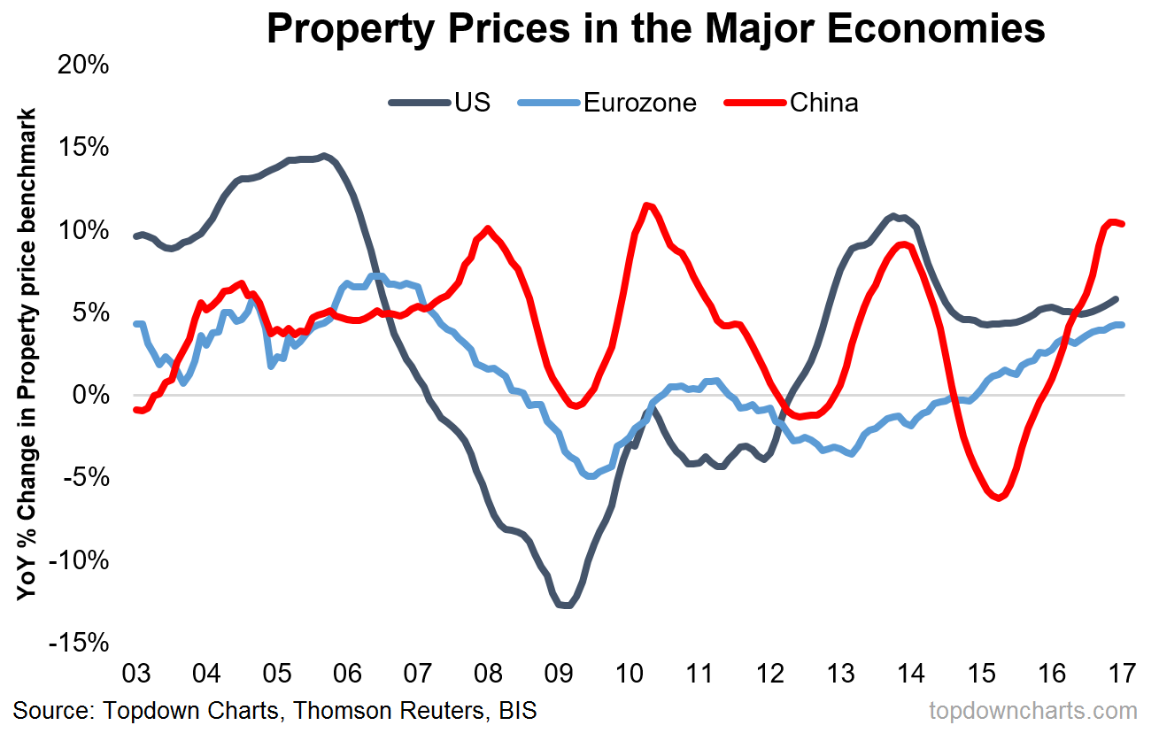
For my chart I picked one that I used in the Weekly Macro Themes report a couple of months ago - basically it provides a fundamental backing to the whole concept of "reflation".
What is it currently telling you?
To me this particular chart stands out because it shows property prices growing at a solid pace across the major economies.
What are the implications for investors?
Property prices matter because they play a major role in the risk and growth outlook for economies and financial systems. Notably, the last time we saw all 3 of the world's major economies experiencing positive YoY gains in property prices it was the pre-GFC boom times. Credit constraints in the form of already sizable debt loads means we probably wont see anything like the pre-GFC boom, but as a minimum this chart shows that there is something going on out there...
Never miss an update
Enjoy this wire? Hit the ‘like’ button to let us know.
Stay up to date with my current content by
following me below and you’ll be notified every time I post a wire
Callum is Head of Research at Topdown Charts.
Topdown Charts is a chart-driven macro research house covering global Asset Allocation and Economics.


Callum is Head of Research at Topdown Charts. Topdown Charts is a chart-driven macro research house covering global Asset Allocation and Economics.
Expertise
Callum is Head of Research at Topdown Charts. Topdown Charts is a chart-driven macro research house covering global Asset Allocation and Economics.
Expertise
Comments
Comments
Sign In or Join Free to comment