Central bank balance sheets, retirees and the big three Aussie exports
This week’s charts begin by examining the relationship between central banks’ balance sheets and stocks.
.png)
Macrobond Financial
This week’s charts begin by examining the relationship between central banks’ balance sheets and stocks. As the former shrinks, are equities overvalued? We created three visualisations that compare countries: the performance of various emerging markets, incomes of retirees in developed economies, and breakdowns of local stock markets by sector. For Australia, we track the growing importance of three mega-commodities to export revenue. For the tech world, we create an index of artificial-intelligence stocks and compare it to historic stock bubbles. And as economies surprise on the upside in 2023, we chart how forecasters have changed their expectations for growth and inflation.
Central bank liquidity and stocks
.png)
Is central bank liquidity a key determinant of stock-market returns? In February, we wrote about how Japan’s unorthodox monetary policy was probably boosting global equity markets, even as the Federal Reserve was tightening.
Indeed, there is a 96 percent historic correlation between the combined balance sheets of the world’s major central banks and the performance of the S&P 500.1
In the chart above, we track the theoretical value of what the S&P 500 “should” have been, given that correlation, against the US stock benchmark’s actual performance.
The second panel expresses this relationship in a different way, measuring the S&P’s variance from the model. The one-standard-deviation range is highlighted in gray.
As central banks drain liquidity, the S&P 500 has crept higher and is more than 1 standard deviation away from the trend. Are we headed for a correction, or will markets defy shrinking balance sheets as they did during the tech-driven surge of 2018-19?
1To be precise, this assertion refers to the R2 statistical measure used in regression model analysis.
Rich and poor retirees around the world
.png)
This scatter chart uses OECD data to compare the mean disposable incomes of working-age people (aged 18-65) and retirees (defined as 65-plus) in different countries. If your nation is on the diagonal line, that means the two age cohorts make the same amount of money.
If not, this gives a sense of how far your nation is from “income coverage parity”. The smaller the dot, the lower the relative income for older people in that nation.
Retired South Koreans have the biggest income gap with their younger counterparts. But in Italy, the over 65’s make slightly more than the rest.
Tracking Australian commodity exports: LNG, iron ore and the rest
.png)
.png)
.png)
Australia’s resource-based economy is famously resilient. The last recession Down Under was more than 30 years ago.
For the last 20 years, Australia has especially benefited from China’s sustained demand for minerals and hydrocarbons.
This chart breaks down Australian export revenue over the years, highlighting the ever-growing importance of iron ore, natural gas and coal. The big three commodities account for more than 60 percent of the total, compared with about 15 percent in the late 1980s.
Coal has been important for decades. But liquefied natural gas (LNG) exports are a relatively new feature of the Australian economy. The nation now jostles with Qatar for the top rung among LNG exporters.
For iron ore, China is the world’s dominant market, buying 70 percent of seaborne supply. The effect of China’s zero-Covid policy on the composition of Aussie export revenue in 2021-22 is clearly visible – as are the windfall gains that LNG exporters have reaped from higher global gas prices in the wake of Russia’s invasion of Ukraine.
What’s been displaced, share-wise? Manufactured goods and agriculture, most notably.
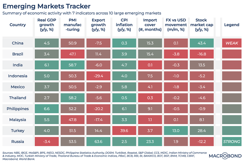
A mixed picture on our emerging markets dashboard
.png)
This dashboard assesses the most recent data points for economic activity across 10 major emerging markets.
Using seven indicators, we break down the health of these economies. Green signifies strength; red indicates weakness.
As oil prices decline and sanctions bite, Russia’s poor GDP performance stands out. And in the wake of Recep Tayyip Erdogan’s re-election, so does Turkey’s rampant inflation.
Indonesia suffered a particularly pronounced slump in exports due to the year-on-year price drops for coal and palm oil, two of its most important commodities.
China, the biggest emerging market, is showing a bit more green than red overall as its stock market recovers.
In search of an AI bubble index
.png)
Artificial intelligence breakthroughs have dominated headlines in 2023. ChatGPT has become a cultural phenomenon.
Cynics compare the hype around AI to past dotcom and crypto bubbles. Is there a way to compare the current craze to past investment trends?
We’ve created a mini-AI index and charted it against investment crazes ranging from 1970s gold to 1990s Asian tiger economies, as represented by the Thai stock benchmark. We also included the FAANG, which defined the late 2010s. (With the Fed-driven bear market of 2022 in the rearview mirror, it seems this Big Tech trade is back on.)
So far, there are few pure-play AI stocks; most of the hype has focused on Nvidia, a venerable chipmaker once associated with video-game graphics. It’s now seen as the dominant supplier of AI-related hardware and software. Microsoft, meanwhile, is integrating OpenAI into its Bing search tool. Both tech giants are in our nascent AI bubble index. We’ve also added Alphabet, Palantir and AMD.
Many of the interesting pure-play AI companies, like Midjourney and Hugging Face, are still privately held. As they come to the market, Macrobond users can customise their own AI indexes accordingly.
Visualising the whiplash from revised forecasts
.png)
This chart uses data from FocusEconomics and can only be accessed by subscribers.
Pessimism was abundant in 2022, but 2023 has seen surprising economic resilience on both sides of the Atlantic.
This chart visualises how consensus estimates for 2023 inflation (x axis) and GDP (y axis) evolved for the US, UK and eurozone from the start of 2022.
Economists consistently underestimated inflation for most of last year. As central banks hiked rates in response and the economic outlook grew darker, the arrows for all three economies headed in the same direction. Inflationary, Brexit Britain took the most rapid voyage to the lower right corner.
As optimism about growth kicked in, we see the lines “bounce” higher in unison. Only the eurozone is showing much optimism about disinflation in what remains of the year.
The biggest pieces of the pie in local stock markets
.png)
This chart requires access to Macrobond FactSet Equity Factor Aggregates.
Most economies around the world are associated with a particular industry. The UK is dominated by London’s financial hub. Canada and Australia are known for their resources. But as this visualisation shows, sometimes national stock markets’ composition defies stereotypes.
This chart first breaks down global equities into different sectors and weights them as a percentage of total market capitalisation. We then take national and regional stock markets and compare them to that global breakdown. When a sector is overweight in a given nation compared to its global importance, we highlight the percentage in bold: perhaps unsurprisingly, tech is disproportionately large in the US, Japan and the China-dominated Emerging Markets aggregate.
The importance of banking in developed markets stands out. Even with Europe’s banks a shadow of their former, pre-GFC selves, they account for a quarter of equity capitalisation. Canada’s energy sector is disproportionately large on a global basis, but it’s still surpassed in value by the nation’s banks.
Never miss an update
Enjoy this wire? Hit the ‘like’ button to let us know.
Stay up to date with my current content by
following me below and you’ll be notified every time I post a wire
Macrobond delivers the world’s most extensive macroeconomic & financial data alongside the tools and technologies to quickly analyse, visualise and share insights – from a single integrated platform. Our application is a single source of truth for all your data needs. In addition to our core database, the platform also provides a direct connection to third-party premium providers & even your own proprietary & internal data.
Macrobond’s analytics & visualisation tools streamline building & updating charts, saving hours of repetitive work manually recreating assets each time new data is released. Whether you’re an asset allocator or portfolio manager we enable you to collaborate effectively across your organisation and with your clients.
........
All written and electronic communication from Macrobond Financial AB is for information or marketing purposes and does not qualify as substantive research.
All opinions expressed in Macrobond webinars are those of the presenters and do not reflect the views of Macrobond Financial AB.
The views and opinions expressed here are those of the author/s and may not represent the views of the company.
.png)
3 topics
Macrobond Financial
Macrobond delivers the world’s most extensive macroeconomic & financial data alongside the tools and technologies to quickly analyse, visualise and share insights – from a single integrated platform. Our application is a single source of truth for...
Expertise
Macrobond Financial
Macrobond delivers the world’s most extensive macroeconomic & financial data alongside the tools and technologies to quickly analyse, visualise and share insights – from a single integrated platform. Our application is a single source of truth for...
Expertise
Comments
Comments
Sign In or Join Free to comment
most popular
Equities
Silver set for its day in the sun courtesy of solar panel boom
Independent Journalist
Equities
Macquarie tips these 6 ASX stocks could outperform
Livewire Markets