This week’s charts begin by showing a concerning trend in China – net new borrowing is concentrated in the business sector as households pull back.
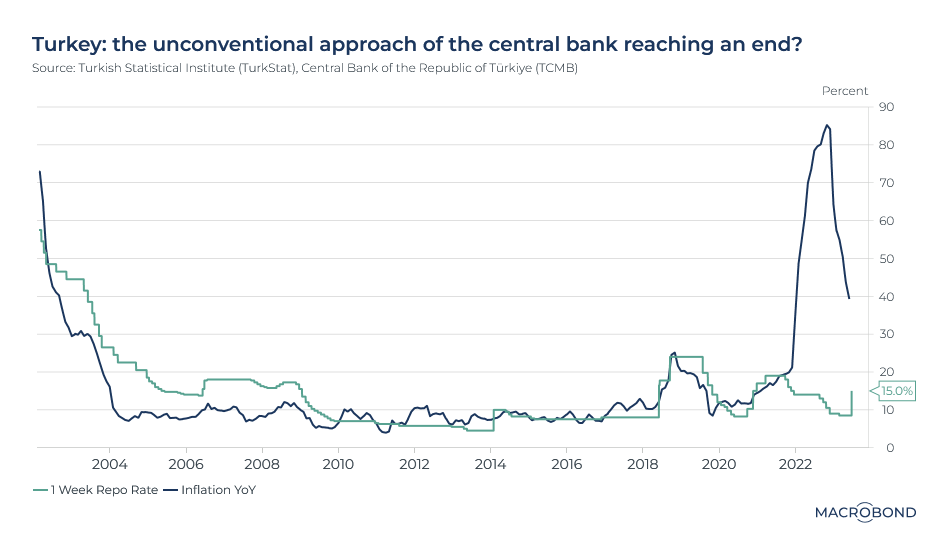
We look at two central banks: we show how the Fed’s “dot plot” moved toward predicting rates will stay higher for longer, and we show how Turkey abandoned monetary policy orthodoxy in the run-up to its recent election.
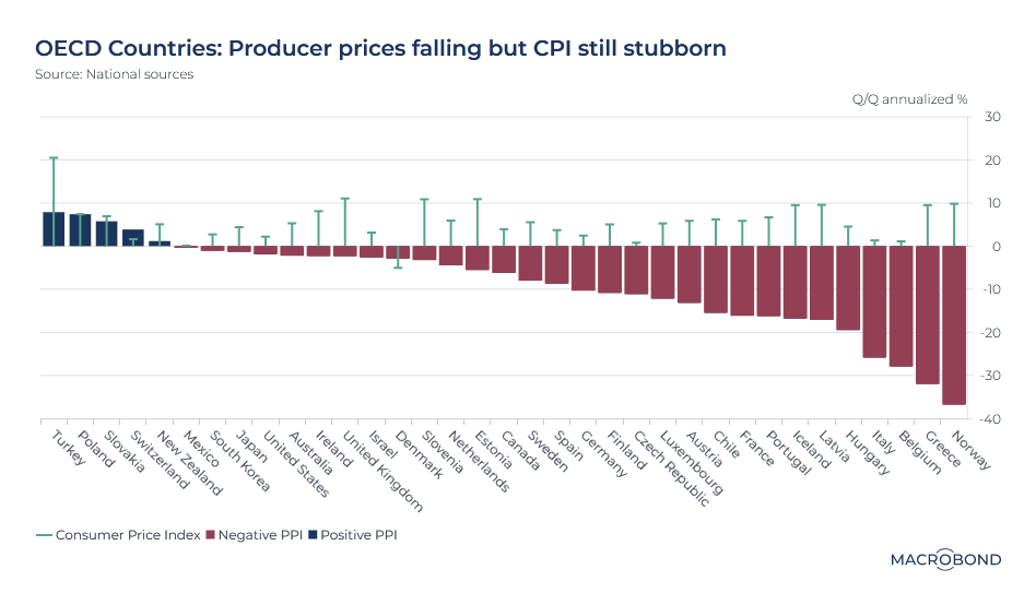
On inflation, we break down UK price increases by components such as food and shelter and take an OECD-wide view that shows CPI is taking its time catching up with trends in PPI, as it usually does.
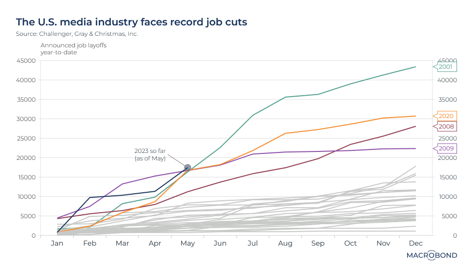
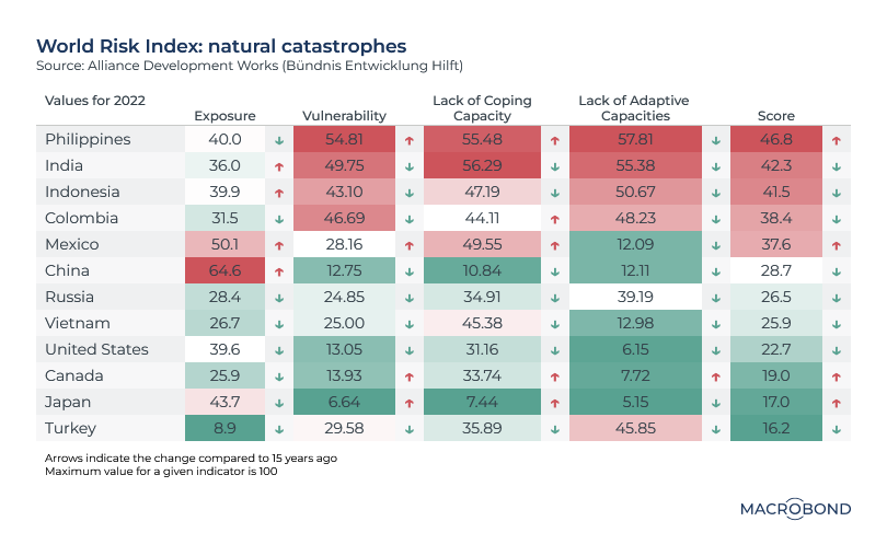
Finally, we examine a spike in US media layoffs and visualise how different countries are exposed to natural disasters.
Chinese households avoid borrowing
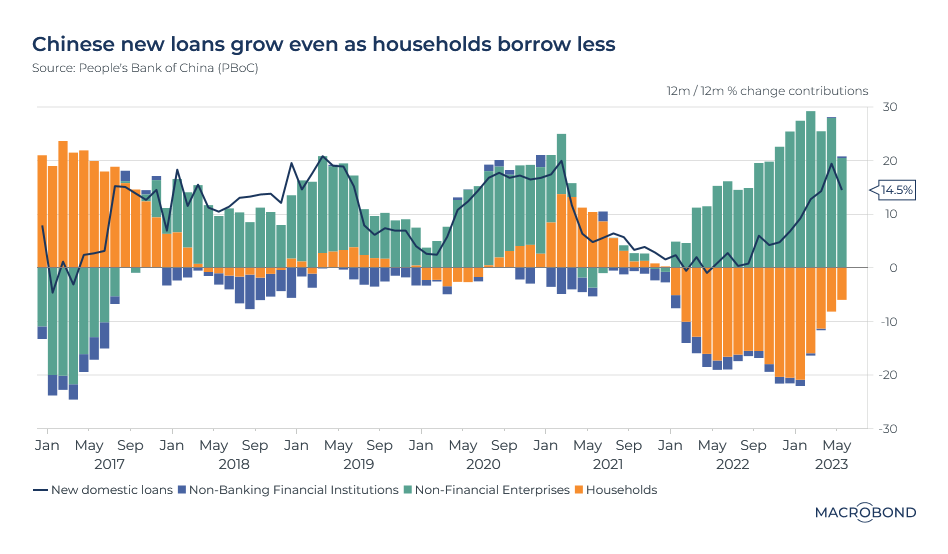
Is China’s great reopening stuttering? Bank lending gives cause for concern: domestic credit growth has been weaker than expected, and there’s an interesting bifurcation in the data.
As our chart shows, on a twelve-month cumulated basis, new lending is growing year-on-year. But demand is solely driven by non-financial enterprises.
Since January 2022, new household loans have been shrinking, as seen by the swath of orange-coloured bars in negative territory – something rarely seen in the previous few years.
This is the context for this month’s rate cuts by the central bank, which is keen to boost the recovery.
The Fed dot plot creeps toward tighter-for-longer
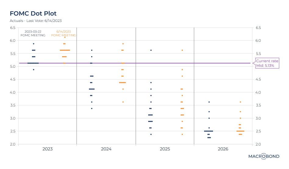
The Federal Reserve “dot plot,” the de facto monetary-policy forecast, entered the lexicon about a decade ago. It polls seven Fed board members and presidents of the 12 regional Feds. The resulting 19 dots show where central bankers see the Fed funds rate going.
This chart compares dot plots for the two most recent Federal Open Market Committee meetings in March and June.
The June 14 FOMC saw the Fed hit the pause button on rate hikes, saying it wanted to “assess additional information.” But look at the dot plot from that meeting and a more hawkish tone emerges.
Most members now expect the Fed Funds rate to average 5.6 percent during 2023, compared with the current 5-5.25 percent range, indicating that additional hikes should be expected in the near term.
For 2024, most of the policymakers are plotting higher rates than they were three months ago. Expectations are creeping higher for 2025, as well.
Scatterplotting the UK inflation crunch
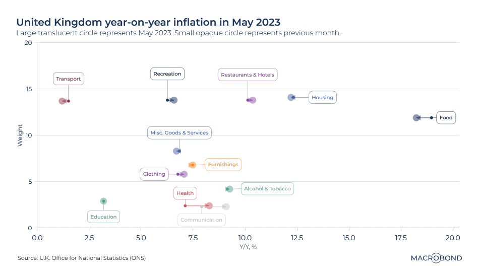
The inflation surge is easing in many countries, but its stubbornness in Britain is proving to be a global outlier. Data this week showed that the consumer price index rose 8.7 percent in the year to May, defying expectations of a slowdown.
This chart breaks down that CPI number, showing the components with the highest and lowest inflation (the x-axis), adding their month-on-month trends, and cross-referencing these sectors with their weighting (the y-axis).
Food is heavily weighted in the CPI and has been experiencing by far the most pronounced inflation, approaching 20 percent in the previous month. The year-on-year pace slowed in May but remained well above 17 percent.
Restaurants and hotels also have a heavy weighting, and inflation in that segment accelerated slightly from a month earlier. (That’s the kind of services inflation might be worrying the Bank of England the most, showing how higher wages are feeding into core inflation measures that exclude food and energy.) Healthcare has a smaller weighting, but also showed a notable inflation pickup versus April.
TINA no more as alternatives to equities look good
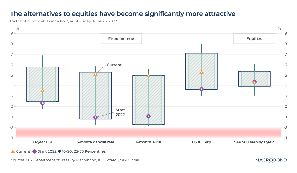
Amid a decade-plus of low rates, many investors came to believe “there is no alternative” to equities – a mantra known by its acronym, TINA. But as rates go higher, other investment alternatives are increasingly attractive. (Or, TARA. “There are reasonable alternatives.)
This candlestick chart aims to show the power of Macrobond’s data by examining the post-1990 range and recent trends for the S&P 500’s earnings yield, corporate credit, six-month Treasury bills, and three-month cash deposit yields. The latter three all offer returns that are competitive with the US stock benchmark and are significantly above their median historical yields – and much higher than they were the start of 2022.
At their current yield of around 4.5 percent, stocks aren't really on track to deliver inflation-busting returns – and are riskier than these other investments.
The monetary experiment in Turkish central banking
Turkey followed an unconventional monetary-policy approach in the years before President Erdogan’s recent re-election: cutting key interest rates and letting inflation soar to multi-decade highs. Capital fled Turkey, aggravating the collapse of the lira. The central bank’s reserves withered as it attempted to maintain currency stability.
As this chart shows, the historic relationship between rates and inflation was shattered in 2021 – a stark contrast from the central bank’s hard-fought battle to tame inflation two decades earlier.
Following his re-election, Erdogan appointed a new central bank chief with a mandate to bring down inflation. The recent jump in the repo rate from 8.5 percent to 15 percent reflects yesterday’s central bank meeting; monetary tightening probably isn’t over.
Journalism keeps shedding jobs
Traditional media companies, unable to find a sustainable response to free content on the Internet and fragmenting audiences, have been shedding staff for two decades now (a subject close to COTW’s editor’s heart).
This year, there was another blow: an advertising cutback as the economy slows. (Perhaps AI will replace editors at a large scale next.)
This chart tracks the calendar-year progress of layoffs in the US media industry in recent decades. As of May 2023 has had the most layoffs of any calendar year up to that point. The only years showing similar patterns were recessionary: 2001, 2008, 2009 and 2020.
Recent high-profile cuts occurred at the Los Angeles Times and Washington Post. New platforms aren’t immune: the Athletic, a high-profile disruptive online sports-journalism platform bought by the New York Times just last year, is letting go 4 percent of its journalists. And perhaps most notably, Vice Media has filed for bankruptcy.
Producer prices fall across the OECD but CPI stubbornly refuses to follow
This chart compares how companies and consumers are experiencing inflation across the OECD nations.
The producer price index (PPI) is a measure of the average change in prices that an economy’s domestic producers receive for their output. It’s often considered a leading indicator for consumer price inflation (CPI) – with the lag in recent years estimated at about three months.
In the most recent quarter, we’ve seen PPI drop for most OECD countries – but CPI is still increasing for almost all of them, though it’s slowing.
Note Norway, the nation with the most pronounced PPI drop. We’ve written about
the nation’s peculiar “hyper deflation” before – a byproduct of its hydrocarbon-dependent economy and year-on-year comparisons to the price surges that followed Russia’s invasion of Ukraine.
A heat map for natural catastrophe vulnerability
We’ve repeatedly highlighted concerning weather-related data. As the climate becomes more volatile, which nations are most vulnerable to catastrophe – and which ones have best prepared themselves to cope?
This chart measures these dangers using indexes designed by Germany’s Alliance Development Works. They differentiate between exposure to disaster and state vulnerabilities – such as deficiencies in state “coping capacity” (such as infrastructure, insurance and healthcare) and future-oriented “adaptive capacity” (reduction of disparities, climate protection and disaster prevention). More information on the methodology can be
viewed here.
China, on the other hand, has by far the world’s worst exposure to natural disasters but has been building its state capacity – resulting in an overall benign score. A similar trend is seen in Japan.
The up and down arrows measure whether nations have made progress in the various categories versus 15 years earlier – or if dangers for citizens are getting worse.
Never miss an update
Enjoy this wire? Hit the ‘like’ button to let us know.
Stay up to date with my current content by
following me below and you’ll be notified every time I post a wire
.png)
.png)
.png)
.png)