Charts of the Week - Foreign workers in Japan, equities’ waning appeal and disinflation
.png)
This week’s charts begin by visualising the steady increase in foreign workers hosted by historically immigration-averse Japan. Moving to inflation, we show how it’s slowing in more and more countries – but the stubborn absolute level of price increases is offsetting resilient GDP growth in the US. Two charts for US investors show how stocks’ risk premium is in the doldrums, while bond yields are exceeding equity earnings yields for the first time in many years. We chart decades of central-bank hikes and cuts, aggregating the differing trends seen in emerging and developed markets. And we finish by measuring how most nations’ workforce participation rates have approached – and sometimes surpassed – pre-pandemic levels.
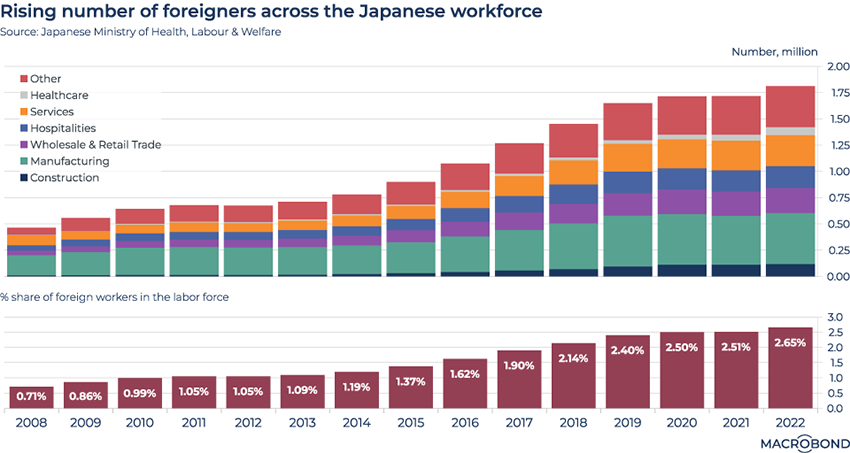
Japan is employing ever more immigrant workers
.png)
With an aging population causing a labour shortage in some industries, historically immigration-averse Japan has been welcoming more and more foreign workers. As the Wall Street Journal recently wrote, it’s also loosening regulations, potentially letting them stay in the country for good.
As our charts show, the numbers have quadrupled in just 15 years – and the foreign-born now account for 2 percent of the total labour force. The effects in the services, retail and hospitality sectors are easily seen in this visualisation.
The number of foreign-born construction workers is small, but also notable, taking an upturn in the run-up to the 2020 Olympics.
More nations join the US-led disinflation
.png)
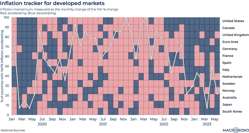
This visualisation tracks inflation in developed markets before, during and after the pandemic.
Red squares indicate months where inflation was speeding up; blue squares represent decelerating inflation; and the white line measures the percentage of countries where price increases were accelerating year on year.
The peak global inflation in the winter of 2021-22 is clearly visible – as is the inflation slowdown that broadened in 2022-23. The US and Canada were first to experience sustained disinflation, with Europe following.
Two decades of central bank decisions: DMs vs EMs
.png)
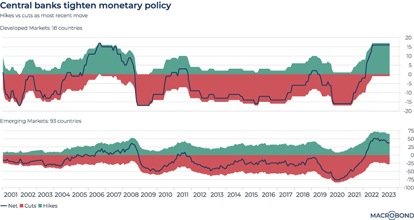
Aiming to visualise a truly global perspective on how monetary policy has evolved, this chart aggregates inputs from central banks around the world – split into a selection of developed and emerging markets. It shows whether a central bank’s most recent move was a hike or a cut.
The Covid-driven emergency stimulus of early 2020 was unprecedented in its breadth: nearly 100 percent of the world’s central banks were cutting rates. By contrast, during the global financial crisis of 2008-09, a few EMs were still hiking as developed markets slashed rates.
The current cycle is also showing a divergence between the two groups. A few emerging markets have started cutting rates this year, but no developed markets have. (Strictly speaking, Japan’s last move was a cut, but that was in 2016, when it moved to negative interest rates.)
Inflation has resulted in downward real GDP revisions
.png)
Tip: this chart allows for change region functionality. This chart also uses revision history data that can only be accessed with a subscription to Macrobond Data Plus.
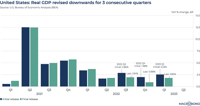
Macrobond’s revision history function lets users see how perceptions of the recent past contrast with the final analysis. In this case, we examine economic growth adjusted for inflation.
The macro story of 2023 is how the US has avoided recession (or, at least, postponed it). But stubborn inflation is offsetting some of that good news.
Data published yesterday confirms that for three consecutive quarters, real GDP has been revised downward from the initial estimate.
Waning equity yields: even three-month Treasuries have caught up
.png)
Last week we examined the death of TINA – the narrative during the ZIRP years that “there is no alternative” to investing in equities. After more than a year of rate hikes, there are definitely viable alternative investments today.
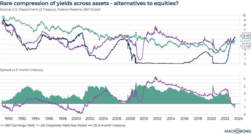
This week’s chart revisits the topic. We tracked the S&P 500 earnings yield with the yields from top-rated (Moody’s Aaa) US corporate bonds and three-month Treasuries over recent decades. (The second panel expresses this relationship a different way, tracking the yield spread versus three-month Treasuries for the US stock benchmark and top-rated corporates.)
The current moment is the first time that all three yields have roughly converged since 2007. And for the first time since the early 2000s, the S&P 500’s earnings yield has crept below the three-month Treasury yield.
The corporate bond line is even more notable: debt issued by the strongest companies is yielding less than short-term Treasuries – the first time that has happened since at least 1989.
Equity risk premiums are at the lowest since the GFC
.png)
Tip: this chart allows for change region functionality. It also requires a subscription to the Macrobond/FactSet Equity Factor Aggregates add-on database.
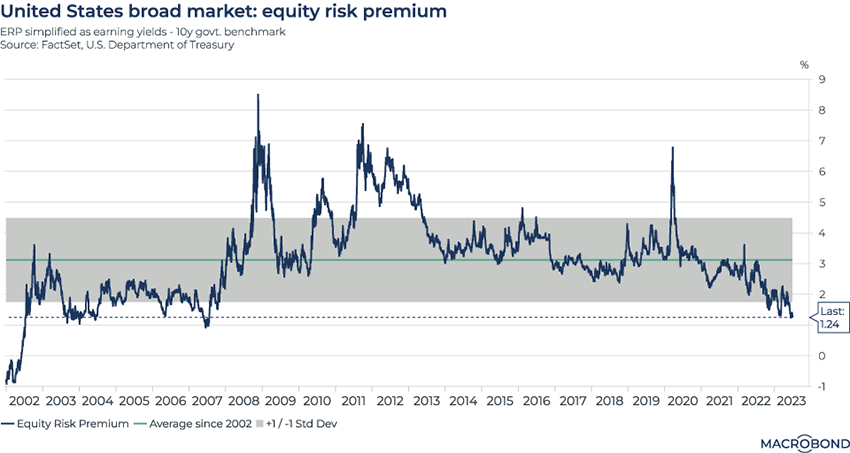
Following on the previous chart, we examine the limited allure of equities through another prism. Stocks are supposed to be riskier than bonds in exchange for higher returns over time – but increased risk comes with less reward these days.
The chart above uses FactSet data to calculate a simplified “equity risk premium” for US stocks: it subtracts the 10-year Treasury yield from the equity earnings yield.
The risk premium is at its lowest since 2007, edging outside the one-standard-deviation range of the past two decades.
Equity valuations are high, and bond yields have risen significantly, limiting the excess returns investors can generate from stocks.
Labour participation after Covid
.png)
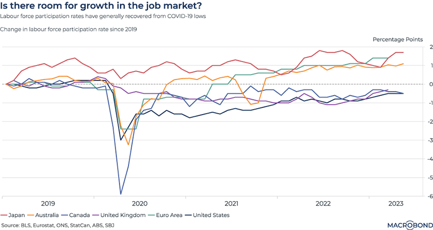
This chart tracks different countries’ participation rate – defined as the percentage of the population that is either working or actively looking for work.
The workforces of major economies have made up all the lost ground from the pandemic – and in some markets, trends are defying demographic change.
In Australia, Japan, and the euro area, participation is higher than it was at the start of 2019 – even as the population ages.
The UK is different from its Continental neighbours. Early retirement surged after the pandemic. Long-term sick leave is also pushing down labour force participation.
4 topics
.png)
Macrobond delivers the world’s most extensive macroeconomic & financial data alongside the tools and technologies to quickly analyse, visualise and share insights – from a single integrated platform. Our application is a single source of truth for...
Expertise
.png)
Macrobond delivers the world’s most extensive macroeconomic & financial data alongside the tools and technologies to quickly analyse, visualise and share insights – from a single integrated platform. Our application is a single source of truth for...
.png)