Stock valuations, European gloom and bullish Japan
.png)
This week’s charts begin with GARP – “Growth at a reasonable price” – a methodology for choppy markets that identifies relatively undervalued stock sectors with earnings momentum. We also track global fund flows, which despite those unsettled markets are still reflecting investor inflows into both stocks and bonds. In the world of central banking, we apply the hawkish Taylor Rule analysis to recent Fed policy, and use futures for an overnight money-market rate to chart changing perceptions of ECB tightening. Finally, we contrast bullish signals in Asia – Japanese sentiment, Indonesian and Indian PMI – with the gloomy outlook in France and Germany.
Stock valuations according to GARP

This chart requires a subscription to the Macrobond/FactSet Equity Factor Aggregates add-on database.
It’s a "stock picker’s market," Barron’s suggested earlier this year. This investing cliché suggests that selecting growth stocks with appealing valuations will be paramount in an environment where broader indexes are stagnant. (Indeed, the S&P 500 finished October down 2 percent amid earnings-related selloffs in some high-profile names.)
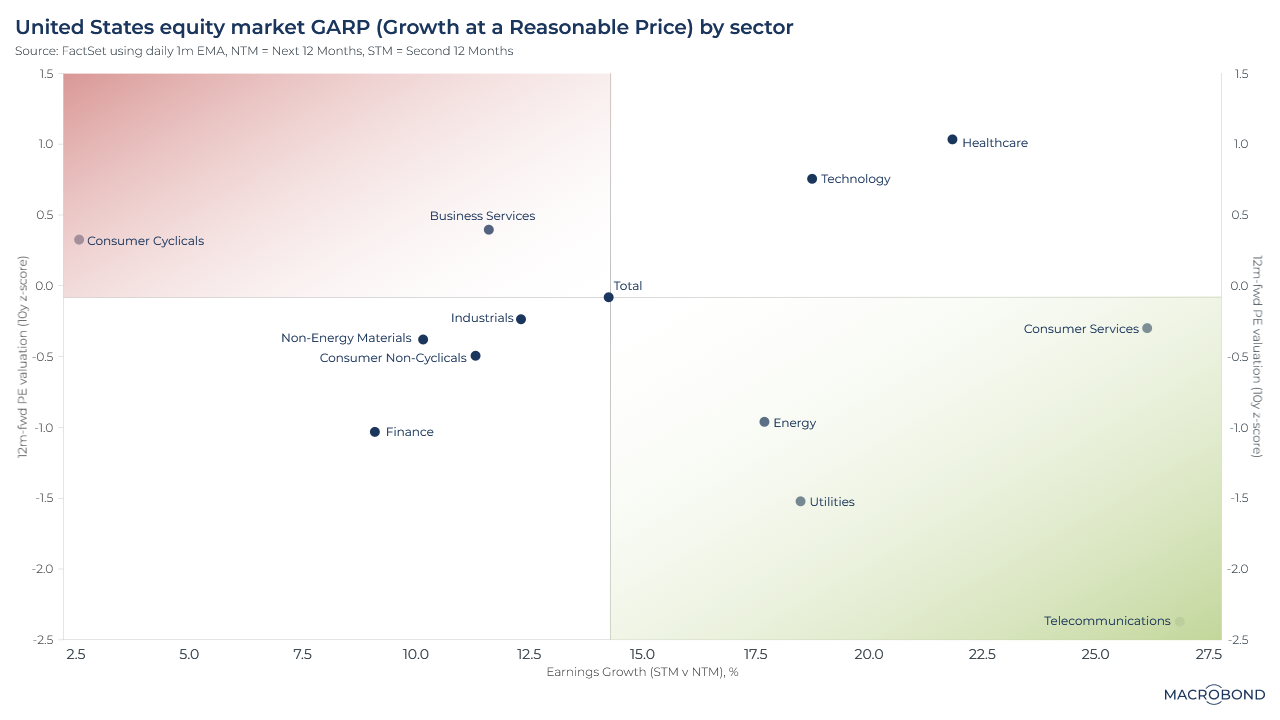
The strategy in our scatterplot visualisation is “growth at a reasonable price,” or GARP. Using FactSet data, we created buckets of large-capitalisation US stocks by sector, searching for relative undervaluation. Our “earnings growth” x axis compares estimates for the next 12 months to the 12 months after that; our “historic price-earnings valuation” y axis compares the forward P-E ratio’s deviation from the 10-year average.
This analysis found that telecommunications stocks have the greatest GARP potential: they’re well below their historic price-earnings ratios and analysts are estimating dramatic earnings growth over the next two years. Consumer services, utilities and energy also perform well in this analysis. The reverse was true for consumer cyclical and business-services stocks.
The Taylor Rule and where rates “should” have been

This chart can be applied to different countries using Macrobond’s change region functionality.
When assessing Federal Reserve policy, it’s interesting to look at the Taylor Rule, created by a Stanford University economics professor. It’s a rough guideline for a central bank’s response to inflation; typically, formulations include the concept of a “natural” rate of interest, based on factors including price levels and real incomes. The Taylor Rule also usually calls for a relatively high rate when inflation is above target.
This chart compares Fed policy to two formulations of the Taylor Rule based on different assumptions about the natural rate of inflation.
Since the financial crisis, and especially since the pandemic, the Taylor Rule has usually called for tighter policy than the Fed delivered. (Taylor himself was often a critic of what he perceived as the Fed’s “easy money.”) As inflation has slowed after the Fed’s historic tightening cycle, the rates have converged.
Tip: See how we applied the Taylor Rule to Germany last year.
Investors’ steady inflows into turbulent markets

This chart requires a subscription to the EPFR Fund Flow add-on database.
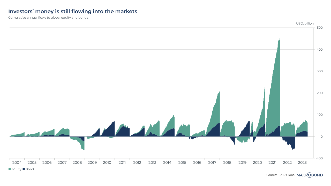
This chart tracks the evolution of global fund flows into equity and bond markets over the past two decades by calendar year.
Even with the S&P 500 sliding since July as the market digested “higher for longer” Fed policy, and even as the bond rout continued through 2023, investors continued to place money in both asset classes until very recently, as our chart shows. It wasn’t a repeat of the excitement about equities in 2021-22, but cumulative flows for the year are still quite positive.
Last year is notable for the money that flowed out of bonds after a historic selloff.
A bullish trajectory for Japanese confidence

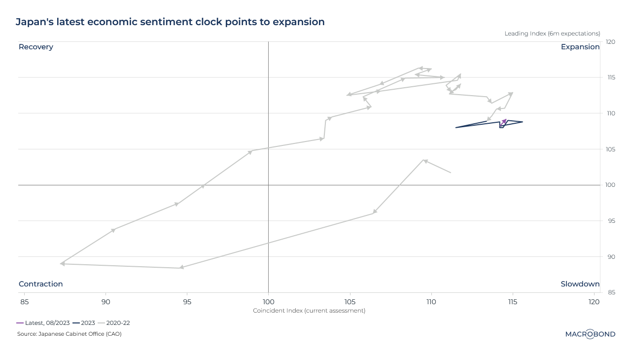
This visualisation is one of our “clocks” that track the business cycle. It’s showing how, sentiment-wise, Japan remains in expansion mode.
It does this by assessing two indicators: the nation’s leading index (which points to the coming trends in the economy, using inputs such as job offers and consumer sentiment) and the coincident index (which aims to identify the current state of the economy through data such as factory output). The government’s latest readings for both will be released on Nov. 8.
It doesn’t seem like a slowdown is imminent. Staying in the “expansion” quadrant will make it easier for the Bank of Japan to consider “lift-off” from the world’s last negative interest-rate policy in 2024.
Read Harry Ishihara’s latest blog on Japan’s monetary policy and obsession with wage growth here.
French and German gloom, Asian optimism for PMIs

We regularly examine the purchasing managers index (PMI), an indicator that tracks sentiment among executives in the manufacturing sector.
This visualisation compares PMI across major economies. It gives an idea of why the European Central Bank chose to put rate hikes on hold: the economic engines of France and Germany are suffering on a global basis. (They’re both far below the “neutral” PMI level of 50.)
Asian economies, highlighted in green, are generally faring better – especially India and Indonesia. The US is right on the neutral line.
Read Meghna Shah’s blog about the ECB’s “pause,” France and Germany here.
Changing perceptions of ECB rate peaks using Euro short-term futures

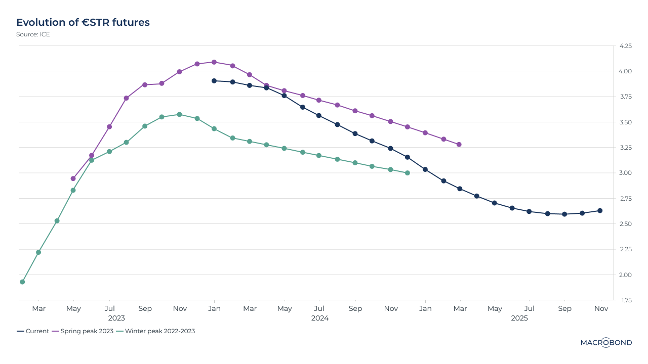
The Euro Short Term Rate, or €STR, is the primary overnight money-market benchmark rate, reflecting how expensive it is for banks to borrow in the very short term. Futures for the €STR are considered to be a representation of market expectations for the ECB’s key policy rate.
This chart tracks the current futures curve against two past counterparts – in particular, recent “peaks” for what was seen as the ECB’s likely terminal rate last winter (Dec. 27) and this spring (March 8).
As inflation proved sticky, there was a dramatic change in expectations between December and March; the terminal rate was pushed up by about 75 basis points. Since then, and with the ECB likely on pause for a while, the curve has flattened.
4 topics
.png)
Macrobond delivers the world’s most extensive macroeconomic & financial data alongside the tools and technologies to quickly analyse, visualise and share insights – from a single integrated platform. Our application is a single source of truth for...
Expertise
.png)
Macrobond delivers the world’s most extensive macroeconomic & financial data alongside the tools and technologies to quickly analyse, visualise and share insights – from a single integrated platform. Our application is a single source of truth for...
.png)