The clock is ticking on the US economy
.png)
This blog uses a series of “clock” visualisations that conceptualise the US economic cycle by exploring the relationship over time between two variables – some from macroeconomic data, others from the markets. Over time, the tick of the clock – usually monthly – will show the economy taking a clockwise trajectory through various quadrants on the chart. (One of the most famous business-cycle “clocks” is produced by Germany’s Ifo Institute, which we’ve referenced in our Charts of the Week.)
Our first two clocks use the Institute for Supply Management’s purchasing managers index (PMI), which surveys sentiment among manufacturing executives. The key threshold for PMI is a reading of 50. Below that figure, PMI indicates economic activity is contracting. As both charts show, PMI’s optimism peaked above 60 during the post-pandemic recovery, but has fallen back.
The inflation outlook clock

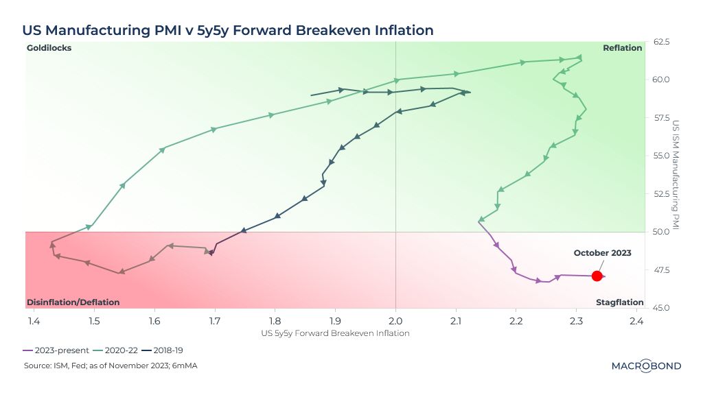
Our first clock charts PMI on the Y axis against 5-year/5-year forward breakeven inflation on the X axis. This measure is watched closely by the Federal Reserve and predicts five-year inflation five years in the future (2028-33) as implied by prices on Treasury Inflation-Protected Securities (TIPS).
Using that threshold of 50 for PMI and the Fed's 2 percent interest-rate target, we can divide our chart into four quadrants: reflation, stagflation, disinflation/deflation and “Goldilocks,” i.e. just right.
Clock no. 1 suggests we have been in a “stagflationary” outlook for several months: slowing growth with an uncomfortable longer-term inflation view.
The financial conditions clock
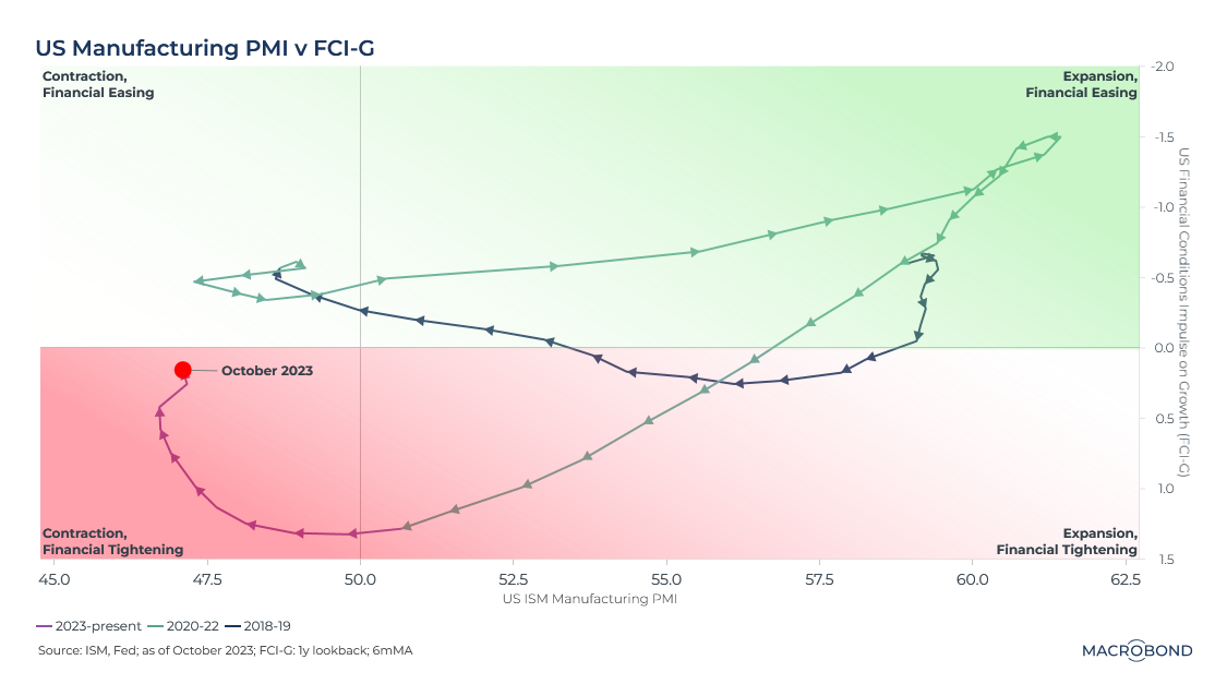
Our second clock compares PMI to a measure from the Fed called FCI-G – the Financial Conditions Impulse on Growth. This indicator is particularly related to future real GDP growth and incorporates short and long bond yields, stock values, the housing market and the dollar. (The Fed’s methodology can be found here.)
We’ve inverted the Y axis so that negative FCI-G readings – indicating that financial conditions are easing – are higher. PMI moves to the X axis.
The strong post-pandemic rebound with ultra-loose monetary policy is obvious, as is the U-turn that occurred when the Fed started raising rates to contain inflation.

We’ve been in the “economic contraction and financial tightening” quadrant for much of 2023, but have recently taken an upward turn; interestingly, financial conditions are already improving.
The bond-market volatility clock
The next two charts turn to indicators from the financial markets, using the spread between 10-year and two-year US Treasuries. The inversion of this spread – i.e., when short-term bonds are yielding more than their long-term counterparts – is a classic recessionary indicator: the market is saying the Fed will need to cut rates from current levels because of an economic downturn.

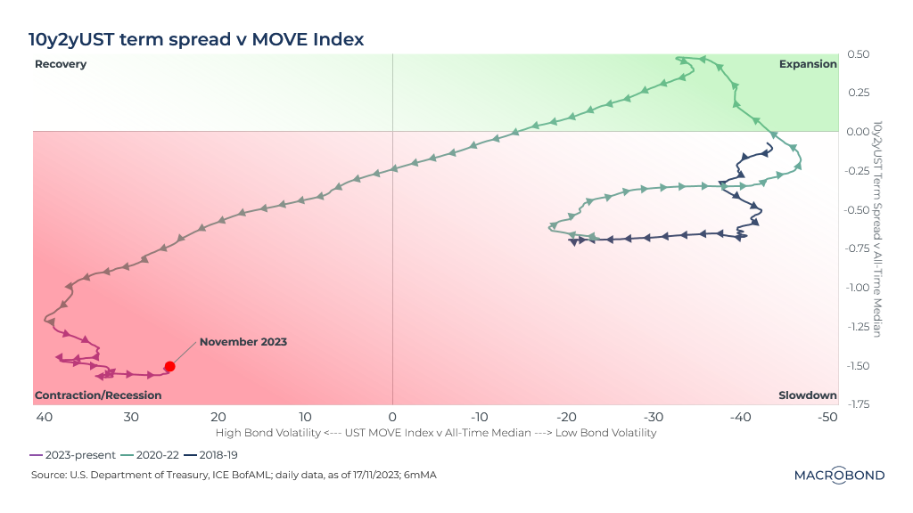
As we’ve experienced some of the most rapid monetary tightening in history, this clock looks at bond-market volatility. The X axis tracks the ICE BofAML MOVE index—which reflects US Treasury volatility, as implied by the options market (comparable to the VIX for stocks) – in relation to its historic median. The axis is inverted so that volatility gets higher as we move to the left. Some have dubbed MOVE the “fear index” as higher readings generally imply heightened risk and uncertainty.
The Y axis compares the 10-year/2-year Treasury spread to its historic median. The red quadrants include (but are not limited to) periods of yield-curve inversion.
We’ve zig-zagged a few times lately, but remain relatively deep into the “contraction/recession” quadrant as the yield curve stays inverted. The “fear index” is slipping, but remains higher than the long-term median.
The ”bankruptcies” clock
Finally, we turn to a measure of high-yield credit risk – which tends to spike when a recession is beginning as bankruptcies rise and “credit events” hit more leveraged, higher-risk companies.

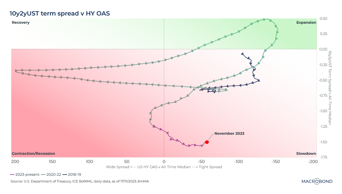
The X axis in this chart uses the forward-looking option-adjusted spread (OAS) for high-yield credit, comparing such bonds to a spot Treasury curve. The 10-year/2-year Treasury spread versus its historic median is on the Y axis again.
This chart is somewhat more optimistic than the rest. We’re in the “slowdown” quadrant, rather than “contraction/recession,” as solid corporate balance sheets appear to be preventing distress in the high-yield market: OAS is tighter than its long-run median.
All in all, these clocks are reflecting a US economy that is expanding, but vulnerable after this year’s surprising resilience.
2 topics
.png)
Macrobond delivers the world’s most extensive macroeconomic & financial data alongside the tools and technologies to quickly analyse, visualise and share insights – from a single integrated platform. Our application is a single source of truth for...
Expertise
.png)
Macrobond delivers the world’s most extensive macroeconomic & financial data alongside the tools and technologies to quickly analyse, visualise and share insights – from a single integrated platform. Our application is a single source of truth for...
.png)