10 years on from Lehman’s collapse: seven charts to consider
Ten years ago, US investment bank Lehman Brothers filed for bankruptcy, marking the most symbolic moment of the global financial crisis. It remains the largest bankruptcy filing in US history. The demise of Lehman on 15 September 2008 was just the tip of the iceberg. Little did we know at the time the whole global financial system was on the brink of collapse.
The underlying cause was the failing US housing market, in particular the subprime mortgage sector, which lent to borrowers with poor credit histories. These subprime mortgages were repackaged along with traditional mortgages and sold to investors. Convinced that the risk had been spread, Lehman, among many other investment banks, invested in them.
Unfortunately the housing market began to fall and those repackaged mortgage investments became toxic. No one knew who held the bad debts and so banks became wary about lending.
What happened next, few will forget. The world stood on the precipice. Only unprecedented actions by policymakers and central banks prevented a breakdown of the global financial system.
Did we learn the lesson on debt?
While the catalyst for the crisis was the downfall of the US housing market, the root cause was easy access to cheap money. Encouraged by policymakers and financial institutions offering cheap credit, investors took ever more risky bets using excess amounts of debt.
A decade on and debt is rising rapidly in many countries. Interest rates, while increasing in the US and the UK, still remain at or near record lows in many countries.
Global debt has increased by more than $70 trillion since the financial crisis, to $247 trillion, or 318% of GDP, according to the Institute of International Finance.
Matthew Dobbs, Head of Global Small Caps at Schroders and a veteran fund manager who invested through the Asian debt crisis and the global financial crisis of 2008, said:
“It would seem the world has not learnt the lesson on debt. In the years since the crisis we’ve seen exceptionally low interest rates. The costs of servicing debt have been so low that people have not paid enough attention to the amounts they are actually borrowing."
“Increasing the flow of cheap money put a plaster on the crisis wound but it also facilitated a continued rise in debt. In essence, the can was firmly kicked down the road.”
Has global economic growth become dependent on QE?
The world has enjoyed the benefits of 10 years of low interest rates and quantitative easing (QE).
QE is effectively central banks pumping money directly into the financial system by way of asset purchases (buying mainly bonds) to keep lenders lending and corporations spending. It serves to increase the supply of money in the economy, also known as “broad money”.
It has helped stabilise the global economy. By the end of 2017, annual economic growth was around 2% in major economies, such as the US, UK, Japan and the eurozone. But central banks' balance sheets have ballooned as a result and QE has become an ever larger component of global growth.
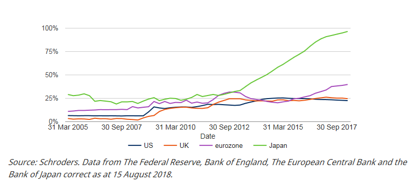
As you can see in the chart below, it is nowhere more apparent than in Japan where the Bank of Japan’s (BoJ) balance sheet accounts for 96.3% of GDP, up from 19.3% in June 2008.
In the eurozone, the European Central Bank’s (ECB) balance sheet accounts for 36.6% of GDP, up from 14.5% midway through 2008. The Bank of England’s (BoE) balance sheet accounts for 24.4% of UK GDP, up from 1.6%. For the US Federal Reserve (Fed) the figure is 22.3%, up from 6%.
The Fed ended its QE programme in 2014 leaving the central bank holding $4.5 trillion worth of assets. It began reducing its holding in October 2017, allowing $10 billion of assets to expire each month. The BoE created £375 billion between 2009 and 2012. The programme was restarted in the aftermath of the Brexit referendum, taking total asset purchases to £445 billion. It has yet to begin selling its holdings.
QE programmes remain open in Japan and Europe.
The effects are clearly seen in the chart.
Central bank balance sheets as a percentage of GDP
Robin McDonald, Fund Manager in the Schroders Multi-Manager team, said:
“QE has helped the real economy, at least in the short-term. An important lesson from the Great Depression in 1930s was to not allow broad money growth to turn negative. QE helped to avoid that. If another crash were to happen it is likely that central banks would open the same playbook.”
Have markets become dependent on QE?
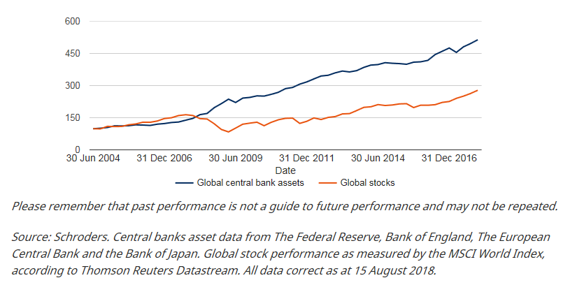
It is not just global growth that has been affected by QE. The primary aim of QE was to lower the cost of borrowing in the economy by pushing down yields on government and company bonds. But the effect was to push up bond prices. The effect was so powerful it spilled over into pushing up the prices of everything from stock markets to houses to classic cars.
The chart below illustrates how the rise in asset prices, in this case global stocks, have closely followed the expansion of central banks’ balance sheets, once the impact began to be felt in 2009.
How global stocks have risen with the expansion of central bank balance sheets
So what happens when the QE taps are turned off?
For now, the majority of the central bank support that helped stabilise the economy and raise asset prices remains in place.
Fund manager Robin McDonald said: “Sadly, by waiting so long to recalibrate policy, central banks have once again encouraged record amounts of leverage to build throughout the system, making it more reliant than ever on continued low rates.
“We have yet to learn what the long-term effects of quantitative tightening will be. Governments, households and the corporate sector are all more leveraged today than they were pre-crisis, making the system potentially very sensitive to higher interest rates and thus more fragile.
“For now, though, I think most would argue that the benefits of QE have outweighed the potential costs and risks. It remains to be seen whether this will still be the case as the programme is unwound.”
Andrew Lyddon, a fund manager in the Schroders Equity Value team, said:
“Markets are driven by humans, and unfortunately, we show time and time again that we have short memories."
“We will get carried away when times are good, and fearful when they aren’t. Right now we feel it is the former that is considerably more pervasive, with investors happy to pay higher and higher multiples of earnings for businesses that are priced for perfection.”
Are there signs of trouble ahead?
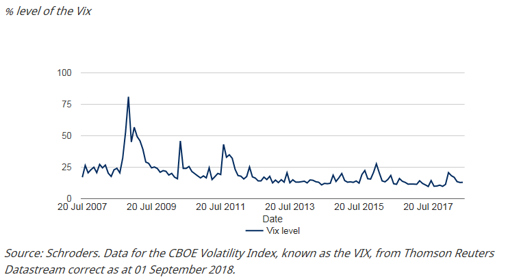
Predicting precisely when and if a market crash will happen is all but impossible. However, we can look for signs of potential weaknesses in the market or a growing lack of confidence or overconfidence among investors.
The fear index, otherwise known as the VIX, indicates that investors remain calm and see nothing that is likely to derail the current bull market. The VIX is currently at multi-year lows, around 10%, and well below the highs of over 80% during the financial crisis. A higher reading suggests that investors anticipate a market-moving event is on the horizon.
The Vix - the fear gauge that shows no fear
The lack of fear seems to have bolstered confidence in the stock market. However, while stocks continue to rise momentum has slowed, so far, in 2018.
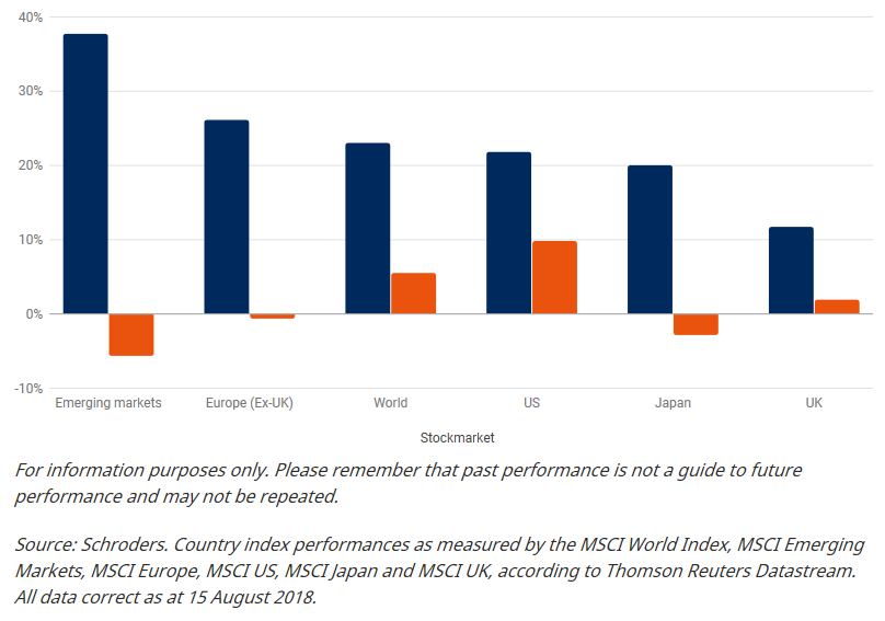
The prospect of a trade war between the US and China has threatened global growth and a US dollar strengthened by rising interest rates and President Trump’s pro-business policies has hit certain regions. Emerging markets, such as Turkey, have struggled as a result. They tend to hold a lot of dollar-denominated debt, which becomes more expensive to repay when the dollar is strong.
As the chart below shows, gains in 2018 are well short of those achieved in 2017. US stocks have returned the most, around 10%, but emerging market stocks have produced negative returns of more than 5%.
Stock market returns in 2017 vs 2018
Fund manager Matthew Dobbs said: “We are going through a tricky period at the moment. This year hasn’t been great for stocks. Turkey’s case is worrying but it seems to be isolated. Trade tensions are worse than expected and China’s growth is questionable. US interest rates are going up and there are still huge amounts of debt swirling around the global financial system. We appear to be skating on thin ice.”
Andrew Lyddon said: “We have had nine years of almost uninterrupted gains for stock markets. If we are in the later stages of a bull market, then gains accrued are only really captured by those who sell. For the rest, these gains are merely temporary.
“We think that most investors today not only feel reasonably optimistic about the economy and corporate earnings, but believe valuations are reasonable and that there remains little threat from the bond market.
“Our concern is that investors are overly complacent.”
How do you prepare for anything similar happening again?
Each crash brings a different challenge. In 2008, at the height of the crisis, even the most defensive sectors (stocks most likely to provide a constant dividend and stable earnings) were hit.
As you’d expect, banks were hit hard, but as the chart below shows sectors such as healthcare and tobacco registered losses of more than 30%. The selling was indiscriminate, which is also symptomatic of the latter end of a bull market.
Sector performance (%) between October 2007 and March 2009
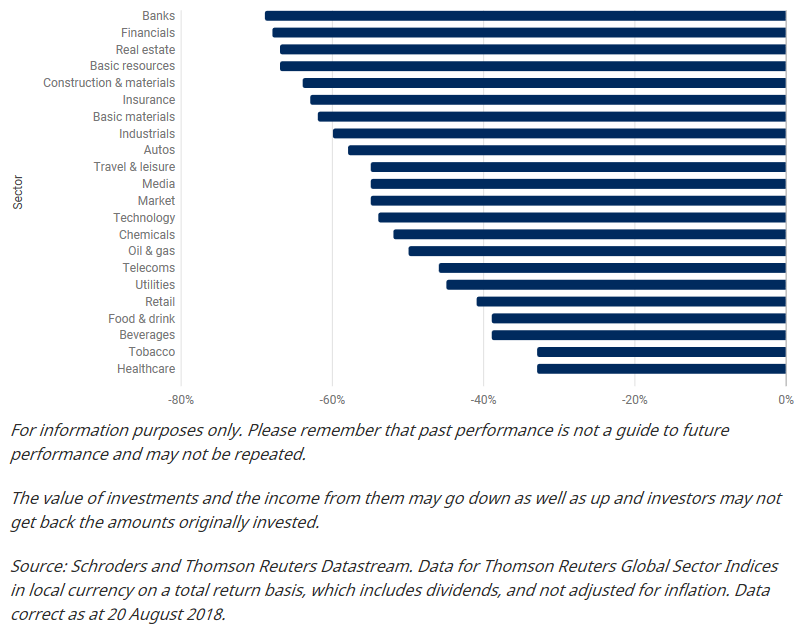
Matthew Dobbs said: “As a stock picker, it is at this point you can then sit there and look at it and say ‘here is a chance to buy the long term winners I want as we may never get these prices again’. We did that then, and I hope we have the nerve to do so again.”
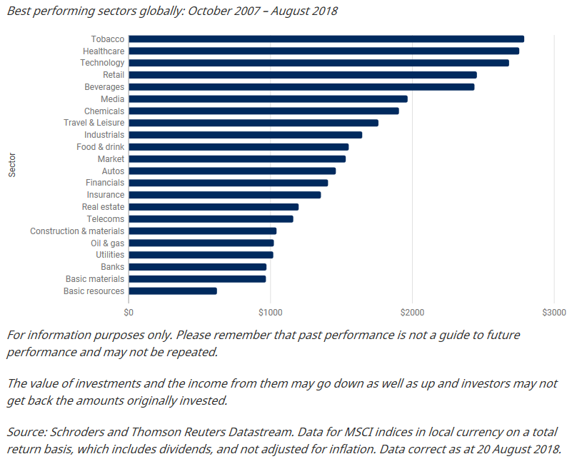
Winners and losers since the crisis
It can also pay to stay the course, providing you make the right investments. The chart below shows what the value of $1,000 invested at the top of the market prior to the GFC in October 2007 would be worth now had you left your investment alone.
Only three sectors - banks, basic materials and basic resources - would have left you with less money than the $1,000 invested.
Figures haven’t been adjusted for inflation or considered any charges. Every other sector would have provided a gain.
What $1,000 would be worth now if you invested in October 2007
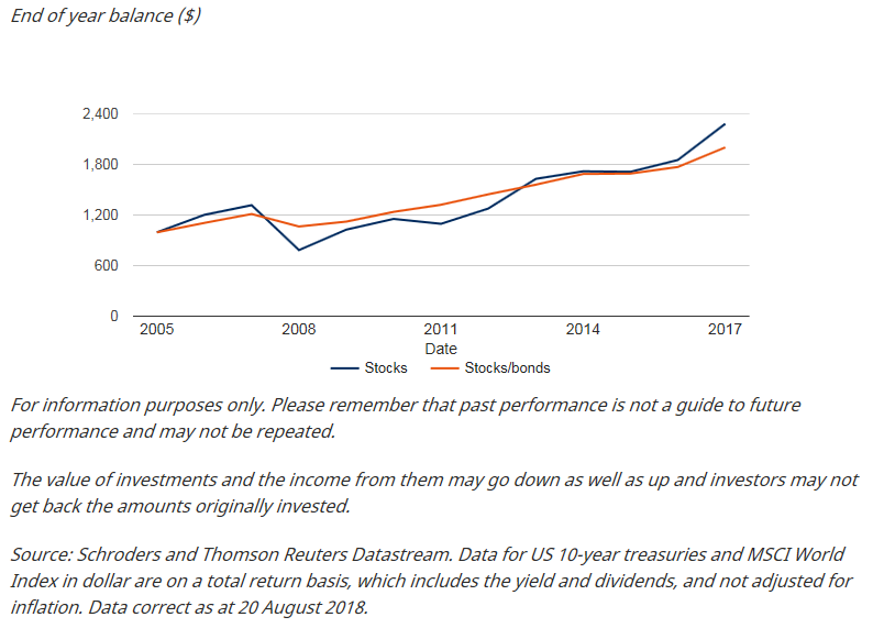
The importance of spreading your money around
Diversifying your portfolio would have helped smooth out the huge peaks and troughs of the post-crisis years.
The chart below shows two investments. One is $1,000 invested purely in global stocks in 2006, as measured by the MSCI World Index. The other investment is split equally with $500 invested in global stocks and $500 in government bonds, as measured by US 10-year treasury total returns, during the same period.
As you can see, while the investment that is split between stocks and bonds returns less over the period between 2006 and now, it doesn’t suffer the huge fall global stocks suffered during the crisis.
Diversification could help ease the pain: Returns since 2005-2017
For further insights and analysis from Schroders, please visit our website
Never miss an update
Enjoy this wire? Hit the ‘like’ button to let us know.
Stay up to date with my current content by
following me below and you’ll be notified every time I post a wire
Established in 1961, Schroders in Australia is a wholly owned subsidiary of UK-listed Schroders plc. Based in Sydney, the business manages assets for institutional and wholesale clients across Australian equities, fixed income and multi-asset and global equities.
We believe in the potential to gain a competitive advantage from in-house global research; that rigorous research will translate into superior investment performance. We believe that internal analysis of investment securities and markets is paramount when identifying attractive investment opportunities. Proprietary research provides a key foundation of our investment process and our world-wide network of analysts is one of the most comprehensive in funds management.


Schroders
Established in 1961, Schroders in Australia is a wholly owned subsidiary of UK-listed Schroders plc. Based in Sydney, the business manages assets for institutional and wholesale clients across Australian equities, fixed income and multi-asset and...
Expertise
Schroders
Established in 1961, Schroders in Australia is a wholly owned subsidiary of UK-listed Schroders plc. Based in Sydney, the business manages assets for institutional and wholesale clients across Australian equities, fixed income and multi-asset and...
Expertise
Comments
Comments
Sign In or Join Free to comment