Charts of the Week - Our 100th edition, historical Fed hiking trends, German industrials and declining Indian FDI
.png)
Charts of the Week has reached its 100th edition and this milestone has given us a chance to reflect on where it all began. The first edition was published on October 1, 2021, during a time of global economic disruption caused by the Covid-19 pandemic. Half of the charts in that edition focused on the tourism and travel market, which was still struggling, while the other half focused on various long-term trends in the global economy. To other topics this week: hurricane occurrences in the US, the historical relationship between Federal Reserve hiking cycles and recessions, asset class valuations, the impact of rising energy costs on German industry and the steep decline in Indian foreign direct investment.
A reflection on 100 editions of Charts of the Week

It’s the 100th edition of Charts of the Week – your road map to making the most of Macrobond’s visualisations and a succinct digest of trends in the global economy.
As we reach this milestone, we’re looking back to where it all began.
The first COTW was published on October 1, 2021. The world economy remained deeply disrupted by Covid-19, even as governments had mostly lifted lockdown measures and rolled out vaccines. As such, half of our charts focused on the market for tourism and international travel more generally, which remained largely depressed.
This chart visualised data from the US Transportation Security Administration, measuring the number of people who passed through airport security checkpoints. The second pane showed the shortfall when compared to the 2019 average.
We’ve updated this chart to show its evolution to the present day. As you can see, US air travel slowly but surely normalised to pre-pandemic levels.
Hurricane occurrence in the United States

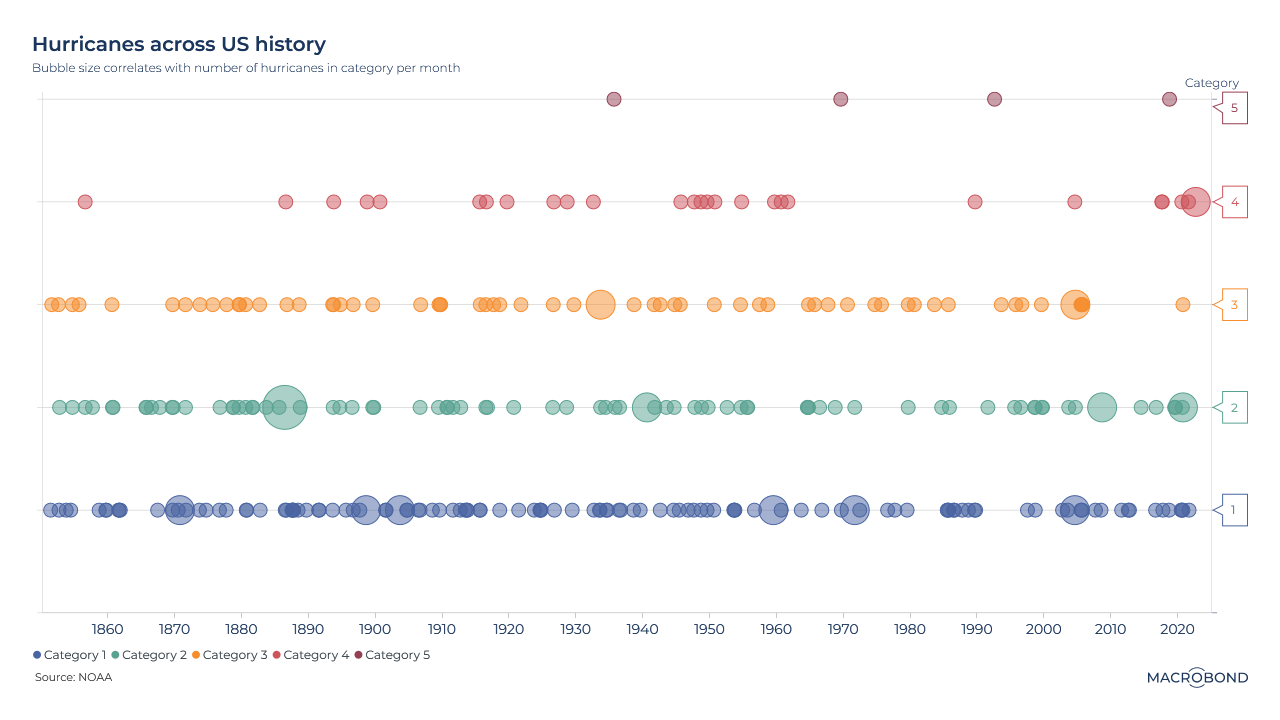
This ‘bubble string’ chart visualises the occurrence of hurricanes in the United States over time, categorised by their intensity and month. The data spans from June 1851 to September 2022 and comes from the National Oceanic & Atmospheric Administration (NOAA).
Each category is color-coded and labelled on the y-axis to the right. The size of the bubble size corresponds to the number of hurricanes in that category for a particular month.
Historical trends: The Fed's hiking cycle and timing of recessions

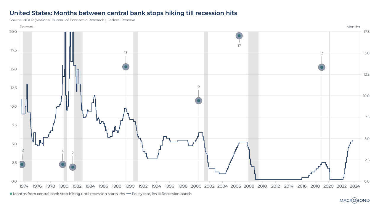
There has been much speculation about when the Federal Reserve will end its hiking cycle and when the next recession will hit. Our chart sheds light on the relationship between these two factors by examining how long it takes for the economy to slip into a recession after the Fed stops hiking rates.
The chart reveals a historical pattern: during the 1970s and 1980s, recessions followed closely on the heels of rate hikes. However, things have changed since then, as the gap between the peak interest rate and the onset of a recession has widened. In three out of four cases, a recession occurred more than a year after the Fed's rate hikes concluded.
This begs the question of whether the current situation will buck this trend, or if we should prepare ourselves for the possibility of a delay of up to a year before the next recession emerges.
Asset class valuations visualised

Investing in US equities, particularly in the technology sector, has been a popular choice amongst investors and has generated impressive returns over the past decade. However, given the current economic climate characterised by high interest rates, inflation, and recessionary risks, other asset classes and regions are becoming increasingly appealing and may offer potentially profitable returns.
This chart shows the "Z-Score" of different assets, based on 20-year average valuation measures. A Z-Score measures how far an asset's valuation has strayed from its mean level. A score of zero indicates that the valuation is identical to the mean and a score of 1.0 indicates that the price is one standard deviation above the mean. Negative scores indicate that it's slipped below the mean.
In this visualisation, we compare the current Z Score of several assets’ valuations vs the end of 2019. When the current valuation is higher than it was at the end of 2019, the stripe is shown as GREEN, while it is shown in RED if the valuation is lower than at the end of 2019. The stripe also shows the range that the valuation has moved between the end of 2019 and now.
Hedge Funds beat S&P 500 in bear markets

Looking at the chart above, we see a comparison between the annual returns of the S&P 500 and various hedge fund indices from HFR Research. The chart uses conditional formatting to highlight the performance difference between the S&P 500 and the corresponding hedge fund index. Green indicates better performance for the hedge fund index.
What's interesting is that hedge fund indices tend to outperform the S&P 500 only during the years when the equity index shows negative returns. This is, perhaps due to their ability to find returns in other asset classes when equity markets are down.
Oil market faces supply squeeze as output is cut

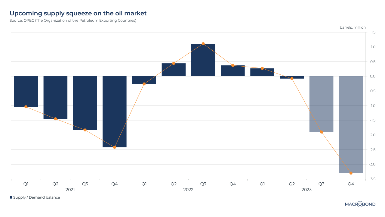
As Saudi Arabia decided to prolong its 1 million barrel-a-day output cut until the end of the year, announced jointly with Russia reducing its oil exports, the oil market is now facing a supply squeeze.
The chart above indicates, in the current market state, supply will be short of 3 million barrels at the end of year, aggravating tensions on the oil market as consumption surges. The combined announcement will force consumers to deplete their inventories, pushing oil prices up.
Rising energy prices have adverse impact on German industry

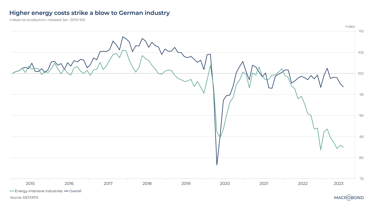
The chart analyses the headline industrial production and contrasts it with the industrial production levels of energy-intensive industries in Germany. The data is recalibrated to 100 in 2015.
There has been a decrease in the share of car manufacturing, which has led to a downturn in the German industry. This has put pressure on Berlin to revive the economy. The region's industrial hub has been adversely affected by increased energy prices, higher interest rates, and reduced trade with China - its second-largest export market.
Indian foreign direct investment shows steep decline

Foreign direct investment (FDI) in India has experienced a significant decline since the beginning of the year, as evidenced in the chart above. The data reveals a decrease of nearly 50% in foreign investments compared to the same period last year, measured on a 12-month cumulated basis.
Typically, only repatriation of capital adversely affects FDI inflows, which is represented by the purple columns in the chart. However, it has been a decade since gross inflows have contributed negatively to net inflows. Several factors, such as high inflation, recent geopolitical tensions, and weak demand in the United States and Europe, have led to a depletion of inflows, primarily in the start-up sector.
4 topics
.png)
Macrobond delivers the world’s most extensive macroeconomic & financial data alongside the tools and technologies to quickly analyse, visualise and share insights – from a single integrated platform. Our application is a single source of truth for...
Expertise
.png)
Macrobond delivers the world’s most extensive macroeconomic & financial data alongside the tools and technologies to quickly analyse, visualise and share insights – from a single integrated platform. Our application is a single source of truth for...
.png)