Updated COVID-19 Deaths/Forecasts
Enclosed for your benefit are screen-shots from our proprietary COVID-19 tracking and forecasting systems, which are updated live every 15 minutes. To understand the forecasting methodology better, please read this paper. Today we will focus initially on deaths rather than infections, because the fatality data are likely to be much more reliable than the poorly-estimated infection information.
There are a few interesting observations in the data. First, there is clear divergence in the death rates between Australia, Germany, the US, South Korea, and China ex Hubei, on the one hand, and Italy, France, Spain, the UK and Japan on the other.
On the lower left-hand-side of the first screenshot below you can see mortality rates over time. (Click on the image to see a better version of it.) There is one cluster of countries converging around 1% at the bottom (Australia, Germany, China, the US and South Korea) and others that are much, much higher (eg, Italy, Spain, the UK, France and Japan). (We can also lag the data by a week as you can see in the drop-down menu above the chart, but the same story holds.)
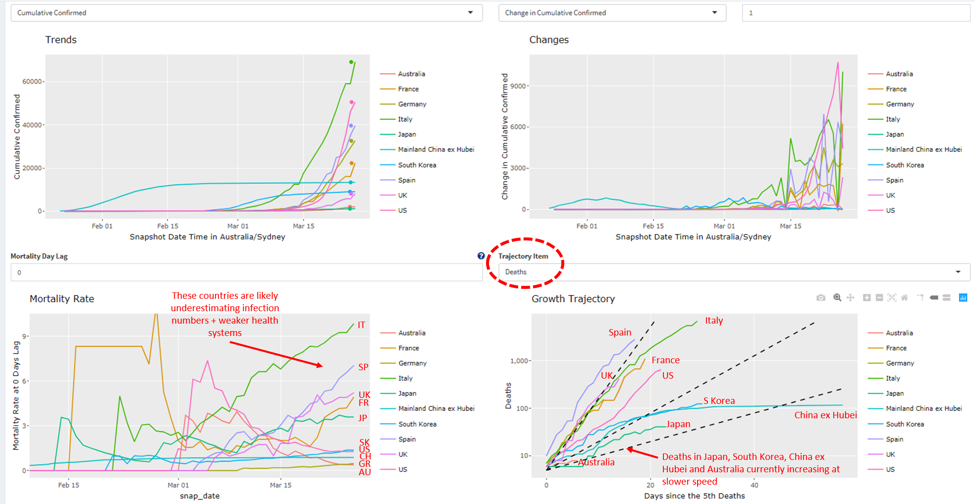
The higher death rates are likely a function of: (1) poor testing and detection that bias death rates up; (2) inferior health systems; (3) older populations -- the median age is higher in Italy (46), Spain (43), and the UK (41) compared with Australia (39), the US (38) and China (37); (4) the propensity to smoke (higher in Italy, Spain, Japan and France); and (5) the availability of effective anti-viral drugs that we have discussed before, such as hydroxychloroquine and remdesivir. (See our discussion of these drugs here.)
In the lower right-hand side chart in the image above, you can see the growth path of the number of deaths over time, and here again we observe large divergences. It is noticeable, for example, that people are passing away much more quickly in Spain, Italy, the UK, and France.
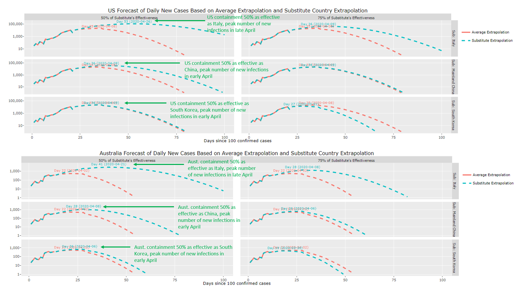
Our latest forecasts for the peak number of infections in the US and Australia as a function of the efficacy of their containment regimes remains unchanged (see next image). Assuming that the US and Australia are only 50% as effective at containment as South Korea and China, infection numbers should start rolling over in early to mid April. This is pushed out to late April if these countries are only half as good in containment terms as Italy. While the image below is a little hard to discern, each horizontal panel shows our forecasts for the number of new infections as a function of the US (top three panels) and Australia's (bottom three panels) containment strategies. Each row shows the US and Australia's forecast infection numbers assuming they are either 50% (first column) or 75% (second column) as effective as those observed in Italy (first row), China (second row) and South Korea (third row). If you want higher resolution images of these pictures, try the Livewire version of this note. We also discuss some limitations associated with this method here.
Never miss an update
Enjoy this wire? Hit the ‘like’ button to let us know.
Stay up to date with my current content by
following me below and you’ll be notified every time I post a wire
Chris co-founded Coolabah in 2011, which today runs over $8 billion with a team of 40 executives focussed on generating credit alpha from mispricings across fixed-income markets. In 2019, Chris was selected as one of FE fundinfo’s Top 10 “Alpha Managers” based on his risk-adjusted performance throughout his career across. He previously worked for Goldman Sachs in London and Sydney, the Reserve Bank of Australia, and founded the award‐winning research/investment group, Rismark. He has regularly advised governments, developing unique policy proposals. Chris graduated with the University Medal (Economics & Finance) from Sydney University. He studied in the PhD program at Cambridge University in 2002/03, leaving to set up his funds business.
........
Disclaimer: This information has been prepared by Smarter Money Investments Pty Ltd. It is general information only and is not intended to provide you with financial advice. You should not rely on any information herein in making any investment decisions. To the extent permitted by law, no liability is accepted for any loss or damage as a result of any reliance on this information. Past performance is not an indicator of nor assures any future returns or risks. Smarter Money Investments Pty Limited (ACN 153 555 867) is authorised representative #000414337 of Coolabah Capital Institutional Investments Pty Ltd, which holds Australian Financial Services Licence No. 482238 and authorised representative #001277030 of EQT Responsible Entity Services Ltd that holds Australian Financial Services Licence No. 223271.

1 topic

Chris co-founded Coolabah in 2011, which today runs over $8 billion with a team of 40 executives focussed on generating credit alpha from mispricings across fixed-income markets. In 2019, Chris was selected as one of FE fundinfo’s Top 10 “Alpha...
Expertise
Chris co-founded Coolabah in 2011, which today runs over $8 billion with a team of 40 executives focussed on generating credit alpha from mispricings across fixed-income markets. In 2019, Chris was selected as one of FE fundinfo’s Top 10 “Alpha...
Expertise
Comments
Comments
Sign In or Join Free to comment