Welcome to the bond lost (half) decade
It’s no secret that our team does not like bond benchmarks. It’s nothing personal, but our view has been that they don’t provide the logical starting point for fixed income exposures. Hence our long-standing Absolute Return focus. When we started at Franklin Templeton in 2014, our observation - as it had been previously - was that the benchmark is so flawed that we needed to create massive latitude around it to make sense, to the point we ditched the benchmark altogether whilst still seeking to retain some logical constraints.
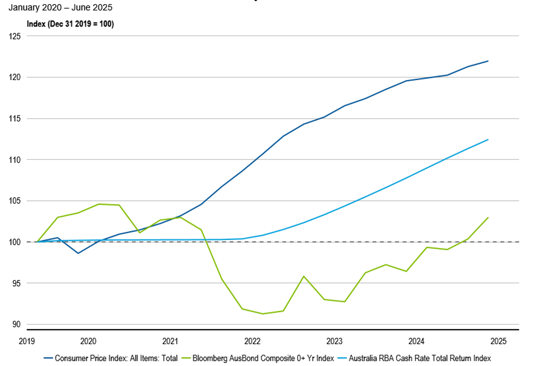
We are now more than halfway through the decade. Both the Bloomberg Ausbond Index and Global Aggregate Index are barely above their starting point in January 2020. Put differently, bond investors are experiencing a lost ‘half decade’ with the value of their initial investment five years ago having largely gone nowhere. Worse still, with inflation having averaged around 4% p.a. over this period, traditional bond benchmarks have destroyed value.
As my colleague Josh illustrates in the chart below, even cash has outperformed bonds by a factor of approximately 4x.
Australian interest rates and inflation since January 2020

What’s going on? Where’s the bond recovery?
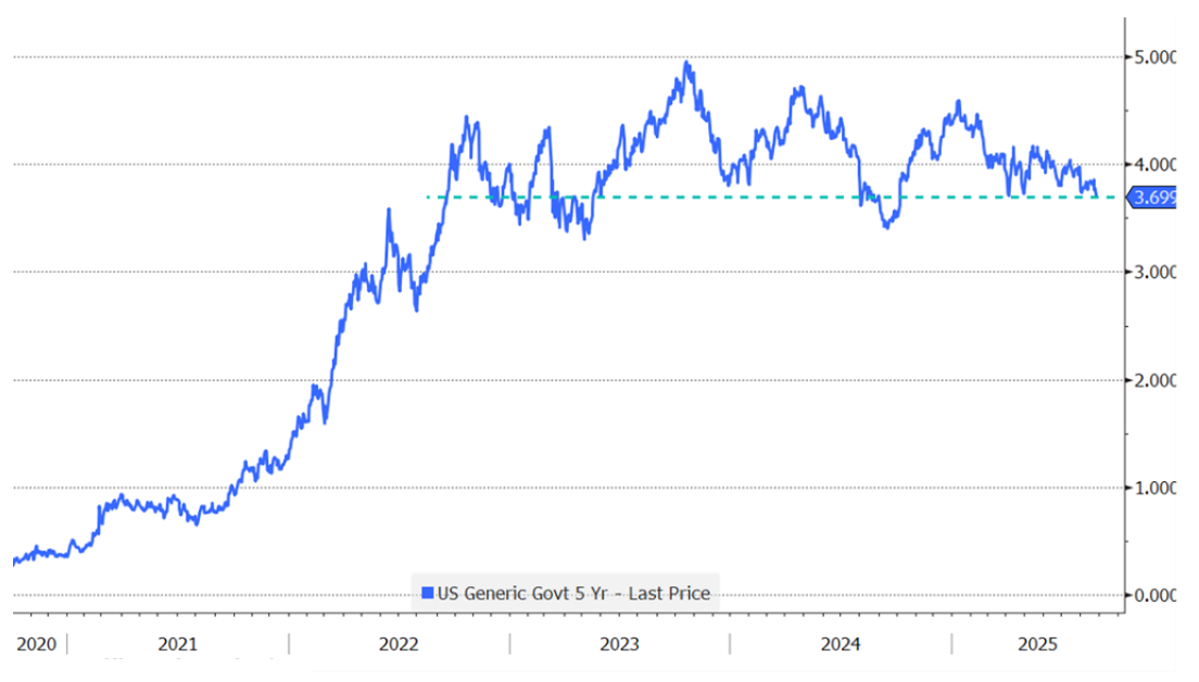
The yield on the US 5-year Treasury is virtually unchanged from where it was three years ago.
US 5-year Treasury Yield

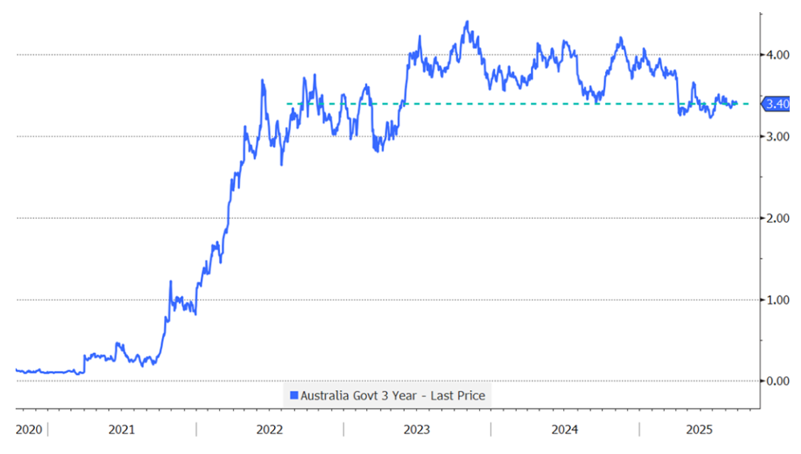
It’s the same story for the short end with the Australian 3-year government bond yield.
Australian Government 3-year Yield

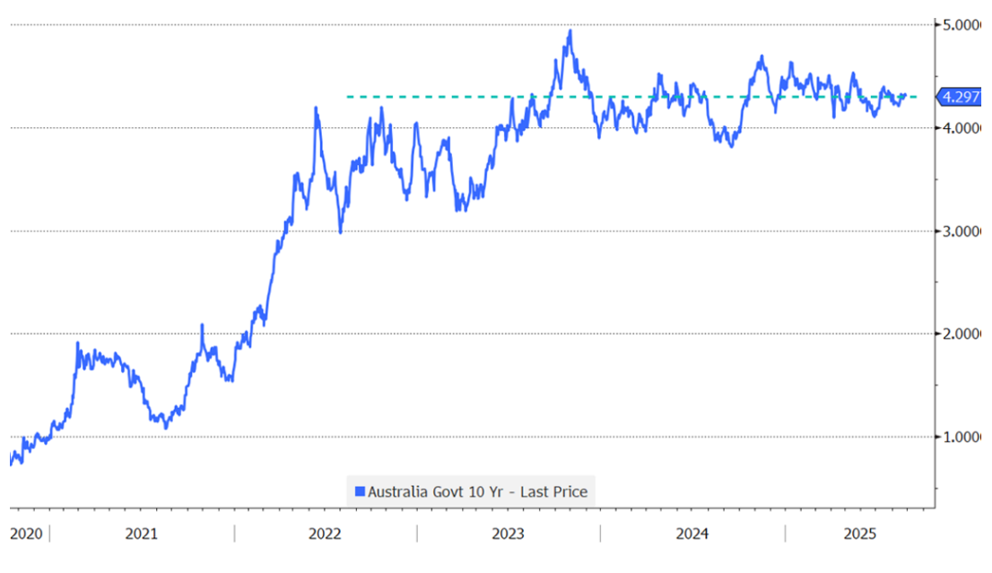
To make thing worse, the yield on the 10-year Australian government bond is slightly higher - even as the RBA’s rate cut cycle is now well advanced.
Australian Government 10-year Yield

In bond land, it’s felt like Groundhog Day for over three years. Yields remain stuck around levels last seen in 2022. Central banks are well and truly into their easing cycles, the bulk of which is priced in, and medium-term expectations for neutral levels of rates are much higher than they were pre-COVID.
Total returns in fixed income (like other asset classes) are a function of income and price change. The good news is that income levels (yield) are relatively high in the context of the past decade. Yields on 10-year government bonds in both the US and Australia (which tend to move in tandem) sit around 4.3%, which is encouraging.
However, bond benchmarks aren’t typically used for yield. For example, AAA-rated amortising prime residential mortgage-backed securities currently offer yields of approximately 4.6%-4.8%. They have close to no duration and will deliver a higher yield than government bonds.
The rationale for allocating to benchmarks is the potential for price appreciation – duration exposure. A starting yield of ~4.3% combined with a rally in rates could deliver total returns well above the yield alone.
Except it isn’t happening. It may still be out there somewhere. In the meantime, every year that goes by that the Ausbond Composite Bomb (sorry, I mean Bond) Index underwhelms, is an opportunity cost.
We don’t want to wade into the quagmire of central bank independence and the headlines around the recent announcement of President Trump firing (or attempting to?) Fed Governor Lisa Cook. That’s another topic. But suffice to say, markets are being remarkably sanguine about the risks (perceived or otherwise) of the US Presidential administration shaping the world’s most important central bank into doing its bidding. Were such risks to rise then we’d be resending the above charts. And for maturities of 10 years and beyond, those yields would be higher.
.png)
1 fund mentioned
.jpg)
.jpg)