15 practical ways to value the stock market - and the one that is not
This article presents a look at a listing of different valuation indicators for the stock market. The purpose is to provide a reference of the various methods, to reiterate the principles for market cycle analysis, and to provide further worked examples for indicator design and input selection.
As a brief refresher, the reason for studying valuation signals is to attempt to identify which stage we’re at in the market cycle, to help form a directional view, and to understand the risk vs opportunity outlook.
The visual below shows how to interpret value signals at a high level — there is contrarian information at extremes (e.g. extreme expensive = at risk/sell signal vs extreme cheap = opportunity/buy signal), meanwhile not ignoring the momentum information through the range (e.g. cheap can get cheaper, wait for the turn).
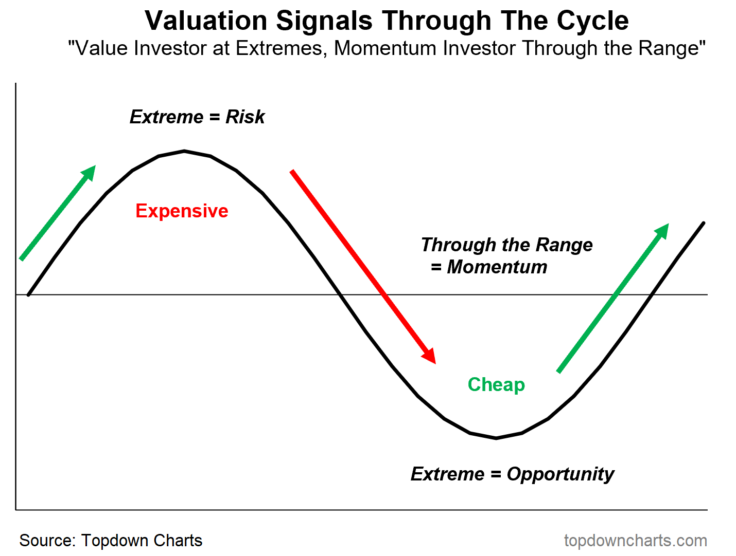
For active asset allocation, market timing, and risk management — valuation signals can hence be tremendously valuable.
However, due to the various strengths, weaknesses, distortions, nuances, and shifts over time, we do need to be thoughtful on indicator design and input selection when it comes to building up an actionable picture.
You want an indicator that is ideally explainable (makes sense), works over time (consistent signal), and is sensible (actually gives the right signal and helps clarify vs confuse). You also ideally want it to be mean-reverting (travels within a well-defined range, rather than trends, and ideally oscillates enough to present actionable signals rather than just going to one level and staying there).
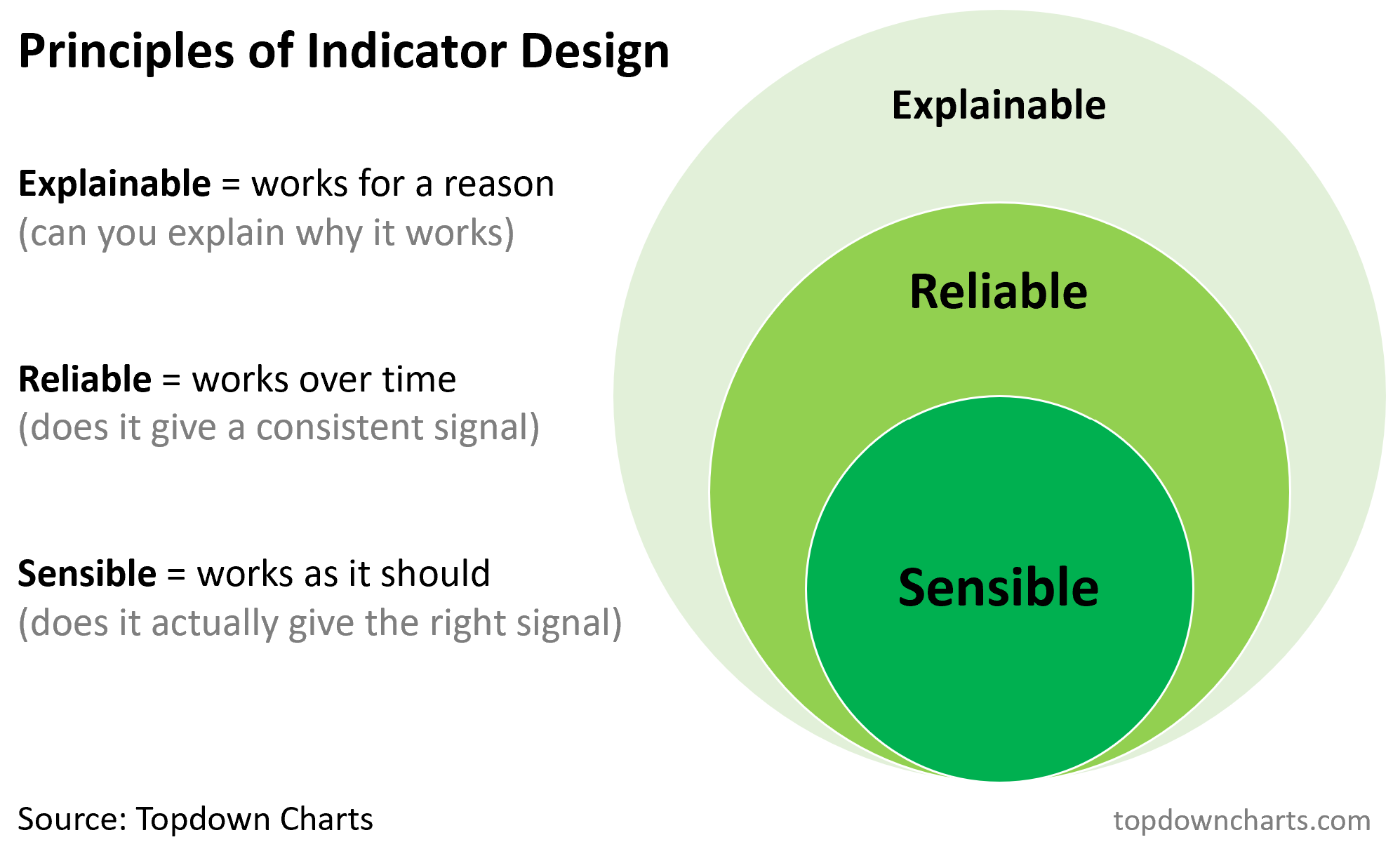
It’s important to keep both of these visuals in mind as we go through the various indicators below. Think: how does this indicator help me navigate the cycle, and does it meet the criteria of a good indicator? Even if the indicator fails, there can still be some merit in occasionally checking and tracking a wider set of indicators, while relying on a few core series.
Before we get into the data, I will add one point of clarification. This post does not address methods such as discounted cash flow valuation models, analyst point estimates, comps or other point-in-time appraisals (such as might be used in corporate finance, stock selection, venture capital and private equity).
These methods are out of scope for this article because we are focused on market cycle analysis, and we need a consistent, objective, quantitative source of information that evolves with the cycle, and can ideally be easily sourced and updated.
But I would note that the ultimate level of valuations from those types of analysis will rise and fall with the broader market tides — which we attempt to discern with these indicators.
Indeed one way to think about valuations is as the tides of the market (e.g. high tide = high valuations, low tide = low valuations — know the tides, know the changing of the tides), whereas by contrast other sources of information like sentiment and technicals can be used to determine the waves (to maintain the oceanic metaphor).
Data and Application
With that all said, let’s get into the data and take a look at a not-entirely-exhaustive (but pretty close to it — write-ins will be accepted and added) listing of stock market valuation indicators.
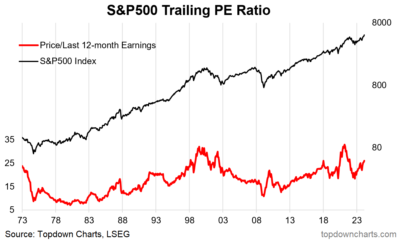
Trailing P/E: Price divided by the trailing 12-month’s sum of earnings.
Strengths/Weaknesses/Nuances: This is the standard P/E ratio that you have probably seen and heard of already.
Conceptually it is a good starting point — comparing price vs fundamentals (and earnings is probably about as fundamental as it gets when it comes to fundamentals for stocks). It’s a useful indicator in that it’s often higher than usual around market peaks and lower than usual around market troughs.
The main weakness is that during a recession earnings declines can mean that you get nonsense readings just due to volatility in the denominator. It also, as with many absolute value indicators like P/E ratios, can go through structural changes (and sometimes trends rather than mean reverts) in part due to changing macroeconomic conditions (e.g. higher/lower inflation and bond yields) and even index composition changes.
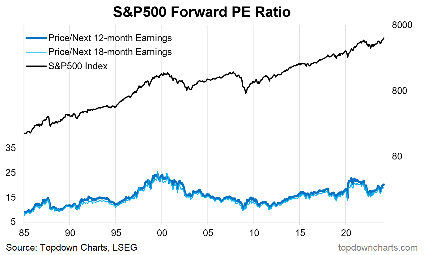
Forward P/E: Price divided by analyst consensus estimates of the next 12 months’ sum of earnings (in this case using the gold standard of analyst consensus data from I/B/E/S (LSEG)).
Strengths/Weaknesses/Nuances: This is the same concept as the trailing PE, but using estimated future earnings. This can be helpful when the past 12 months of earnings are not representative of what the next 12 months might be (e.g. in the case of a recession/downturn in earnings or anticipated acceleration in earnings).
One issue is that the analyst's estimates are just that — estimates, and are subject to being wrong. But from a market analyst standpoint, it provides us with an objective and quantitative data point that we can track over time.
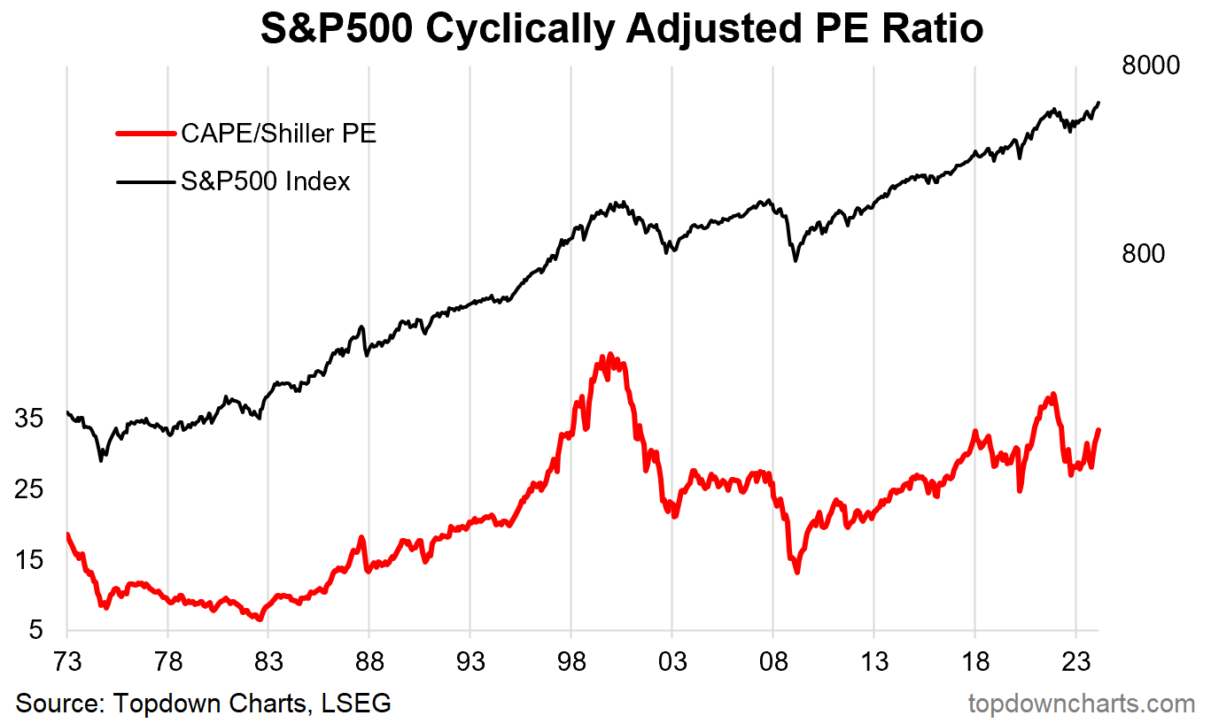
CAPE (Cyclically Adjusted Price/Earnings Ratio): Sometimes referred to as the Shiller P/E, calculated by taking the real (CPI deflated) price divided by trailing 10-year average real (CPI deflated) earnings.
Strengths/Weaknesses/Nuances: This version of the PE ratio corrects for earnings volatility by taking a more stable anchor (by using the average of earnings over 10 years) — the intention is to smooth out the cyclical ups and downs in earnings.
Where this indicator runs into trouble is if you get a major up or downshift in earnings e.g. if earnings were elevated for several years artificially due to a credit bubble and then come down going forward (this might make it appear cheaper than it is), or e.g. if a new industry with structurally higher earnings rises to dominate the index (this might make it appear more expensive than it is).
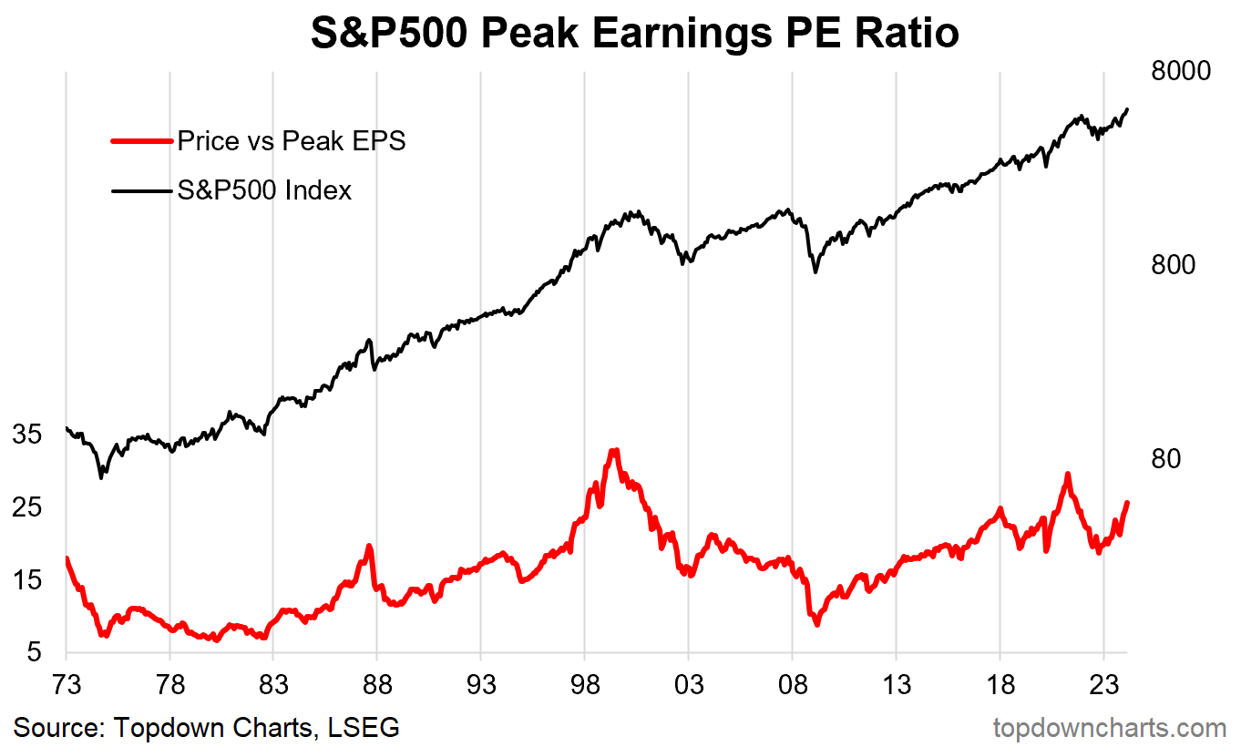
PPE (Price to Peak Earnings): This indicator divides price by the trailing maximum earnings figure (both in nominal terms).
Strengths/Weaknesses/Nuances: Parsimony likers will enjoy this indicator — it gives the same signal as the CAPE (actually slightly better: gives a more accentuated peak and trough signal). Basically it’s just another way of correcting for earnings volatility, and intuitively it is appealing if you think that the recent peak in earnings is probably more representative of near-term potential earnings. The weakness would be if you had a bubble in the fundamentals or encountered a long period of economic stagnation, where the peak would not be representative going forward.
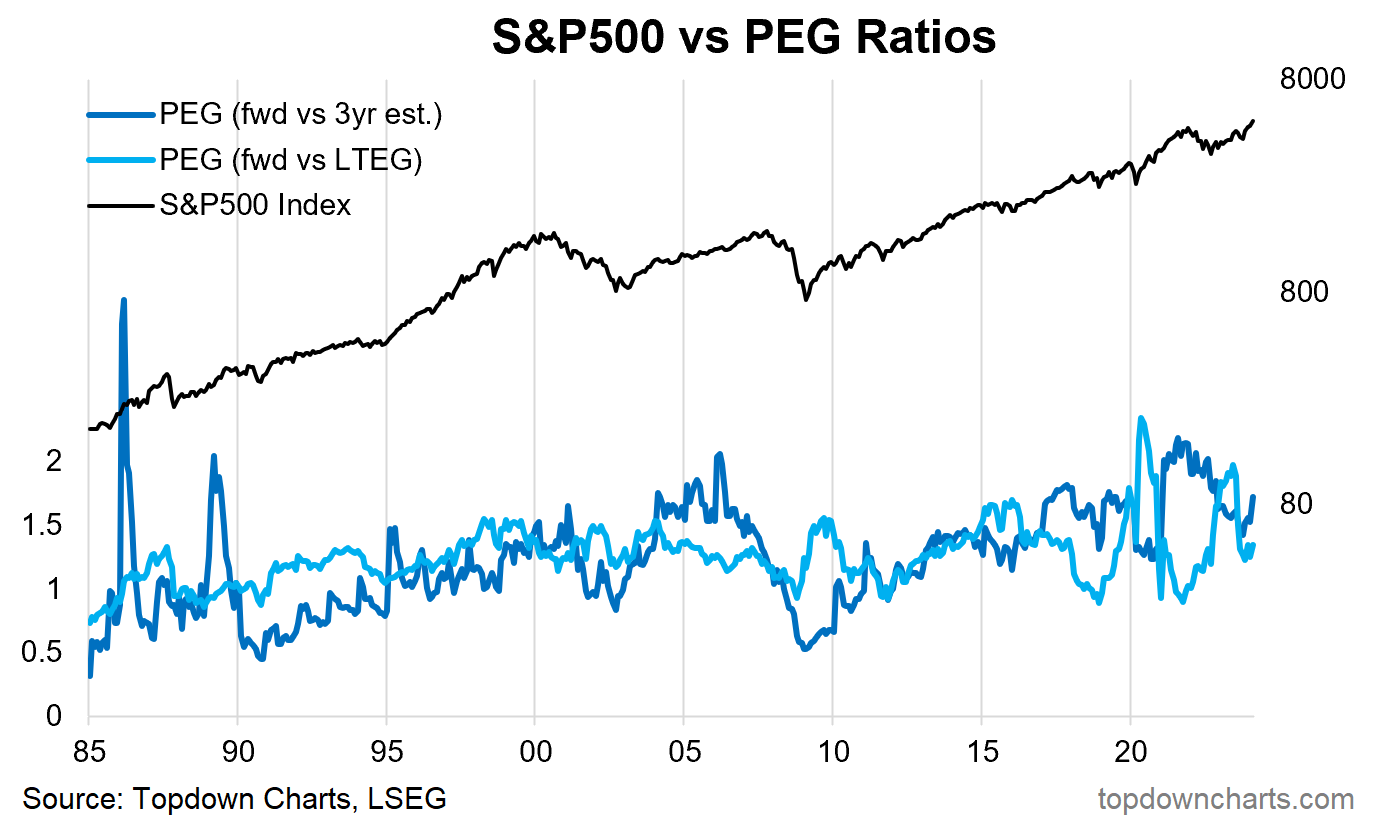
PEG (P/E to Growth Ratio): This indicator attempts to adjust the PE ratio for earnings growth, I have shown 2 approaches — the Forward PE vs 3-year analyst consensus earnings growth estimate, and the Forward PE vs the consensus Long-Term Earnings Growth estimates.
Strengths/Weaknesses/Nuances: Conceptually it’s an interesting idea, and it attempts to correct for what I noted before about potential shifts in earnings growth rates. In practice, it is highly flawed and unusable — and does not provide any real signal improvement relative to alternatives. One of the main issues with it is selecting an objective and consistent figure for the growth rate, here I have used analyst consensus estimates, but these can swing around due to volatility in base comparators and swings in analyst sentiment. Conceptually interesting but it's practically not practical. Do not use.
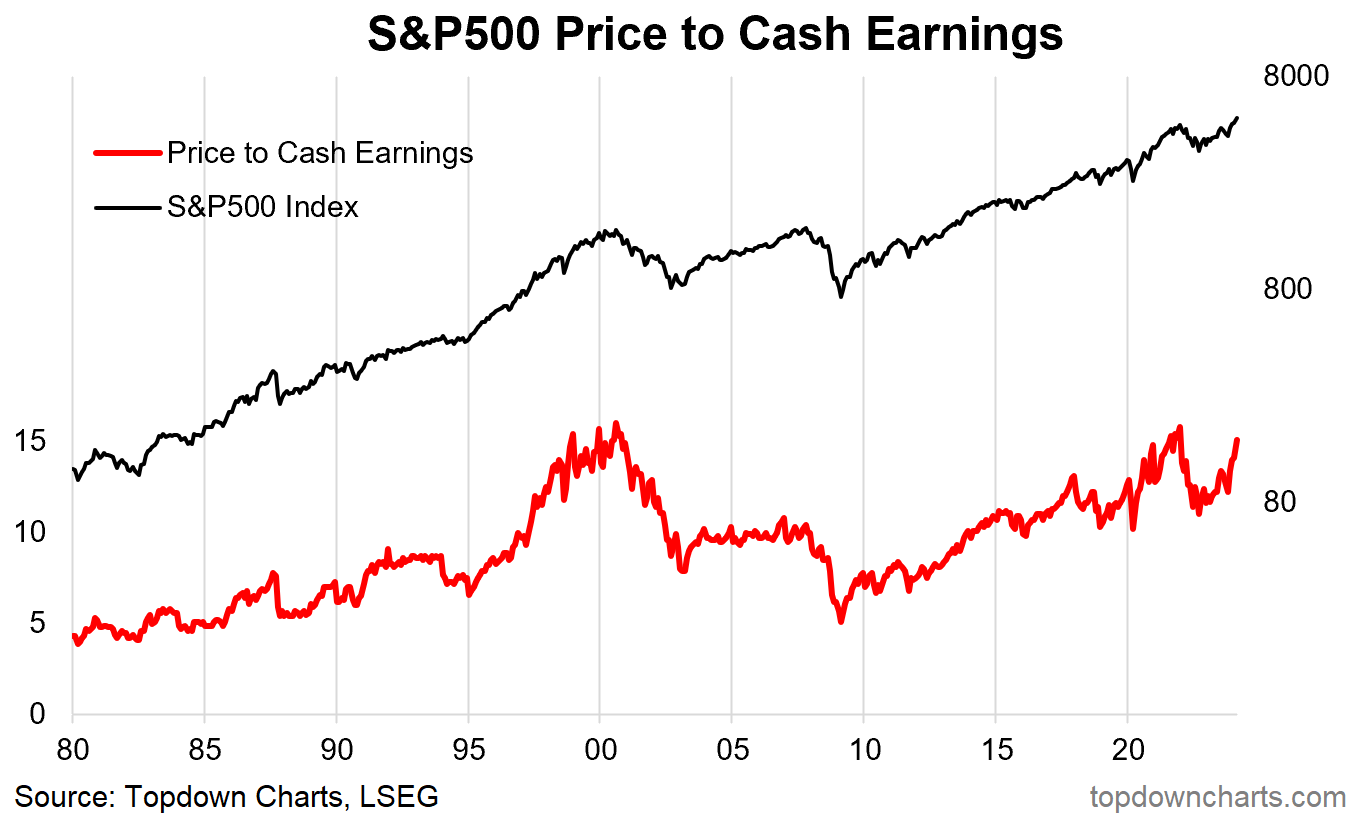
Price to Cash Earnings: Similar to the PE ratio but using Cash Earnings as the denominator (funds from operations).
Strengths/Weaknesses/Nuances: Gives a slightly less volatile picture than the PE ratio given the earnings figure is adjusted for depreciation etc and hence a more accurate representation of the ongoing actual recurring operating earnings. Interestingly, it gave more expensive/peak signals at the actual market peak or final stages before the 2000 peak and 2021 peaks.
One issue is that it does seem to trend through the entire period in the chart …so it’s difficult to use it for an outright all-time high/low expensive/cheap interpretation — as opposed to more expensive vs cheaper than usual. That is often an issue with absolute valuation metrics like this, but there are ways and means of dealing with this.
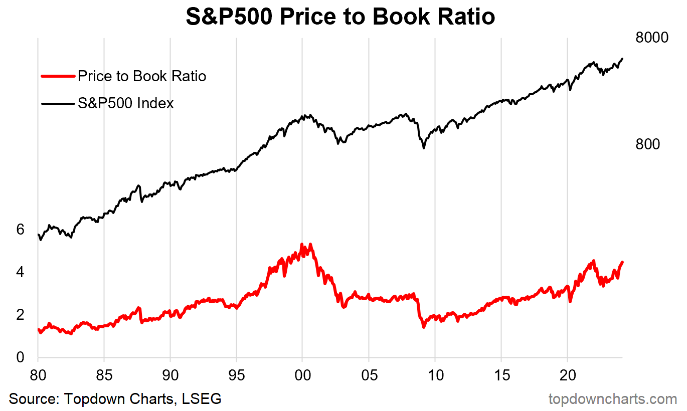
Price to Book Ratio: Price vs book value (net assets).
Strengths/Weaknesses/Nuances: Similarly, the price-to-book ratio provides good signals due to the generally less volatile nature of the book value figure. One issue is the changing composition of the index e.g. for the US the rising weight of sectors (like internet and software businesses) which are generally capital-light.
However, one could have made the same argument near the peak of the dot com bubble (“it’s different this time“ — and sometimes it is), and there is a lesson in there. Be alert to extremes, even if they can be ‘explained‘, and be alert to changing sector composition for context …as well as signals.
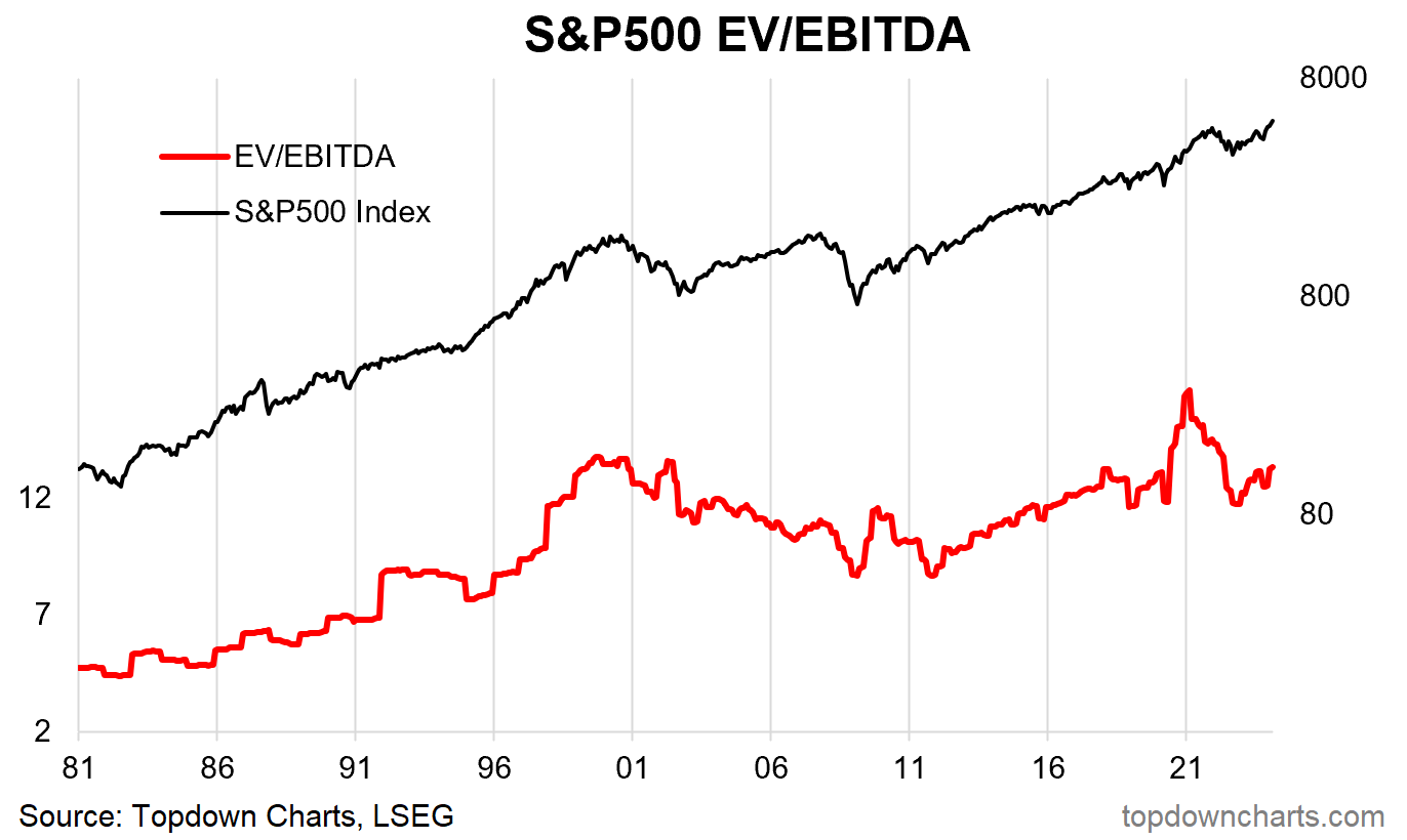
EV/EBITDA: Enterprise Value (market cap + value of net debt) divided by EBITDA (earnings before interest, tax, depreciation, amortisation).
Strengths/Weaknesses/Nuances: This is a popular metric for comps in corporate finance (capital raising, M&A), as a stock market valuation indicator it is on par with the PE ratio, and shares similar flaws (can give a wrong signal during times of volatility in the EBITDA figure).
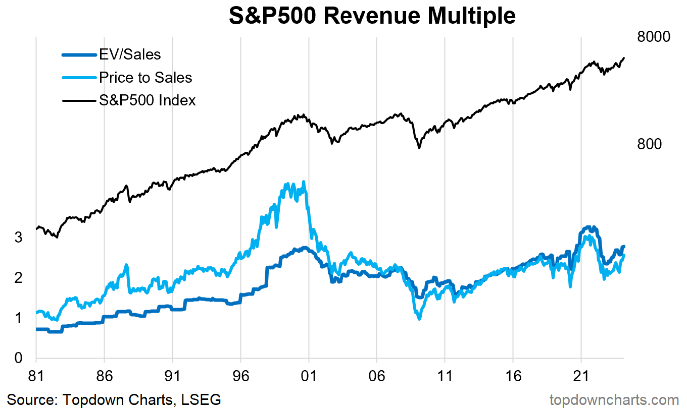
Revenue Multiple: Price divided by sales (also showing enterprise value to sales ratio).
Strengths/Weaknesses/Nuances: The price to sales or revenue multiple can be useful when a company has negative earnings (e.g. early stage/growth companies), it is often used in corporate finance comps — particularly M&A where the acquirer might be able to run a different cost structure and hence a higher earnings margin.
But on that note, it does ignore changes in earnings margins, and hence can under/overstate things if earnings margins undergo a structural shift.
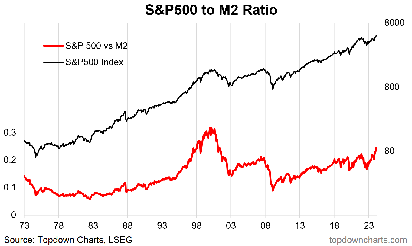
Price to M2 Money Supply: S&P500 index divided by US M2 money supply.
Strengths/Weaknesses/Nuances: This is one of those newer indicators, which as far as I can tell came about during the post-pandemic stimulus era when the markets were awash with stimulus and liquidity, and hence the thinking with this indicator is that the market price level should reflect the economy-wide liquidity level.
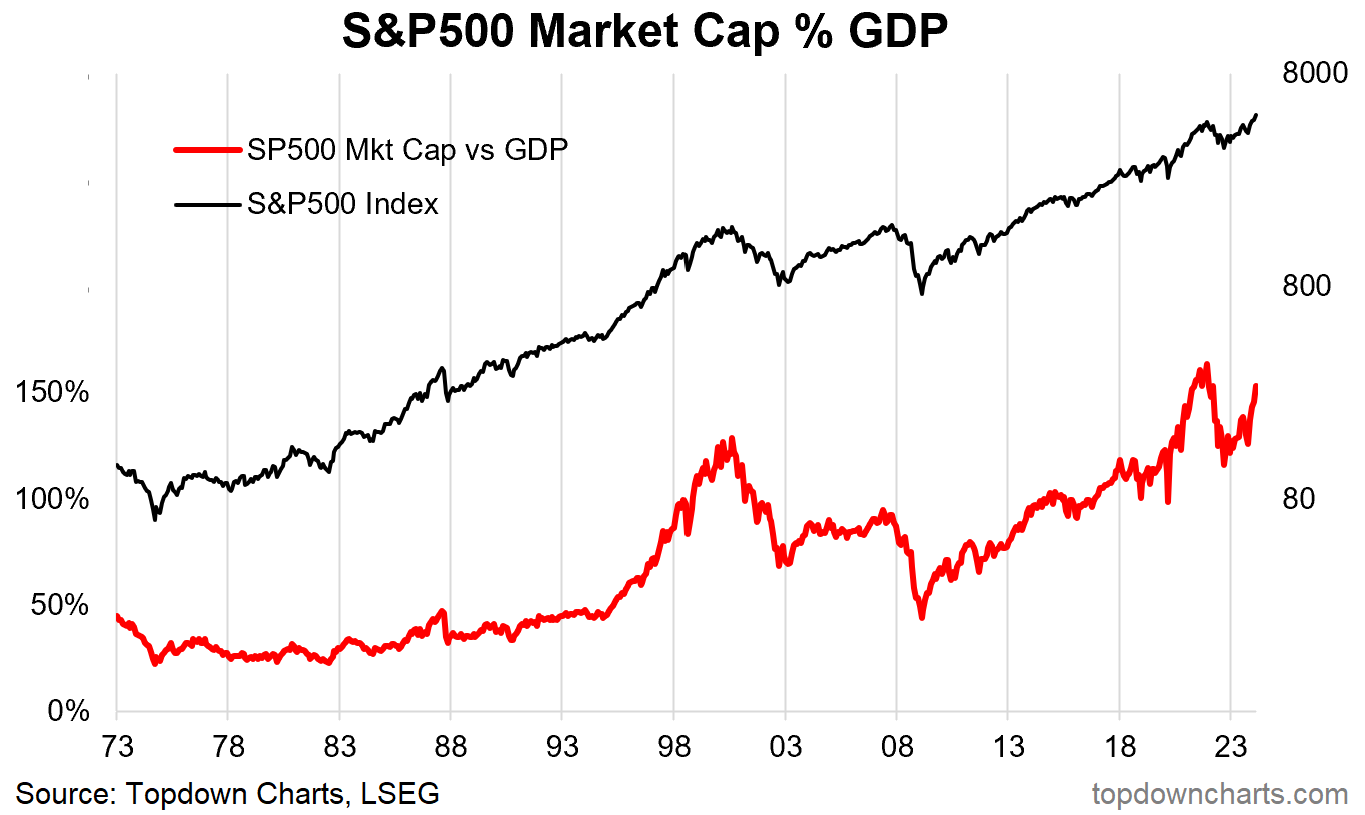
Market Capitalisation vs GDP: Stock market capitalisation as a percentage of nominal GDP.
Strengths/Weaknesses/Nuances: I’ve never been a fan of this indicator. I think it’s because one day long ago I was an analyst at a stock exchange operator — I was pulling together this stat for the exchange and global peers as an indicator for capital market development.
Think about that: if you have a thriving and well-developed capital market, then more of the economy will be listed on the exchange and represented by the stock market (so a higher figure might just mean you have better capital markets, and a rising figure might mean improving coverage and function of your capital markets).
Having said that, it has historically been very high at some of the major peaks, and very low at the bottoms. There is some merit and information to it, but I would not use it as a primary indicator.
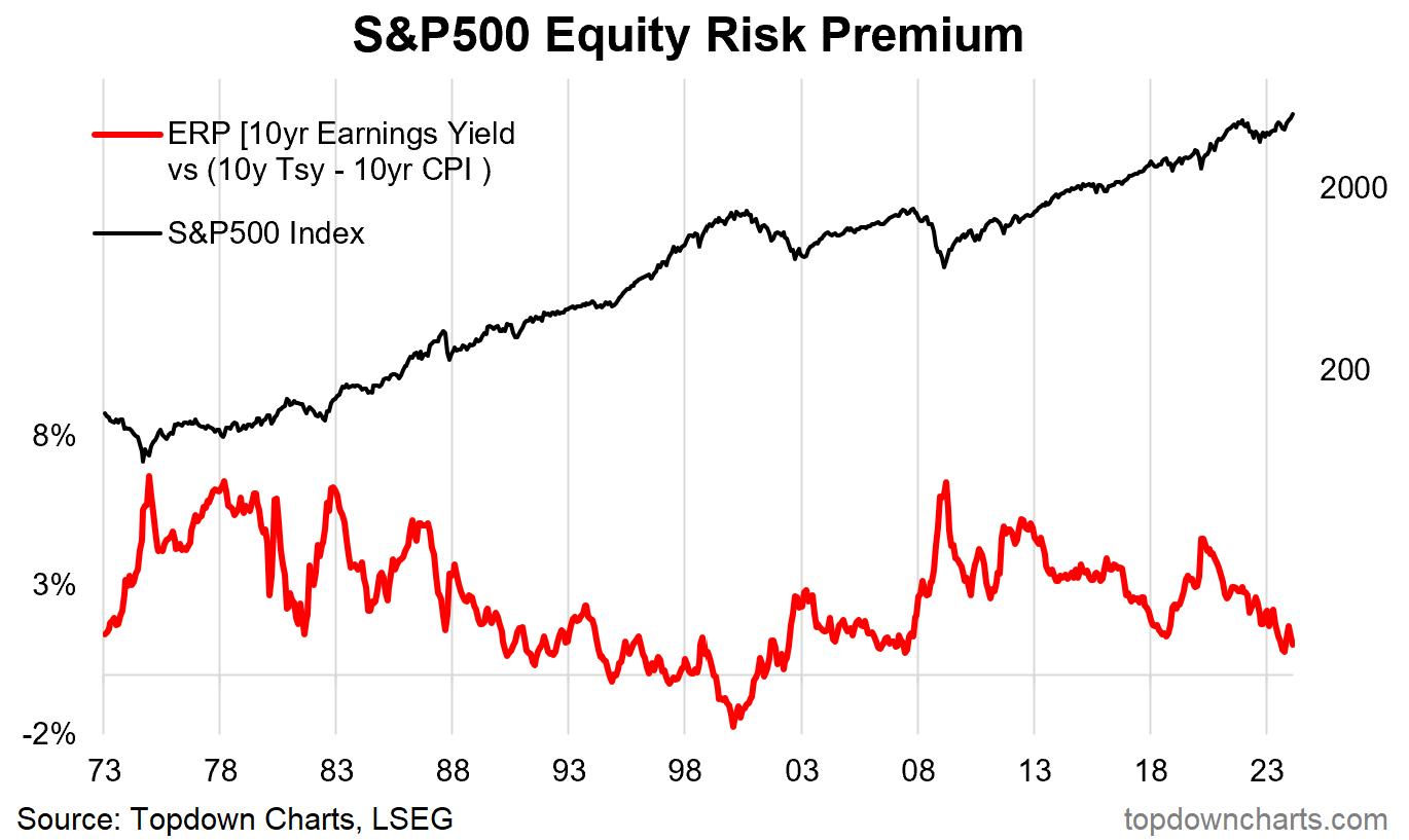
Equity Risk Premium: My method = 10-year earnings yield (average trailing 10-year earnings figure divided by price) minus 10-year real yield (10-year treasury yield minus the 10-year CPI compound annual growth rate).
Strengths/Weaknesses/Nuances: This indicator attempts to contextualise the P/E ratio (inverted to find the earnings yield (i.e. 1/P/E ratio)) for the level of interest rates. Conceptually the higher it is the greater the premium over and above treasuries investors require to take on equity risk.
In other words, it gives a buy signal at extreme highs (when you get a greater premium for taking on equity risk), and a sell signal at extreme lows (when you get a smaller or negative premium for taking on equity risk) — particularly relative to bonds (useful for asset allocation).
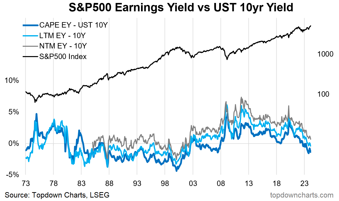
Earnings Yield vs Bond Yield: Earnings yield minus 10-year treasury yield (I have shown the earnings yield from the CAPE, trailing, and forward P/Es).
Strengths/Weaknesses/Nuances: This indicator likewise compares equity yields to bond yields, albeit with no inflation adjustment.
Similarly, buy signals come from elevated readings, and sell signals come from low/negative levels. The main problem with this one is, much like the absolute value signals, it goes through long periods above or below zero — so you can’t make a hard and fast rule (e.g. if you said sell whenever it’s negative, you would have been out of the market through most of the 90’s bull market).
As with all of these indicators, the thing to watch for is outright extremes, and significant (rapid or large) moves (e.g. compare and contrast the 2000 dot com peak vs the 2009 financial crisis low).
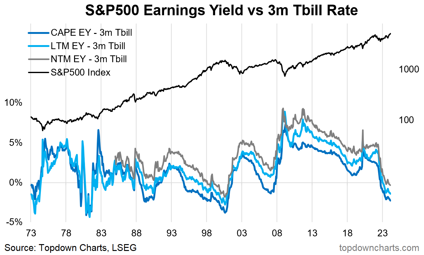
Earnings Yield vs Cash Rate: Earnings yield minus 3-month T-Bill yield (again, I have shown the indicator for CAPE earnings yield, trailing 12-month earnings yield, and next 12-months earnings yield).
Strengths/Weaknesses/Nuances: Similar to the price vs M2 ratio, this one has some intuitive appeal given that higher cash rates present two types of headwinds to stocks — opportunity cost (higher rates, especially relative to equity yields, mean the opportunity cost of holding risky stocks vs safe high-yielding cash is higher), and tighter monetary policy (and thus the brakes being applied to the economy, which may lead to lower confidence, recession risk, and lower earnings). A negative earnings yield vs cash rate spread would signal increased downside risk for stocks (and vice versa).
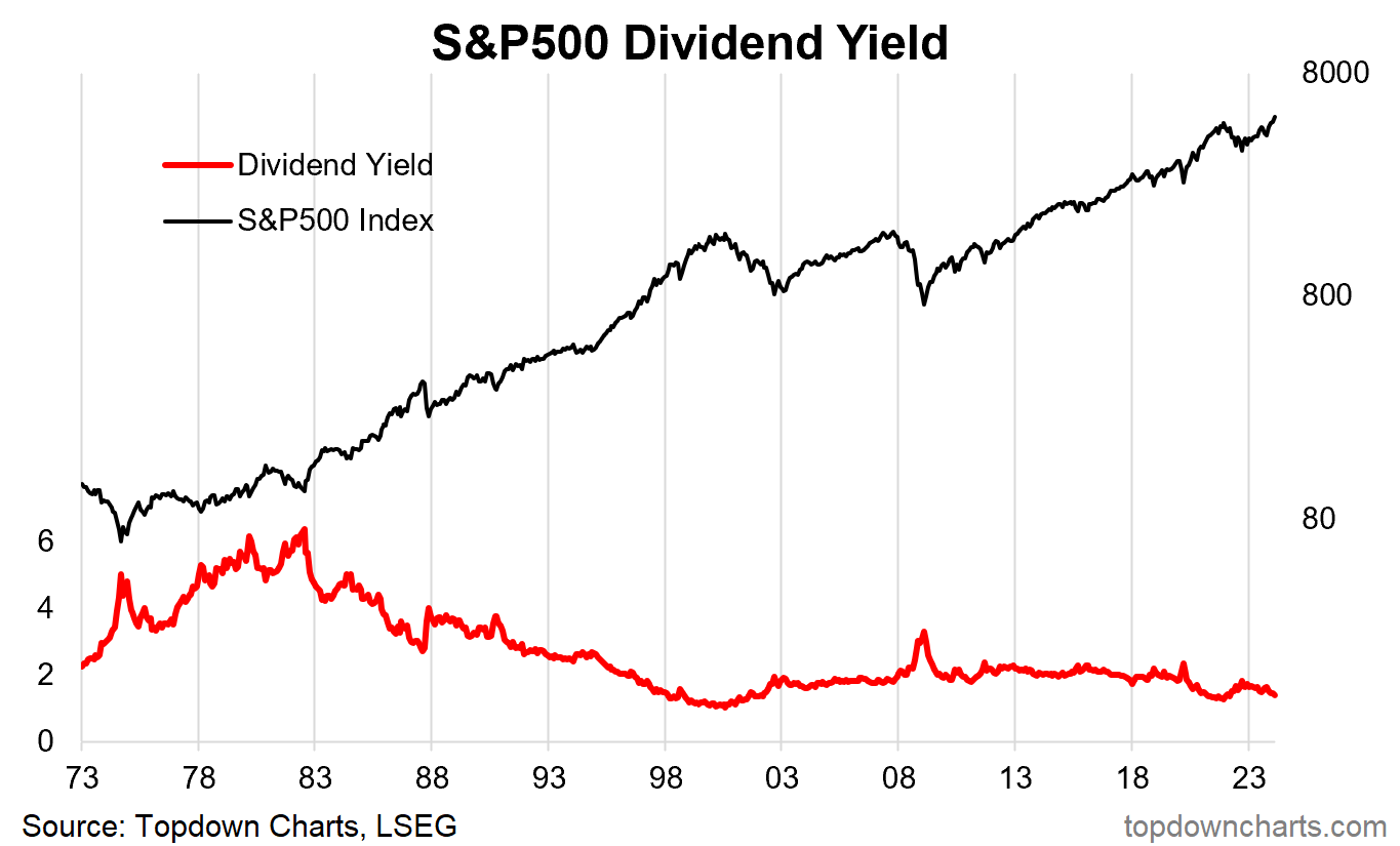
Dividend Yield: Trailing 12-month’s dividends divided by price.
Strengths/Weaknesses/Nuances: The dividend yield similarly rises and falls with the market cycle — spiking during crashes and downturns, and declining as the market rises. From a dividend income investor’s perspective buying at the bottom when yields are high is a dream come true (as long as the dividends continue!).
But one flaw with this is the rise and rise of buybacks. Companies in the US increasingly return cash to shareholders via buybacks, so that’s one reason why in the previous fixed income spread charts we use the earnings yield rather than the dividend yield (and changing payout ratios also matter).
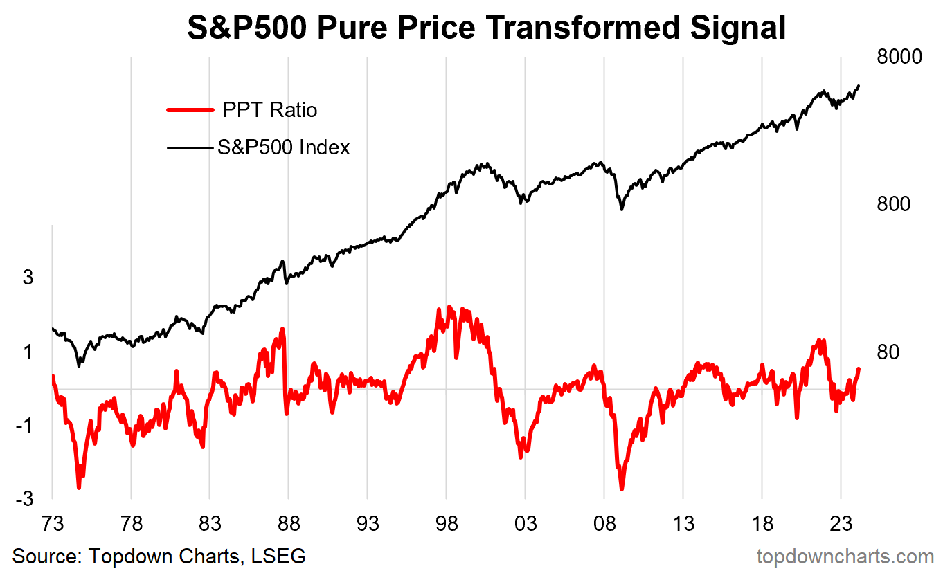
PPT Ratio: Saving the best and most controversial until last, this one is a combination of 3 pure priced based signals (I call it the PPT Ratio — Pure Priced Transformation), a 3-year mean reversion factor (price vs 3-year moving average), 5-year mean reversion factor, and the deviation of log price vs trend (i.e. de-compounded, and de-trended).
It takes an equal weight of the z-scores of each. It follows a similar, but different, approach to that used for the commodity value indicator.
Strengths/Weaknesses/Nuances: The main strength of this indicator is that it does what it is — a valuation indicator; i.e. it gives a consistent, reliable, sensible signal as to whether the market is stretched to the upside or downside (which is ultimately why we look at valuations from a market cycle analysis standpoint).
The main downside is that it does not directly incorporate any fundamental anchor (except to the extent to which you believe that stock prices already reflect all of the fundamentals). But that’s why we look at multiple data points and indicators to gather the fullest picture and colour. In practical terms, I would use an indicator like this for actionable signals, while reviewing the other indicators above for context-building.
Reflections
As you can see from this large but not exhaustive listing, there are a lot of different options and inputs you can use to gauge the valuation picture for the stock market. Each has its strengths and weaknesses, and I would say none offers an infallible holy grail panacea.
But we look at, track, and study valuations as one of a few key sources of information as we try to build up a full picture. Building up the picture within the valuation lens, but also as part of a broader spectrum of information like macro, sentiment, and technicals.
If I had to pick some favourites, I would say the CAPE, price-to-peak earnings, earnings yield vs cash rate, the ERP, and the pure-price transformation indicator. I think there is merit in combining signals, and I will go into that in more detail in a future post, but I also think even if you go and come up with some sort of a holy grail be-all-and-end-all indicator, there is still going to be merit in having visibility of the components so that you don’t miss any important shifts and changes.
The macro-market cycle rhymes, but it is always different in some details — different macro regimes, different technology trees, different geopolitical paradigms, different social trends, and differing lengths of economic expansion and contraction. Knowing how things change and how these changes can influence valuation indicators and signals is important. But also knowing what stays the same — the principles, is important for keeping a level data-driven head, especially in times of great greed and fear (be thoughtful when others are thoughtless).
2 topics

