Boom and bust in developed markets
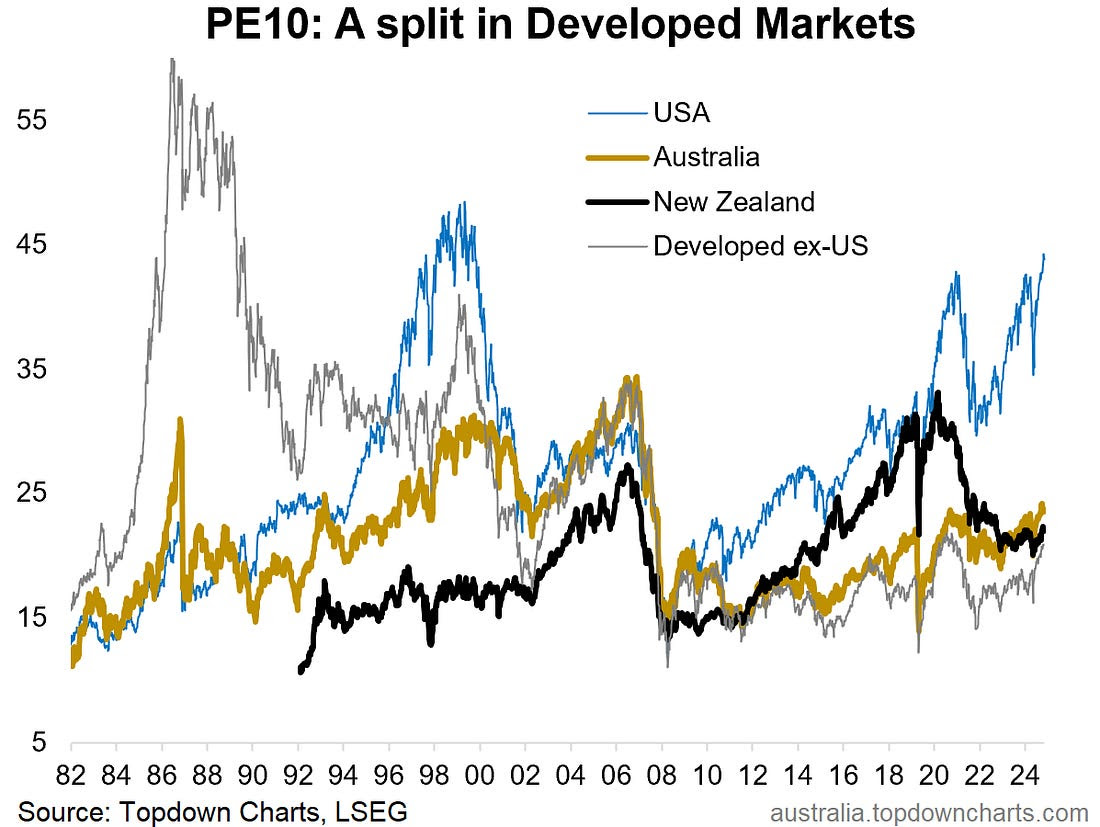
The history of valuations (in this case looking at the Price-to-trailing 10-year average Earnings [PE 10 Ratio]) across developed market equities has been one of cycles of divergence and convergence as countries’ sharemarkets walk similar but different paths. This week’s chart illustrates these longer-term trends, but also some interesting divergences (and convergences) more recently.
The first point of interest just zooming out to the bigger picture is the cycles of boom and bust, of euphoria and despair …and all 4 markets show multiple cycles of extreme highs and lows across the past 4 decades. This is interesting from an investing standpoint as it validates the idea that there are sometimes better opportunities (+risks to be avoided) by looking globally and across countries (and in across market cycles).
The second observation of intrigue is how all 4 lines started at the roughly the same point back in the depths of 08/09 …but went on to 4 very different paths (mileage can still vary despite similar signals).
The final point is just how far the USA has pulled away from the pack (for a while there NZ was valiantly keeping up, but the 2020/21 stimulus bubble burst put an end to that). As the USA charges deeper into boom/bubble territory, the prospect of eventual inevitable bust comes to mind… but what also comes to mind on the optimistic end is the catch-up trade that appears to be underway for the rest of developed markets.

Key takeaway: The history of boom/bust echoes on today, with the USA out in boom territory, and the rest of developed markets offering the prospect of catch-up from still relatively low levels of valuation.
1 topic

