Coronavirus: The limits of forecasting
A lot of people think a model and a forecast are the same thing. They aren’t. They are very different and knowing when you can forecast, and when you can only model is a critical investing skill. Coronavirus forecasting is a testament to the difference – many elements can be modelled, very few can be forecast.
If we take coronavirus deaths/hospitalisations as an example, the range of outcomes from very minor changes in assumptions is so extreme that forecasts are almost meaningless. However, virus models themselves are not useless as they do let us forecast other outcomes.
Coronavirus deaths/hospitalisations forecasting
I’m going to use the online model at (VIEW LINK) to illustrate the issue. I’ll use this with a population of a little over 300m to show the vast difference in outcomes for a country the size of the United States from simple changes in assumptions.
There are lots of assumptions, but I’m going to focus on the three main ones:
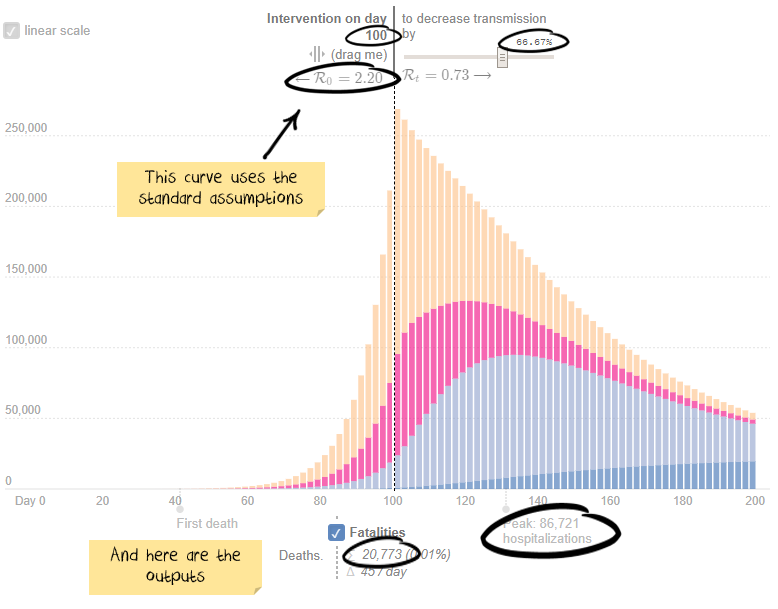
- R0 – how many people (on average) will one person spread the virus to in an unconstrained society. Case 1: using the model default of 2.2 people. Case 2: A more aggressive 2.8 people.
- Intervention delay – how long after the first case are quarantines/lockdowns implemented. Case 1: using the model default of 100 days. Case 2: Assume 5 more days before intervention.
- Intervention effectiveness – how are social interactions reduced by because of the quarantines/lockdowns. Case 1: using the model default of a 66.6% reduction. Case 2: Assume quarantines are slightly less effective, reducing transmission by 60%.
Here is the output for case 1: 86,721 peak hospitalisations and 20,773 deaths.
Now, stop for a second. How many more hospitalisations/deaths do you think case two will create? 10% more? 100% more? 1,000% more?
Scroll down to see how right you are.
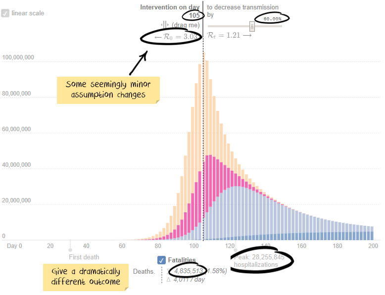
If you guessed a 32,500% increase in peak hospitalisations and 23,000% for deaths, then you take the prize.
Keep in mind the above assumptions are not known to any precision. Last month estimates for R0 were around 2.5, the US Centre for disease control just released a paper suggesting it is 5.7. So the difference between assuming 2.2 and 2.8 isn’t much. A five-day intervention delay is not unheard of. The difference between a 66.6% effective quarantine and a 60% effective is probably unmeasurable, but again a relatively trivial difference in assumptions.
Net result:
We can model deaths and hospitalisations. We can’t forecast them in any meaningful way.
Aggregating or comparing COVID-19 case counts is futile
I find the focus on global case counts or comparisons also irrelevant. There are four main gaps between reported cases and actual cases:
- Insufficient testing: Countries that do not have the systems or capacity to test properly
- Yet to be reported cases: People who have the virus but are either: yet to show symptoms, yet to be tested, or had a test that showed a false negative
- Asymptomatic cases: Estimates are that around half of all people who get the virus will never show symptoms
- Deliberately under-reported: Some countries look to be deliberately under-reporting cases
The net result is the number of global cases is likely to be significantly different from reported statistics. Some estimates are that global infections are as much as 500% to 1,000% higher than reported. Which basically makes any aggregated reported numbers useless.
We started our analysis in January by excluding Wuhan data, then all Chinese data. Then Iranian data looked suspect. Then Italy changed definitions to under-report cases. After that, we gave up on aggregates and focussed on individual countries. At least that way, changes would be based on a relatively consistent methodology.
Ideally, testing would be randomised, significant in size and from a trustworthy source. Iceland, Norway, Australia, Germany and South Korea (in green below) rate the best. Switzerland, Italy, Japan, US and Netherlands (in red below) rank poorly. Dashed lines are countries with widespread facemask use.
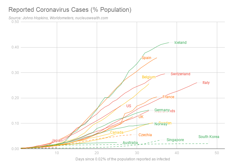
However, the above chart is misleading. For example, Iceland rates at the top, but not because it has the most number of severe cases. Instead, Iceland ranks highly as it has been doing far more testing – including random sampling.
Hospitalisations are the better statistic
We are focussed on the number of critical or severe cases. While the definition of these will vary between countries, they are likely to represent hospitalisations which we believe are a better indication of the current severity. Note: for these statistics updated daily, see here.
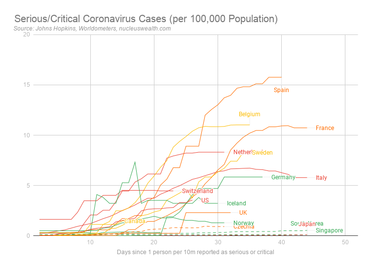
Note also these are a measure of the current active numbers. Total case numbers can only increase, but these numbers can decrease as sick people either die or are cured and are removed from the count. So, it represents a better indication of the stress on the hospital system.
Experimenting with trade-offs
We note the economic/humanitarian trade-off:
- Humanitarian. The bigger the shutdowns, the greater the preventative measures, the fewer people will die.
- Economic. The bigger the shutdowns, the greater the preventative measures, the more significant the economic impact will be.
We are of the view that governments around the world are experimenting, trying varying levels of shutdowns to get hospitalisations down to a level that does not overwhelm the healthcare system.
As Tomas Pueyo eloquently puts it, the solution is in two forms, the Hammer and the Dance:
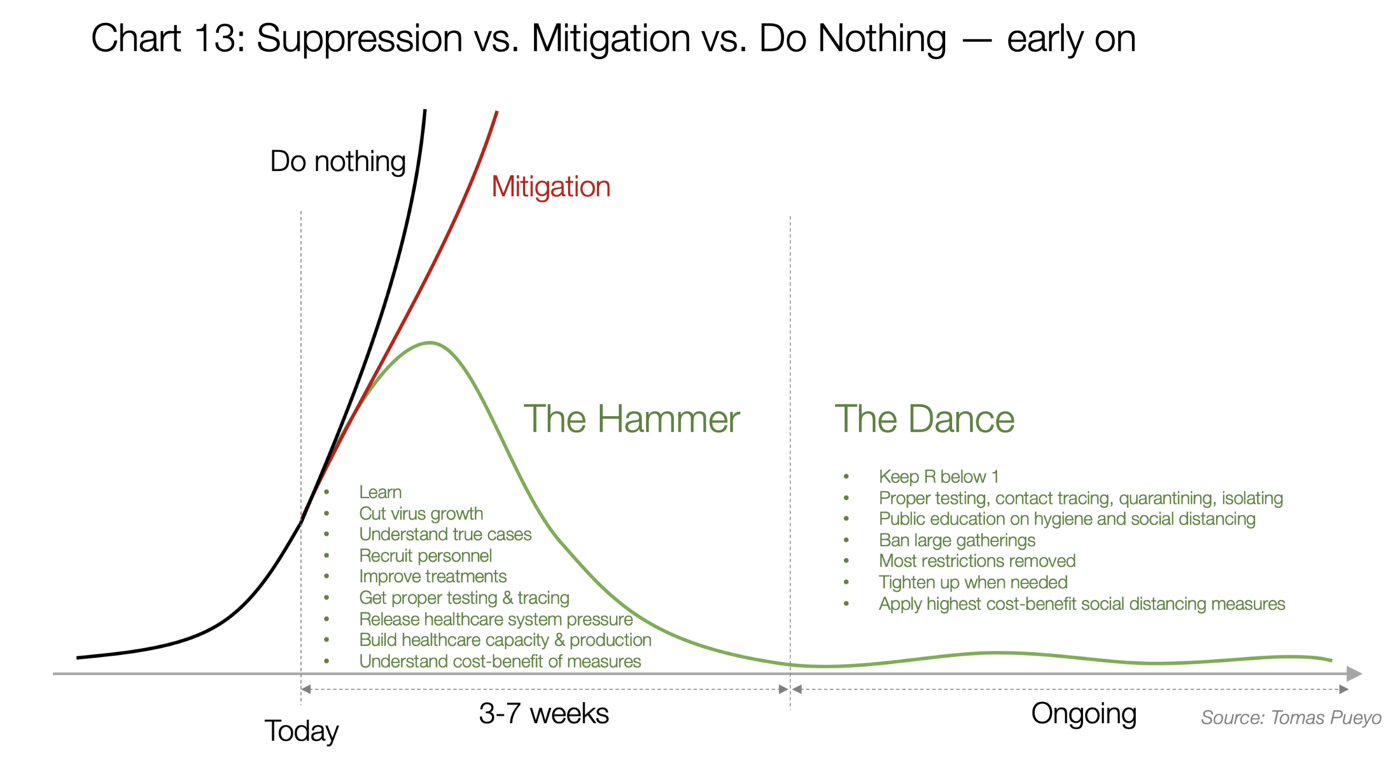
We are making the assumption that governments will eventually come to the same conclusion.
The Hammer is needed to get cases down to an acceptable level. Then the Dance begins where governments will need to adding capacity and mitigation strategies while gradually opening up.
South Korea has probably been the best example.
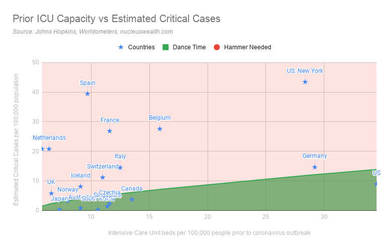
What level of hospitalisation can a country withstand?
So what level of hospitalisation is acceptable during the dance?
We are assuming that an acceptable level of hospitalisations is around 25% of existing beds or intensive care units. This accounts for regular patients and case clustering. So, the target needs to be considerably lower than the capacity.
We estimate:
- it takes about two weeks for patients to die.
- it takes four weeks for patients hospitalised to be released.
- about a quarter of hospitalisations need to be admitted to intensive care.
So new patients will need to be below 4% of capacity each day. As Intensive Care Unit beds are created and treatments become more effective this will improve.
There are two ways to look at whether a country needs the hammer or whether it can advance to the dance.
Hammer/Dance 1: Is the hospital system is overwhelmed?
We have used the capacity available prior to the coronavirus outbreak to assess this measure. While many countries are adding temporary capacity to deal with patients, these are emergency measures. If we are looking at an extended period before vaccines are available then coronavirus patients should take up only a relatively low proportion of a country’s intensive care beds:
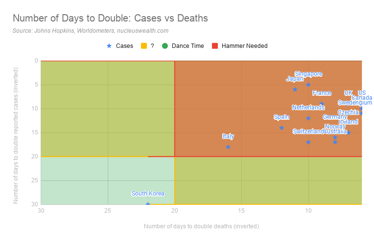
Hammer/Dance 2: How fast are cases and deaths growing?
The second is the speed of growth of cases and deaths. If cases are quickly growing then the hospital system will be overwhelmed, even if it is currently coping.
We use a target of 20 days to double cases/deaths. This is roughly the time for an Intensive Care Unit bed to become free either through a cure or death. For now, those levels are a reasonable target:
Is Winter an issue?
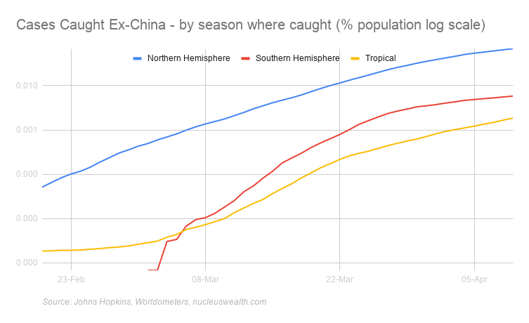
At the moment our base case is coronavirus is worse in winter but delayed or poor responses in tropical or summer countries can offset most of the benefit.
We split cases into:
- Northern Hemisphere Countries that are now in spring and are getting warmer
- Tropical countries: Countries near the equator where temperatures are relatively high all year
- Southern Hemisphere Countries now in autumn and are getting colder
In aggregate numbers the differences are still stark:
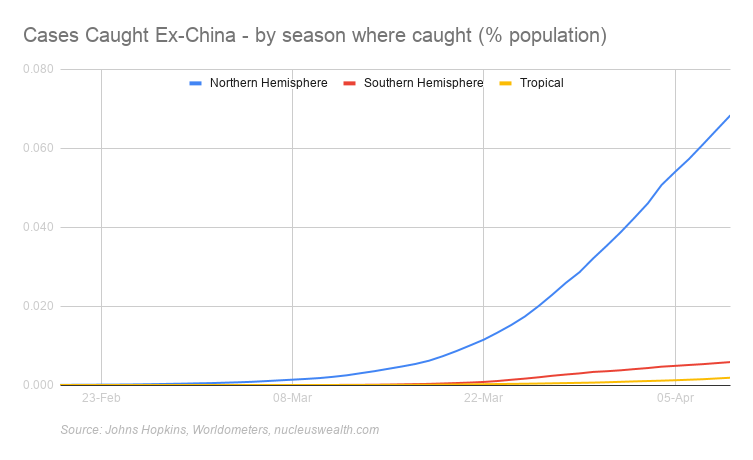
The COVID-19 statistics in these charts are based on where the case was caught. For example, as at 01-Mar two-thirds of the cases in Thailand were caught in China or Iran but diagnosed in Thailand. So, in that example, one-third of cases are allocated to Equatorial and two-thirds to Winter.
There are suggestions that UV-B radiation and vitamin D played a role in reducing deaths in the Spanish Flu pandemic. Other studies suggest humidity greatly reduces the aerosol transmission of viruses, but some suggest humidity increases the surface transmission. It is unknown how these affect COVID-19.
The below charts are the pessimistic take on the summer/winter divide. Cases are spreading just as quickly and tropical countries are sustaining significant outbreaks. Also, a number of large population tropical countries have poorer testing/reporting:
What can we forecast?
Viruses are complex systems, but virus models do have what we call emergent properties. The shape of the initial two curves above is an example - the shape is similar even if the scale and the timeline aren't. And these emergent properties are the factors that can be used.
The emergent properties from the models and data that we think important:
- Lockdowns work: If they don't slow the virus enough then stricter ones will. However, the consequence of not being harsh enough or delaying makes a massive difference to the outcome. i.e. calibrating the hammer
- Lockdowns = curve flattening: Lockdowns take about 10 days or so to take effect.
- Summer beats Winter: But complacency overwhelms any benefit
- Facemasks work: Countries with broad use doing better than those without.
- Opening up needs to be measured: too fast creates more cases. i.e. calibrating the dance
- It is all about the hospital system: Not overwhelming the hospital system is the key measure
Never miss an update
Enjoy this wire? Hit the ‘like’ button to let us know.
Stay up to date with my current content by
following me below and you’ll be notified every time I post a wire
Damien runs asset allocation and global stock portfolios for Nucleus Super, Nucleus Ethical and Nucleus Wealth. His 25 year+ career includes Global Quant at Schroders, Strategy at Wilson HTM & co-founder of Aegis.
........
The information on this blog contains general information and does not take into account your personal objectives, financial situation or needs. Past performance is not an indication of future performance. Damien Klassen is an authorised representative of Nucleus Wealth Management, a Corporate Authorised Representative of Nucleus Advice Pty Ltd - AFSL 515796.

1 topic

Damien runs asset allocation and global stock portfolios for Nucleus Super, Nucleus Ethical and Nucleus Wealth. His 25 year+ career includes Global Quant at Schroders, Strategy at Wilson HTM & co-founder of Aegis.
Expertise
Damien runs asset allocation and global stock portfolios for Nucleus Super, Nucleus Ethical and Nucleus Wealth. His 25 year+ career includes Global Quant at Schroders, Strategy at Wilson HTM & co-founder of Aegis.
Expertise
Comments
Comments
Sign In or Join Free to comment