How to spot the next big crisis

Morphic Asset Management
Morphic Asset Management
Humans tend to fear spectacular, but unlikely events. This is the proposition that Bruce Schneir makes in his book “Beyond Fear”. For example, European tourism has been significantly impacted by much talked about terrorist attacks despite the extremely low probabilities of something occurring to any individual. With the anniversary of October 1987 recently, it was remarked that “the week after the crash people started worrying about a crash”. The more recent an event’s occurrence is to you, the more likely you are to think that event is going to happen (when in fact it’s actually a lot less likely).
UNDERESTIMATING RISKS
What does this look like? Overall we tend to underestimate threats that creep up on us. Humans are ill-prepared to deal with risks that don’t produce immediate negative consequences, like eating a cupcake or smoking cigarettes. For example, surveys show more people fear dying from cancer than they fear heart disease.
As markets push on globally to new highs and talk of bubbles emerges, I thought it would be timely to take a look back at the last century to see what the world looked like when markets were making all-time highs before a big correction.
In the below table (Figure 1), we identify seven major highs in the US S&P 500 stock market. The criteria for identifying a “major high” was twofold:
1. the market was making highs; and
2. it was followed by a market fall of at least 25% in the following 18 months. Why 25%? Because falls of 15-20% are relatively common in a bull market. The ongoing bull market since 2009 has already had two of these episodes.
The first thing that should strike a reader is how rare these events are: seven times in 90 years so roughly every 12 years. So in one’s investing life (~40 years), there should be on average 3 “events”. For all the talk of fearing crashes every year, one should not bank on them too often – meaning the old saying “time in the market is more important than timing the market” has a ring of truth to it.
Importantly though, note that they are not evenly spread at 12-year intervals as we observe a clustering around the 1960s and the early 2000s. For whatever reason, these events have tended to “clump”.
FIGURE 1 – MARKET HIGHS USING OUR TWOFOLD CRITERIA
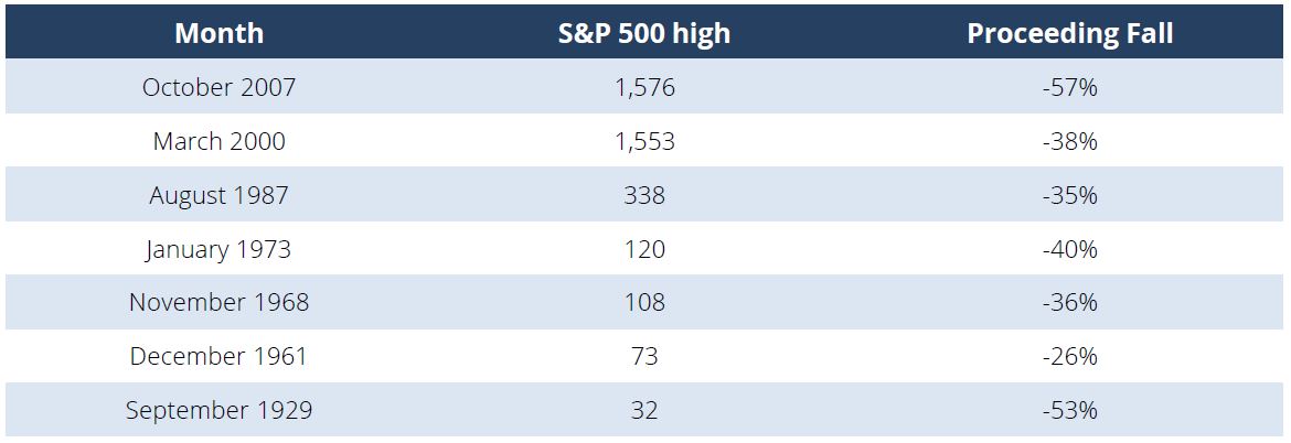
Source:Bloomberg, Team Analysis
DELVING INTO THE DATA
I then looked into a selection of market and macroeconomic data points to see what they were indicating at these market tops (Figure 2). Some statistics include:
- the level of unemployment;
- the Purchasing Managers’ Index (PMI) levels, which are surveys quantifying manufacturers order books;
- consumer surveys to gauge their optimism;
- and the Federal Reserve’s level of interest rate and perhaps more importantly how much had it changed coming into the high.
The first thing to note, which is to be expected, is there is not one consistent signal across all the outcomes. I say if there was consistency, markets would already be using the indicator! But a few pertinent points do jump out:
- stock market highs before a crash have occurred two thirds of the time when unemployment was below 5%;
- in most cases, the Fed has been hiking;
- consumer expectations have been elevated but falling;
- and PMI surveys of future expectations have been mixed.
However, the last two market highs were made with confidence starting to wane, while for prior occurrences it was strong and strengthening.
FIGURE 2 – ECONOMIC DATA AT THE HIGHS
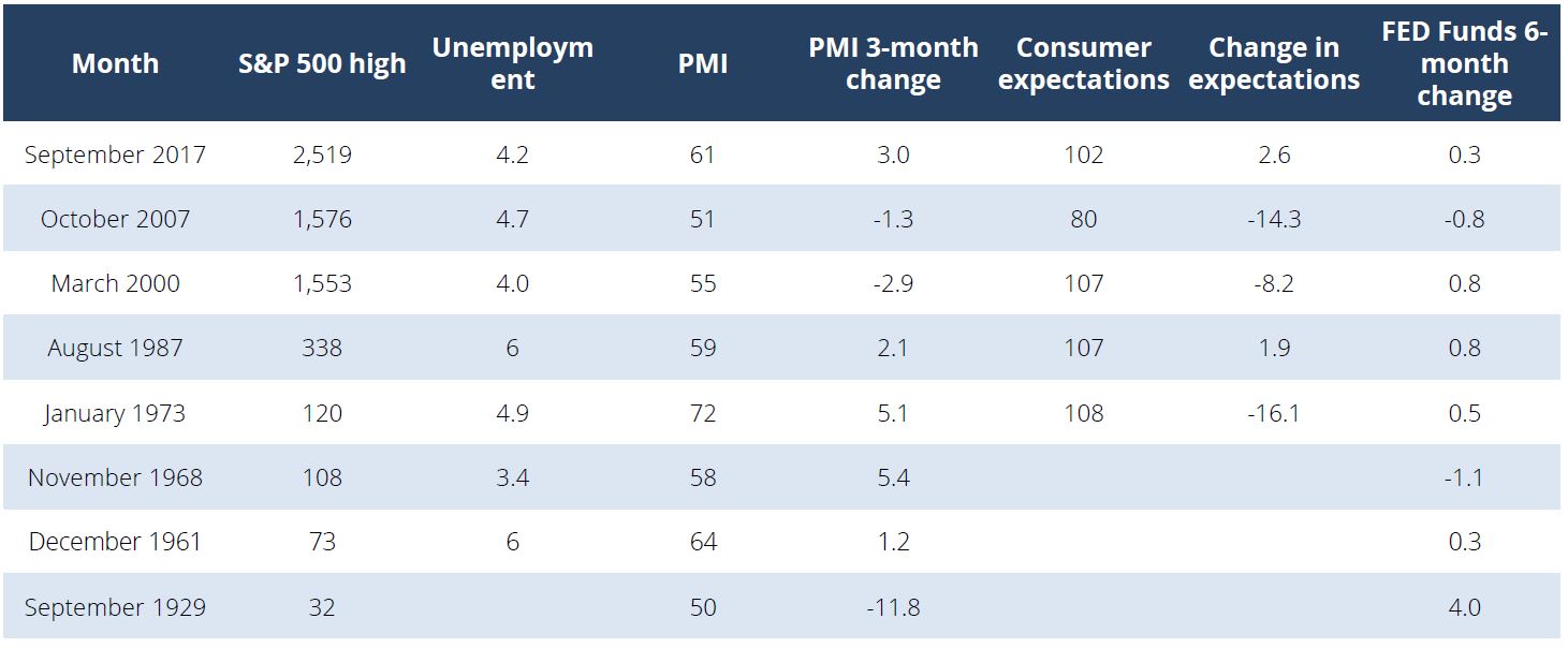
Source: Bloomberg, Team Analysis
VALUATIONS AND MARKET DYNAMICS
S&P valuations have had a wide range from 10 to 25x price/earnings (P/E) over the last century, reflective of the wide range of deflation, inflation, reflation and stagflation that markets have lived through.
We find that market tops in the S&P have tended to occur when the market was expensive – but not eye wateringly so – at around 20x. The 2000 dot com top was an exception with the market trading closer to 30x.
In most cases, P/E’s are expanding into market tops, which is a sign of continued confidence about the future (Figure 3).
FIGURE 3 – VALUATIONS AT HIGHS
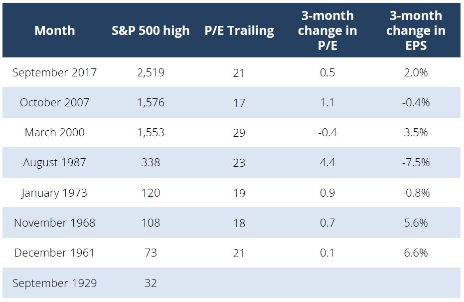
Source: Bloomberg, Team Analysis
WHAT DOES THE RUN-UP TO A PEAK LOOK LIKE?
Are stocks losing or gaining momentum into the peak?
Figure 4 looks at the path coming into the peak. Prices have generally risen 20% or more in the 18 months preceding the high and are 30% above any lows in that same period. The range can vary hugely with “blow-off” moves off 48% in 1987.
Breadth measures how many stocks in the S&P 500 are making 52-week highs. A strong market is driven by many areas. For the different dates studied here, there are mixed messages as the 1987 high was across the board, while the 2007 high was only driven by a small number of areas. It seems to us that the overriding factor/indicator is either low breadth or narrowing breadth.
The Relative Strength Index (RSI) in Figure 4 measures the consistency of buying and a figure over “70” is largely seen as overbought or overvalued. All market highs involved the monthly RSI being around or above the widely sighted 70 figures, signaling consistent strong buying over an extended period.
FIGURE 4 – MARKET DYNAMICS AT THE HIGHS
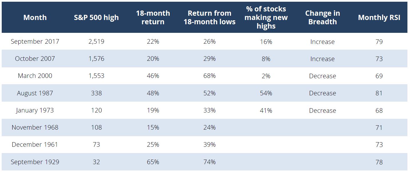
Source: Bloomberg, Team Analysis
HOW ABOUT OTHER ASSET CLASSES?
Lastly, I thought it would be instructive to look at how other asset classes were performing into the equity market top. If something is going wrong with liquidity or the economy, these assets should be reacting as well (Figure 5).
The bond market is generally seen as a better identifier of recession risks than stock markets and as such, it typically starts to price the central bank cutting rates in advance forcing the yield curve to flatten. The yield spread between the two-year and ten-year yields in a healthy market is typically around 100bps but going into the last two corrections was significantly lower.
Credit markets are also worth watching as again there is a view that credit “fails” before equities. My examination shows this is indeed the case: in the last few cases, spreads have been widening while the market went into a top because of the credit market prices increasing default risks.
FIGURE 5 – OTHER ASSET CLASSES AT A STOCK MARKET PEAK
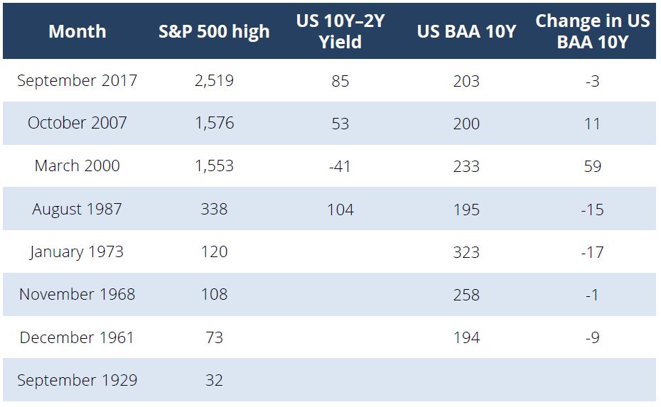
Source: Bloomberg, Team Analysis
SUMMARY
So back to the original question. What does underestimating risk look like?
The highest risk points for investors, with the benefit of hindsight, was when there appeared little left to worry about. Unemployment was low; consumers were confident; and investors were willing buyers of equities month after month, driving big market moves upwards into the end. I would speculate that during these periods, the “fear” became more about “fear of missing the rally” rather than avoiding a crash.
On the flip side, when everyone is talking about risks such as Europe imploding or North Korea firing missiles, this may just be the time to buy.
One last thing to bring to the reader’s attention is the risk of “false positives”. We only know in hindsight what the tops were. The data can also be consistent with outcomes where a market top doesn’t take place. The most recent example of this was just last year: credit spreads widened, driven by falling oil prices; PMI surveys fell below 50 (indicating a contraction); and the market dropped more than 15% at one point. Yet the data reversed and the market rebounded to new highs. The market is not designed to be easy…
Taken all together, the analysis supports what we have written before: this bull market is moving to the late stages but these indicators I have analysed do not indicate a market top is imminent yet.
As the market continues its grind higher, we will be aiming to stay alert to market complacency and a change in these indicators.
For further insights from Morphic Asset Management, please visit our website
Never miss an update
Enjoy this wire? Hit the ‘like’ button to let us know.
Stay up to date with my current content by
following me below and you’ll be notified every time I post a wire
Morphic is a Sydney-based investment manager that has a strong record for delivering high risk-adjusted returns from investing in global equities in a way that doesn’t harm the environment, society or people.

1 stock mentioned
Morphic Asset Management
Morphic Asset Management
Morphic is a Sydney-based investment manager that has a strong record for delivering high risk-adjusted returns from investing in global equities in a way that doesn’t harm the environment, society or people.
Expertise
Morphic Asset Management
Morphic Asset Management
Morphic is a Sydney-based investment manager that has a strong record for delivering high risk-adjusted returns from investing in global equities in a way that doesn’t harm the environment, society or people.
Expertise
Comments
Comments
Sign In or Join Free to comment