Is the Global COVID-19 Infection Curve Peaking?
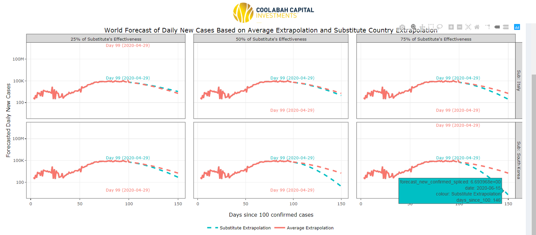
We now look to be passing through the current peak of global infections for the coronavirus induced COVID-19 disease according to our live data-tracking systems and forecasting models. The screen-shot below shows our proprietary forecasts for the world, which as you can see are all signalling a peak on April 29 (ie, right now). Click on the image to see a higher resolution version.
In March we projected peaks for the US, Australia, the UK and many European countries in early April, which materialised as expected months ahead of when the health experts and epidemiologists were advising governments we would see the peak in new infections. This triggered a significant rally in financial markets in April, which we actively positioned our portfolios to capitalise by aggressively buying assets in March.
Readers might recall that we hypothesised that investors faced two key future regime changes: first, the passing through peak infections, which we forecast would precipitate more favourable market sentiment; and, secondly, a much more rapid than expected exit from lockdowns and normalisation of activity, which is just starting to happen right now. (We argued in March that the prime minister would be forced to ditch his six month business hibernation strategy for an early and graduated exit from containment, which now appears slated for May.)
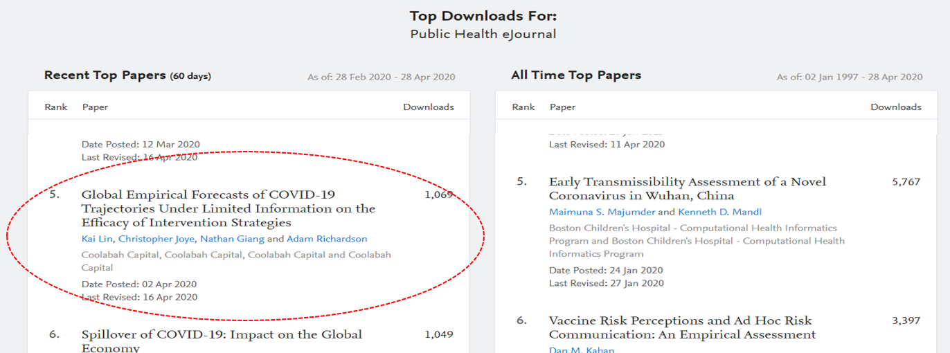
This is, in fact, why we went to great lengths to build real-time infection/fatality tracking systems and a proprietary forecasting framework in the first place: we expected markets to be extremely sensitive to unanticipated changes in the infection trajectory. The paper that summarises our forecasting model is now the the fifth most downloaded public health research paper in the world, according to the SSRN academic publishing site.
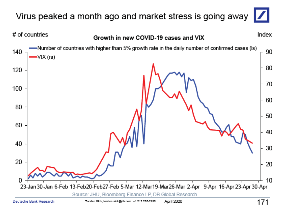
In this context, Deutsche Bank's Torsten Slok has published a useful chart today showing the relationship between new infections in the US and the VIX Index, which proxies equity market volatility. It tells the same story that we had outlined in March.
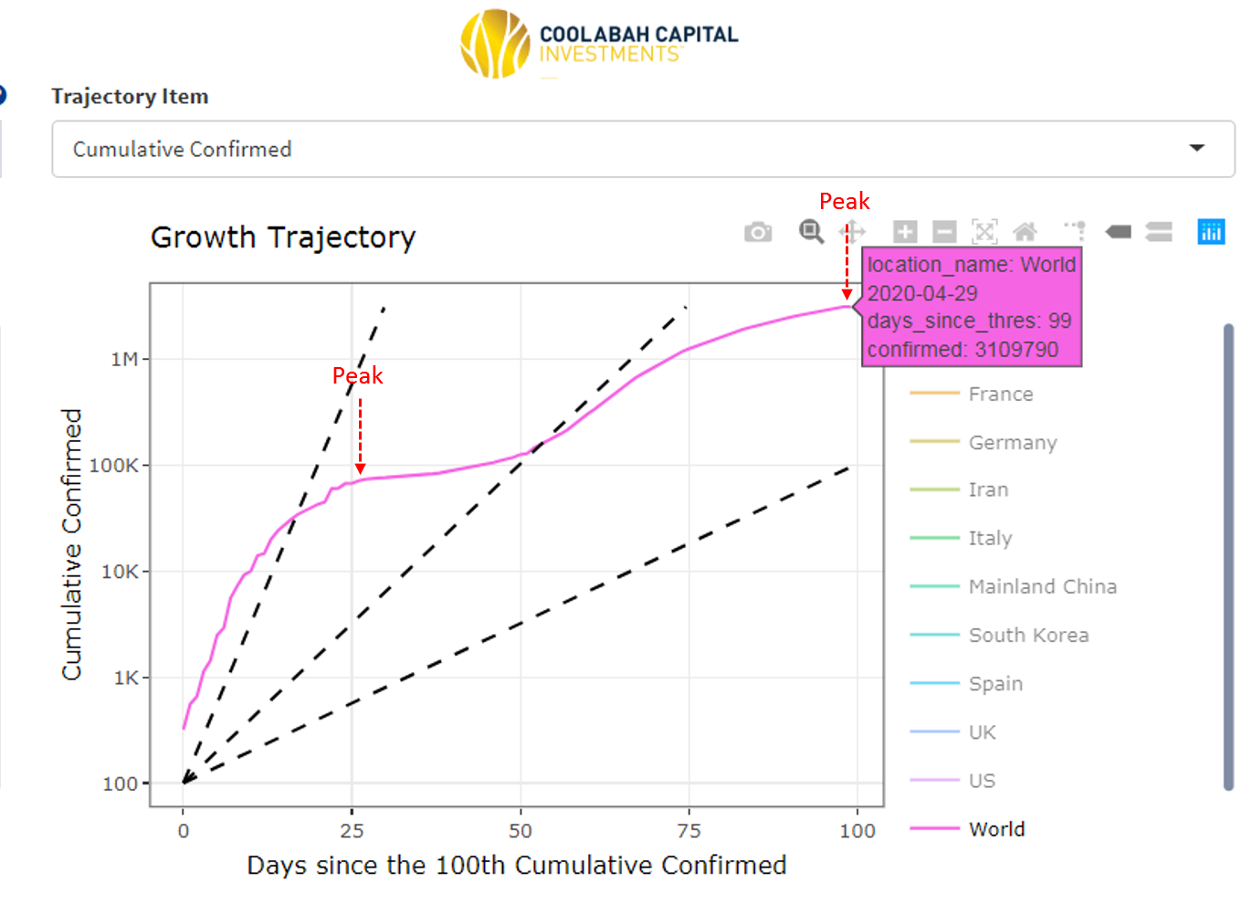
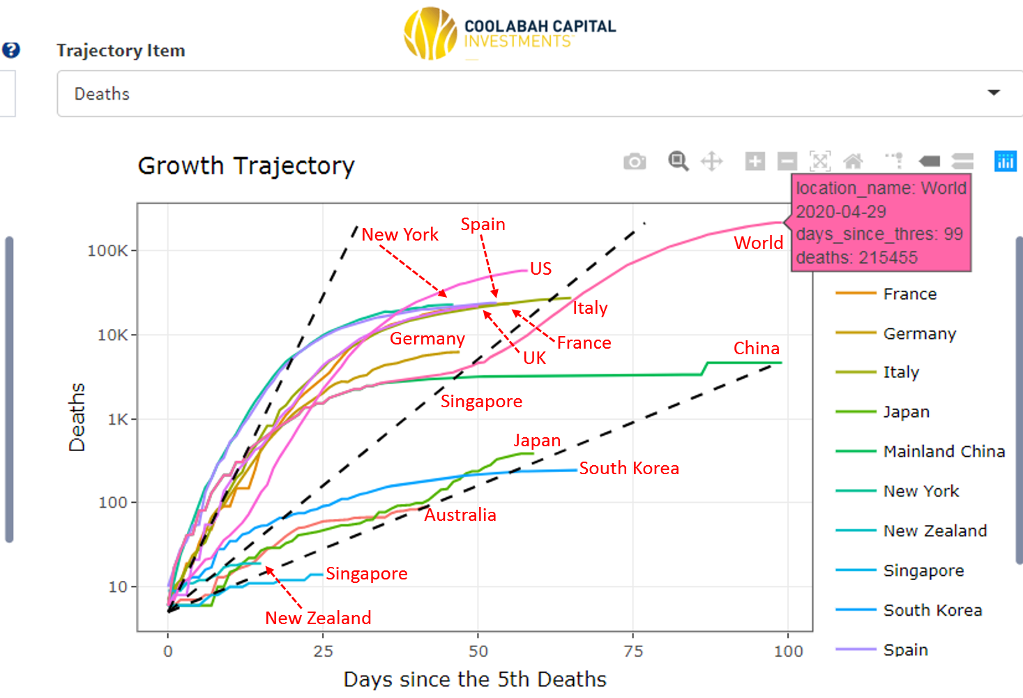
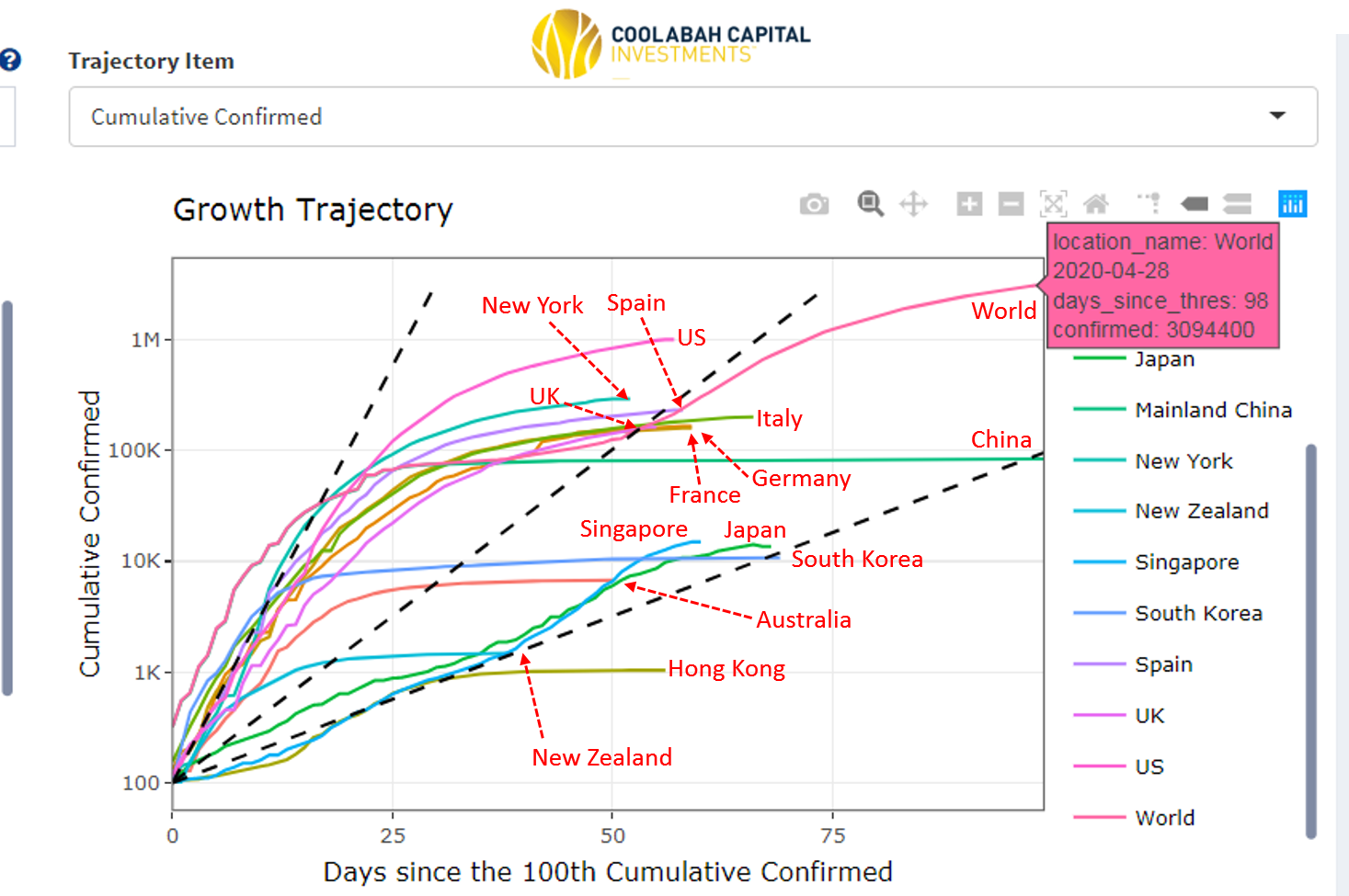
The challenge with a forecast for global COVID-19 infections is that the curve is likely to be multi-modal with several potential peaks. If you examine our next screen-shot, you can see that the infection curve for the world has already peaked twice, including the current flattening phase. This is because the virus has propagated around the world over time with new outbreaks in major regions, such as South Korea, followed by Italy, Europe, the US and so on. It is, therefore, entirely possible that we will see another new global peak at some point in the future as the virus spreads through, say, India, Africa, and South America. Our final two screen-shots show the current death and fatality curves for key countries around the world, which are flattening fast. Australia has done especially well and is only behind New Zealand and Hong Kong in terms of the efficacy of our containment strategy amongst major economies...
2 topics

