Weekly S&P 500 #ChartStorm - 20 Nov 2016
Those that follow my personal account on Twitter (VIEW LINK) will be familiar with my weekly S&P 500 #ChartStorm in which I pick out 10 charts on the S&P 500 to tweet. Typically I'll pick a couple of themes and hammer them home with the charts, but sometimes it's just a selection of charts that will add to your perspective and help inform your own view - whether its bearish, bullish, or something else!
The purpose of this note is to add some extra context beyond the 140 characters of Twitter. It's worth noting that the aim of the #ChartStorm isn't necessarily to arrive at a certain view but to highlight charts and themes worth paying attention to.
So here's the another S&P 500 #ChartStorm write-up
1. Fear & Greed Index: The CNN Money Fear and Greed Index (VIEW LINK) made a remarkable turnaround from the lows it reached during the election period. For me two things stick out: 1. The rapid snapback from fear to greed - a powerful thrust for the market and rapid transformation of mood; and 2. How there's still room for upside in this indicator. So in my view, the spike in greed represents growing momentum in the market that could have further to run.
Bottom line: The Fear & Greed Index switched instantly back to greed, showing the bullish momentum in the market.
[SPXCS2011-1.PNG]
2. Bonds vs Equities breakout: This chart from Sentix (VIEW LINK) particularly interesting as it shows a powerful breakout in the relative performance of equities vs bonds - it's not just good stock market performance, it's also bad bond market performance, which when you think about the drivers is entirely internally consistent. The sentiment differential looks kind of stretched but it usually does surge like that during big moves, and is not necessarily a hurdle or a contrarian signal at this point, rather it shows the thrust in market momentum.
Bottom line: The equities vs bonds breakout has been remarkable and could have further to run.
[SPXCS2011-2.PNG]
3. Fund manager allocations: The latest BAML Fund Manager Survey shows asset allocators are dipping their toe back into US equities. There has been quite a bit of um'ing and ah'ing about US equity allocations following an extended period of underweights (as investors had been off chasing returns in Europe and Japan), but slowly they're coming back, and if and when they do, that marginal flow could be something to drive the market higher. But a common complaint is that US equities are richly valued - so the fundamental story will probably need to continue to firm up (i.e. justification of higher valuations) in order to attract global asset allocators back in.
Bottom line: Fund managers have moved to a small overweight on US equities after an extended period of underweights.
[SPXCS2011-3.PNG]
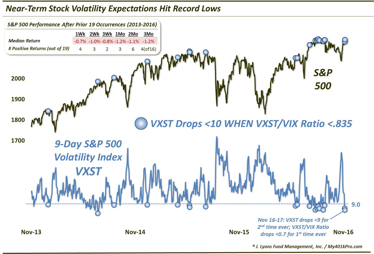
4. VXST indicator: This chart from Dana Lyons (who has a much more extensive writeup on it here (VIEW LINK) ) shows the $VXST or the "Short Term VIX" heading back to the lows, and on the chart he also pairs it with a curve indicator (VXST vs VIX) which shows basically that the S&P500 is back in the complacent zone. While complacency alone is not enough to break the market, it is something to be wary of if you're concerned about short-term gyrations as it's the type of conditions that show up around short-term highs. So it's not a show-stopper but something to be mindful of.
Bottom line: The VXST indicator is in the complacent zone.
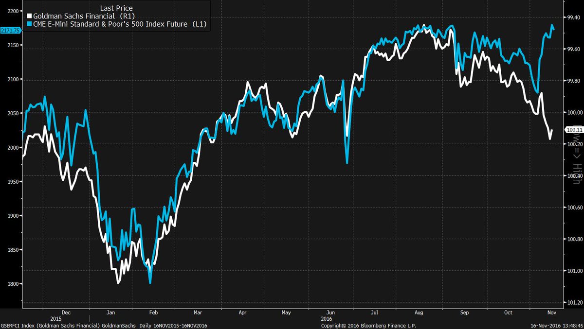
5. Financial conditions: Joe Weisenthal (VIEW LINK) of Bloomberg shows an interesting if dire divergence between the S&P500 and the Goldman Sachs Financial Conditions Index. The Financial conditions index has turned down - as you would expect given the surge in the US dollar, and rip higher in bond yields and bond volatility.... which stand at odds with solid performance in the equity factors. So yes, while the financial conditions index does include equity variables, an important point is that if the bond market factor tightening and currency factor tightening extend much further it will almost certainly show up in the equity market factors. So, while I said before that the equity strength and bond weaknesses is internally consistent, if it goes too far the divergence will become self-limiting.
Bottom line: Equities are diverging from financial conditions, time will tell if this is sustainable.
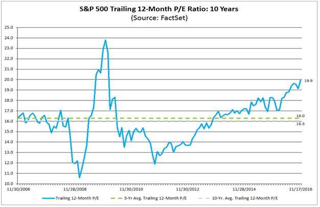
6. Trailing PE ratio: The latest insight piece from FactSet (VIEW LINK) on US corporate earnings shows the trailing 12-month P/E ratio for the S&P 500 at a post-crisis high of 19.9. Valuation is an indicator that becomes useful only at extremes. When it reaches extreme lows it can help build the confidence to buy in a bear market or a crash, and when it reaches extreme highs it can be an important element along side technical indicators in getting out around the top. It's important to note that the trailing PE ratio can be heavily distorted e.g. as it was coming out of the crisis - giving "overvaluation" signals when the market is really actually not expensive, simply because earnings are temporarily depressed. There could be some element of this effect playing through at the moment given the recent earnings recession we've just seen for the S&P500, so while it's something to keep an eye on, it may not necessarily be the warning light it appears to be.
Bottom line: Trailing 12-month PE for all its faults it registering at multi-year highs for the SPX.
7. Looking at leverage: This chart (VIEW LINK) by Goldman's shows the median net-leverage ratio (net debt to EBITDA) of S&P 500 companies... which appears to be at alarmingly high levels. Again this is something that an earnings recession can distort - because obviously if the level of EBITDA is temporarily lower than usual it will overstate any ratio that compares something that either stayed constant or rose. Does that mean it's something to ignore? Not necessarily, it is one piece of information, and if EBITDA ends up being permanently lower then it will be an issue. Of course the flipside or glass-half-full argument is that if things pickup then higher leverage means shareholders will see a disproportionate benefit.
Bottom line: The median net leverage ratio of the S&P500 is close to all-time highs.
[SPXCS2011-7.PNG]
8. Stock market seasonality: The Topdown Charts seasonality tracker (VIEW LINK) has showed the 2016 experience tracking remarkably close to its historical seasonal pattern. The only real major deviations were the global panic in February, the Brexit outcome in June, and more recently the US election. But interestingly, while it's "headed in the right direction" at the moment it is lagging slightly behind its historical tendency. So if you're glass is half empty this is a sign of bad health, but the glass half full argument is that we could be in for a considerable year-end rally.
Bottom line: The market is slightly lagging its seasonal pattern after tracking fairly closely for most of the year.
[SPXCS2011-8.PNG]
9. The presidential cycle: Tom McClellan (VIEW LINK) shows an interesting chart of the presidential cycle (how the market behaves across presidential terms) - and in particular splits out the performance during Republican and Democrat presidencies. While there appears to be some differentiation in performance between the two parties, the overall trend is broadly the same. The first year is mixed to slightly positive, the second year is generally lackluster, and the third year tends to be the best (followed by the election year). So will it be different under Trump? The consensus so far seems to be that Trumpnomics may put at least a short-term booster under growth - but I guess it could still take time to implement the policy and for it to transmit, so there's still a bit of wait and see around that. In the mean time, the chart provides a useful reference for what to expect on average.
Bottom line: The presidential cycle suggest lackluster returns in the first two years of office.
[SPXCS2011-9.PNG]
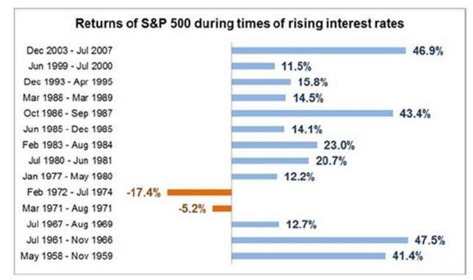
10. SPX during times of rising interest rates: This chart by ESO Capital, which appeared in a webcast (VIEW LINK) by DoubleLine's Gundlach, shows how the S&P500 fared during times of rising interest rates. The first point to note is that, yes, rising interest rates are not inherently bad for the market because they typically reflect improving economic conditions which will translate through to improving earnings. The trouble is where interest rates rise too fast or as in the 70's when rates rise because prices are rising too fast. So about that December rate hike - at this point it's probably not something to be overly concerned about...
Bottom line: Historically the S&P500 has seen positive performance during times of rising interest rates.
So where does all this leave us?
This week there's probably 3 themes:
1. Bullish momentum
The first two charts showing the swift shift from fear to greed and the extremes in sentiment on equities vs bonds goes to show the strong bullish momentum that has taken hold of the market. Both charts would seem to suggest that there is further room for it to run.
2. Bearish hues
A number of charts in this week's edition had a more bearish hue to them, for example the complacency seen in the VXST, the bearish looking divergence vs the financial conditions index, high valuations on the trailing PE ratio, and almost record high leverage ratios. Certainly, these are all things to keep an eye on, and are not necessarily something to be dismissed, and if the current rally goes much further these factors could come home to roost.
3. Lessons from history
A couple of charts in the lessons from history category; seasonality suggests a bullish short-term outlook, while the presidential cycle suggests two years of mixed returns before seeing the strongest year of the cycle, and a reminder that returns have historically tended to be positive during rising interest rate environments. Taken together it would be short-term positive, medium term mixed but likely positive (assuming interest rates do rise!).
Summary
The charts this week showed powerful bullish momentum in the market, but also sounded a few cautionary tones with some charts that displayed a more bearish hue. The lessons from history chart gave cause for short-term optimism at least on the seasonality front. Overall, the market will most likely see a short-term correction at some point soon, but there remains considerable bullish momentum.
See also: Weekly S&P500 #ChartStorm - 13 Nov 2016 (VIEW LINK)
1 topic


