What US inflation means for your portfolio
The US inflation print, out overnight, continues to have something for everyone.
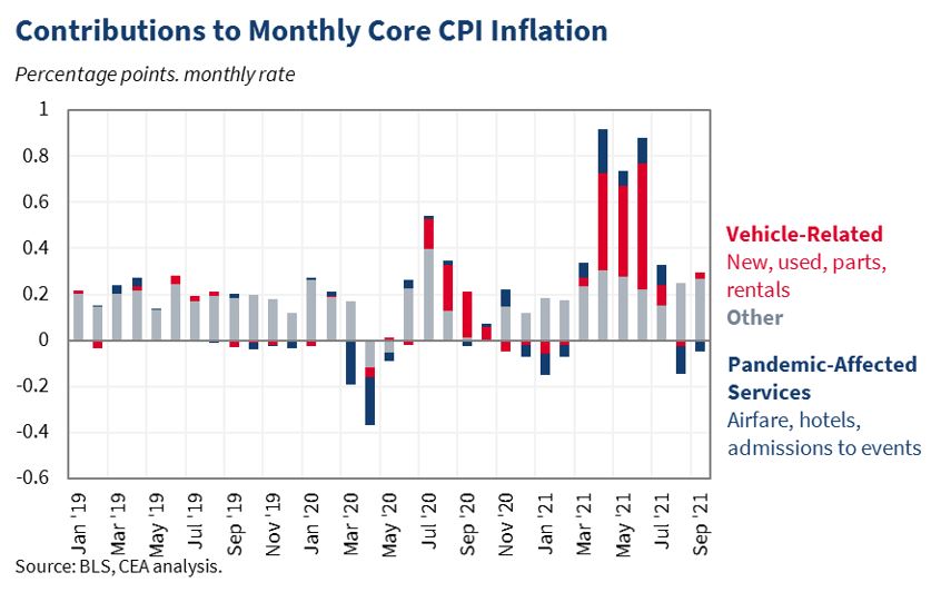
Here’s our favourite graph, produced by the Council of Economic Advisors (CEA), which shows the narrow, but very material, contribution to inflation from auto-related supply chain issues. New and used cars, are a tiny percentage of the overall basket, but with mammoth moves.
Either things sort themselves out, in those supply chains, or they don’t, but ongoing price increases don’t seem likely (as eventually the higher prices settle at some new equilibrium of lower demand, and cease to drive inflation).

The small decline in airfare, hotels, and leisure more broadly, will likewise normalise, and add some modest degree of upside pressure, as COVID case rates continue to decline.
That’s the sort of stuff that makes us think “transitory”.
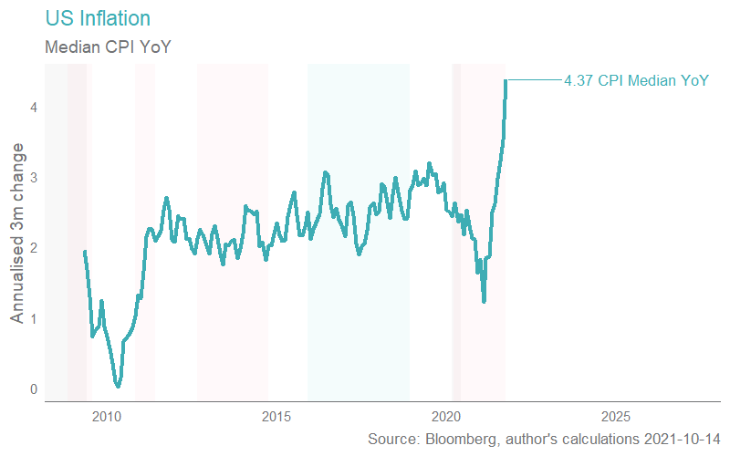
However, the median CPI, and the “trimmed mean” CPI are both showing a more meaningful acceleration, shown below as the annualised 3 month change.

Couple this with the recent back-to-back miss on non-farm payrolls (NFP are employment data, changes in the number of people with jobs) and you’ve got an argument that says “we are at capacity, and demand is pushing up against this supply side constraint”.
To flesh that out a little further, note that the number of job vacancies is very high (the equivalent of “help wanted” signs hanging in every shop) but the number of people accepting those jobs is comparatively low, leading to small NFP gains.
We can also note that the generous US unemployment benefits ended a little while ago, and if “being paid to stay home” was something that decreased the supply of labour, then its expiry should increase it, if it was a constraint in the first place. As such, you can make a credible argument that there’s a labour supply shortage, at the prevailing wage rate.
Ergo, bring forward the taper, and the subsequent normalisation of rates timetable.
That, as we’ve written previously about, should mean higher real rates, a higher USD, downwards pressure on equity prices, but most especially long duration growth stocks (which are typically found in healthcare and tech) and rate sensitives (in this case infrastructure, utilities, REITs, and transport).
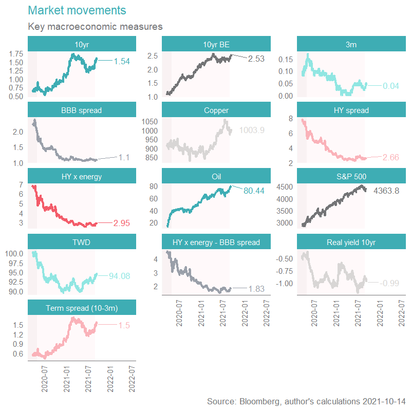
Overnight, however, the USD fell, and long dated bond yields actually fell. How to make sense of this?

Well, markets are very forward looking, and a plausible case can be made for a market view akin to the-economy-can’t-handle-higher-rates-and-historically-the-Fed-overtightens-in-response-to-inflation-which-lowers-growth-expectations. That chain of thought leads to higher shorter dated yields and lower longer dated bonds yields (called yield curve twists).
For 30 years, the Fed has prioritised inflation stability over employment, and as such the view above is a very reasonable one to form.
In our view, the Fed knows what it is doing. We think the economy is strong enough (ex COVID) to warrant higher rates, and that should push up the entire term structure of interest rates, and, by implication, not lead to an acute flattening of the curve. That’s a bit like aiming for goldilocks: not too hot, not too cold.
As such, we continue to position for the first view (the higher USD, higher longer dated yields, weaker long duration plays). We likewise continue to think that inflation is likely to ultimately prove well contained (the Fed is much better at constraining inflation than it is from offsetting deflation). However, if we are wrong, our sizeable exposure to energy (typically a more reliable inflation hedge than gold) should provide us with adequate insulation.
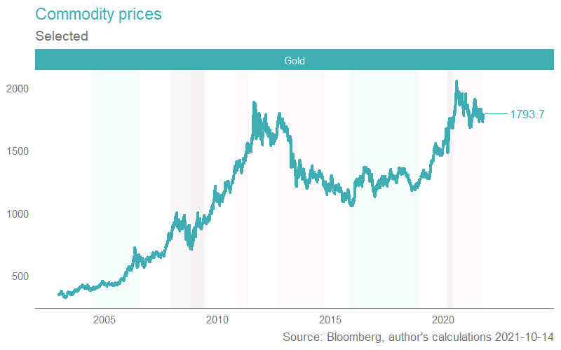
Note that gold is about a divisive a topic as you get on Livewire (up there with TSLA notes). To our mind, golds’ fairly modest pricing action in the face of the largest inflationary pressure we’ve seen in decades is fairly conclusive, but, there are some gold producers that have attractive economics.
Note also the graph below, for those interested in gold, which depicts the performance of gold prices over various time periods (grey bars are recessions, pink bars are the various forms of QE, and teal bars reflect rate rising environments). You can see the price of gold has tended to fall during periods of QE.

1 topic

