Capital cities, British purchasing power and dwindling US savings
.png)
This week’s charts begin with a visualisation of how countries dominated by their capital city (the UK and France) compare to more regionally balanced economies like Germany and the US. Turning to the American consumer, we show how the stock of pandemic-era savings has dwindled and people are increasingly running up their credit-card balances. In Europe, the economy might have avoided recession, but the leading indicators are gloomy; in Britain, real wage increases have started to outpace inflation. And we conclude with a chart on China’s shrinking exports.
Major economies dominated (or not) by their capital cities
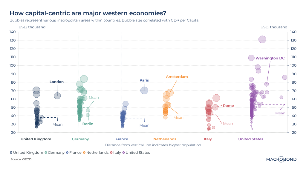
How different are capital cities from the nations they govern? This visualisation aims to track geographic economic dispersion in five major economies.
Major urban centres are placed on the Y axis according to their GDP per capita (which is also reflected in the bubble size). The larger an urban area is, the further right it is on the X axis.
Paris and London stand out as by far the largest cities in their countries. The French capital also dominates the rest when it comes to GDP. But Britons may be surprised to learn that there are a few cities with higher economic activity per capita than London. (Fast-growing Milton Keynes, home to head offices and manufacturing plants, tops the ranks.)
Germany is notable for the relative economic weakness of its capital. Though Berlin's tech scene and real estate have boomed in the two decades since its former mayor called the city "poor but sexy," its per capita GDP remains well under the national mean.
The US is a truly decentralised economy when compared to the Europeans: it has by far the biggest dispersion in both incomes and city size. Metropolitan Washington, DC, home to defense companies and well-paid government workers, is well above the national mean – but several areas are considerably richer when measured by the per-capita-GDP metric.
Americans’ pandemic-era savings dwindle
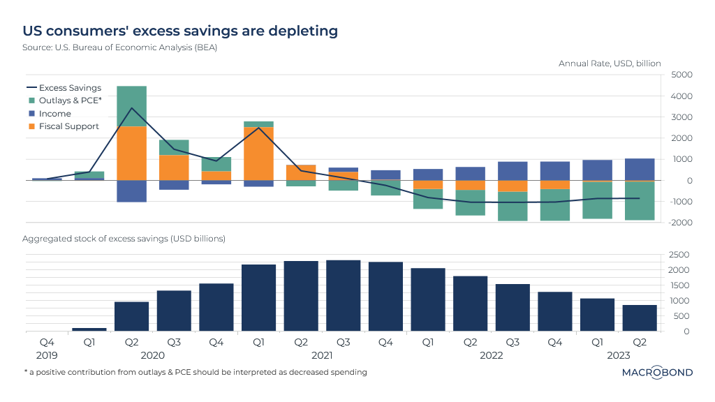
US households built a substantial stock of excess savings during the pandemic. Inflation and higher interest rates are rapidly depleting that stockpile.
This chart tracks savings trends pre- and post-pandemic, with the top pane breaking down different contributory factors. The government’s massive fiscal support, in orange, was key, more than offsetting falling income (in dark blue). “Outlays and personal consumption expenditure,” in green, is another important but somewhat idiosyncratic category: in normal times, it’s a drag on savings, but it entered positive territory in 2020 as people slashed their spending.
As the second pane shows, at the 2021 peak, excess savings represented more than USD 2.3 trillion. The savings stockpile is down more than 60 percent since then.
Today, while incomes are rising, PCE is a significant drag – and Americans are making up the difference by running down their savings.
US credit-card arrears hit pre-pandemic levels
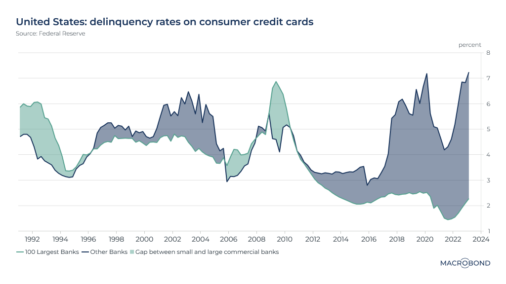
While running down their savings, more Americans are also running up unsustainable credit-card debt – especially with cards issued by aggressive regional banks.
This chart tracks delinquency rates on consumer credit cards, making a distinction between cards issued by the 100 largest US banks (in green) and the rest (in blue).
The global financial crisis appears to have changed big banks’ risk tolerance in this segment. Post-2010, the top 100 maintained a historically low delinquency rate – below 3 percent.
For the small banks, delinquencies hit a record high, surpassing 7.2 percent in the first quarter.
The much lower delinquency levels seen during the worst of the pandemic were likely the result of that excess savings cushion from our previous chart.
Intra-year S&P 500 volatility through history
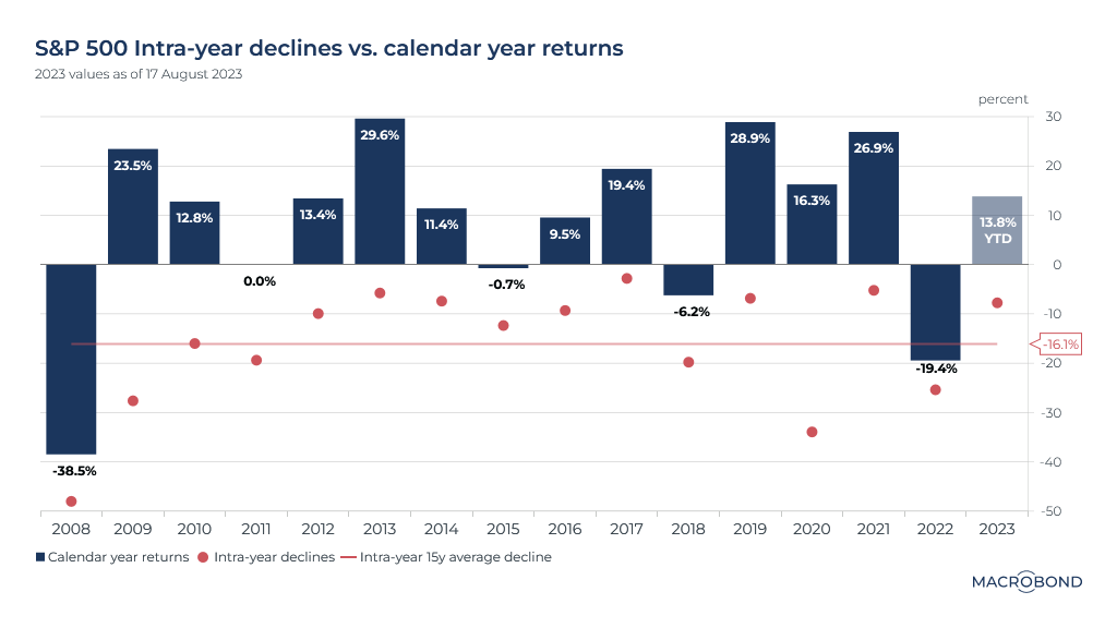
The chart above displays the S&P 500’s calendar-year returns, alongside the low point – or maximum intra-year decline – for each of those years.
Except for 2008 and 2022, stocks had a tendency to rebound from the point of maximum pessimism. Returns were positive in 12 out of 15 years.
Gloomy leading indicators in Europe
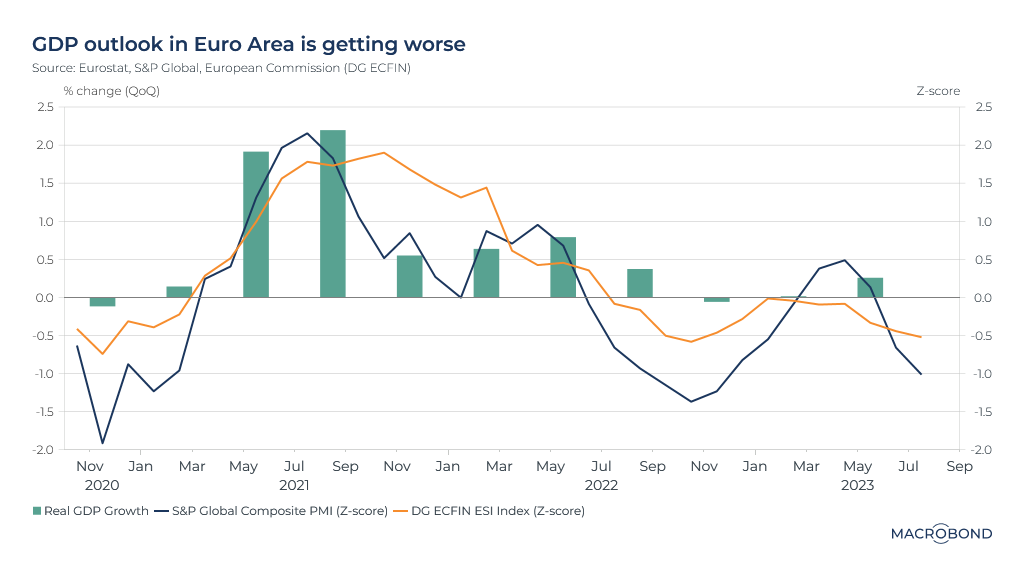
On August 16, Eurostat released updated figures for GDP in the eurozone. The positive news: the region avoided a technical recession in the first quarter, thanks to growth of 0.01 percent quarter-on-quarter. Second-quarter growth was 0.25 percent.
However, data points with a track record of being leading indicators are looking more negative for the eurozone – particularly S&P Global’s composite purchasing managers index (measuring sentiment at manufacturing and services companies) and the Economic Sentiment Indicator (ESI), published by an arm of the European Commission.
This visualisation charts quarter-on-quarter real GDP growth rates against the normalised trends for composite PMI and ESI. The past correlation is bearish for economic growth.
A positive-purchasing-power era for British workers?
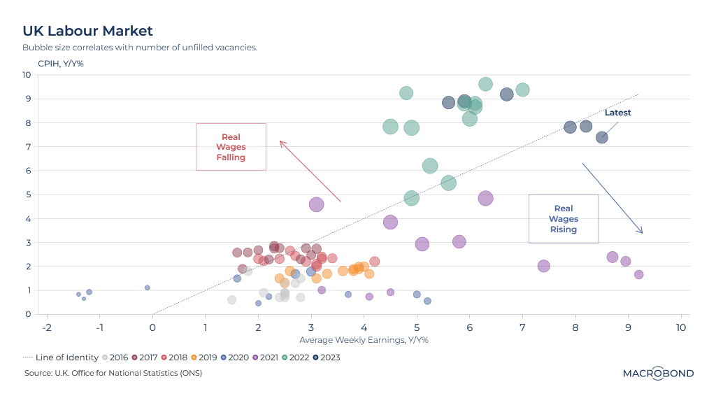
This visualisation tracks the UK labour market since 2016 in “3D” – enabling us to not only see when workers were beating inflation or not, but when the job market was in a low- or high-vacancy era.
The X axis assesses year-on-year percentage change in average weekly earnings, while the Y axis measures inflation*. The diagonal line, therefore, divides months that saw workers make real wage gains from periods when any gains were more than offset by the cost of living.
Finally, the bubbles are colour-coded by year – and their size reflects the level of unfilled job vacancies.
The extraordinary effects of the pandemic are clearly visible, as is the 2016-19 “old normal” cluster. The tiniest dots in the lower left reflect the worst moments of lockdown in 2020: very few job vacancies and wages in absolute decline – meaning real wages were falling even though inflation was very low.
The fat dots of the labour shortage era of 2021, 2022 and 2023 also stand out. While in 2022, workers were being pummeled by inflation, we moved into real wage growth this year.
*This measure of inflation is CPIH – the consumer price index including owner-occupiers’ housing costs.
Chinese exports decline almost everywhere but Russia
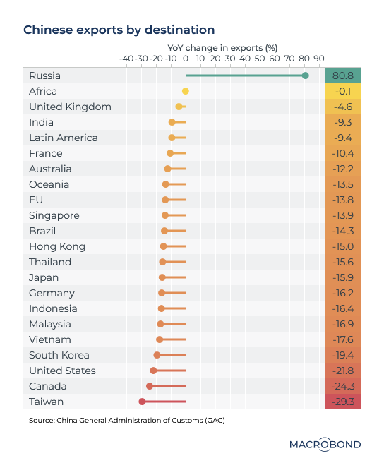
This table tracks the year-on-year change for Chinese exports to various economies and regions. Demand is faltering around the world, except for the Russian market. Amid Western sanctions on Russia, the two economies have stepped up their trade.
5 topics
.png)
Macrobond delivers the world’s most extensive macroeconomic & financial data alongside the tools and technologies to quickly analyse, visualise and share insights – from a single integrated platform. Our application is a single source of truth for...
Expertise
.png)
Macrobond delivers the world’s most extensive macroeconomic & financial data alongside the tools and technologies to quickly analyse, visualise and share insights – from a single integrated platform. Our application is a single source of truth for...
.png)