Eurozone inflation, UK bankruptcies and Japanese yield control
.png)
This week’s charts begin with a new visualisation of European inflation: tracking the proportion of countries experiencing steeper or more limited price increases at a given moment. Moving on to manufacturing, we break down global PMI (the sentiment survey of factory managers) to show how 2023 is very different from 2022. Turning to an alternative dataset, we examine satellite image-derived activity at Amazon’s quieter-than-usual warehouses. For Britain, we chart the post-pandemic spike in bankruptcies. In Asia, we visualise the historic changes to Japan’s yield control policy and examine India’s stock market and its rich valuations. And finally, we use a political sentiment dataset to examine perceptions of polarisation in the US.
Tracking inflation’s breadth in the eurozone
.png)
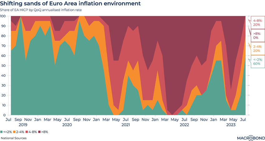
This chart visualises the breadth of price increases in the 20-nation eurozone over the past four years.
It does this by looking at annualised quarter-on-quarter inflation rates and then “bucketing” every nation into one of four segments: less than 2 percent in green, 2 to 4 percent in amber, 4 to 8 percent in red, and greater than 8 percent in dark red.
The difference between the pre-pandemic era and the inflationary episode that began in 2021 is stark. Up until April of 2021, the norm was that 70 percent of the nations in the eurozone were probably experiencing very little inflation.
By the spring of 2022, all of the nations in the currency bloc were in the two most inflationary buckets.
While 2023 has seen a broadly disinflationary trend as tighter monetary policy takes hold, inflation hawks will note the renewed spike that occurred in April and May.
Global PMI: comparing manufacturers in different regions
.png)
The Purchasing Managers Index (PMI) is one of the world’s key economic indicators. Manufacturing executives are polled to get a sense of whether economic activity is contracting or expanding.
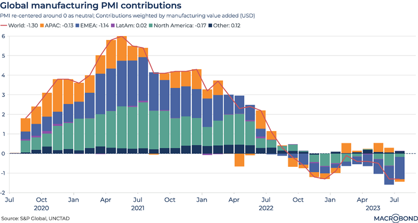
This chart looks at the contributions of the world’s various regions to global-level manufacturing sentiment, aiming to assess the more optimistic and pessimistic geographies.
It assesses PMI from 34 major countries and re-centres them at zero. Next, these time series are weighted by their country’s share of value added in global manufacturing. Finally, they are aggregated into their respective regional territories.
For the most part, Asia-Pacific, the EMEA region and North America have seen PMI sentiment move in unison – from a post-pandemic resurgence through late 2020 and 2021 to a shift to negativity in mid-2022. EMEA has been notably negative in recent months, while Asian manufacturers have reported intermittent flickers of optimism.
Satellites are watching the sluggish activity at Amazon’s logistics centres
.png)
Amazon reported better-than-expected earnings this week, with CNBC calling the figures a “blowout.” The e-commerce and cloud computing giant returned to double-digit sales growth, while indicating its core online retail division is recovering.
For most of 2023, the Amazon story had been one of cost cutting and warehouse closures after consumers’ pandemic spending boom faltered.
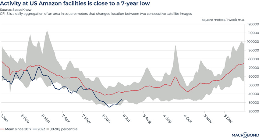
This chart aims to get a sense of real-time activity at Amazon’s US logistics centres using data from SpaceKnow, which uses algorithms to analyse satellite images. The series used here, CFI-S, is a daily aggregation of the area in square meters that changes between two consecutive satellite images – i.e. vehicle movements.
Activity has been dwindling over the course of 2023 – remaining steadily below the average annual trajectory since 2017.
British firms are filing for bankruptcy
.png)
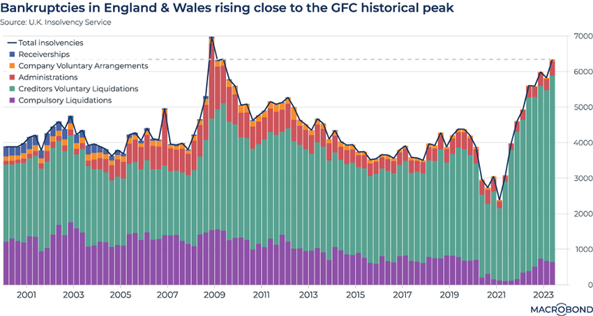
A growing number of companies are filing for bankruptcy in the UK. In the second quarter of 2023 alone, 6,342 companies were declared bankrupt – the highest level since the global financial crisis.
What’s going on? The unsettled, inflationary, post-Brexit economy can’t be helping. But this is also likely a delayed impact from the pandemic, worsened by ever-increasing interest rates. To preserve employment, government subsidies and loans kept many businesses afloat through 2020-21 (as this chart shows).
The burden of repaying these loans has resulted in “zombie” companies, and operators and creditors appear to be pulling the plug.
As our chart shows, the largest contribution (shown in green) is Creditors’ Voluntary Liquidations, a process that is typically applied when debt-burdened, insolvent companies liquidate their business – but involve their creditors in the process to reduce losses. (There are currently relatively few administrations, which occur when there’s the perceived chance of saving a business, or compulsory liquidations, when creditors ask the courts to step in.)
Yield curve control loosens in Japan
.png)
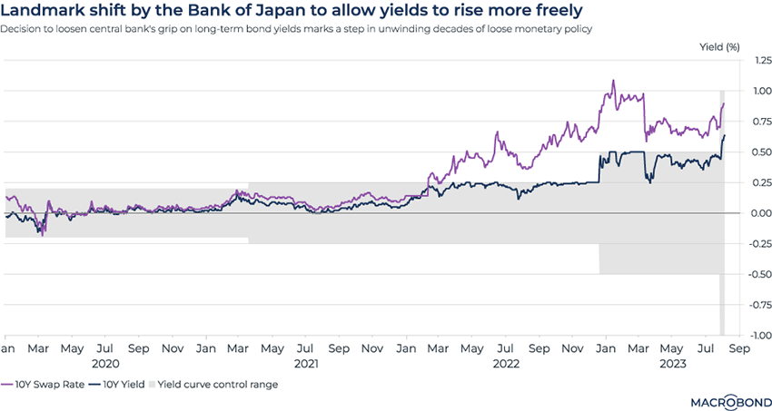
The Bank of Japan is the last major central bank to maintain ultra-loose monetary policy. Markets have been watching for signs that a true tightening cycle will begin, given that inflation is running hot.
As our chart shows, the yield curve control (YCC) range – the shaded grey area – was widened at the start of this year, which we wrote about in January. The YCC allows the BOJ to control the shape of the government bond market’s yield curve, keeping short- and medium-term rates close to its 0 percent target.
Recently, the BOJ unexpectedly adjusted YCC again. The 0.5 percent “cap” on 10-year JGBs was watered down; yields will be allowed to move closer to 1 percent.
As our chart shows, the 10-year yield has jumped outside the band. But for now, the BOJ is downplaying the prospects for an “exit” from monetary easing.
India’s stock market is running hot
.png)
Tip: Macrobond subscribers can use the change region functionality to apply this visualisation to any country. This chart also requires a subscription to FactSet add-on database.
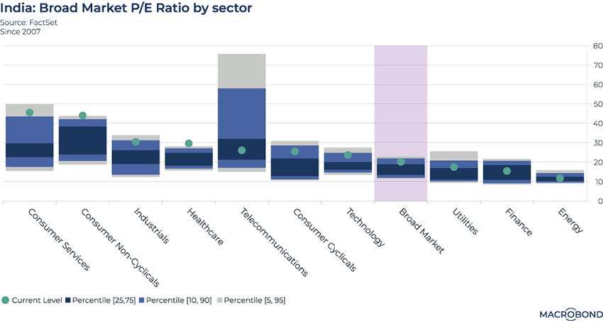
India’s equity market has rallied to all-time highs, attracting attention from global investors.
This chart uses data from FactSet aggregated by Macrobond to dive into fundamental valuations, comparing Indian equity sectors’ price-earnings ratios with post-2007 norms (as represented by the 5-95, 10-90 and 25-75 percentile bands). The broad market is also included.
As the green dots indicate, 6 of the 10 sub-sectors are trading at PE multiples above the 75th percentile – indicating a richly valued market. The healthcare and non-cyclical consumer sectors have shot above their 95th percentile.
The telecom sector is an interesting laggard on a relative basis, trading near its historic average. This segment also has by far the most volatile historic range.
Visualising US voters’ unhappiness
.png)
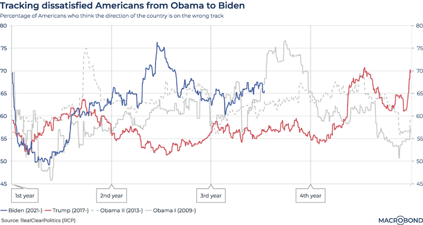
This chart uses polling data from RealClearPolitics to visualise the proportion of Americans who thought their country was on the “wrong track” at any given moment.
We have tracked this metric over the course of the four-year presidential terms since 2009.
Strikingly, Joe Biden has faced much more voter dissatisfaction in the second and third years of his term than Donald Trump did in his, as the chart shows. Unemployment was low in both 2018 and 2022, but the current president has faced a much higher inflation rate.
The “wrong track” numbers shot up in Trump’s last year, 2020 – touching 70 percent at the start of the pandemic and also at the very end of his term, when the incumbent disputed his election defeat.
Interestingly, voters appear to be so polarised that the “wrong track” number only briefly dipped below 50 percent for a short time – under Obama.
5 topics
.png)
Macrobond delivers the world’s most extensive macroeconomic & financial data alongside the tools and technologies to quickly analyse, visualise and share insights – from a single integrated platform. Our application is a single source of truth for...
Expertise
.png)
Macrobond delivers the world’s most extensive macroeconomic & financial data alongside the tools and technologies to quickly analyse, visualise and share insights – from a single integrated platform. Our application is a single source of truth for...
.png)