Is the ASX 200 better or worse under Labor or the Coalition? The answer will surprise you!
This may be the most challenging Australian economy in a generation. So, what can investors expect from a Labor or Coalition government?
Stock markets tend to take Australian federal elections in their stride, and as we’ll see, there’s not a great deal of difference in terms of the performance of Aussie shares under either of the two major parties. However, Saturday’s election comes at a time when one could argue the Australian economy is facing the most challenging set of circumstances in over a generation.
By pure coincidence, Australian federal elections over the last 50 or so years have occurred closer to market tops rather than during corrections like the one we’re in now (a correction is defined as a decline of 10% or more from a peak). In fact, this is the first time since the March 1990 election that Aussies have gone to the polls during a stock market correction. That correction preceded the start of “the recession we had to have” – a term famously coined by then Prime Minister Paul Keating.
So perhaps then, given the current heightened global political and economic uncertainty, the result of this election matters? Let’s check the stats on which major Australian political party has the best track record for both economic and stock market outperformance – Labor or the Coalition – which party has been the best bet for Australian investors!?
Was Labor or the Coalition better for the ASX?
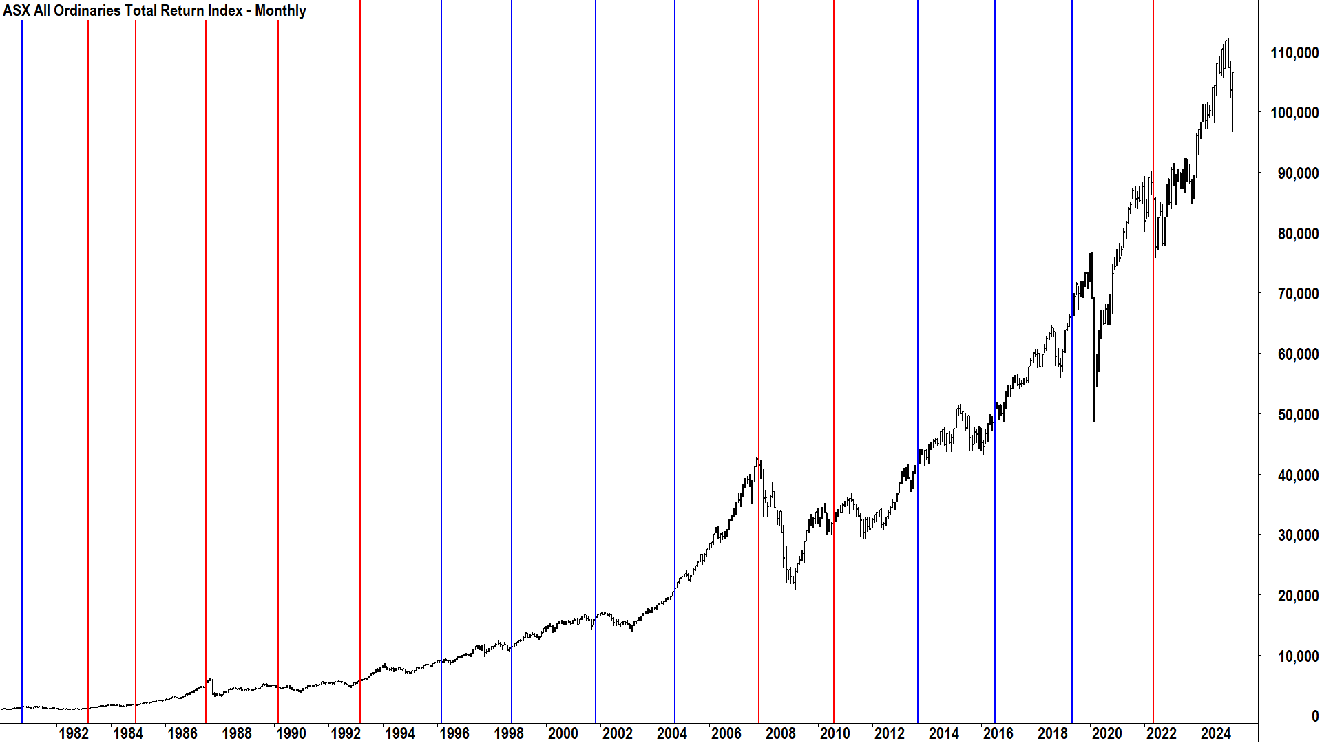
Let’s look back to all Australian federal elections since 1980 – some 45 years of data covering 16 times Aussies went to the polls to decide which party would lead the country. I have overlaid each election on top of a monthly chart of the ASX All Ordinaries Total Return Index. The “All Ords” as it is more commonly known, contains around 500 of Australia’s largest stocks, and was the benchmark Australian stock index until April 2000 when the current benchmark, the S&P/ASX 200, took over.

Note that I am deliberately using total return (“TR”) data here, which includes both dividends and price appreciation, because in my opinion – any statistical analysis on the Australian stock market that doesn’t use total return data is worthless.
Very neatly, there were 8 terms of government for each of the major parties in the lookback period. In terms of total time in government, it was also a close race with 22 years and 10 months in power for the Coalition versus 21 years and 9 months (and counting) for Labor. There’s a great mix of market conditions across both party’s respective rules, so I suggest our analysis should be rather fair and even!

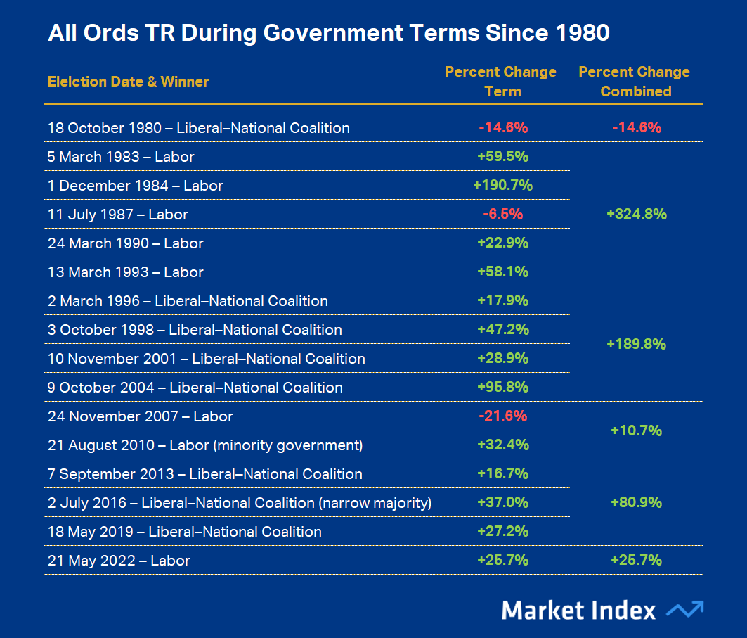
The table above shows the chronological schedule of each party’s government versus All Ords TR performance, and the table below shows the relevant summary data by party.

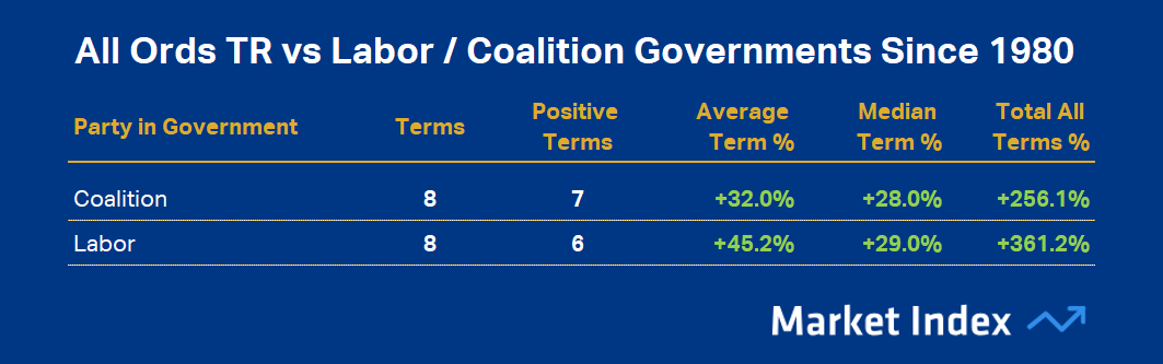
Who would have thought it!? Despite repeated assurances of their respective economic prowess, it appears it’s a much of a muchness between our two major political parties when it comes to which has been the better bet for our stock market. Both parties presided over generally strong stock market performances, with only three losing terms in the lookback period – two to Labor versus one to the Coalition if that means anything to you.
Labor, however, could arguably claim the win in terms of total stock market appreciation (361.2% vs 265.1%), and it had the higher of the two parties in terms of average appreciation per term (+45.2% vs 32.0%). However, if we look at the median appreciation per term – which is going to be less influenced by that stellar Labor government 1984-87 period which included the massive run up in Aussie stocks into the 1987 crash – let’s call it a tie at 29% appreciation per term for Labor and 28% appreciation per term for the Coalition.
(No doubt though…given the chance…I suspect our friends of the Labor persuasion are going to claim their 1% superiority in this statistic as a resounding victory!)
Which party presided over the fewest corrections and bear markets?
That’s where most statistical analyses of which party is better for the Australian stock market tends to end. But it’s fair to say during many terms of government in the lookback period, stock prices dipped during a term and then recovered by the end of it. Let’s dig a little deeper and see which party was better for market volatility – which party presided over the fewest corrections and bear markets.
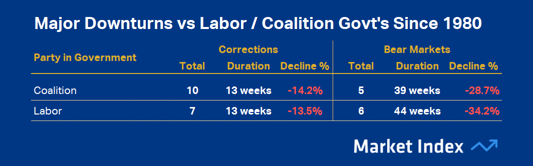
It's worth checking out this article I recently wrote about ASX bear markets and corrections for more background on the subject. For the record, there have been 17 corrections (including this one) and 12 bear markets since 1980. I’ve coloured the corrections orange and the bear markets pink on our All Ords TR chart from before.

As pretty as the above chart is, it’s also probably a little hard to decipher – hence the summary table below. It may strike you, however, just how common corrections and bear markets have been over the last 45-odd years. Perhaps also, consider that many of these major market downturns occurred due to exogenous shocks to the Australian economy, for example the GFC and the COVID-19 pandemic – so arguably it didn’t matter which party was in government at the time.

It’s another very close call here. The coalition presided over three more corrections than Labor did (10 to 3), with corrections across both parties roughly the same in terms of duration and severity. It was a similar story with bear markets – roughly the same at 5 to 6 in favour of the Coalition.
However, one could easily argue the 2007 bear market was hardly Labor’s doing given the All Ords TR peaked 3 weeks prior to them returning to government. Similarly, it’s hard to blame the Coalition for the COVID-19 pandemic bear market, which only lasted a few weeks anyway.
Which party managed the economy better?
A recession is defined as two consecutive quarters of negative gross domestic product (“GDP”) growth. There have only been three recessions in Australia since 1980, so there’s not a great deal to go on simply using this statistic. For what it’s worth, though, it's one each if we discount the COVID-19 recession or 2 to 1 against the Coalition if we don’t.
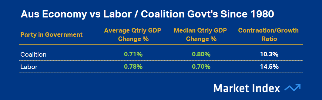
If we broaden our analysis to all quarterly GDP growth figures – some 180 quarters of data to 31 December 2024, we may get a better understanding of which party has generally fostered the greatest growth in the Australian economy. The table below shows the summary data.

Is this the smoking gun of political party economic prowess? Nope, not really. Once again, depending on the statistic – either party in theory could claim victory. (Um, a political party claiming superiority in managing a particular issue by selectively quoting the data? Surely not!).
On average, Labor presided over periods of stronger GDP growth, 0.78% to 0.71% for the Coalition. Yet, the median stats show it going the other way by a still-modest 0.80% to 0.70%. To put this data into perspective, the long run average quarterly GDP growth figure is about 0.7-0.8%, so we’re talking about roughly 10% better growth under a Coalition government at the median compared to Labor.
If we add in the fact that the Coalition presided over fewer GDP contraction periods than Labor, with around just 10% of their time in government in contraction compared to Labor’s 14.5% – perhaps we do have a smoking gun here. It could be argued on this statistic that the Coalition governments tended to be associated with a more stable economy and better economic growth.
Conclusions
It would be remiss of me to write an article as potentially contentious as this without repeating this old adage of statistical analysis (and politics!):
“There are three kinds of lies: Lies, Damned Lies, and Statistics” — Mark Twain
The other thing I’ll note is in the last paragraph of the last section I wrote about the economy, I used the phrase “it could be argued”. You and I both know Aussie politics: It will be argued – one way and the other!
I’d argue, it’s a very close call when it comes to deciding which major Australian political party has the better track record with respect to the Australian economy and stock market. Both have presided over their fair share of economic and market downturns, but also over extended periods of prosperity.
If I had to give it to one party, and this is just my opinion based solely on the data, then perhaps the Coalition just snatched it with the superior median GDP growth and lower GDP contractions to growth ratio. That’s the only dataset with a statistically sound dataset (“statistical soundness" typically requires a sufficient number of data points to provide reliable and accurate insights – some say 40 is the minimum, some say at least 100).
But it’s a very close call, and no doubt there’s about 50% of the audience reading this who disagree with me!
This article first appeared on Market Index on Friday 2 April, 2025.
Never miss an update
Enjoy this wire? Hit the ‘like’ button to let us know.
Stay up to date with my current content by
following me below and you’ll be notified every time I post a wire
Carl has over 30-years investing experience and has helped investors navigate several bull and bear markets over this time. He is a well respected markets commentator who specialises in how the global macro impacts Australian and US equities. Carl has a passion for technical analysis and has taught his unique brand of price-action trend following to thousands of Aussie investors.
........
Investing is risky. Inevitably you will endure losses. If you can't cope with losing, don't invest.

5 topics

Carl has over 30-years investing experience and has helped investors navigate several bull and bear markets over this time. He is a well respected markets commentator who specialises in how the global macro impacts Australian and US equities. Carl...
Carl has over 30-years investing experience and has helped investors navigate several bull and bear markets over this time. He is a well respected markets commentator who specialises in how the global macro impacts Australian and US equities. Carl...
Comments
Comments
Sign In or Join Free to comment
most popular
Investment Theme
If 24 LICs ran the Melbourne Cup, which ones would we back?
Affluence Funds Management