This economic indicator could help you pick stocks in a recession
Macroeconomic data can be full of noise, and never has that been more clear than right now.
Some economists are saying the RBA's March hike was the last of the cycle. Others think there may be one more if the inflation print on April 26 does not pan out the way the central bank hopes. And while the Federal Reserve is not done with its rate hiking cycle, everyone agrees it is much closer to its beginning than its end.
How do we know this? Labour markets are still tight across the globe, inventories are rising, credit conditions are tightening (especially following the SVB/Credit Suisse saga), and of course, inflation remains too hot for most central banks that have a 2-3% inflation target.
Over the next couple of weeks, we should get an indicator of whether profit margins are now falling stateside as well.
FactSet's estimates suggest this quarter's earnings declines will likely be the largest since Q2 of 2020 and that far fewer companies will beat their respective revenue estimates than the long-run average.
All this appears to set investors up for a hard landing, but is there a way to outperform even in a downturn? In this wire, I'll show you the correlation between a widely followed economic indicator and the sectors that do well in each of its trends.
Introducing the PMI
Bloomberg estimates that the global economy is worth in the order of US$90 trillion. That's a lot for data watchers to keep a track of. I'm sure you've heard of the big metrics before - GDP, inflation, unemployment, and interest rates just to name a few. But there is one indicator that economists and macro-minded investors look at just as closely as all of these.
PMIs (or Purchasing Managers' Index) are the measure for indicating the pace of economic activity. It's generally published in three forms - manufacturing, services, and composite (the average of the first two).
The Index is actually a survey of business managers in a range of industries. Business leaders are asked a range of questions about any changes to conditions in their company and industry.
The answers then get sorted into the following categories:
- New orders
- Inventory levels
- Production
- Supplier deliveries
- Employment
These scores are then combined, averaged out, and used to create the PMI read for a month. The index is scored between 0 and 100, with 50 being the middle. A 50-or-above read indicates expansion while a 50-or-below read indicates contraction.
Why do investors care about PMIs?
Simply put, it's a leading indicator for other data points such as GDP, inflation, and unemployment. Paying attention to the shifts in PMI readings can give valuable information about trends in the overall economy.
Here is just some of what S&P Global, the world's leading PMI surveyor, has been able to uncover in recent months:
- Global PMI is at a nine-month high, led primarily by the US and China
- Services are expanding far more than manufacturing-oriented businesses
- The Australian Manufacturing PMI is at a near-three-year low
- The Australian Services PMI is in contraction territory
(Note: All figures are correct as of writing. These figures change month to month.)
PMIs as a leading indicator for stocks
We've now learned that PMIs are a leading indicator for economic data and macro investors. But can they also be used as a stock-picking tool?
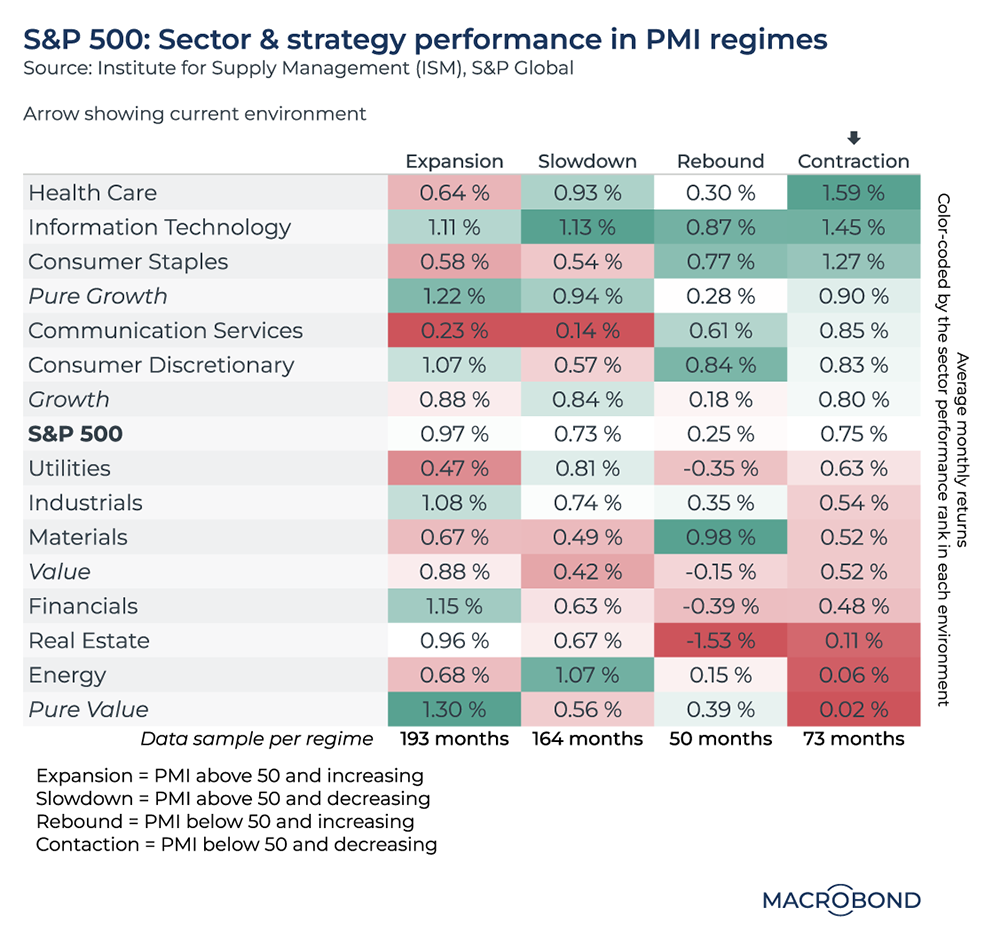
The team at Macrobond Financial certainly think so. In their Charts of the Week publication (now available on Livewire each Monday), the team measured 40 years' worth of PMI data and tracked how different sectors in the S&P 500 performed when the indicator was expanding, slowing, contracting or rebounding.
This is what they found:

Their research found that when PMIs are firmly in the contracting trend, healthcare stocks perform the best. In a pure expansion period, pure value and financial-oriented names outperform. Their research also found that tech stocks appear to do well in every environment - though of course there are many, many nuances to this finding.
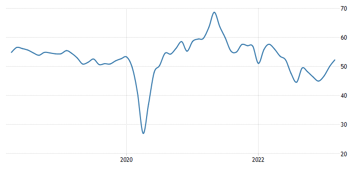
Incidentally, the arrow indicates the point in the cycle which we are currently in. The US is just coming out of a contraction phase - as this next chart shows:

And for Australia...
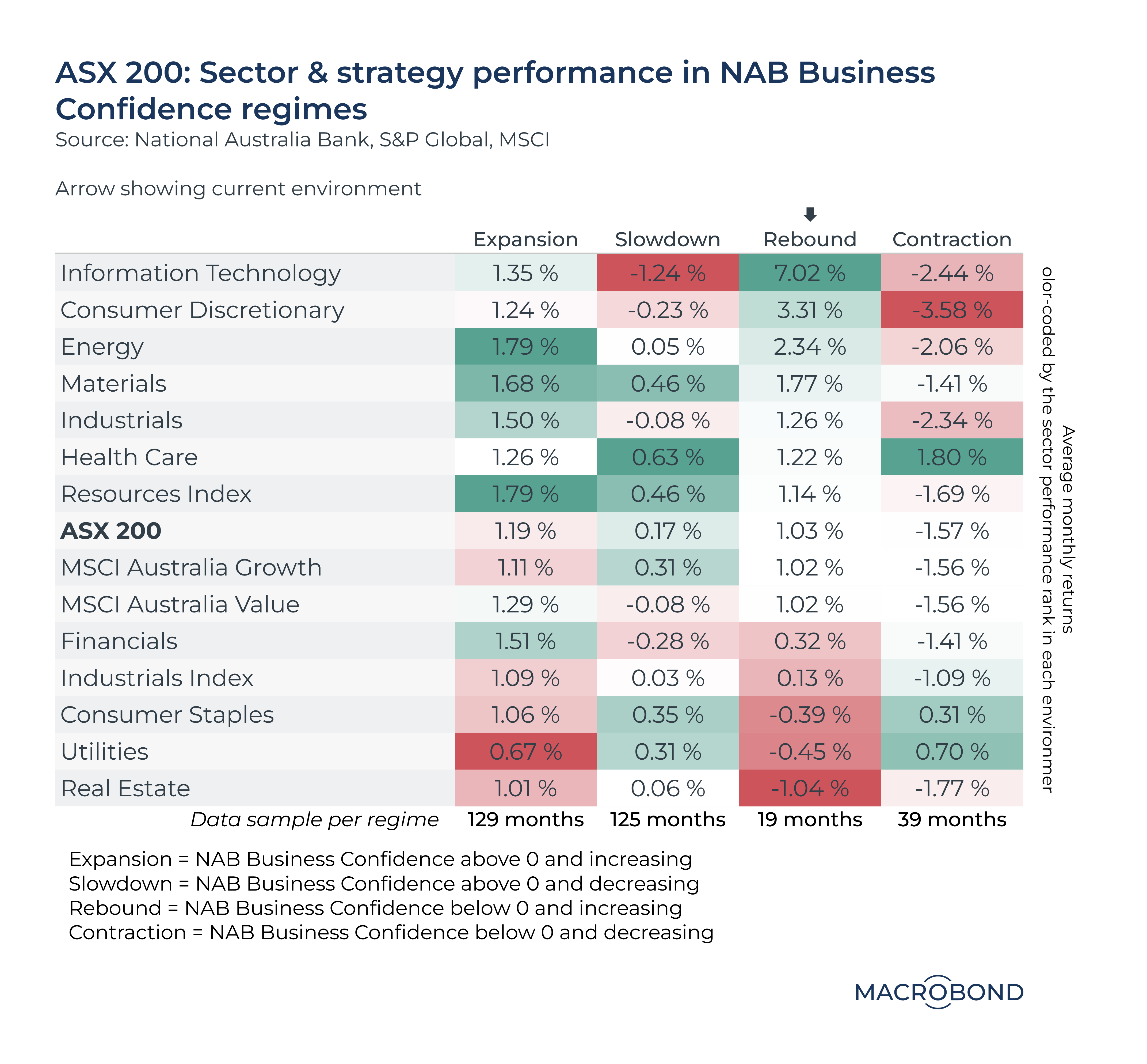
After we came across this chart, I asked the Macrobond team if they could put together a compare-and-contrast for the Australian market using Australian economic indicators.
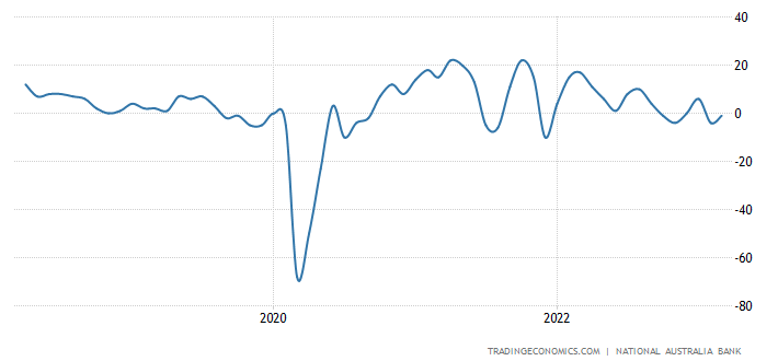
For this example, the team used the results of the monthly NAB Business Survey (the confidence measure specifically) and correlated them against the sector-by-sector performance of the ASX 200. Australia is considered to be in a rebound phase after last month's +3 read, as this chart shows:

Note that at the PMI level, Australia's composite read slumped recently to contractionary territory but no trend has been set. So what do the results show? We are very different to our stateside counterparts.

In this phase, it's actually tech stocks that perform the best - up 7%. Real estate stocks do comparatively worse. But before you get too excited, note the data sample for the "rebound regime". At 19 months, it's a much smaller sample compared to an expansion or slowdown period. In those periods, energy and healthcare stocks outperform respectively.
In terms of the growth versus value debate, the performance is actually broadly similar in all four regimes. That must speak to the value (no pun intended) of a style-agnostic approach.
What economic or fundamental indicators are you looking at to pick stocks in this increasingly uncertain market? Let us know in the comments.
1 topic

