This time is not different – a charting comparison

Michael Gable
Fairmont Equities
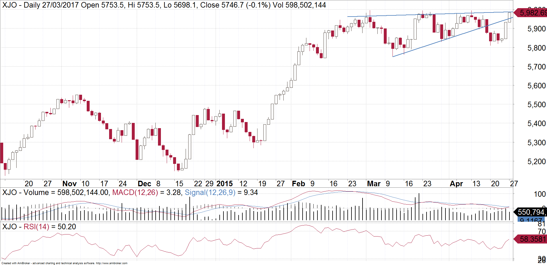
Patterns and investor behaviour repeat themselves in share markets. The current chart pattern on the ASX200 looks uncannily similar to one from two years ago. Below is a daily chart of the ASX200. Have a close look. One could be forgiven for thinking that it is a current chart, but it is actually from 2015.
Now have a look at the following chart. This is the ASX200 as at today.
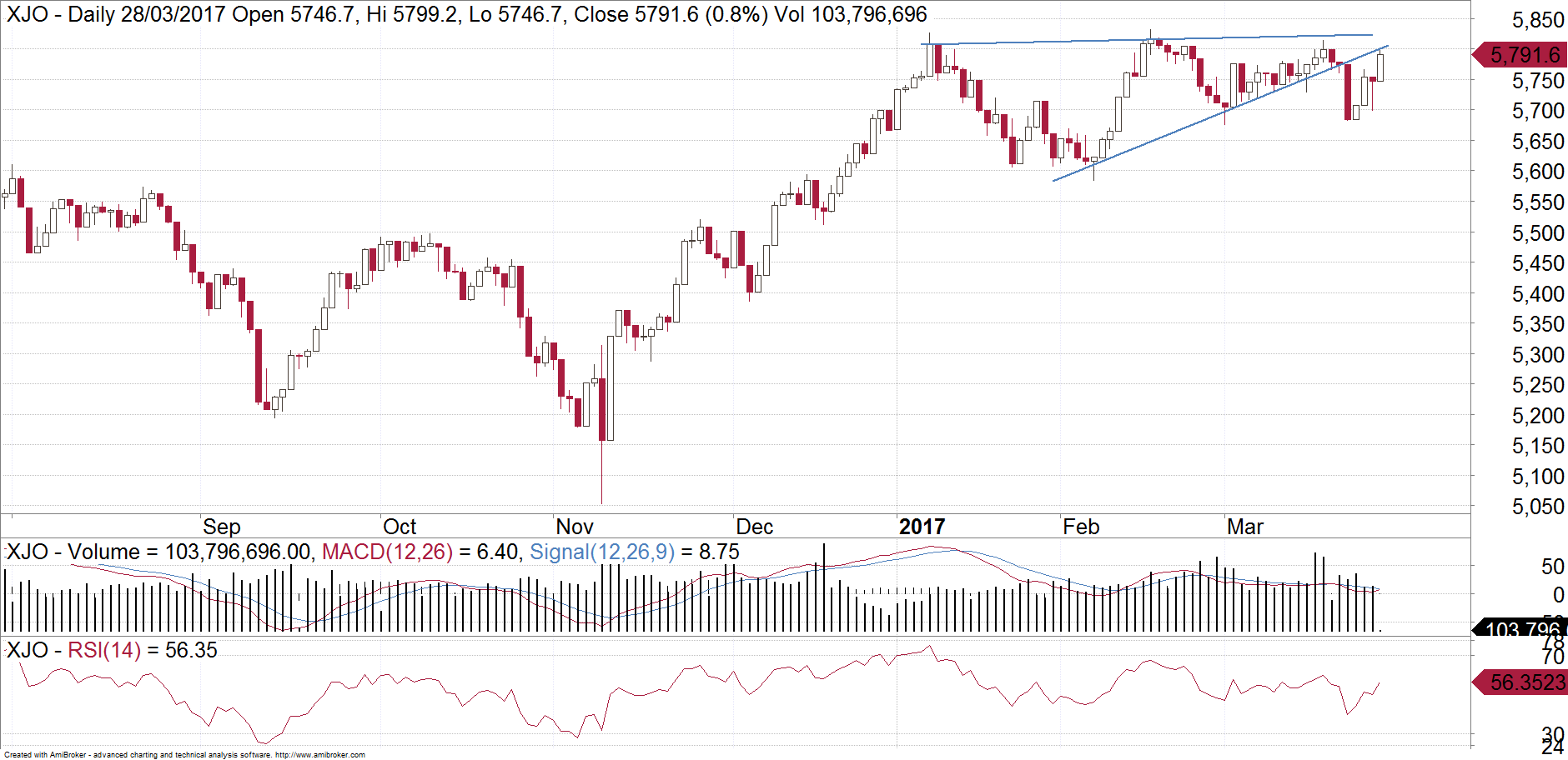
What some people thought was a bullish triangle on the ASX200 has proven to be the opposite. Triangles normally break within about 2/3 - 3/4 of the way through. By converging to a point last week, the XJO was at risk of either making a small unsustained break to the upside, or a break to the downside. It is clearly broken to the downside now. This triangle is most likely a rising wedge. We are now retesting last week's break just under 5800. The market is trying to test the patience of the "buy the dip" crowd. This implies at the very least a pullback towards the base of the wedge, which is just under 5600 but it is likely to extend down towards the 5400's.
Our first chart from 2015 resulted in a drop to under 5000. It is impossible for me to predict such things but at the very least investors should be a bit cautious and expect more chance of downside than upside over coming weeks. We are hedging client holdings and perhaps it is prudent for you to now investigate this.
Never miss an update
Enjoy this wire? Hit the ‘like’ button to let us know.
Stay up to date with my current content by
following me below and you’ll be notified every time I post a wire
Michael Gable is managing director of Fairmont Equities. We are a small boutique advisory that uniquely combines both fundamental and technical analysis. As a result, our analysis is featured regularly in the finance media such as the Australian Financial Review, and Sky News Business.
Fairmont Equities provides portfolio management services and also produces weekly investment and trading ideas.
Sign up to our weekly newsletter containing stock tips and educational articles. Head to www.fairmontequities.com and leave your email to sign up now.

2 topics
Michael Gable
Managing Director
Fairmont Equities
Michael Gable is managing director of Fairmont Equities. We are a small boutique advisory that uniquely combines both fundamental and technical analysis. As a result, our analysis is featured regularly in the finance media such as the Australian...
Expertise
No areas of expertise
Comments
Comments
Sign In or Join Free to comment
most popular
Investment Theme
If 24 LICs ran the Melbourne Cup, which ones would we back?
Affluence Funds Management