We are passing through peak infections
Today I will provide a quick update on our latest data analytics on infections, deaths, and our current forecasts for the US and Australia, which seem to be coming to pass (you can download the full technical forecasting paper here).
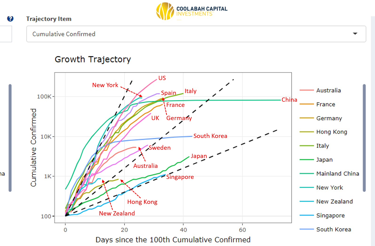
The first chart below is a screen-shot from our real-time COVID-19 tracking systems that shows live infection trajectories as of this morning from key countries I have selected (we track all nations globally, so this is just a sample of interest).
It's clear that the curves are flattening in Italy, Spain, France, Germany, the UK and, more belatedly, in the US. I've also added in the New York infection curve so you can see how that contrasts against the US in its entirety.
The Australian infection curve continues to outperform many of its global peers, and is flattening fast. In fact, we appear to have already passed through the peak in the number of new daily cases, which is consistent with our March 23 projection that Australia would peak in early April.
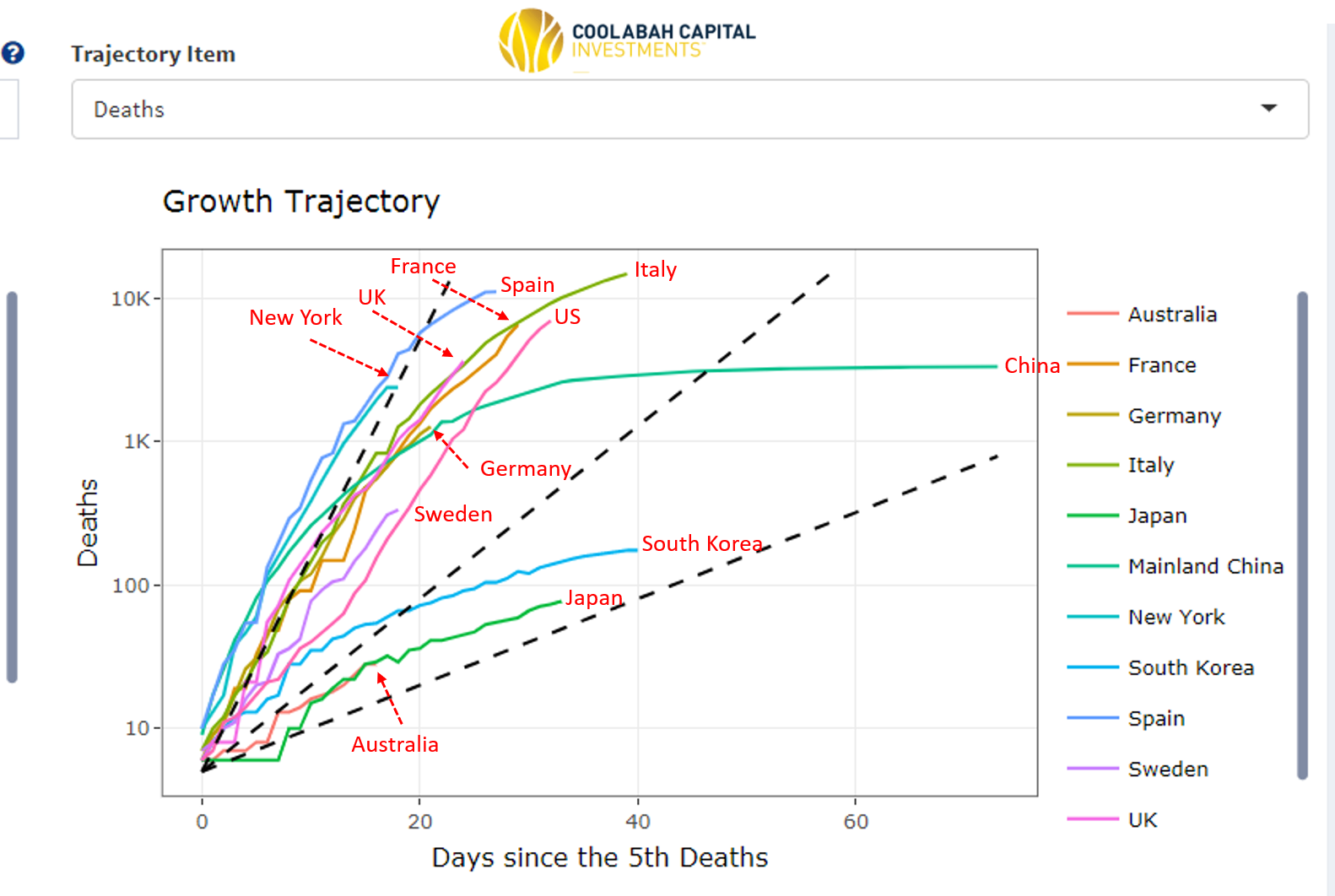
Readers will know that we place greater weight on the death data given the many problems tracking the true number of infections. Notwithstanding the lag between infections and deaths, here again we see curves flattening globally. And pleasingly, Australia continues to outperform most of its global peers on this front as well.
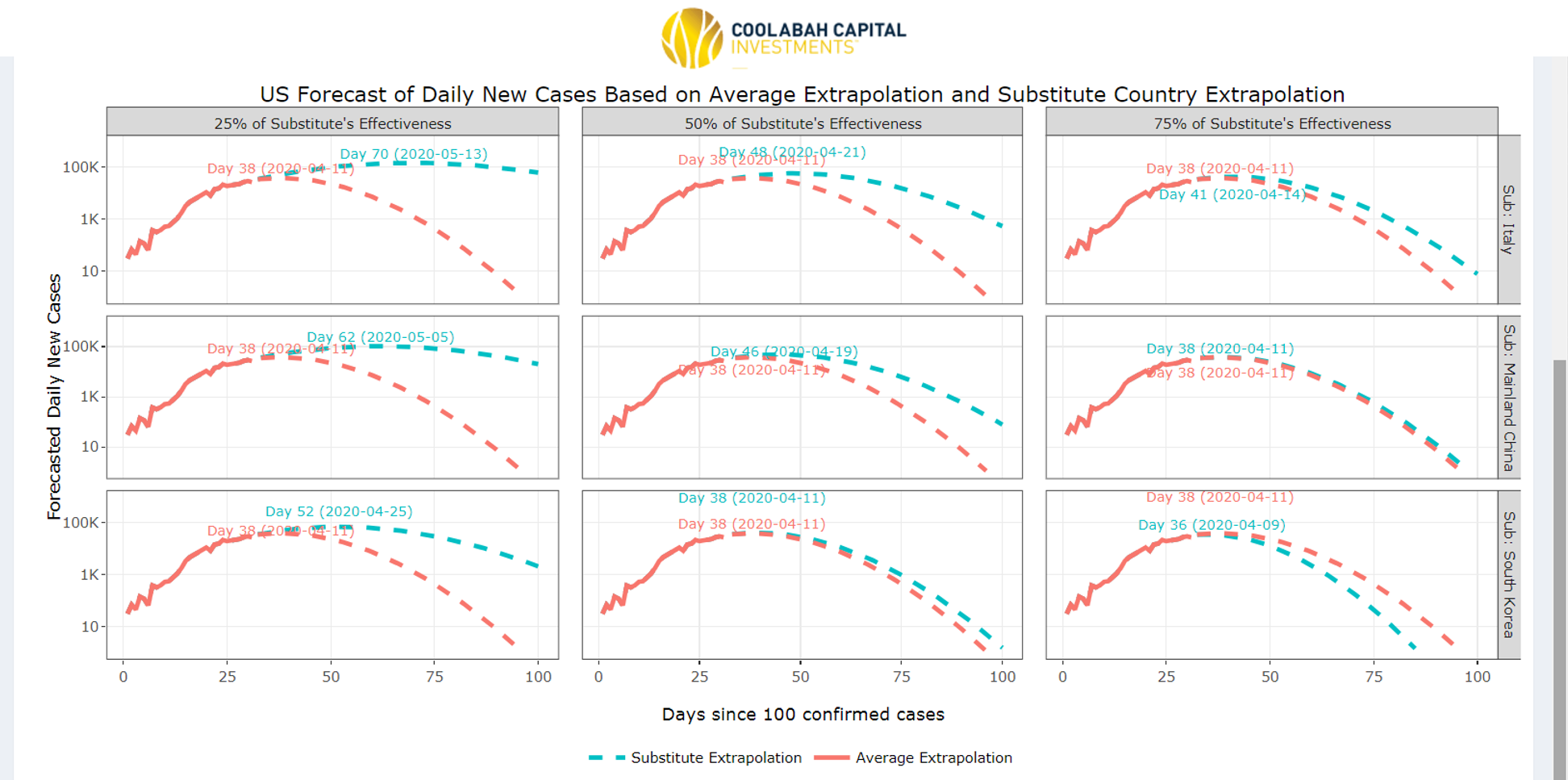
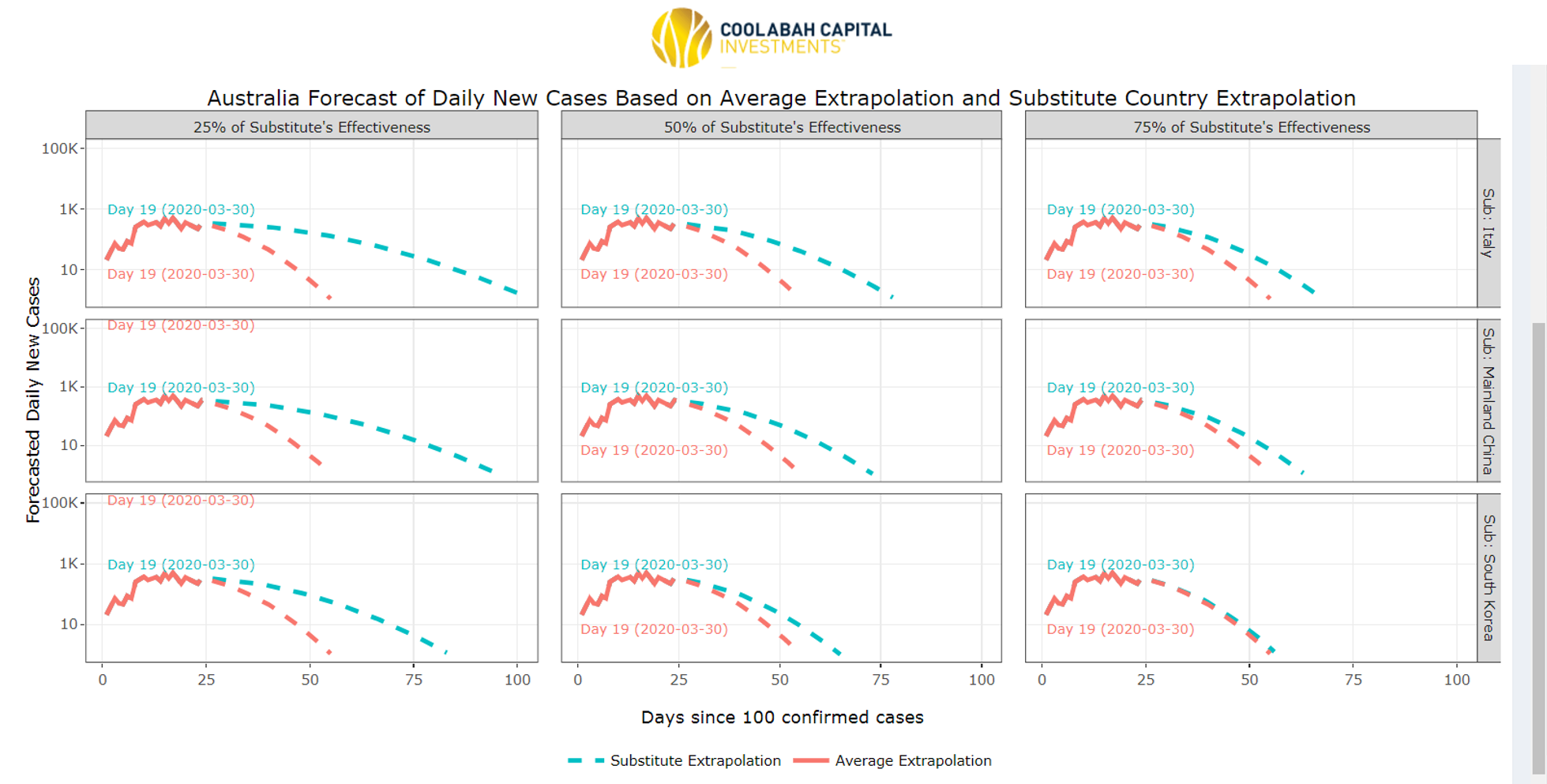
Our latest forecasts for the peak in the number of new infections for the US and Australia are enclosed. Recall that our forecasting framework allows us to make projections for any target country based on the empirically observed containment paths of countries that are much more advanced in terms of their own infection trajectories. In these screenshots I have selected the US (first image) and Australia (second image) as the targets for the forecasts and then chosen Italy, South Korea and China as the countries that we use as a base-line for containment experiences.
Our models allow us to hair-cut the forecast containment efficacies such that the US and Australia are, say, only 25%, 50% or 75% as effective as Italy, South Korea and China. Now the pink hard line in these charts is the actual evolution of new cases in the US and Australia. The pink dotted line is the forecast assuming the US and Australian containment strategies emulate the average observed throughout the rest of the world. The blue dotted line is the forecast assuming the US and Australia are 25% (first column), 50% (second column), or 75% (third column) as good at containment as Italy (first row), China (second row) and South Korea (third row).
On this basis, our analysis suggests that if the US is half as good at containment as South Korea and Italy, it will reach its peak on 11 April and 21 April, respectively. In the case of Australia, our models are of the view we have already passed through the peak. Here's hoping we are right!
From an investment perspective, I am focussed on several future contingencies, which I described in detail in my AFR column yesterday (online)/today (print). Click on this link to read the full column or AFR subs can click here. Excerpt enclosed:
As we move through the eye of the coronavirus storm, two key events will be turning points for markets. The first is when the rate of increase in the number of new infections and deaths in larger economies starts to noticeably decline, signalling that containment strategies are doing their job.
A second will be when these nations begin to transition businesses out of their lockdowns and back to work, albeit on a "new normal" basis that continues to mitigate ongoing transmission. The Chinese and South Koreans have demonstrated that this is possible.
This is why my team has spent significant time developing models to track live infections/fatalities and to predict the peak in the number of new cases. And there is some good news on this front. Notwithstanding the hand wringing about the laconic and lackadaisical Aussie response to the crisis, the infection and death data indicate we are outperforming many others.
The rate of increase in new Australian infections is slower than most of our peers. Even more importantly, the rate at which new infection numbers are decelerating (or at which our curve is flattening) is especially impressive and seems to be broadly tracking South Korean’s containment path, which is arguably the best in the world for any nation that has suffered a substantial outbreak. Perhaps most interestingly, the pace at which Australian deaths have increased is also outperforming almost all other countries save Japan.
There are a range of explanations for these results. Our geographic isolation, dispersion and relatively low urban densities obviously help, as does our modest median age of 38 years. Australia also has low cigarette consumption per capita, which is valuable in this context given the virus’s impact on our lungs. And finally, Prime Minister Scott Morrison and the state premiers have been assertive and pro-active in seeking to cauterise the threat.
The evolution in the infection trajectories in Australia and the US are validating our contrarian March 23 forecast that the peak in the number of new cases should arise in early- to mid-April. Indeed, our analysis suggests that Australia may be passing through its peak right now. The risk in the US is that ad-hoc, state-by-state containment strategies elongate its zenith into the latter half of the month.
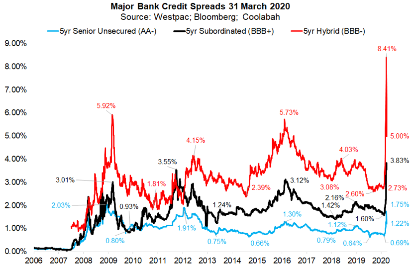
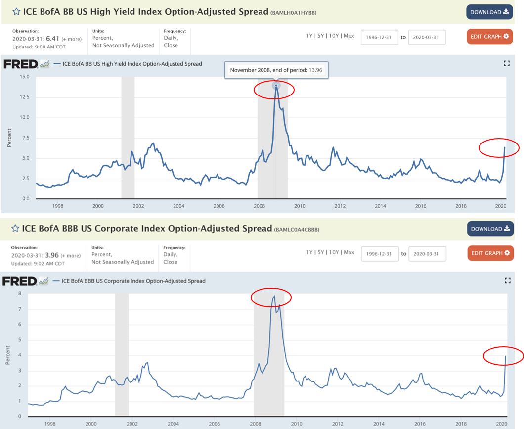
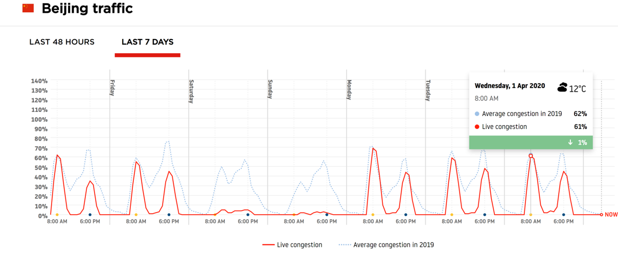
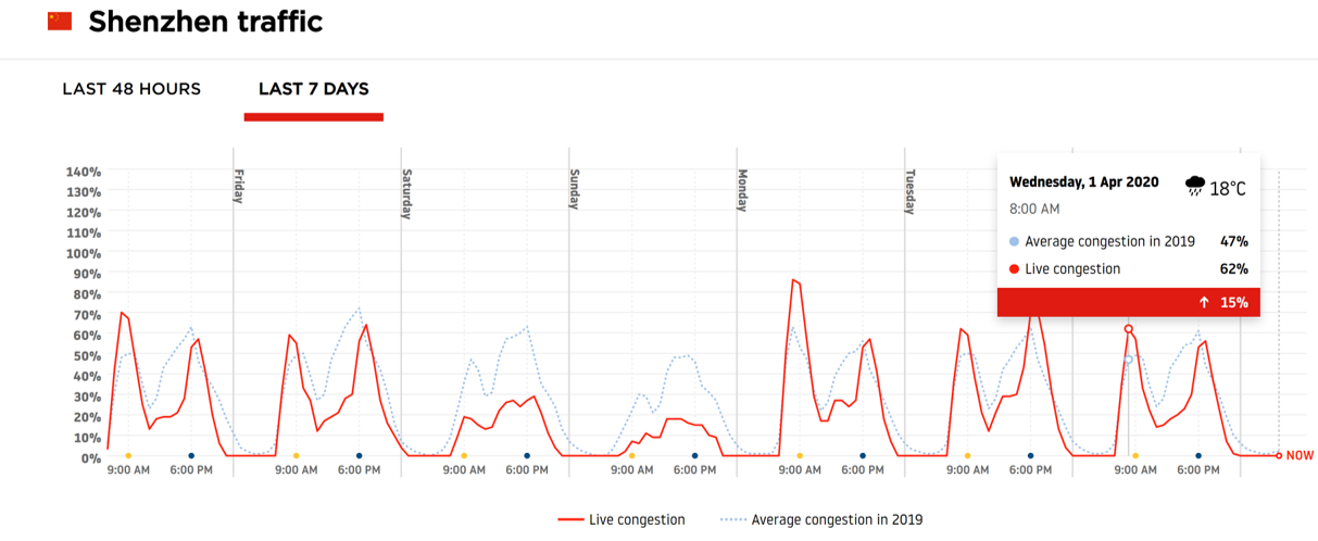
Finally, there have been so many important developments in financial markets, we have been punching out some pretty high-frequency analysis for our clients' benefit. On Livewire, I parsed the consequences of the RBNZ's decision to ban NZ banks from paying dividends here. I also discussed Challenger's announcement that it is committed to calling its shortest hybrid and replace it with a new issue here. I will leave you charts on credit spreads and some traffic data to reflect on...Observe how financial spreads have busted through GFC wides while BBB rated corporate bonds and BB rated high yield corporates are only halfway there...
Never miss an update
Enjoy this wire? Hit the ‘like’ button to let us know.
Stay up to date with my current content by
following me below and you’ll be notified every time I post a wire
Chris co-founded Coolabah in 2011, which today runs over $8 billion with a team of 40 executives focussed on generating credit alpha from mispricings across fixed-income markets. In 2019, Chris was selected as one of FE fundinfo’s Top 10 “Alpha Managers” based on his risk-adjusted performance throughout his career across. He previously worked for Goldman Sachs in London and Sydney, the Reserve Bank of Australia, and founded the award‐winning research/investment group, Rismark. He has regularly advised governments, developing unique policy proposals. Chris graduated with the University Medal (Economics & Finance) from Sydney University. He studied in the PhD program at Cambridge University in 2002/03, leaving to set up his funds business.
........
Disclaimer: This information has been prepared by Smarter Money Investments Pty Ltd. It is general information only and is not intended to provide you with financial advice. You should not rely on any information herein in making any investment decisions. To the extent permitted by law, no liability is accepted for any loss or damage as a result of any reliance on this information. Past performance is not an indicator of nor assures any future returns or risks. Smarter Money Investments Pty Limited (ACN 153 555 867) is authorised representative #000414337 of Coolabah Capital Institutional Investments Pty Ltd, which holds Australian Financial Services Licence No. 482238 and authorised representative #001277030 of EQT Responsible Entity Services Ltd that holds Australian Financial Services Licence No. 223271.

2 topics

Chris co-founded Coolabah in 2011, which today runs over $8 billion with a team of 40 executives focussed on generating credit alpha from mispricings across fixed-income markets. In 2019, Chris was selected as one of FE fundinfo’s Top 10 “Alpha...
Expertise
Chris co-founded Coolabah in 2011, which today runs over $8 billion with a team of 40 executives focussed on generating credit alpha from mispricings across fixed-income markets. In 2019, Chris was selected as one of FE fundinfo’s Top 10 “Alpha...
Expertise
Comments
Comments
Sign In or Join Free to comment