Chart of the Week - Not Expensive, But Not Cheap Yet
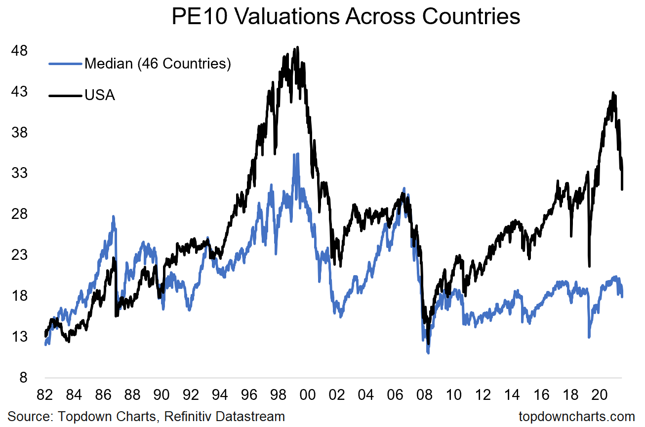
Global vs US PE10 Valuations: One of the most interesting aspects of the past decade has been the divergence in valuations between the USA and the rest of the world. A big part of the divergence in price/value has been driven by a massive divergence in relative earnings performance, with the US significantly and consistently outperforming the rest of the world in earnings growth…
But while the US has outperformed rest of world in earnings over the past decade, arguably this is already in the price and then some.
US PE10 valuations (i.e. price divided by trailing 10-year average earnings) are about double that of the rest of the world, and the breadth of overvaluation shows that it is a widespread issue (more than 90% of countries are at least 20% cheaper than the US by our calculations).
One thing to note on this too is that such valuation gaps can partially close by the expensive one simply “catching down” or correcting further/faster than the other… and that seems to be happening as we speak.
As things stand (this chart is updated for Monday’s dismal price action), US equities are no longer eye-wateringly expensive, but they are still far from levels that you might call *cheap*. Even the rest of the world still has a ways to go before hitting bargain basement levels, and on both counts the valuation metrics are still significantly higher than the depths of March 2020.
Meanwhile the macro remains unfriendly. But on that note, if the value side of things is good enough it can speak louder than the macro (not yet). So let’s keep watching these type of charts for clues on the next steps (which is about as good excuse as any to keep following our work!!).

Key point: Favor global vs US on relative valuations. Also note: valuations have come down materially (no longer expensive), but still not showing up as cheap yet.
NOTE: this post first appeared on our NEW Substack: (VIEW LINK)
Best regards,
Callum Thomas
Head of Research and Founder of Topdown Charts
Follow us on:
LinkedIn (VIEW LINK)
Twitter (VIEW LINK)
4 topics

