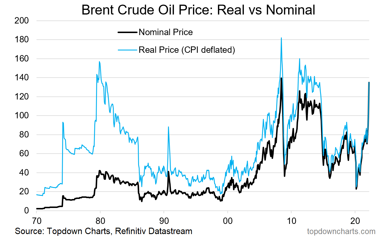
Chart of the Week - The real price of crude oil
This chart really helps put things into perspective, and in many respects it's perhaps one of the most important macro/market developments this year (decade?)
And, uh - it gives me a chance at word-play: the chart shows the “real price“ of crude oil (i.e. deflated by CPI to show historical oil prices expressed in today’s dollar terms)… but also gives a reference to the very real price that is being paid in terms of how we got here, and the ripples and consequences of the current move in crude.
Anyway, in case you missed it (really?), crude oil futures surged as much as +10% at the open this week, taking them very close to all-time highs.
The real price series (CPI deflated) in the chart below is perhaps the most instructive or informative visual, in that it shows just how markets can behave during geopolitical shocks, for example, in the mid to late-70s and briefly in the early-90s.
There is no telling how high oil can go,
Nor how long it will stay at these levels. There are a few examples of crude oil prices spiking drastically, and then dropping just as fast. There are also a couple of examples of a more drawn-out normalisation process (e.g. the post-2008 rebound), or even a “higher plateau” (e.g. the first oil shock in 1973).
As alluded to, this price shock will present significant headwinds to growth (and risk assets). Furthermore, as outlined in the latest report, it’s not just energy either, with metals and agricultural commodities also surging. This is about as challenging a macro backdrop as you could conceive.

Key point: The real price of crude is surging, and the real cost could be huge.
Never miss an insight
Enjoy this wire? Hit the ‘like’ button to let us know. Stay up to date with my content by hitting the ‘follow’ button below and you’ll be notified every time I post a wire.
Not already a Livewire member? Sign up today to get free access to investment ideas and strategies from Australia’s leading investors.
3 topics

