Financial resilience of businesses still to be tested

Chris Rands
Yarra Capital Management
It’s been a wild ride for credit markets these past few weeks. And while the illiquidity is still quite poor outside of government bonds (<10-years), it hasn’t stopped us from doing what we can to improve returns. Here we explain what’s been happening in credit markets and how a carry and roll works.
What’s been making headlines in credit markets?
The credit market over the two past weeks has come back to life, with the catalyst being the US Federal Reserve (Fed) firing an absolute bazooka of a monetary policy. On Thursday 16 April, we were confronted with the following headline:
Federal Reserve takes additional actions to provide up to $2.3 trillion in loans to support the economy
Read full article here
The main policies included:
- USD 500bn for lending to municipalities (state and local government bonds).
- USD 600bn for medium-sized businesses.
- USD 850bn increase in the corporate buying facilities.
In addition, the Fed announced they would buy high yield bonds, which is an important point to note. There is a large number of bonds rated BBB that will transition to BB (sub-investment grade). This rating change from investment grade to sub investment grade, normally causes many bond holders to become forced sellers, but the Fed will now support them.
We can use two measures to put the size of the Fed’s policy into perspective. Firstly, we need to understand the size of the credit market in the US: it’s between USD 6 – 7tn of investment grade debt and USD 2 – 3tn of high yield debt, which you can read about here
While not all of the Fed’s policies were aimed at these credit markets, they are still willing to buy a substantial size of outstanding issuance.
Chart 1 - Growth in US corporate debt level
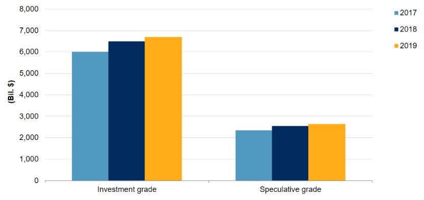
Source: U.S. Corporate Debt Market: The State Of Play In 2019, S&P Global. Includes bonds, loans and revolving credit facilities that are rated by S&P Global Ratings from financial and non-financial issuers as of the beginning of each year.
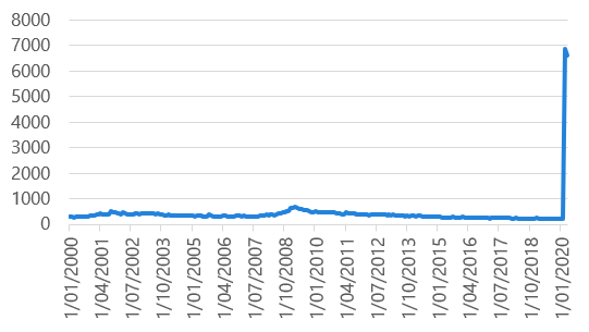
The second measure to understand is the size of the US Fed balance sheet. These purchases, in addition to their purchases of government bonds for quantitative easing (Chart 1 only covers the spread risk they are buying), should take their balance sheet to USD 10tn+. This will be not far off fifty per cent of US GDP. Depending how long it takes to deploy, by our estimates it looks like they are doing four years’ of purchasing in one quick go.
Take a look at the current jump in the Fed balance sheet in Chart 2. In the past two months, the Fed has bought over USD 2tn in securities. Compare this to QE3, which ended in 2014, which was only $1tn per year and prior to that the largest increase was in 2008—about USD 1tn in a 2-month period. This is the Fed throwing in the kitchen sink.
For the cynics out there, it looks like a case of two businessman backstopping the economy—Fed Chairman Jerome Powell is an ex-banker and private equity guy, not an academic, and treasury (read Trump) is providing the loss-absorbing capital to make the policy possible. Shoot first and ask questions later. What happened to moral hazard?
Chart 2 - Federal Reserve balance sheet
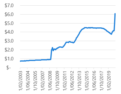
Source: Nikko AM, Bloomberg
Chart 3 - Federal Reserve sheet as %GDP
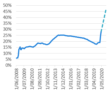
Source: Nikko AM, Bloomberg
The moral hazard idea of this action and why this risk has been lurking for a very long time is a topic for another day. But simply put, over the past three years there have been numerous voices stating that BBB issuance was becoming a problem. The reason that the Fed needed to support the BB part of the market was because a large chunk of the corporate debt was sitting in the BBB bucket, one shock away from transitioning to junk.
Chart 4 - Distribution of US corporate debt by rating category
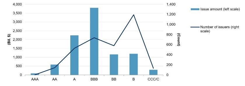
Source: U.S. Corporate Debt Market: The State Of Play In 2019, S&P Global. Issue amount includes bonds, loans and revolving credit facilities that are rated by S&P Global Ratings from financial and non-financial issuers. Issuer count is based on the total number of issuer credit ratings for US corporates Date as of Jan 1, 2019.
So, how has the market reacted? It loved it! This is a back-stop to credit markets in an area that the market previously thought the Fed wouldn’t buy. Chart 5 shows 10-year BBB spreads over the past 10 years. The widening this time around was far quicker and went wider than what occurred during the 2011 sovereign debt crisis, when the European banks looked like they could default. Spreads peaked at around +350bps over treasuries, but have since come back over 100 points.
Chart 5 - US BBB 10-year spread to treasuries
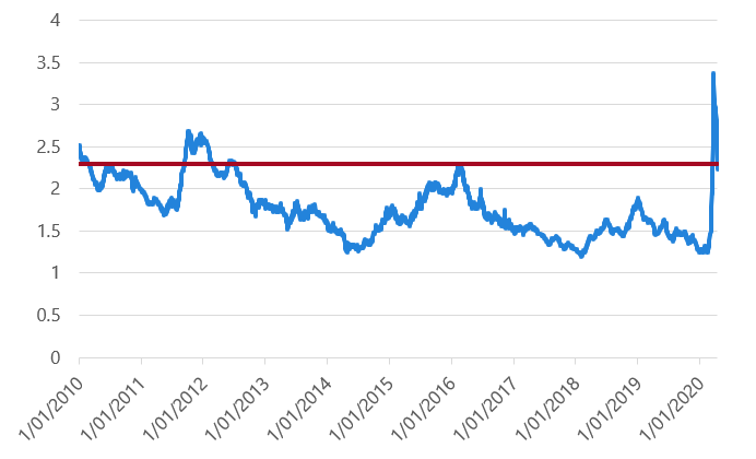
Source: Nikko AM, Bloomberg
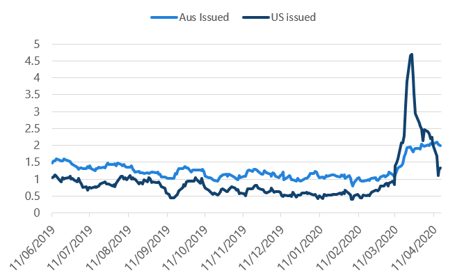
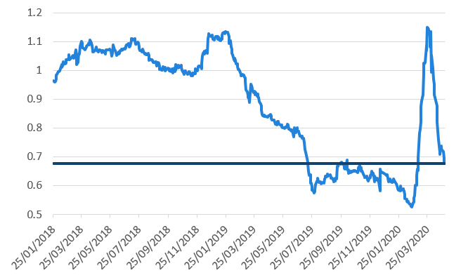
This might be a little off-track, but it’s a good explanation as to why our local credit markets froze up. Chart 5 shows spread movements of a US issuer in both Australian and US dollars. The move in US dollars were far above what we saw in Australia based on our spread calculations. This is because nothing was trading in the Australian bond market, so it was not being repriced.
Chart 6, for example, shows the spread on AT&T 2023 bonds in the United States, compared to the spread on the Australian dollar AT&T 2023s issued in our market. Our spreads did “better”, but that was because there was no-one trading or willing to offer liquidity at the time. The US market is far larger and more liquid than ours, so the US market is more likely to correctly reflect what it would have cost to get something sold.
Chart 6 - AT&T 2023 bonds – spread to government
Source: Nikko AM, Bloomberg
To see the damage of what this means in price terms, Chart 7 shows the price (rather than the yield) of those AT&T bonds in the United States. The price fell over 10% in a month, but with the back-stop of the Fed coming in, prices recovered very quickly.
Chart 7 - AT&T 2023 bond price
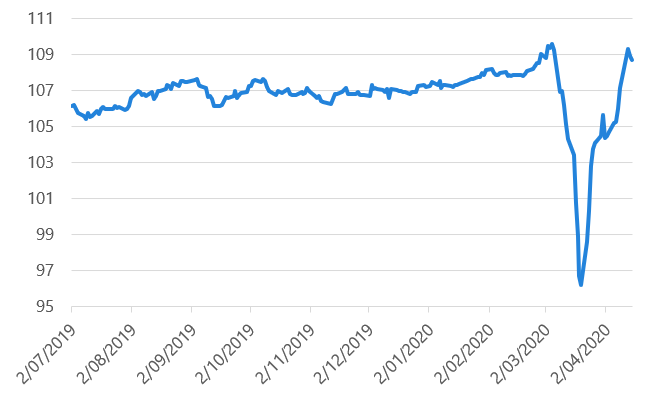
Source: Nikko AM, Bloomberg
This might be a little over the top, and in no way related to AT&T, but here is our general feeling about the Fed’s policy, inspired by the words immortalised on a plaque mounted inside the pedestal of the Statue of Liberty:
"Give me your tired, your poor,
Your huddled masses [credit] yearning to breathe free,
The wretched refuse of your teeming shore.”
People have been binging on credit for years and you can see the reaction of this shock: the Fed very quickly stepped into that void.
With the Fed policy covered, where are we now on credit? There are a few points to make:
- From an historical perspective, the yield that credit is offering is relatively attractive, i.e. it’s still wide.
- The Fed has shown they are willing to support the US market and this has underwritten the losses for now.
- But, the economy is heading for a recession and default risk is real.
Some investors in fixed income worry about rising rates. But the longer you intend to hold your bonds, the smaller this risk becomes. The bigger risk is a default because it means an investor won’t get all of their capital back.
Points one and two above are self-explanatory. It’s point three that we need to be wary of because essentially we currently have a trade-off in credit:
“Do I think the credit I own could default with the economy closed?”
“Will the Fed (or RBA) save me if it goes wrong?”
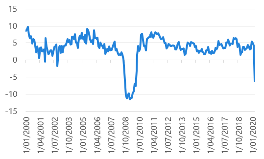
The economic data that came out of the US through April was shocking and there is no reason to expect it to get better while the lockdown continues. Retail sales, industrial production and initial jobless claims, which will be a proxy for unemployment, all experienced 2008-style falls, pointing to what we already know: the economy is in a recession.
Chart 8 US retail sales - YoY
Source: Nikko AM, Bloomberg
Chart 9 US industrial production - YoY
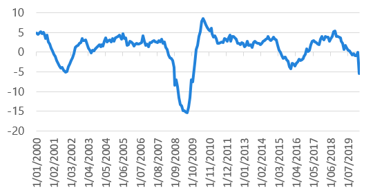
Source: Nikko AM, Bloomberg
Chart 10 Initial jobless claims
Source: Nikko AM, Bloomberg
Sure, you can run the argument that once we are all let out of isolation the economy will come firing back. But there is also the question of what sort of damage an event like this does to growth once we go back to work. To make the point, here are some pretty sobering statistics taken from the RBA’s recent Financial Stability Review:
“Despite the healthy state of listed corporates’ balance sheets ahead of the pandemic and substantial government support, the size of the shock will still test the financial resilience of many businesses. About one-quarter of businesses typically do not have enough liquid assets to cover one month of expenses (including wages) and closer to half could not pay for three months of expenses.”
“Surveys indicate that about one in five households only have enough liquid assets to get from one pay period to the next.”
So, the longer this lingers, the more debt companies will need to take on and the slower the recovery on the other side becomes. What this tell us is that it is far too early to start forecasting how the economy will recover.
Bringing us back to the credit idea, how do we look at the trade-off between:
- will it default;
- do I have a backstop, and
- when will we come out of this?
How have we responded so far?
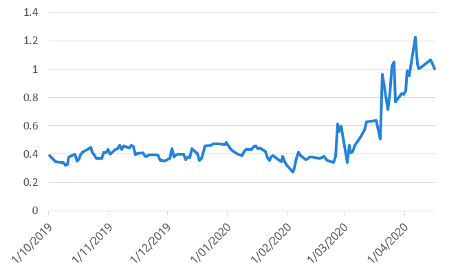
On the back of the announcement from the Fed, coupled with the risk-on tone from the market, the Australian bank spreads have gone on a tear. As an example, Chart 11 shows the ANZ 2023s against 3-year bond futures, which are now trading around 68 basis points over government bonds as at 4 May 2020. While the bond is now a year shorter, this is actually less spread than you received in July of last year. Interesting to see given the banks are going to be giving tens of thousands of payment deferrals and we are entering our worst recession since the 1930s.
Chart 11 ANZ 23s – Spread to 3-year futures
Source: Nikko AM, Bloomberg
1. Invest in solid corporates
In response, we are currently looking for short-dated corporates that we believe can survive the effects of us being in lockdown, particularly looking for the companies that will still be receiving cash flows through this period. Think telecommunications and supermarkets, for example, as the sell-off in credit spreads has hit all issuers.
We examined the index in search for corporates that had widened relative to bank paper, are short dated in case the economy gets worse, and are still receiving revenues throughout this period.
Note: This was not to say we should be out buying these issues; merely a first screen to look for candidates for deeper analysis.
Table 1 - Potential investment opportunities
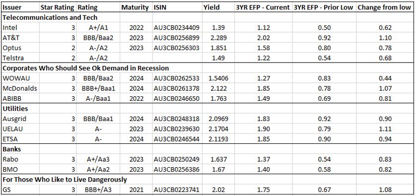
Source: Nikko AM, Bloomberg, as at 16 April 2020
After looking at the list and narrowing down what was available in the market (some of the prices were too tight to warrant buying), we ended up adding some short dated 2020 Telstra, 2024 Woolworths, AB InBev 2024s and 3-year covered bonds brought by the Canadian banks. We had also added Apple 2022s several weeks earlier). We did this by selling out of our short dated (<3 year) bank paper, which, as shown above, is trading back at pre COVID-19 levels.
As a quick aside, you will see that the star rating above has Telstra as a 2, which we wouldn’t normally buy. But in this case it was very short-dated paper (3 months) and given that we bought it at a size that is acceptable for a BBB holding (<1%), the fund can manage the risk of a downgrade. Given the bond was 100 over BBSW, the only way we could see it underperform is if Telstra goes under by July, an unlikely proposition given they just issued new debt in the European market.
Chart 12 - Telstra 2020s spread to 3-month BBSW
Source: Nikko AM, Bloomberg
Overall, we don’t want to load up on credit just because the Fed is doing it. Instead, we are trying to add a small number of solid corporates that will give good carry and switch out of things that have rallied away from the highs. This keeps our overall exposure to credit stable, but switches into bonds that have not seen their spreads narrow as much as the banks.
2. Examining spread differentials
The second thing we have done is start looking at the spread differential between bank paper and semi-governments. The run from bank paper compared to everything else is quite amazing given the circumstances. For example, Chart 13 shows those same ANZ 2023s against Queensland 2023 bonds.
Chart 13 ANZ 2023 spread to QTC 2023
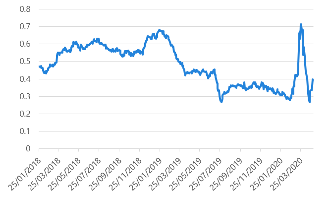
Source: Nikko AM, Bloomberg
Essentially, the market has been saying it doesn’t want to own semi-government bonds as they have too much debt to issue—since the stimulus packages will increase government debt. At the same time, the market has been telling us that as we head into a recession, it doesn’t need any extra compensation for holding bank paper over state governments than it normally would.
Our view is that the market believes the banks are back-stopped by the government (something we don’t entirely know yet), even though Queensland is actually a government. Over the past couple of days, semi-government spreads have rallied aggressively to improve the above ratio.
If we roll out the semi-government maturity date ever so slightly, then we get this spread between 2023 bank paper and 2027 semi-governments: twenty points of pickup for owning NSW instead of ANZ if you’re happy to go four years longer.
Chart 14 NSW 2027 yield vs ANZ 2023 yield
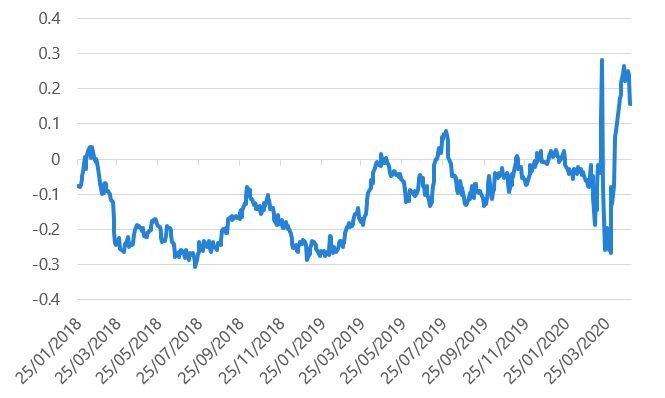
Source: Nikko AM, Bloomberg
Why has this happened? Because the semis have lagged the risk-on tone compared to the move of the major banks, particularly in longer dated maturities. Sure the semis will be issuing more bonds, but let’s not lose sight of what a prolonged shut down could mean for the banks. Another comment from the RBA:
“Amongst households with mortgage debt, just under one-third of mortgages have less than one month of prepayments, and about half of these appear particularly vulnerable to a sharp decline in income.”
We’ll come to our reasoning below, but we like the 2027 part of the curve and as such used this to sell some bank paper and buy 2027 semis.
Government bonds: Carry and roll — The final benefit of that trade
To understand why we think the 2026 – 2028 part of the government curve looks attractive, we need to explain the concept of carry and roll. This is a very common metric used in fixed income, but can get a little technical.
In fixed income, there are two ways to earn money:
- the passage of time (your carry)
- how interest rates change (roll).
When looking at these, point one is determined when you buy the bond, as it will be dictated by the yield that you receive. Point two, however, is more deterministic, as it is a function of where the yield ends up over the holding period.
The good thing about fixed income is we can calculate the bond price today and in the future to get a feel for what different yields mean for returns. This allows us to deconstruct the expected return into carry and roll.
An example makes this easier to understand. Chart 15 shows hypothetical bond yields entered into a yield curve below. On the horizontal axis is years to maturity, on the vertical axis is yield.
Chart 15 - Carry and roll example
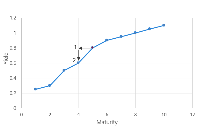
Source: Nikko AM
If we were to buy a 5-year bond (red dot) at 0.8% yield and the bond did not change in yield over one year, then in one year’s time we would own a 4 year bond at 0.8% (point 1).
In this instance, the owner of the bond would receive their coupon with no capital changes. Therefore, to determine what return there is for the passage of time, we can simply price a 4-year bond (since one year passed) at time point 1 on Chart 15 with our original yield. This gives us a return associated with time.
But since the yield curve is downward sloping, the yield of the bond is going to naturally fall through time if nothing changes. You can see this at point 2 in Chart 15, i.e. a 4-year bond is 20 basis points lower than a 5-year bond. To account for this, we can look where a 4-year bond is currently trading (0.6%) and then reprice the bond again in one year’s time, only this time at the lower yield. This will give us the capital change for our roll return.
By comparing the returns at points 1 and 2 on the chart, we can deconstruct the bond returns into carry and roll to get a better understanding of what the returns will be made up of and where the best buying opportunities may lie.
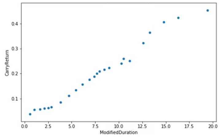
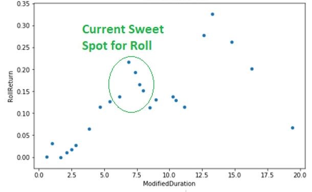
If we take the current Australian government bond curve and perform this exercise, we get the following carry and roll components. (Carry just looks like the yield—it’s the roll that has the funky shape).
Chart 16 - Government bond carry
Source: Nikko AM, Bloomberg
Chart 17 - Government bond roll
Source: Nikko AM, Bloomberg
Chart 17 shows you can get a decent increase in roll occurring at around five to eight years of duration, with very little roll before five years.
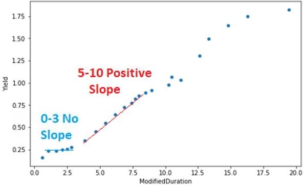
If we look at the government yield curve, you can see why the 0 – 3 year government bonds have no roll compared to the longer dated bonds. The RBA has told us that they want 3-year bonds to trade around 0.25%, which is the cash rate, and all the short dated bonds have now moved there. This creates a very flat bond curve out to three years, as seen in Chart 18. Meaning when we reprice the bond at the new yield in the future—it hasn’t changed—so there is no expected roll return.
However, once you move past three years, where the RBA is no longer targeting 0.25%, you start to get some slope to the bond curve. This increases the ability for the bonds to roll down, just like in our example above.
Chart 18 - Government bond yield curve
Source: Nikko AM, Bloomberg
The problem with carry and roll is that for roll you need to assume some yield holds in the future. If you get that assumption wrong, your roll return will be off and a different part of the bond curve can be more lucrative to own.
However, the RBA is telling us that:
“Members supported the proposal and agreed that the cash rate would not be increased from its lower level until progress is made towards full employment and there is confidence that inflation will be sustainably within the 2–3 per target cent range. Given this, it was considered likely that the cash rate would remain at a very low level for an extended period.”
“Members thought it likely that the target for three-year yields would be maintained until progress was made towards the Bank's goals of full employment and the inflation target.”
Given there is no sign of inflation and unemployment is about to spike, we can safely assume that this policy will still be in place in 6 – 12 months’ time. And if this is the case, then those 4-year bonds will have rolled down to become a 3-year bond, entering the RBA’s 0.25% target range (and making our roll estimate pretty likely). Those 5-year bonds will have rolled down to become 4-year bonds, putting their yield just above 0.25% range. You can keep running this idea; moving out the curve until you hit a time frame when you believe the RBA will no longer need this policy. This makes the roll idea a bit more certain than it usually is.
As we enter the hard economic times, we believe it is more likely that this QE policy gets priced further out into the future. If you think it could last for two years, then the 2025 bonds (which will be 3-year bonds in two years’ time) should fall towards the RBA’s 0.25% target as the RBA will eventually end up owning them.
This gets us to that 2027 part of the curve, where you get decent roll down and the potential for the curve to flatten if the policy persists. Hence, moving out of the 2023 bank paper into 2027 semis increases the yield of the fund, gets you to a part of the curve where the government bonds are rolling down quickly and also increases the credit rating of the fund. It’s not a trade without risk, in that the market could push bank spreads lower and not semis. But a lot of the components to it make sense.
This means over the past month we have reduced our major bank exposure, increased our corporate exposure and added more semi-government bonds.
Stay one step ahead of the crowd
Our investment philosophy is based on identifying pricing anomalies. Inherent in this philosophy is the belief that markets are often incorrect in forecasting short-and medium-term influences and conditions. Keep up to date on where we believe the market has got it wrong by hitting the 'follow' button below.
Never miss an update
Enjoy this wire? Hit the ‘like’ button to let us know.
Stay up to date with my current content by
following me below and you’ll be notified every time I post a wire
Chris is responsible for portfolio management, including portfolio construction and trading for various Australian fixed income portfolios including the Nikko AM Australian Bond Fund at Yarra Capital Management (Nikko AM was acquired by Yarra Capital Management in April 2021). Chris has over 9 years of experience in the fixed income market. He is also co-host of the popular Australian podcast series The Rate Debate.

3 stocks mentioned
Chris Rands
Co-Portfolio Manager, Fixed Income
Yarra Capital Management
Chris is responsible for portfolio management, including portfolio construction and trading for various Australian fixed income portfolios including the Nikko AM Australian Bond Fund at Yarra Capital Management (Nikko AM was acquired by Yarra...
Expertise
Comments
Comments
Sign In or Join Free to comment