German confidence, Vegas gamblers and explaining currencies
.png)
This week’s charts begin with a “traffic light” measurement of German business confidence. Turning to the euro-dollar exchange rate, we run a regression model aiming to correlate currency moves with the price of oil and interest-rate differentials. In the wake of Turkey’s surprisingly large rate increase, we chart the lira’s performance after similar episodes. We compare the likelihood of making money from a buy-and-hold strategy in various equity markets and show how this failed in Japan. For the inflation hawks, we visualise the M2 measure of money supply. In emerging markets, we track how Chinese construction starts have slowed and how the BRICS economies are, broadly, not converging – with the US or each other. Finally, we turn to Las Vegas, where the house is winning: casinos are raking in above-trend gambling revenue that evokes the pre-GFC good times in the American economy.
German business confidence stuck at a red light
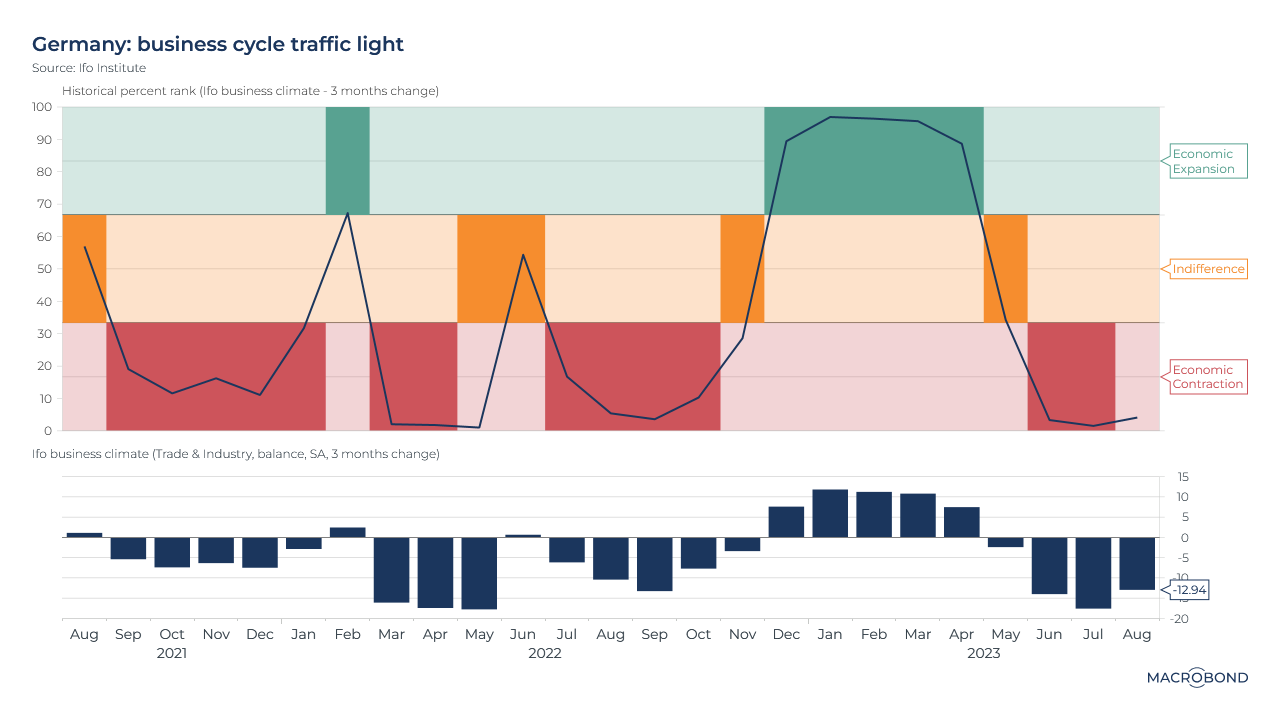
This morning, Germany’s Ifo Institute released August figures for its widely watched business survey – and it confirmed the nation’s economic contraction. The business climate index slid to a three-year low of -20.9.
The top pane of the chart uses Ifo’s “traffic light” configuration to compare the three-month change in reading to this measure’s historic range, which has been split into three slices: green, yellow, and red. This summer’s data points have been not just well into “red light” pessimism (the bottom 33 percent of all readings) but at the very bottom of the distribution.
The bottom pane tracks the value change versus 3 months ago – including today’s reading: a decrease of 12.9 in August.
Why the euro-dollar FX rate moves
Note: This chart’s ICAP time series require our premium data sets.
What drives the most important currency pair? There are various factors, but conventional wisdom says rate differentials are key: when the ECB was tightening in 2008 and the US was fighting the subprime crisis, for instance, the euro soared as capital chased higher yields.
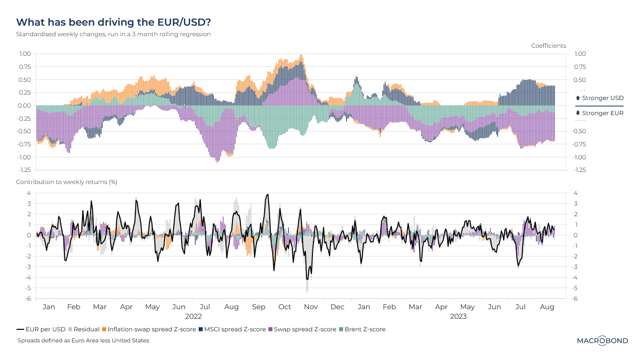
This visualisation is the result of a rolling regression model we built, attempting to find correlations that explain why EUR/USD moved at a given point in time. We tracked two swap spreads. One is a proxy for the perceived future of rate differentials; the other is for which currency is losing more value to inflation. We added Brent crude – ECB research found that pricier oil is correlated with USD weakness – and we added a MSCI spread tracking whether US or European equities outperformed.
According to this model, inflation is having little influence at the moment. But future rate differentials have a substantial negative influence: if the spread moves in Europe’s favour, the euro strengthens.
Meanwhile, spreads between equity markets have the opposite effect: if US stocks underperform their European counterparts, that tends to strengthen the dollar. This could be related to the “dollar smile” theory: consider a “risk-off” market, where a selloff in US tech stocks coincides with a global flight to safety in the form of US Treasuries and USD.
The second panel shows each factor’s contributions to weekly returns – and also indicates the generally lower volatility in 2023 versus the 2022 “King Dollar” era.
Turkish rate shocks and diminishing returns for the currency
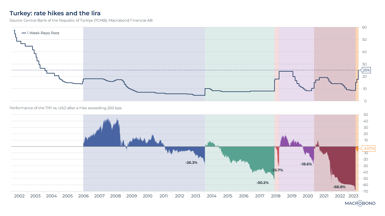
Turkey’s central bank shocked markets on Thursday, raising rates to the highest in more than two decades. (We had recently written about President Erdogan’s new economic team, considering the prospects that the nation would return to a more economically orthodox approach to interest rates and inflation.)
The key policy rate was lifted from 17.5 percent to 25 percent – surpassing the 20 percent consensus forecast. The lira soared.
Will the currency sustain these gains? The lessons of history suggest that previous tightening episodes resulted in diminishing returns.
This chart’s first pane tracks the key policy rate. The second panel tracks TRY vs USD. The shaded areas are the periods that followed rate increases of 2 percentage points or more. (The current period groups together several such increases.)
About two years of lira strength followed the big rate hike in 2006, relatively early in Erdogan’s tenure. Later interventions had an increasingly shorter-lived effect on the currency.
Buy-and-hold didn’t work out in Japan
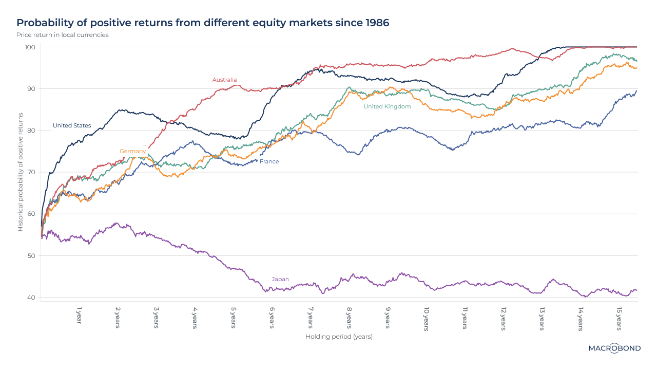
This chart revisits a previous theme: how long would you have had to hold a given equity index to ensure a decent chance of a positive return?
Crunching data going back to 1986, we analysed the US, Japan, Australia and various European nations’ stock benchmarks.
On a two-year horizon, you would have been best off Stateside. The chances of a positive return were about 85 percent. The first 100 percent guarantee of positive returns comes at the 12-year mark – for Australia.
Japan, due to its 1986-1991 asset bubble, is a remarkable outlier. Only the shortest time horizons had a better-than-even chance of a positive return.
Keeping an eye on global M2 money supply
.png)
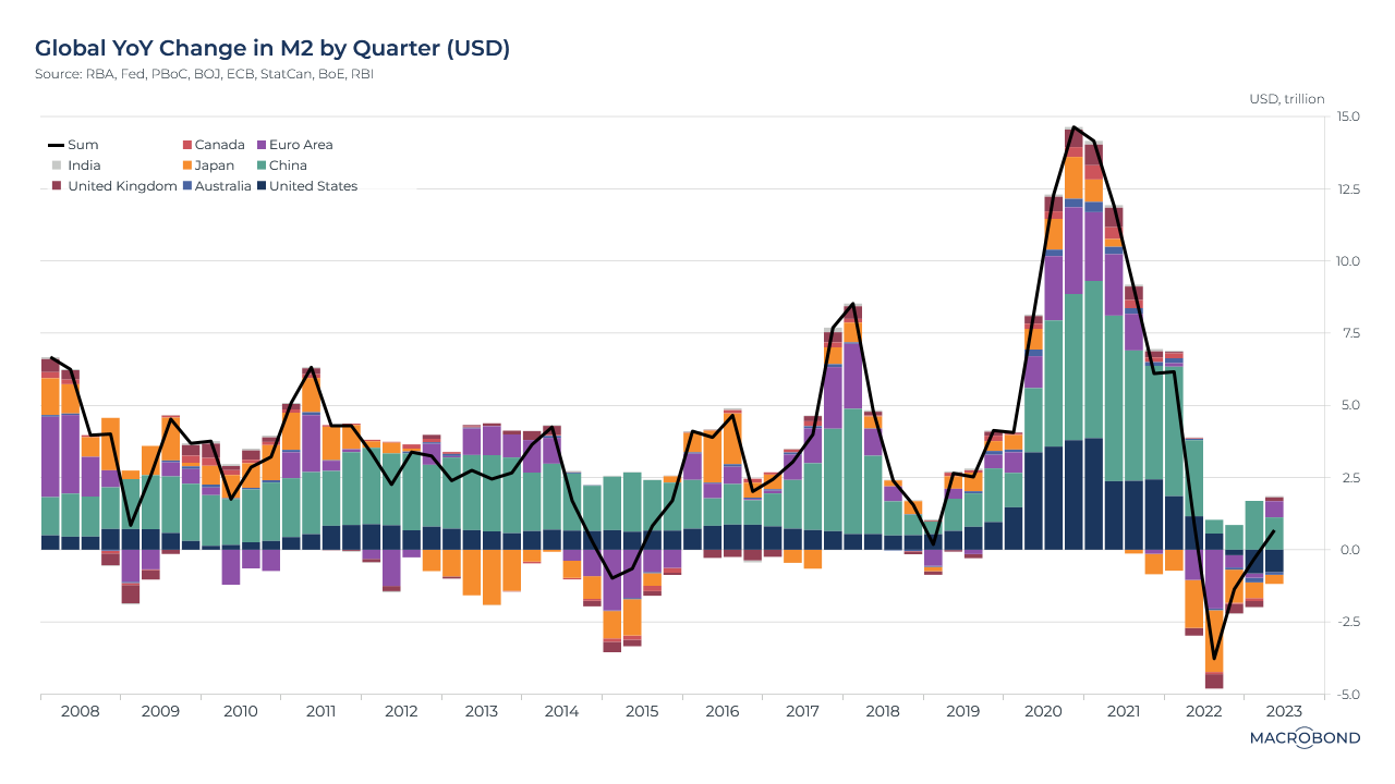
Many strategists have a favourite inflation indicator. One of them is the M2 measure of money supply, which includes cash, chequing and savings account deposits, and other short-term saving vehicles.
This chart measures the aggregate 12-month change in M2, measured in USD, across the largest central banks. Money supply grew at a record pace during the pandemic, exceeding the growth seen during the various quantitative-easing programs of 2008-15. This was followed by a record decline in 2022 as central banks tightened policy to tame inflation. (Only China posted positive money-supply growth over the entire time frame of the chart.)
(One prominent Macrobond aficionado says M2 could have helped predict the 2021-22 inflationary episode, and might tell us what is coming next.)
Sluggish construction in China
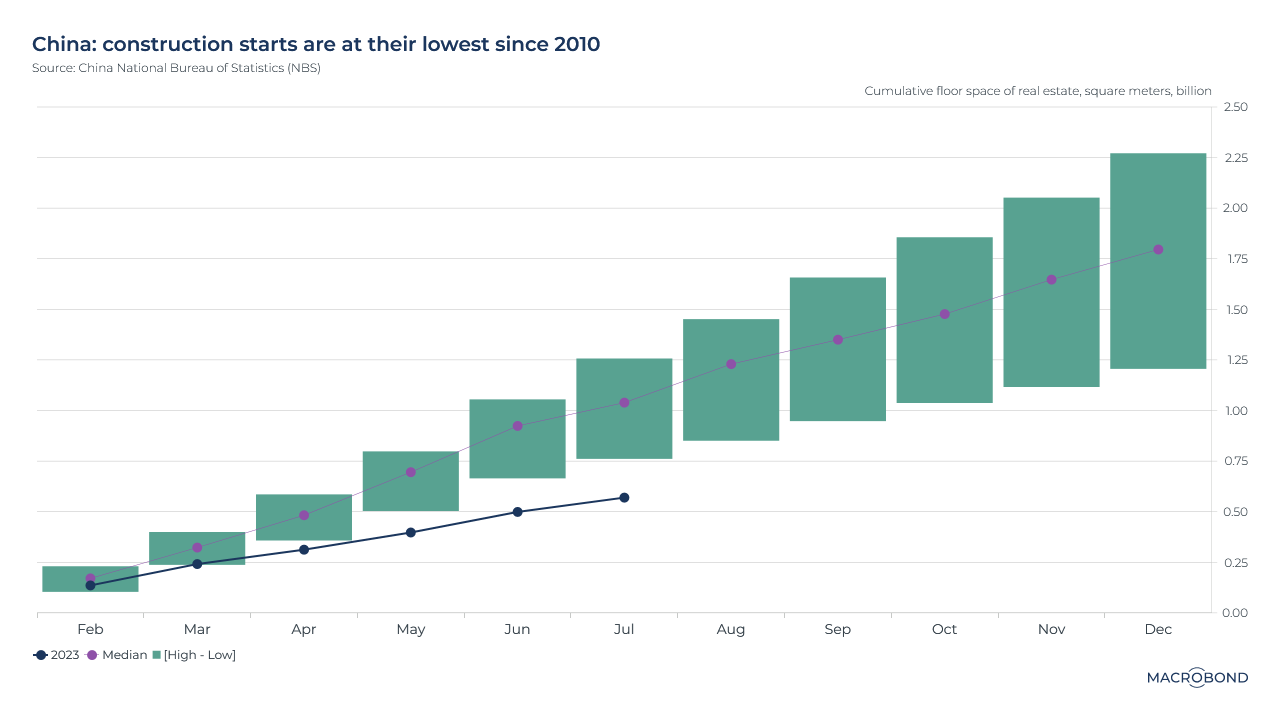
As China’s real-estate market stutters, the effects can be seen on new construction. This chart tracks construction starts (measured by floor space) across calendar years, showing the median and high-low ranges since 2010.
This year’s trajectory is currently 26 percent below the historic lows of that range.
Most BRICS are in a spiral
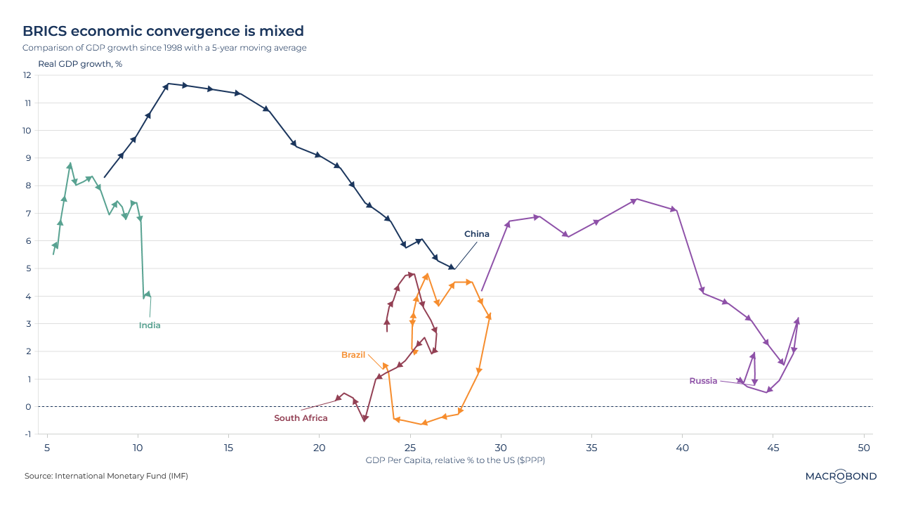
The BRICS nations are in the news again. At the group’s summit in South Africa, the five-nation bloc – originally just a strategist’s concept two decades ago, grouping the biggest fast-growth emerging economies – said it would invite six new countries to join, including Iran and Saudi Arabia, as it seeks to champion the “Global South.”
This visualisation uses IMF data to plot each nation’s progress over about 20 years. The X axis measures GDP per capita, relative to the US, in purchasing power parity (PPP) terms. The Y axis tracks growth rates in real terms, i.e. adjusted for inflation.
Measured this way, the five nations have been on very different paths – though all of them show a slowdown in real GDP growth terms over the decades.
Only China has made significant and consistent progress converging with US affluence. South Africa, Brazil and Russia’s spirals reflect deterioration versus the US.
Americans are hitting Vegas like it’s 2007 again
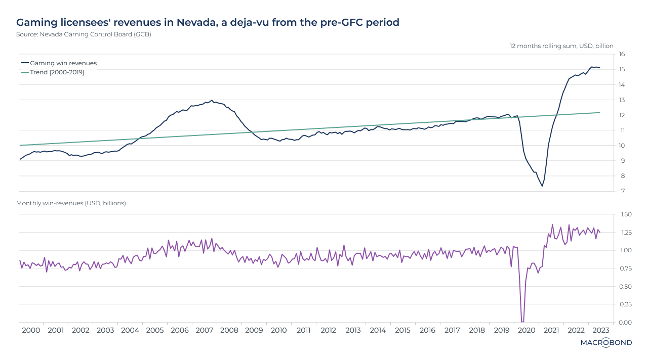
The gambling industry in Nevada continues to boom, even as the economy slows, inflation persists and Americans deplete their savings. Like demand for international travel, Las Vegas is benefiting from an extended period of deferred gratification post-pandemic.
This visualisation measures “gaming win revenue,” the income that casinos make directly from their roulette tables, slot machines and card games.
The first pane shows that this revenue source, measured as a rolling 12-month aggregate, shot through the long-term trend line in 2021. Perhaps ominously, the last time this occurred was the run-up to the financial crisis.
The second pane shows that monthly win revenue surged to a then-record of about USD 1.3 billion in 2021, and has stayed steady around that level ever since.
5 topics
.png)
Macrobond delivers the world’s most extensive macroeconomic & financial data alongside the tools and technologies to quickly analyse, visualise and share insights – from a single integrated platform. Our application is a single source of truth for...
Expertise
.png)
Macrobond delivers the world’s most extensive macroeconomic & financial data alongside the tools and technologies to quickly analyse, visualise and share insights – from a single integrated platform. Our application is a single source of truth for...
.png)