Stock scenarios and considering the peak Fed rate
.png)
This week’s charts start with three visualisations focused on equities. In Europe, we break down large-cap EPS growth to discover the counterintuitive outperformance of banks. We create a dashboard examining how the traditional 60/40 stocks-bonds portfolio would have performed versus other asset mixes. And following this month’s (potentially final) Fed tightening, we look at history to see how stocks performed before and after interest-rate peaks. As observers mull prospects for a Fed “pivot,” we demonstrate how the central bank tends to cut rates soon after it stops raising them. In emerging markets, we show how foreign investors have fled Turkish debt; how international use of the Chinese yuan is growing; and Brazil’s projected debt burden under Lula’s looser fiscal policy. Finally, we show how betting on gold has resulted in different outcomes depending on your home currency.
Even amid financial stress, banks are leading earnings growth in Europe
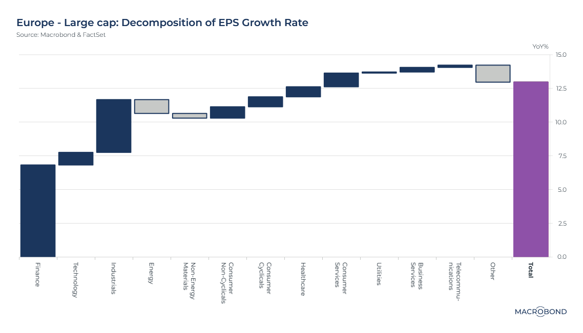
It might be counterintuitive in a year that has seen a series of US bank failures and the demise of 166-year-old Credit Suisse – but banks are driving earnings-per-share growth in the basket of large-cap European stocks tracked by Macrobond and FactSet.
As the sectoral breakdown in our chart shows, aggregate EPS is up 12.5 percent. Industrials are the second-biggest contributor to that gain after financial stocks. Energy is the largest negative contributor.
The end of the zero-interest rate era means banks are making more spread on their core lending business. ING of the Netherlands became the latest big European bank to beat profit forecasts this week.
And as Bloomberg News recently wrote, smaller European banks have been more tightly regulated; larger banks have mostly been cutting their US exposure; and European banks don’t face the same level of deposit competition from money-market funds as US banks do. So far, Credit Suisse is seen as an idiosyncratic one-off.
A dashboard for the 60/40 portfolio (versus going all-in on stocks)
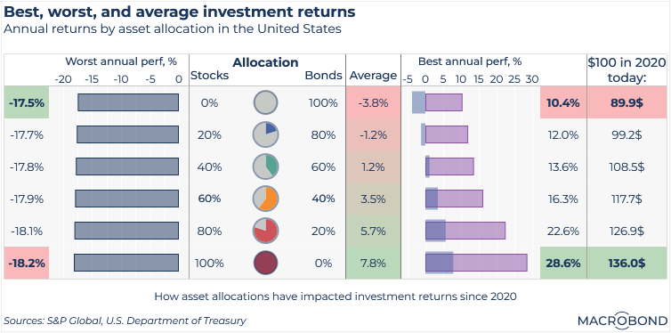
Traditionally, financial advisers recommended that investors with a moderate risk threshold put 60 percent of their money in equities, with the rest in bonds. Over the long haul, most academic research agrees that stocks outperform bonds, but a healthy slice of fixed income was recommended to provide downside protection and income.
Post-2008, this so-called “balanced” portfolio would have done well; tech stocks surged, and bonds benefited from ultra-low interest rates. But in 2022, 60/40 had one of its worst years ever.
Our dashboard explores how different blends of equities and fixed income would have performed since 2020, including last year’s annus horribilis. For stocks, we chose the S&P 500; for bonds, we chose the US 10-year Treasury.
Damage from last year’s bond rout means that to have generated any kind of absolute return over the past 3 ½ years, investors would need to have been at least 40 percent invested in stocks. A 60-40 portfolio would have made an average of just 3.5 percent per year, roughly in line with inflation.
If we’ve seen our last rate hike, history suggests upside for equities
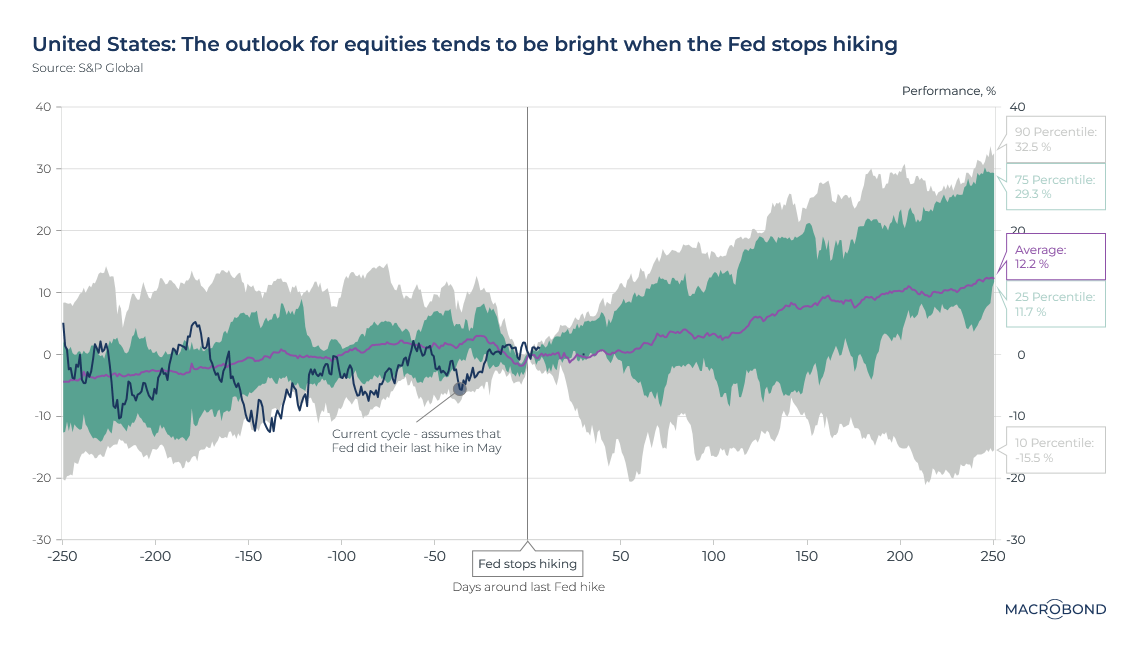
The Fed recently hiked rates to a 16-year high. Well-known bond fund manager Jeffrey Gundlach decreed this week that “the Fed will not raise rates again.”
If Gundlach is right, history suggests that stocks have upside from here.
As our chart shows, the S&P 500 has risen an average of 12.2 percent in the 12 months that follow an end to a tightening cycle. The 25-75 percentile range includes cycles where the benchmark rose from about 12 percent to almost 30 percent.
This updates a previous chart, in December, to overlay the stock benchmark’s performance over the past year, assuming that this month’s rate increase was indeed the peak.
Federal Reserve rates tend to peak rather than plateau
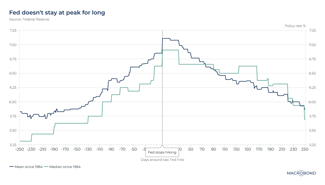
This chart tracks the mean and median Fed funds rate in the days before and after final rate hikes in historic tightening cycles.
When the Federal Reserve stops tightening monetary policy, stocks tend to rise.
This might seem obvious. But part of this performance might be due to the historic tendency of the Fed to start cutting rates soon after it stops hiking them, as the chart shows.
Put another way: the Fed generally doesn’t hold rates at a high “plateau” for long. Is this time different? One camp in the inflation debate has long believed that the Fed is more likely to “pause – not pivot” to quick rate cuts.
Foreigners steer clear of Turkish debt
Turkey’s voters go to the polls on May 14. Recent surveys suggest that after two decades in power, President Recep Tayyip Erdogan may be headed to defeat.
Reuters recently characterised the choice as “Erdogan's vision of a heavily-managed economy and its repeated bouts of crisis against a return to liberal orthodoxy under opposition challenger Kemal Kilicdaroglu.”
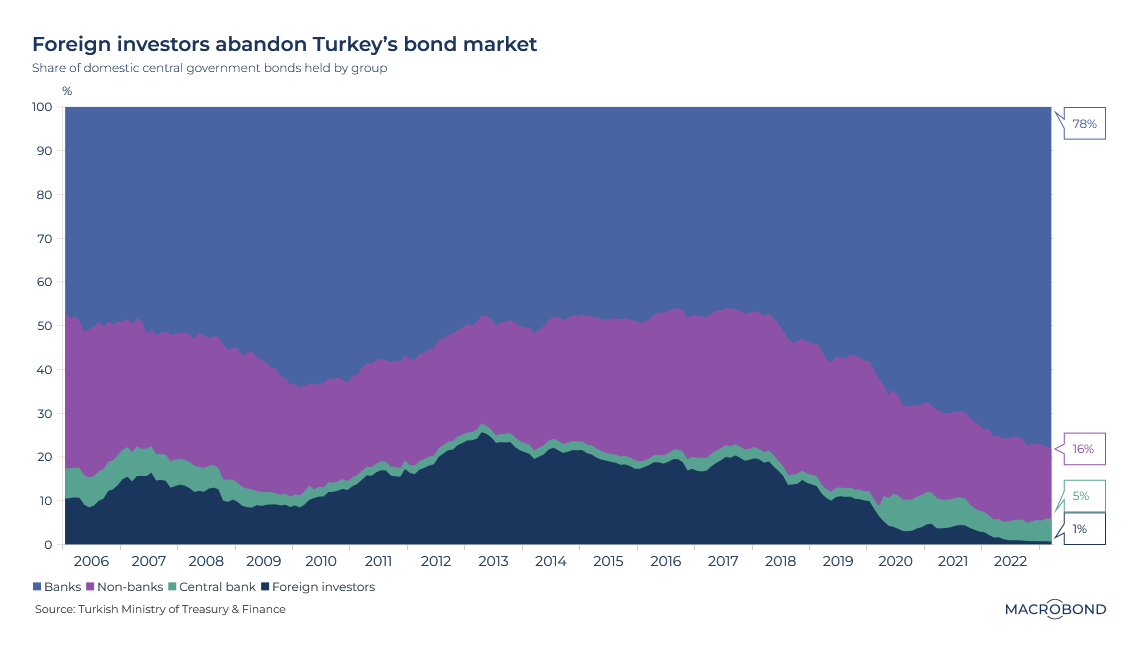
Indeed, Erdogan’s unconventional economic policies have dissuaded foreign investors, as our chart shows. Just 1 percent of Turkey’s government bonds are held by foreign investors – the lowest proportion in more than 15 years. Just five years ago, that figure was closer to 20 percent.
Foreign investors began divesting in 2018 after Erdogan began publicly pressuring the central bank not to raise interest rates to control inflation. The lira has tumbled almost 60 percent over the past two years, reaching record lows against the dollar.
The internationalisation of China’s renminbi
Two weeks ago, we explored the “de-dollarisation” debate. Returning to this theme, we measure the progress China has made in promoting international use of its currency.
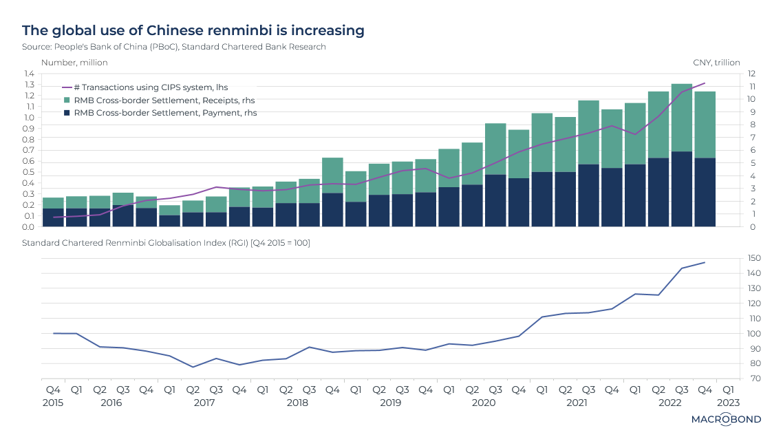
This chart tracks use of the CIPS (the Cross-border Interbank Payment System). The value of receipts and payments in renminbi (or yuan) terms has been gradually rising; transactions using CIPS have surpassed 1 million per quarter.
China introduced CIPS in 2015 after Russia was sanctioned by the US and EU following its annexation of Crimea, complicating the use of the dollar in Russian oil exports. CIPS can be viewed as an alternative to the SWIFT platform, the messaging system that banks use to transfer funds across borders. (Major Russian banks are banned from SWIFT.)
Our second panel tracks the Renminbi Globalisation Index. The RGI, compiled by Standard Chartered, measures the overall growth in offshore yuan use. (Its methodology can be accessed here.) After declining in the first two years after CIPS was created, the RGI has steadily moved higher since 2018.
Brazil’s debt burden to grow as Lula targets scrapping a spending cap
Brazilian President Luiz Inacio Lula da Silva defeated the conservative incumbent, Jair Bolsonaro, last year. Lula pledged to revoke the nation’s public spending cap, aiming to bolster spending on infrastructure and social benefits.
A congressional vote is expected soon on the cap, which Lula’s critics consider a pillar of fiscal credibility.
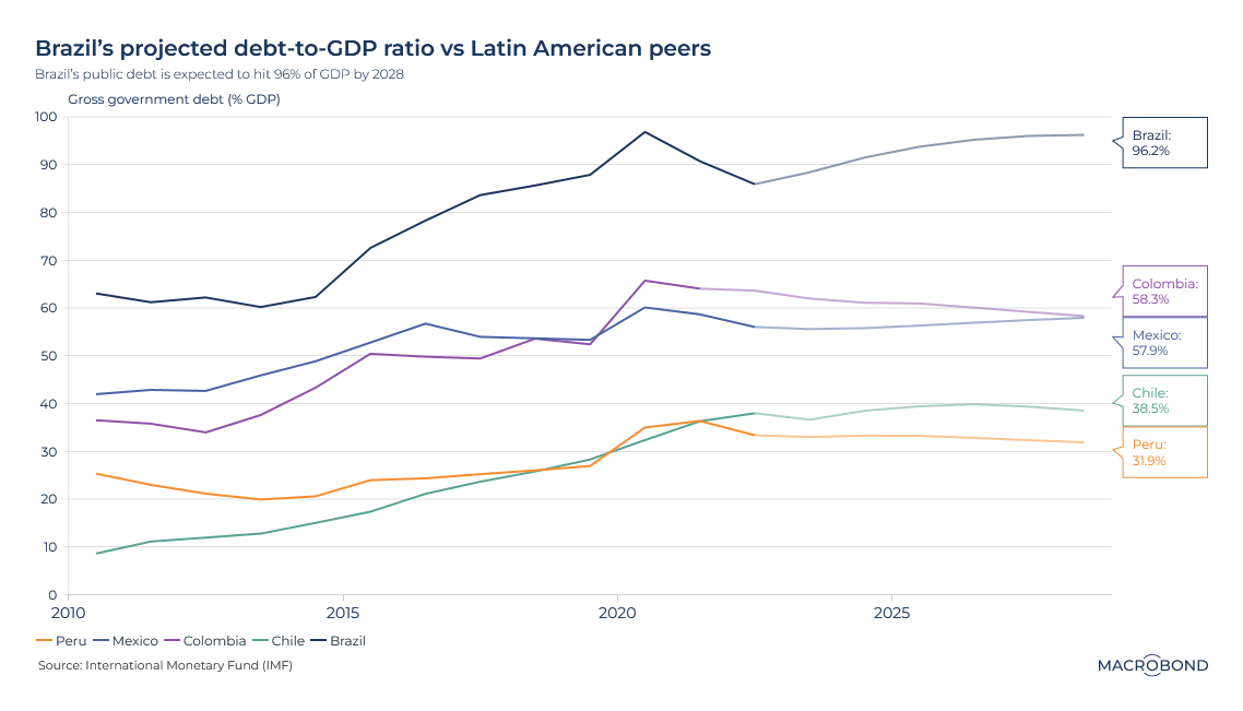
As our chart shows, the IMF projects that Latin America’s largest economy will see its ratio of public debt to gross domestic product gradually creep higher, approaching 100 percent by 2028.
By contrast, debt-to-GDP ratios are set to be broadly stable for Colombia, Mexico, Chile and Peru – and this measure of indebtedness had been falling sharply for Brazil during 2020-2022, despite the pandemic.
Betting on bullion paid off for Japanese and British gold bugs
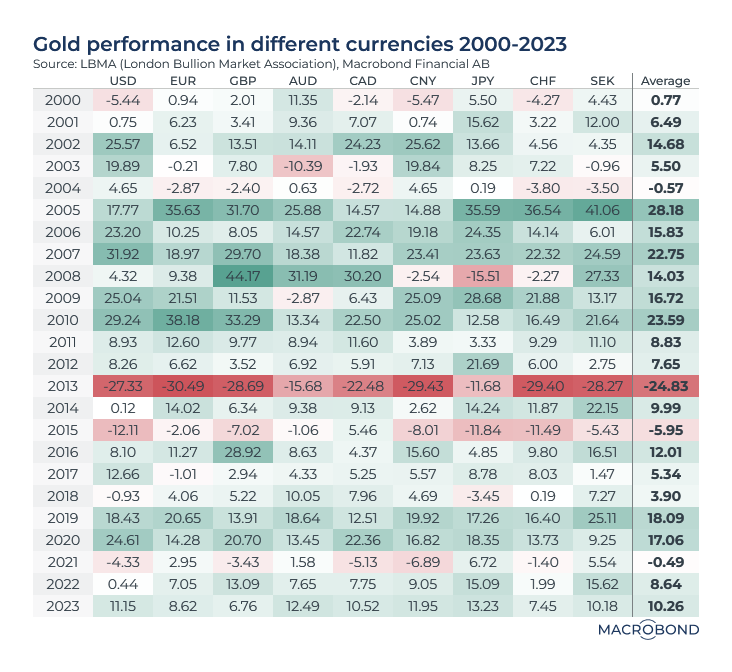
This table shows the performance of gold since 2000. In most years, and in most currencies, bullion prices were either stable or rose. (As the bright red bar shows, 2013 was the big outlier; economies were recovering from the financial crisis, and the Fed was withdrawing stimulus. Money flowed out of gold funds.)
Given that gold is priced in dollars, returns from investing in the metal can vary significantly depending on your home currency. As British and Japanese investors saw the pound and yen sink against the dollar, gold returned 13 percent in GBP and 15 percent in JPY – versus a flat performance in dollar terms in 2022.
4 topics
.png)
Macrobond delivers the world’s most extensive macroeconomic & financial data alongside the tools and technologies to quickly analyse, visualise and share insights – from a single integrated platform. Our application is a single source of truth for...
Expertise
.png)
Macrobond delivers the world’s most extensive macroeconomic & financial data alongside the tools and technologies to quickly analyse, visualise and share insights – from a single integrated platform. Our application is a single source of truth for...
.png)