The only charts that matter today (part one)
If a picture is worth a thousand words, then a chart is worth a million of them. So we asked the experts to isolate the charts you need to be watching right now. Read on to see 5 charts that Australia’s investment experts never take off their screens, and to hear why they are so critical.
Angela Ashton from Evergreen Consultants picks one chart to explain why you should sell anything you don’t have long-term conviction in, Charlie Jamieson from Jamieson Coote Bonds reveals the real reason the Fed suddenly went dovish, Kerry Craig from J.P. Morgan Asset Management quotes Jimi Hendrix to question the tenacity of this rebound, Ashley O'Connor from Invesco makes the case for looking at Alternatives, and Callum Thomas of Top Down Charts nominates the chart you need to watch for a heads up on when it’s going belly up.
Sell anything that you don’t have conviction in
Angela Ashton, Evergreen Consultants
Below is a graph showing the activity of central banks in changing the size of their balance sheets.
We think that many market participants have underestimated the effect quantitative easing has had on markets. This great monetary experiment has been, without a doubt, one of the major causes of the ubiquitous global asset price inflation we’ve experienced over the past decade.
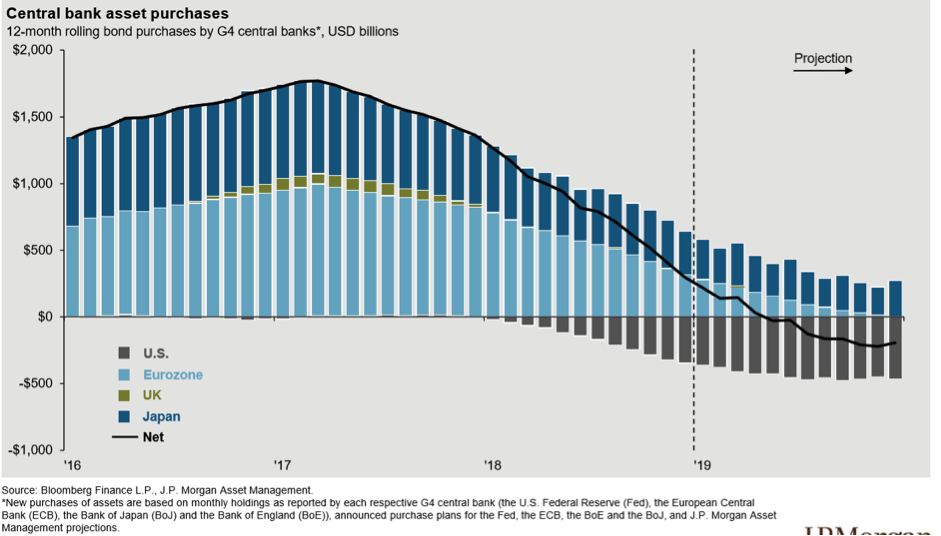
Since the slow withdrawal of this massive stimulus began in early 2018, markets steadily became more volatile. So much so that the Fed hit the pause button in December last year.
The calm is unlikely to last – central banks will need to tighten or risk not having fire-power for the next downturn.
Our advice is to take advantage of the recent market rebound to make sure you are happy with the assets you own.
Sell anything that you don’t have conviction in for the long-term.
The real reason the Fed was spooked into a dovish stance
Charlie Jamieson, Jamieson Coote Bonds
Since the financial crisis corporates have loaded up on bond issuance to the point where we now have over 50% of the Bloomberg Barclays US corporate bond index at the lowest rung of BBB rating.
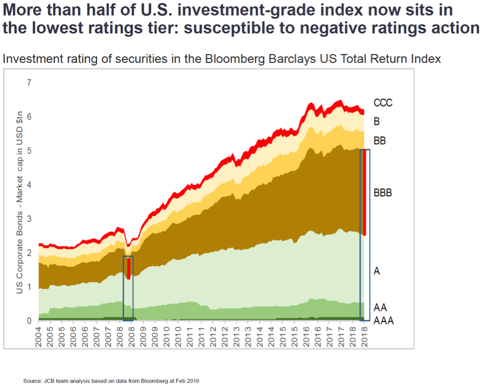
This matters for a couple of reasons.
- If corporates start to be downgraded bonds flow out of the investment grade universe and into the high yield or “junk” index forcing investment managers to sell those bonds as they are no longer able to hold them as “investment grade”
- The participation of the passive investor base has been growing substantially since the beginning of the decade to the point where roughly 30% of all owners of corporate bonds are index investors.
This matters because redemptions in ETFs will force selling into a market where liquidity from the banking intermediaries is thin at best. If we have a wholesale run of corporates downgraded to “junk” forced selling from ETFs can cascade spreads higher forcing large losses on credit holders and indeed forcing borrowing costs higher. As at end of 2018 investors pulled a record 60bn out of Junk rated debt.
It is interesting to note that in December 2018 there was zero issuance of high yield bonds - the worst performance since the GFC. JCB think this is the real reason the Federal Reserve was spooked into a dovish stance.
It is not earnings, but multiples, that are driving this rebound
Kerry Craig, J.P. Morgan Asset Management
As the late, great Jimi Hendrix put it:
“…castles made of sand, fall in the sea, eventually.”
This may resonate with investors as global equities have rallied hard but questions remain about whether the foundations are strong enough for this risk-on revival to turn into something more durable.
Markets have been quick to discount the big macro risks that weighed on them so heavily just a few months ago. But the market rebound has been solely driven by a re-rating of multiples, while analysts’ expectations for earnings continue to fall.
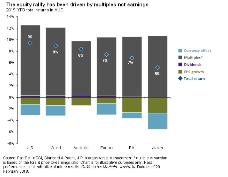
Investors may be hoping for the impossible, a combination of easing of monetary policy, a stable economic outlook and the evaporation of trade problems. But if trade risks fade and economic growth rates moderate, then central banks’ bias will shift away from easing. Equities may not fall back in the near term, but an improvement in earnings outlook is needed to propel them higher.
Time to look at alternatives
Ashley O’Connor - Invesco
Portfolio Management theory has, at its heart, the ‘60/40 Equity Fixed Income’ allocation. This ratio has become a practitioner default, based on the premise that Equities and Fixed Income have historically been negatively correlated and therefore buffer each other’s drawdown periods.
The 60/40 portfolio has had a dream run in the post-GFC environment – in fact, it’s been as good as it gets – as the chart below of the 8-year US portfolio returns since 1973 demonstrates.
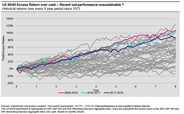
But other charts I’ve been watching question the sustainability of 60/40’s recent run. Observing the rolling correlations of Equity and Fixed Income in Australia a positive correlation has established in the past 5 years. It’s possible that in 60/40’s recent success are the seeds of its future underperformance.
I suspect it may be time for Alternatives to be enlisted to support a portfolio’s foundations; a complementary asset class that may be less vulnerable to the tectonic movements of global quantitative easing, quantitative tightening, and de-globalisation - or at least not as positively correlated to Equity and Fixed Income as these asset classes have been to each other recently.
Important Information: This document has been prepared only for those persons to whom Invesco has provided it. It should not be relied upon by anyone else. Information contained in this document may not have been prepared or tailored for an Australian audience and does not constitute an offer of a financial product in Australia. You may only reproduce, circulate and use this document (or any part of it) with the consent of Invesco.
Get a heads up when it's going belly up
Callum Thomas, Top Down Charts
This somewhat odd looking chart is deceptively clever in the broadness of its coverage and insight into the current global economic environment.
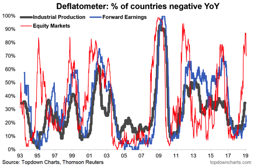
I dub it the 'deflatometer', and what it tracks is the proportion of countries that are experiencing a negative YoY change (aka deflation) in their stock market (red line), industrial production (black line) and consensus forward earnings (blue line). So the higher the reading is on the chart, the more dire that the situation is.
As you can see, the red line recently moved above 80% - that means at that time of the 70 countries we monitor, over 80% had a negative annual performance. The trouble is on more than one occasion this type of action in global stock markets has presaged a global economic recession (or at least a growth-scare).
In short, back in January, global equities were basically pricing in an imminent global economic recession. My base case at this point is that we are undergoing a growth scare, and are not on the cusp of a global recession.
The reason I highlight this chart, however, is because it can serve as an early warning and if things do worsen it will surely show up in this chart.
Watch out for part 2
We have 8 more charts from the experts to share, so watch out for part 2 of this collection in the coming days.
Never miss an update
Enjoy this wire? Hit the ‘like’ button to let us know.
Stay up to date with my current content by
following me below and you’ll be notified every time I post a wire
Livewire Exclusive brings you exclusive content from a wide range of leading fund managers and investment professionals.
5 topics
4 contributors mentioned
Livewire Markets
Livewire Exclusive brings you exclusive content from a wide range of leading fund managers and investment professionals.
Expertise
Livewire Markets
Livewire Exclusive brings you exclusive content from a wide range of leading fund managers and investment professionals.
Expertise
Comments
Comments
Sign In or Join Free to comment