Weekly S&P500 ChartStorm - 14 August 2022
The charts focus on the S&P500 (US equities); and the various forces and factors that influence the outlook - with the aim of bringing insight and perspective...
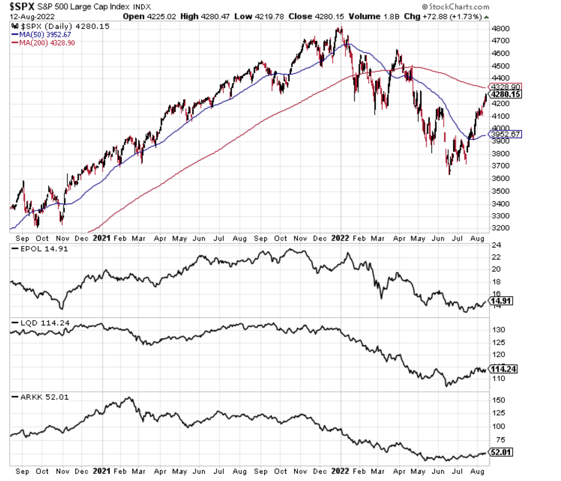
1. Risk Drivers: Earlier this year, this chart was a recurring addition, tracking a number of proxies for the big risk drivers that drove the initial correction/bear.
EPOL 0.95%↑ [Poland ETF] (geopolitics proxy) - Clearly the Russia/Ukraine conflict is still raging, with no obvious sign of resolution in the near term, but by now it is known and obvious, and what is less obvious is any way that it can get materially worse and drive substantial spillover/spread… Which is kind of constructive in a way, but equally, any type of surprise or new bad news on this front will rattle markets.
LQD 0.61%↑ [IG Credit ETF] (credit/rates) - Rising yields were a key downside trigger in H1, but now bond yields are looking relatively contained, and by my read are trying to push lower. The risk from here (and reason I used LQD - credit) is that rising yields stops being an issue, but deteriorating credit quality (i.e. wider credit spreads in the event of an economic downturn) becomes the new issue. Notably, this line in the chart below has stopped getting better.
ARKK 2.73%↑ [New Tech Fund] (tech burst) - The new tech bubble burst is well progressed, and at the very least this one has stopped going down for now, but it doesn't look particularly convincing either.
Overall it seems to be a picture of mild improvement, or at least a case of no longer getting worse. I would note though that on first glance, the S&P500 kind of looks like an outlier among that bunch (overly optimistic price action?). Meanwhile the 200-day moving average and that key 4300 resistance level loom overhead.
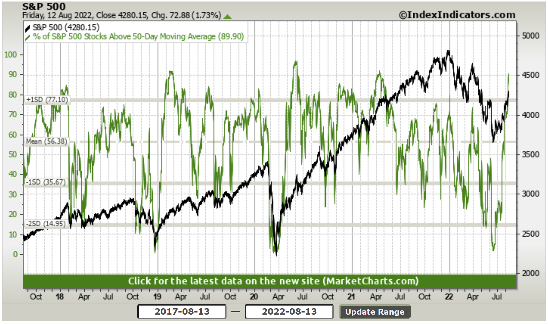
2. Short-term Market Breadth: As of Friday, about 90% of the market is back above their respective 50dma (up ferociously from almost 0% back in mid-June).
Bulls will note that this turnaround in breadth looks familiar to the 2018 + 2020 market bottoms and subsequent bull runs.
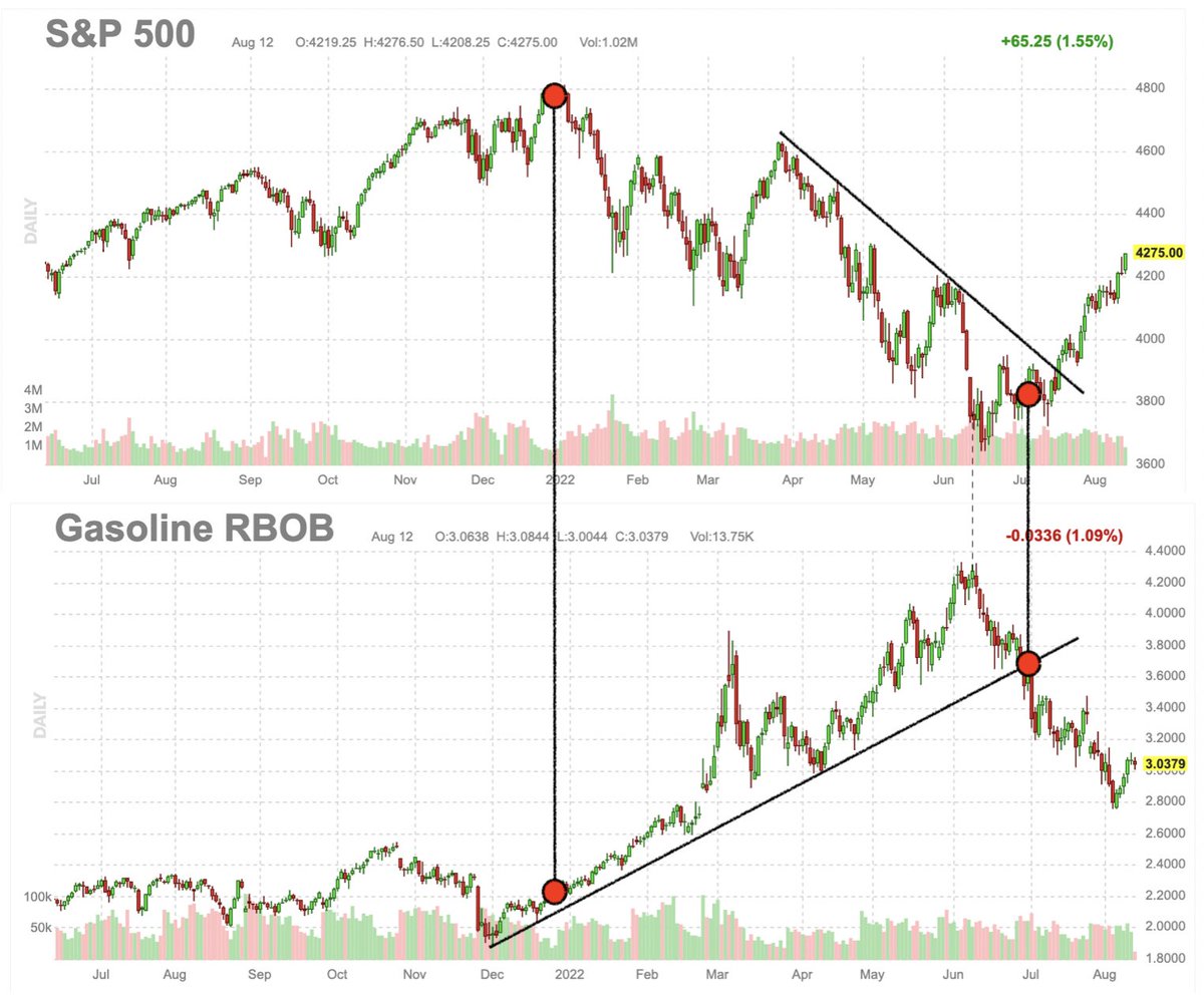
3. Pump Pressure: "It's the economy gasoline, stupid"
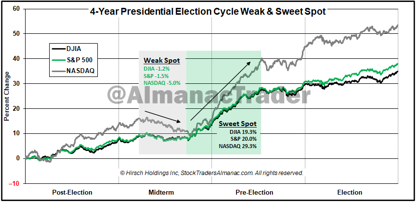
4. Moon after Midterms: Worth noting that we are still in the middle of a seasonally sketchy part of the year (/election cycle) — from Stock Trader’s Almanac: "seasonal/cycle outlook is for a lower low or retest of the lows over the next three months as we are in the worst two months of the year and are smack dab in the *Weak Spot* of the 4-Year Cycle"
5. Banking on Moon: Investors dumped banks in H1, now starting to get back in the water...

6. Bull/Bear Markets are a Process NOT a Percent Change: Ignore and discount anyone who tells you that 20% +/- is a bull/bear market. It's just not that simple.
As Burry pointed out, the Nasdaq rallied 20%+ seven (7) times during the 2000-2002 period (a period which most would describe as an actual bear market)
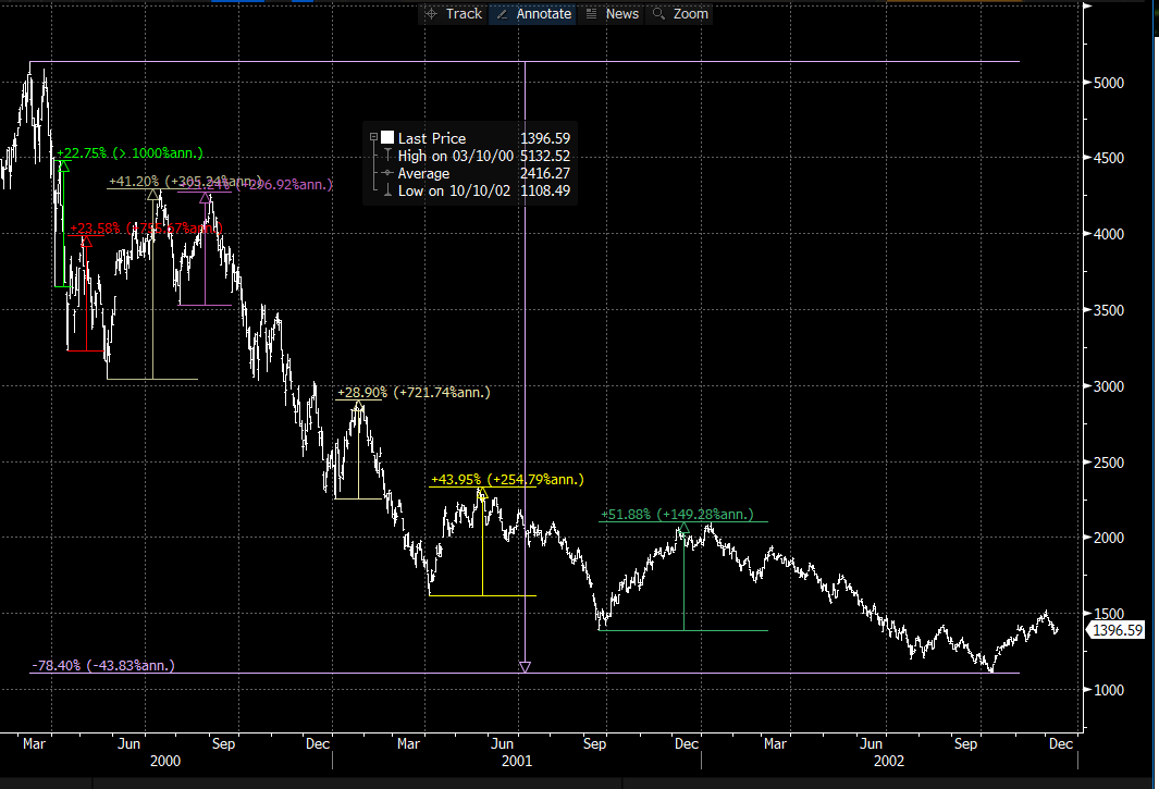
Source: @michaeljburry
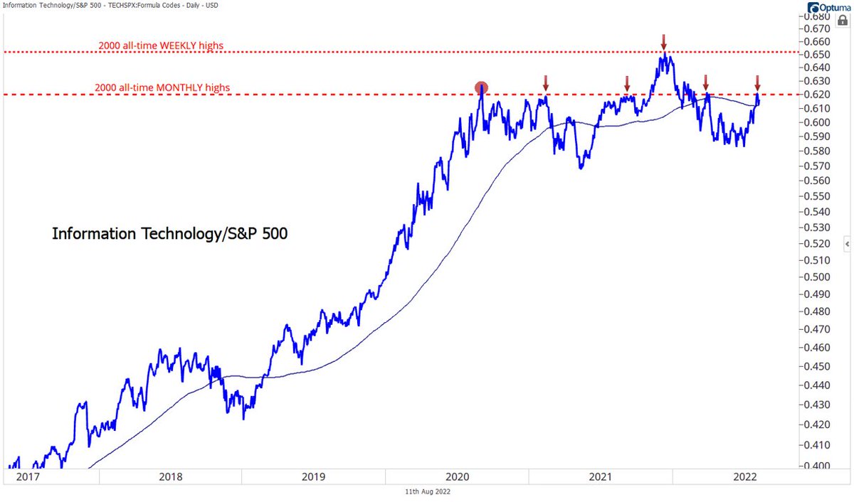
7. Tech Ceiling: Tech sector relative strength is stuck in the mud, and unlikely to be a driver of strength for the broad market unless it can breakout against stiff resistance.
8. Stocks vs Bonds: The Stock/Bond Ratio is making a break for it. As I noted in a report last week, the major determinant of whether this one goes higher or rolls over will simply come down to — recession: yes or no
So definitely one to watch on the macro front.

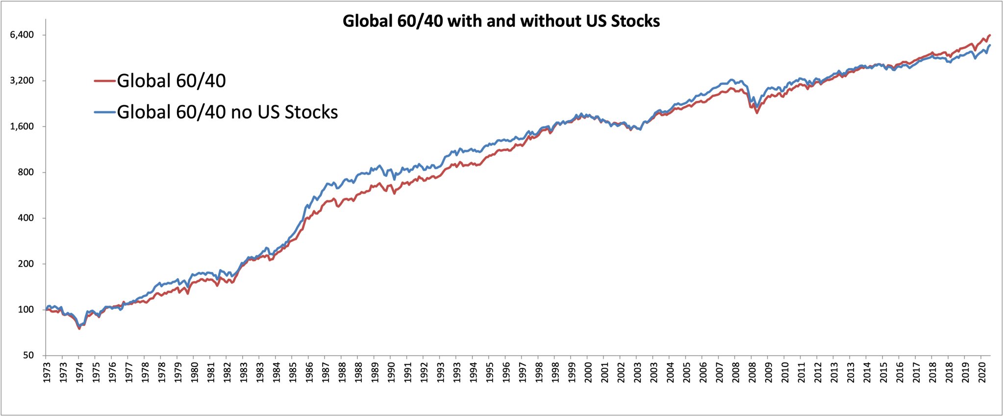
9. US vs Global Equities and the 60/40 Portfolio: This interesting chart shows the path of a global 60/40 portfolio with vs without US stocks.
I would say there is probably not as much of a difference as many might expect (given that US equities did almost 3x vs the rest of world over the past decade, and given the heavy (recency) bias that many investors have to US equities).
10. Under Index: This chart is basically a case study in arbitraging out of market inefficiencies: i.e. the "Index Effect" is apparently no longer a thing in recent times.
“the up-and-down trajectory that was once the fingerprint of the index inclusion effect now resembles a flat line that runs from announcement date through the weeks following inclusion in the S&P 500.“
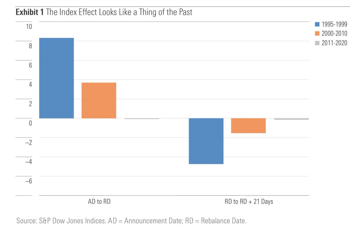
Source: @MorningstarInc via @SnippetFinance
p.s. Be sure to check out SnippetFinance’s own excellent regular mailout.
Thanks for reading!
Callum Thomas, founder and head of research at Topdown Charts.
Any feedback, questions, and views are welcome in the comment section below.
5 topics

