Weekly S&P500 ChartStorm - 15 May 2022
The Weekly S&P500 ChartStorm is a selection of 10 charts that I handpick from around the web and post on Twitter. The purpose of this post is to add extra colour and commentary around the charts.
The charts focus on the S&P500 (US equities); and the various forces and factors that influence the outlook - with the aim of bringing insight and perspective...
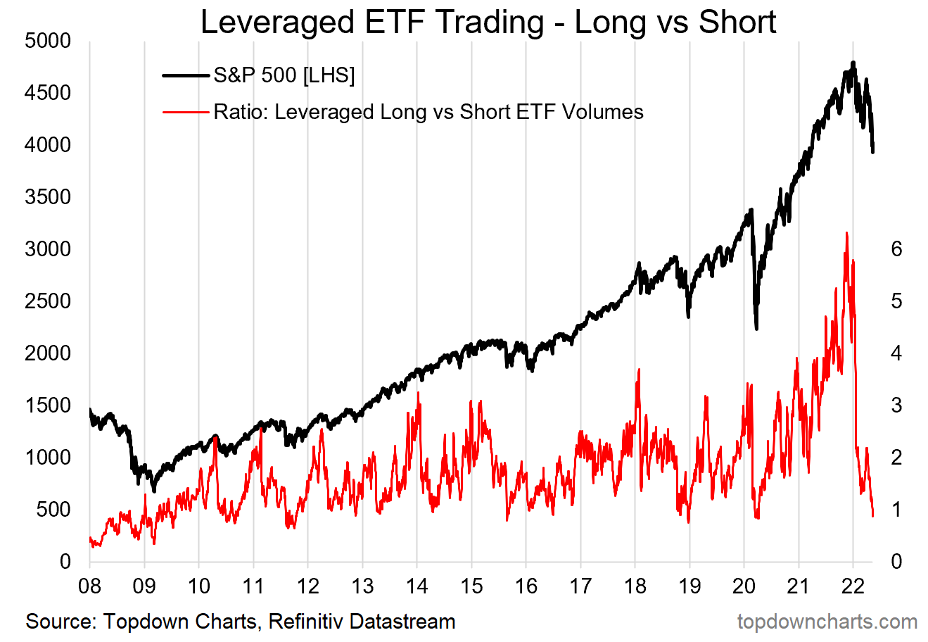
1. Bullish Speculation Evaporation: My leveraged ETF activity indicator has collapsed (the indicator shows the degree of activity in leveraged long vs short equity ETFs). Basically it amounts to a sort of bullish speculation evaporation, but also increasingly a surge in activity on the short side (more than 10x increase vs late last year). I would note that when the market gets a bit lopsided like this the odds of a short-term bounce are good, but strictly speaking with these types of indicators you want to see them stabilize or turn before taking a strong signal.
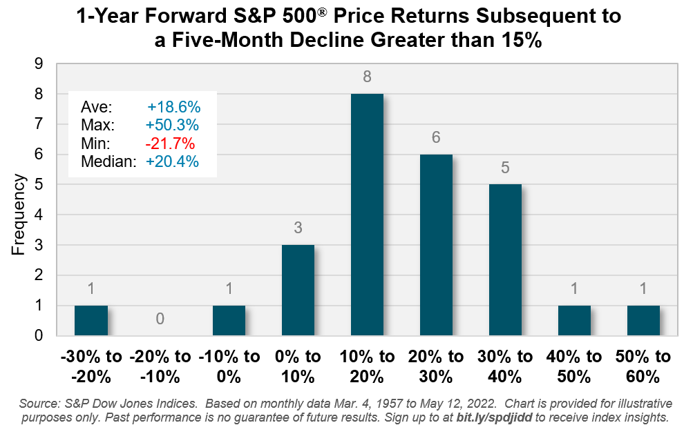
2. Rebound Redux? According to S&P Dow Jones analysis: "going back to 1957: a decline of 15% or more for the S&P 500 has been followed by positive returns in the ensuing 12 months in all but two occasions over the past 65 years"
Feeling lucky? (a lot of if’s and but’s for this one with regards to the broader setup e.g. rising rates, QT, inflation, etc!)
Source: @lhamtil
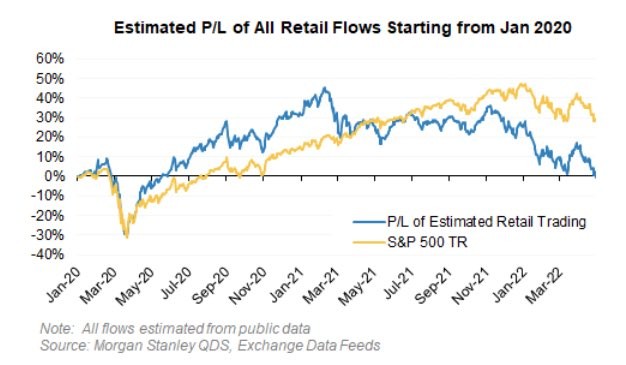
3. Retail Back to Square One: The monetary gods giveth, and the monetary gods taketh… Estimated retail PnL neutralized.
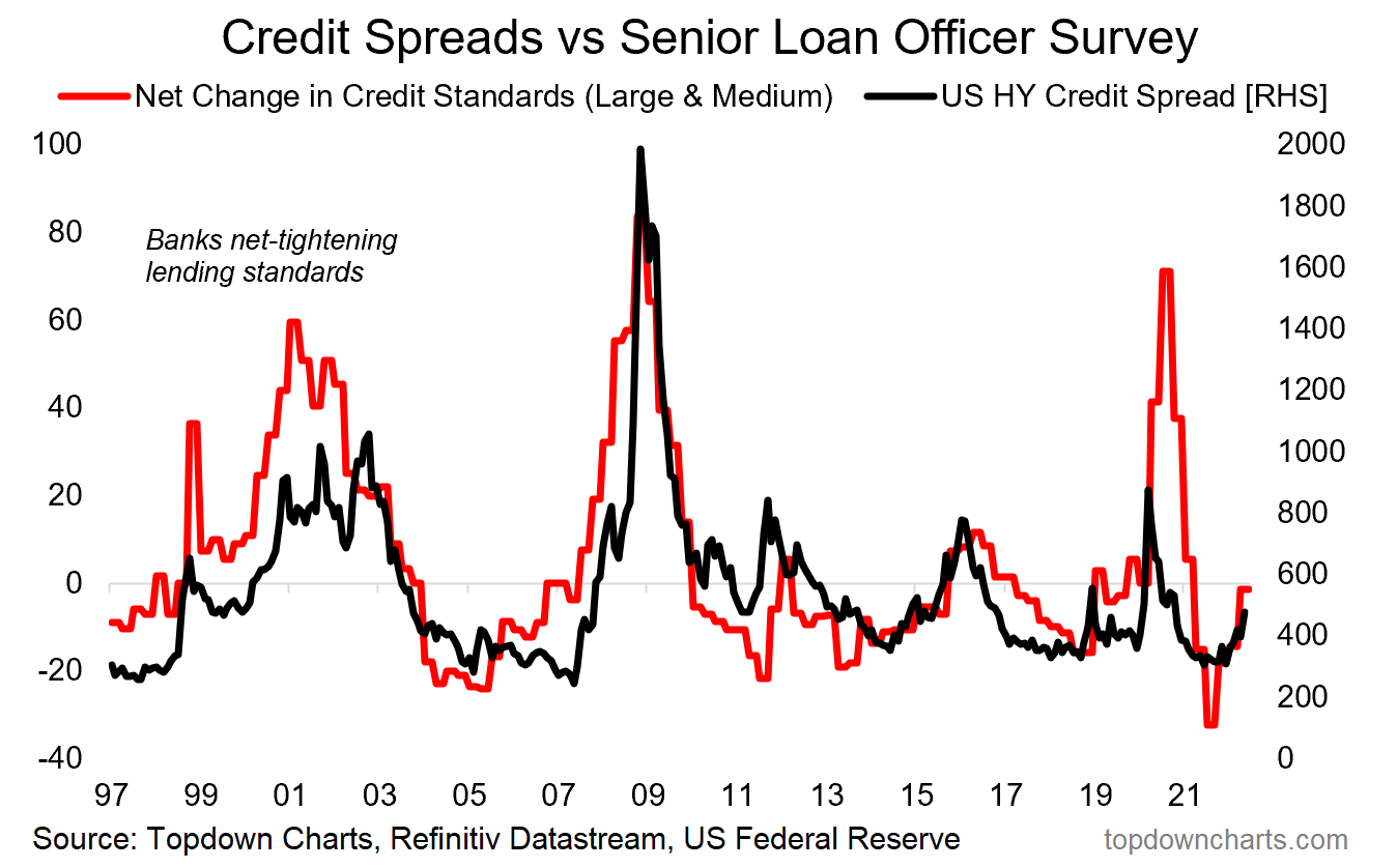
4. Correlation or Causation: The stock market generally has a bad time when banks are tightening up on lending. Part of this *is* correlation, i.e. tighter monetary policy, worsening economic outlook, deteriorating credit quality …are among the things that trigger banks to tighten up… but are also things that make stocks go down. But there is also causation in that lower availability of credit accentuates downturns, damaging fundamentals and limiting debt-driven speculation.
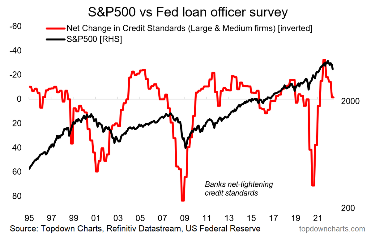
5. Correlation vs Causation pt2: Shifts in bank lending standards point to upside risk for credit spreads...
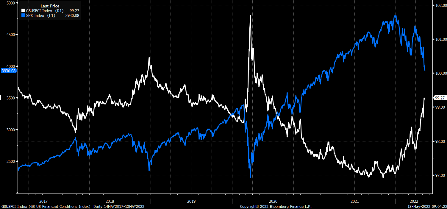
6. Financial Conditions: And another perspective — financial conditions are rapidly and drastically tightening (= bad 4 stocks).
n.b. this FCI does include equities (valuations) as one of its components, but it is clear/confirmed elsewhere that broader financial conditions have tightened a lot [higher bond yields, commodities, credit spreads, etc]. Also, as equities fall the cost of equity goes up and you also get negative wealth effects.
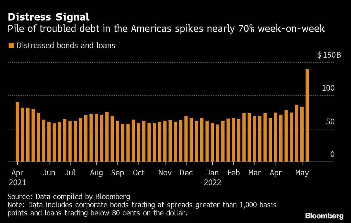
7. Dis Stress: Similar note, value of distressed bonds and loans spiking in May.
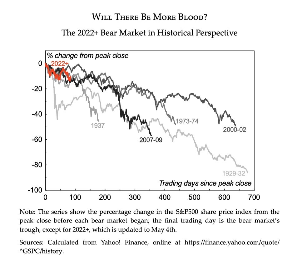
8. Perspective: Not a prediction as such, but certainly some perspective.
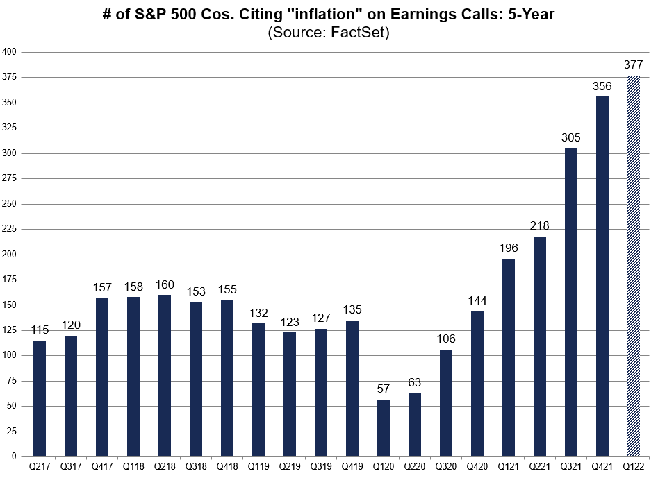
9. Pique Inflation: Whether or not we are at “peak inflation“ we are definitely at “pique inflation” given the amount of people talking about it!
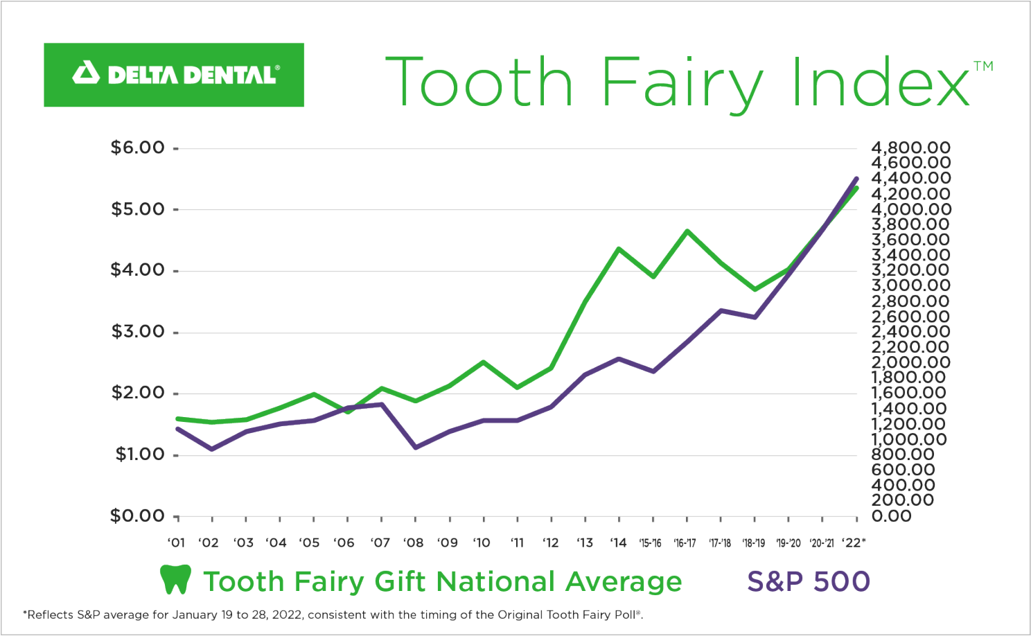
10. The Tooth: Delta Dental’s "Tooth Fairy Index" reached a record high of $5.36 per tooth this year, up 4x since inception (1998).
Thanks for reading!
Callum Thomas
Founder and Head of Research at Topdown Charts
Any feedback, questions and views are welcome in the comment section below.
5 topics

