Why we're bullish in 5 charts
Eley Griffiths Group does not always as a house run bullish, but we have in the past couple of years. In a recent presentation to the Morgans network, Portfolio Managers Ben Griffiths and David Allingham outlined some of reasons underpinning our current bullish stance.
Below are 5 charts from the presentation that provide context on our views and highlight some of the opportunities we've identified. A video of the presentation can be found at the bottom of this post, which also includes two of the stock specific opportunities we've identified.
Chart 1: Is the bull market really that old?
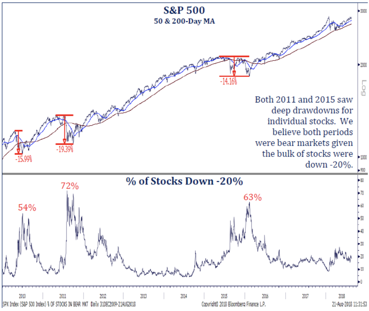
What it tells us
There have been 3 significant corrective periods in recent years. The S&P500 may not have breached the -20% “bear market” threshold, but 2011 and 2015 both saw steep draw downs. The percentage of stocks down more than 20% reached 72% in 2011 and 63% in 2015. The Shanghai Composite is down 35% since January 2018
Chart 2: Maybe it’s not as late as we think?
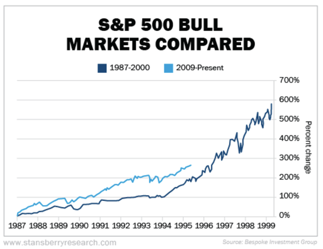
What it tells us
‘Animal Spirits’ take longer to heal after traumatic corrections such as the GFC. The consensus is still focused on the downside, not many investors are asking about upside. The S&P500 trading this year is eerily similar to 94/95. In 1994 the S&P500 delivered strong EPS growth only to finish the year broadly flat. By definition, the market started 1995 a lot cheaper (post the 1994 EPS growth) and rallied 34%. We’re yet to witness the euphoric ‘melt-up’ phase that typically marks the high.
Chart 3: Peak noise on trade?
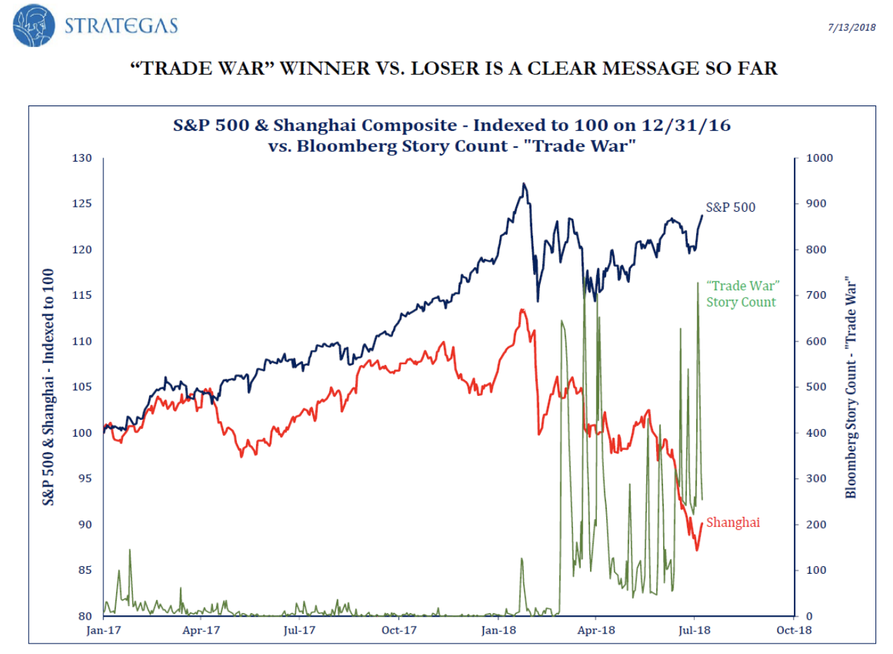
What it tells us
We believe we are at peak ‘noise’ on trade. The ‘Trade War’ story count has likely peaked. Markets are likely to refocus on US mid-term elections in the coming weeks and rising inflation data. We think emerging markets will benefit from trade rhetoric subsiding.
Chart 4: Emerging Markets look oversold
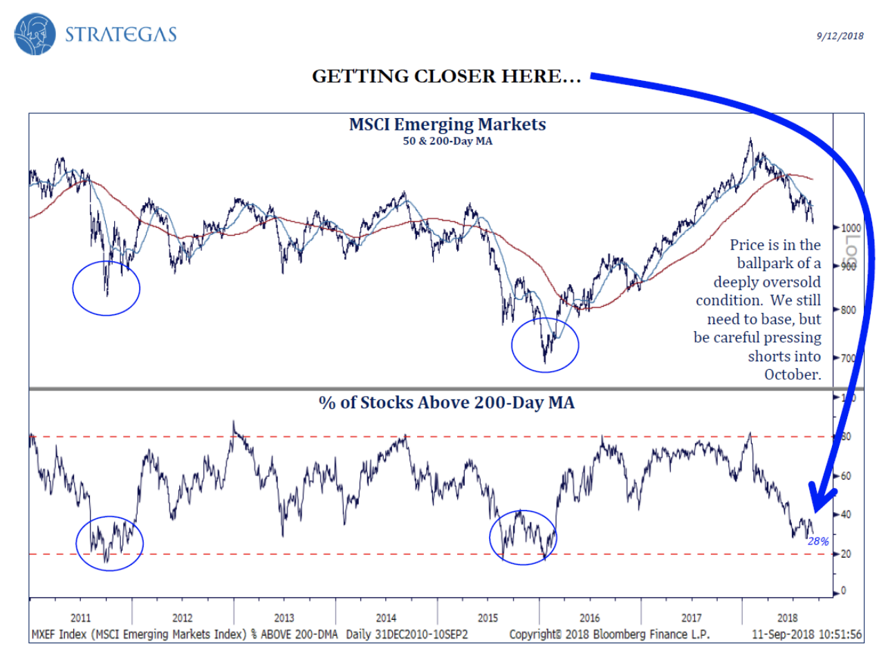
What it tells us
Emerging markets are flashing a contrarian ‘buy’ signal. The percentage of stocks above their 200-Day moving average is now close to previous oversold levels seen in 2011 and 2015. The recent USD rally looks to be losing upside momentum
Chart 5: Might be time for some commodities?
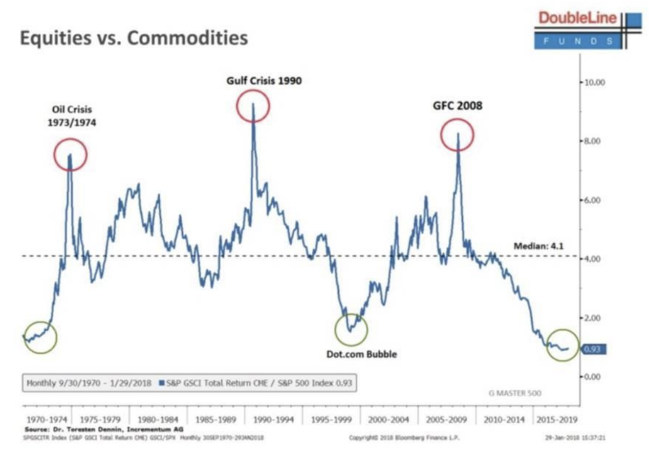
What it tells us
From their peak in 2008, the relative price of commodities declined by more than 75%. Relative to the S&P500, commodities are almost as cheap as they were at the peak of the dot-com rally. Resource companies producing strong free cashflow and screen cheap relative to industrials.
The full presentation
To access the full 10 minute presentation please watch the video below.
Never miss an update
Enjoy this wire? Hit the ‘like’ button to let us know.
Stay up to date with my current content by
following me below and you’ll be notified every time I post a wire
Eley Griffiths Group is an independent fund manager specialising in listed Australian small companies. Our investment team has been uncovering hidden opportunities in small caps since 2003.
2 stocks mentioned
Eley Griffiths Group
Eley Griffiths Group is an independent fund manager specialising in listed Australian small companies. Our investment team has been uncovering hidden opportunities in small caps since 2003.
Expertise
Eley Griffiths Group
Eley Griffiths Group is an independent fund manager specialising in listed Australian small companies. Our investment team has been uncovering hidden opportunities in small caps since 2003.
Expertise
Comments
Comments
Sign In or Join Free to comment
most popular
Investment Theme
If 24 LICs ran the Melbourne Cup, which ones would we back?
Affluence Funds Management
Equities
Buy Hold Sell: 5 ASX stayers built to go the distance
Livewire Markets