Argentina’s economy, FactSet ratings and tapped-out consumers
.png)
This week’s edition begins with a special guest chart: a Macrobond user leveraged last week’s stock sentiment dashboard to compare historic bullishness and market breadth. Next comes a dashboard analysing the troubled Argentinian economy that awaits president-elect Javier Milei. We created a trilogy of charts using FactSet: we analyse countries with vulnerable stock markets after this tightening cycle, visualise how wheatfield conditions track a crop chemical maker’s share price, and break down the health of British banks versus their American and European counterparts. Sticking with the UK, we consider prospects for the pound after its recent rally. We then move on to US consumers, and a visualisation suggesting they might be tapped out. We conclude with the weaker-than-expected return of Chinese tourism to the rest of Asia.
THE “BULL-BEAR SPREAD” AND MARKET BREADTH
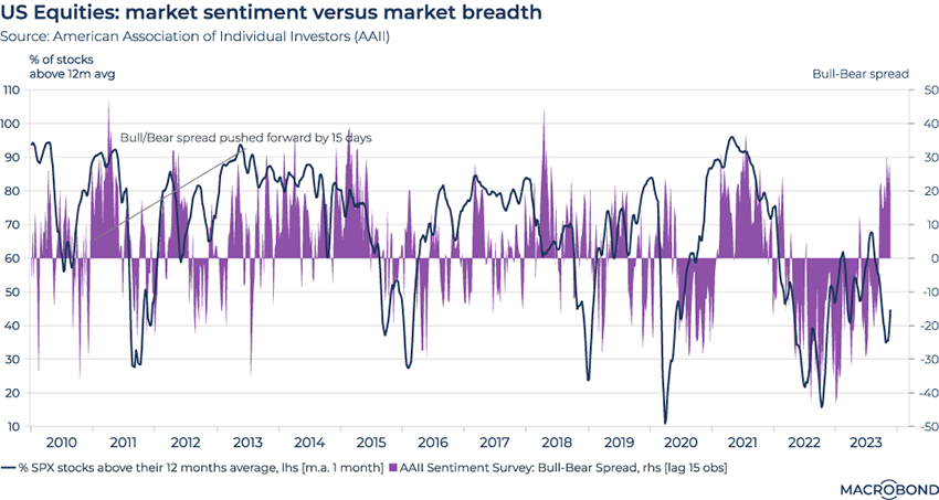
Our first chart this week – and our first “guest chart” ever – comes courtesy of Macrobond user Oliver Loutsenko, founder of OVOM Research in New York.
He was inspired by our previous edition of Charts of the Week, which visualised the ups and downs of bullish and bearish stock-market sentiment as polled by the American Association of Individual Investors.
His own chart tracks the AAII’s weekly “Bull-Bear” spread, in purple and pushed ahead by 15 trading days, against a measure of market breadth: the percentage of stocks in the S&P 500 that are above their 12-month average.
“Sentiment can often be leveraged to give you an idea of where market breadth is going, and, by extension, price,” he writes.
THE DYSFUNCTIONAL ARGENTINIAN ECONOMY AWAITING JAVIER MILEI
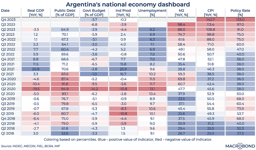
Libertarian populist Javier Milei won Argentina’s presidential election after promising radical change. He advocates policies including replacing the nation’s currency with the US dollar, slashing government departments and even liquidating the central bank.
Our dashboard of economic indicators over the past five years shows why Argentines might have been tempted to vote for such extreme change. As some of the red cells in the top right indicate, inflation has been in triple digits for almost a year. The government budget deficit is running at almost 7 percent of GDP, and industrial production is declining.
CORPORATE STRESS RISK IN CANADA AND BRAZIL UNDER ALTMAN’S MODEL
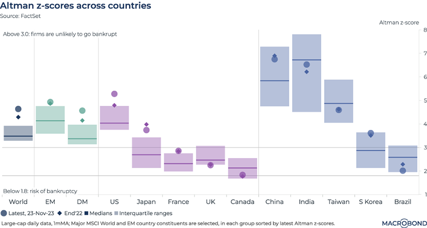
This chart requires a subscription to the Macrobond/FactSet Equity Factor Aggregates database.
If you’re looking for companies that might be in trouble after the historic increase in borrowing costs, this analysis suggests that you might find them in Canada and Brazil.
The “Altman Z-score” refers not to the tech executive in the news, but to the professor who developed a formula for predicting companies at risk of bankruptcy. (He has recently been sounding the alarm about the “end of the benign credit cycle that we have enjoyed since 2010.”)
We offer the Altman Z-score through our FactSet add-on database. This indicator considers a company’s liquidity, profitability, leverage and other metrics. (Read more about the methodology here.) If the Z-score surpasses 3, the likelihood of bankruptcy is low; if the Z-score is below 1.8, one should be concerned that a company might go bust.
We can also apply this analysis to entire stock indexes, as we did here for global benchmarks from different countries. The US stands out as the developed market (DM) with the most robust companies; emerging markets, especially China and India, seem less vulnerable overall than DMs.
WHEAT-FIELD HEALTH VERSUS CROP-CHEMICAL SHARES
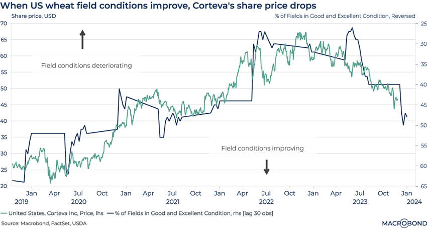
This chart uses data from FactSet (using the FactSet Connector*).
Corteva is one of the biggest US agricultural chemical and seed companies. It was spun off after the merger of Dow Chemical and DuPont in 2019.
This chart compares Corteva’s share price to data from the US Department of Agriculture: the percentage of winter wheat crops in “good and excellent” condition in 18 states. (We’ve reversed the axis for the latter indicator.)
We’ve pushed the crop-condition line ahead by about two months to show an interesting correlation: when conditions in the wheatfields improve, shares in the chemical maker sell off – and vice versa. Corteva shares were doing best during 2022, when the winter wheat crop was historically small amid drought conditions in key states.
(We’ve written previously about USDA crop quality indicators: during the summer of 2023, drought was still impacting Kansas’ wheat fields after a cold winter.)
*The Macrobond/FactSet connector simplifies the integration of high-frequency macroeconomic data and leading indicators from Macrobond with FactSet's comprehensive company, financial, and portfolio data.
UK BANKS’ WEAKNESS VERSUS THEIR US AND EUROPEAN COUNTERPARTS
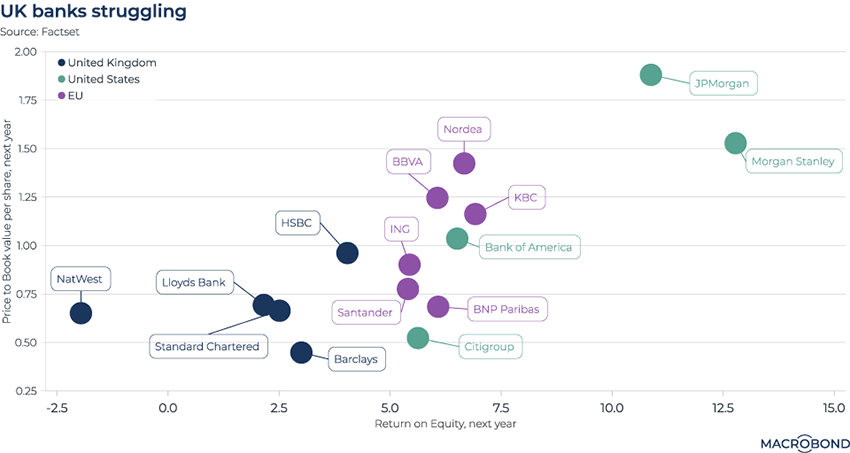
This chart uses data from FactSet (using FactSet Connector*).
During the long period of loose monetary policy, banks in many countries were clamoring for higher interest rates. Now that they have them, national fortunes are diverging, as our chart shows.
This visualisation plots some of the biggest UK, European and American banks based on their estimated return on equity and price-to-book values for next year. The positioning of JPMorgan Chase and Morgan Stanley show Wall Street’s dominance against rivals.
The weakest corner of the chart is populated by Britain’s five big banks. Barclays, which recently announced the worst drop in dealmaking fees of any major investment bank, has the worst price-to-book estimate of any of the banks in the chart.
*The Macrobond/FactSet connector simplifies the integration of high-frequency macroeconomic data and leading indicators from Macrobond with FactSet's comprehensive company, financial, and portfolio data.
UNDERVALUATION AND OVERVALUATION FOR THE BRITISH POUND
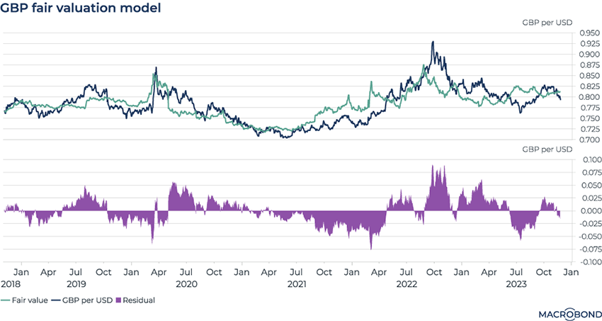
This chart can be applied to different countries using Macrobond’s change region functionality.
The British pound is having a strong fourth quarter as a result of American news flow. It’s returned to September levels against the USD as markets increasingly believe the Federal Reserve might be done hiking rates. (The latest leg up occurred after minutes from the Fed’s Open Market Committee were released, suggesting policy makers have moved to a decidedly cautious stance.)
This chart tracks the GBP/USD spot rate against a “fair value” model that is based on terms of trade, earnings yields, a nowcast of gross domestic product and the 10-year/2-year spread for British government bonds. (Macrobond users can click through to the chart to discover more details about the methodology.)
This model suggests that the GBP has moved into slight overvaluation.
CREDIT-CARD USE SHOWS HOW US CONSUMER SPENDING IS WITHERING
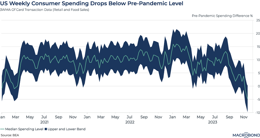
We wrote recently about Americans’ lingering post-pandemic savings cushion, and how that probably allowed consumer spending to stay stronger than it otherwise would have in this tightening cycle.
This chart uses near-real-time card transaction data that suggests the “cushion” effect is finally waning – showing that weekly consumer spending has dropped below pre-pandemic levels.
The Bureau of Economic Analysis uses credit card, debit card, and gift card transaction data to create early estimates of retail and food spending. These estimates capture the difference in spending from the pre-pandemic norms relative to the day, month, and annual trend.
As the holiday season approaches, many observers will be watching this indicator and others like it for signs of a rebound – or further deterioration.
THE LACKLUSTRE RETURN OF CHINESE TOURISTS IN ASIA
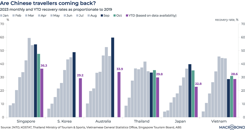
China’s reopening disappointed the optimists this year – including Thai hoteliers and Tokyo department stores, most likely.
This chart tracks how Chinese travelers are resuming their pre-pandemic travel patterns – or not, depending on the market. It creates a month-by-month “recovery rate” comparing the number of trips to a given country to its 2019 equivalent.
Singapore – the recipient of more business travelers than the other destinations – has fared the best. But cumulative tourism to Southeast Asia’s financial hub this year stands at just 36.3 percent of the old normal. Japan and Thailand have lost ground recently, as some press reports discuss.
For more information on the behaviour of the Chinese consumer, we invite Macrobond customers to consult Macromill’s weekly survey data. (At the start of this year, it was showing that Chinese consumers were putting a low priority on foreign travel.)
4 topics
.png)
Macrobond delivers the world’s most extensive macroeconomic & financial data alongside the tools and technologies to quickly analyse, visualise and share insights – from a single integrated platform. Our application is a single source of truth for...
Expertise
.png)
Macrobond delivers the world’s most extensive macroeconomic & financial data alongside the tools and technologies to quickly analyse, visualise and share insights – from a single integrated platform. Our application is a single source of truth for...
.png)