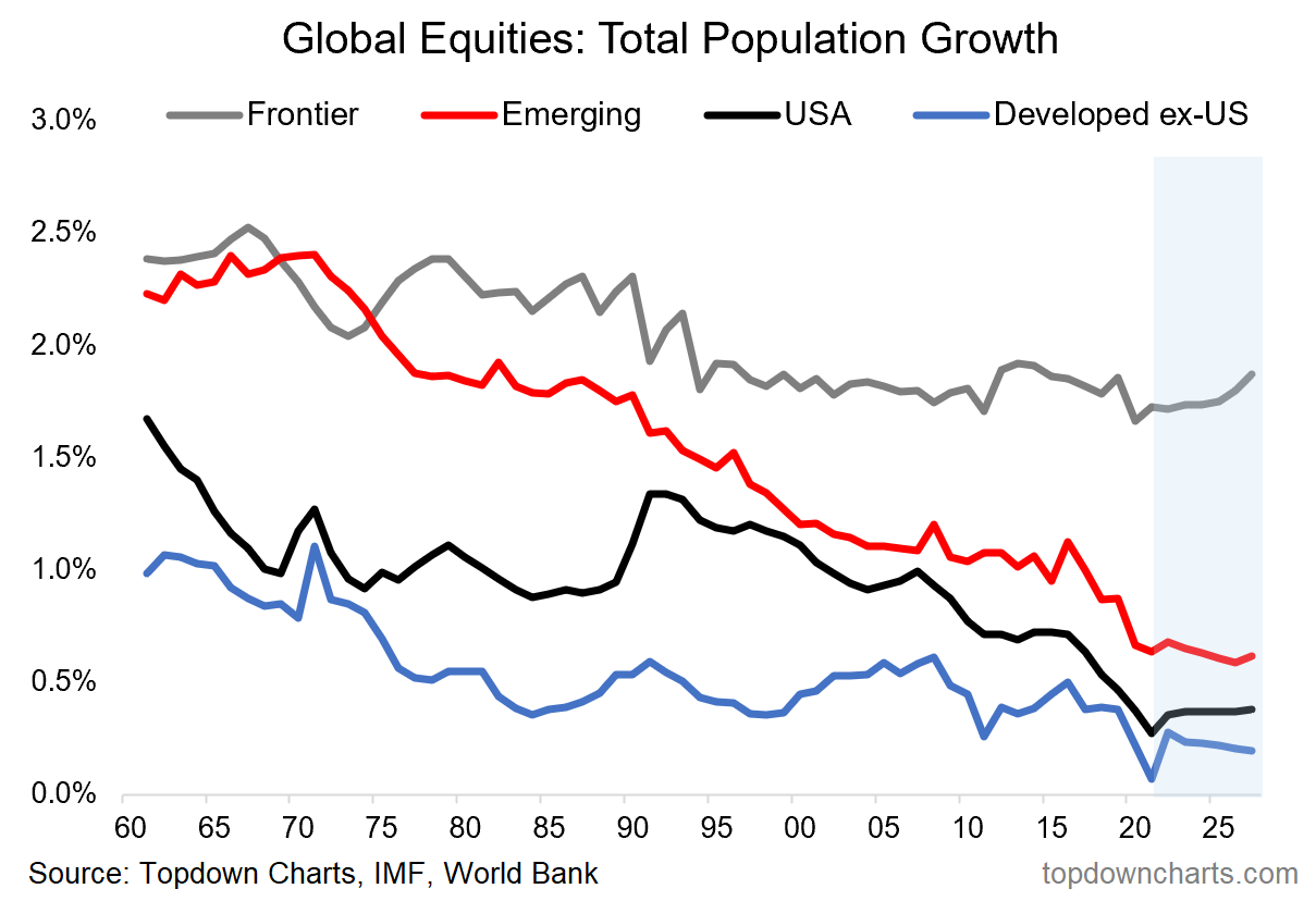
Chart of the Week - Global equity (population) growth
Population growth trends: Demographics has been a hot topic lately, with apparently opposing forces arguing on the one hand for higher population growth to avoid population collapse, and yet others basically arguing for depopulation to avoid climate catastrophe in their quest for sustainability.
We try to steer clear of ideological debates and focus on the facts here — especially as they pertain to investment conclusions: which is our main job. The below chart is an exercise in gauging the facts in terms of population growth across the major groups of countries within global equities.
What is stark and interesting is both the trend vs level aspect as well as the apparent divergence vs convergence across these disparate groups.
Old developed economies (think Europe, Japan) are down the bottom of the growth rankings, meanwhile the US has converged towards them after outpacing for some time. Even the previous fast growing Emerging Markets have trended down toward that bunch. There is a theme there (slower population growth overall).
But perhaps what stands out the most is frontier markets: higher than the rest, and expected to remain high. Frontier has the demographic advantage, and this matters because economic growth potential (and ultimately earnings growth potential) depends on a combination of population growth and productivity growth.
So a very intriguing chart indeed, in general, but especially for global equities and asset allocation strategy. The global equity bear market of 2022 is sure to bring opportunities as valuations reset lower, and it’s information like this that will help prioritize where to look for long-term investors.

Key point: Population growth is slowing around the world (except frontier markets).
Chart methodology notes: the country groupings are as per the MSCI country classifications, the data come from the IMF (including projections) and World Bank (who each aggregate data from other sources). The growth rates are based on total population within each of the groups of countries.
NOTE: this post first appeared on our NEW Substack: (VIEW LINK)
Best regards,
Callum Thomas
Head of Research and Founder of Topdown Charts
Never miss an insight
If you're not an existing Livewire subscriber you can sign up to get free access to investment ideas and strategies from Australia's leading investors.
And you can follow my profile to stay up to date with other wires as they're published – don't forget to give them a “like”.
5 topics

