Commodity correlation, currency effects, Bitcoin rallies and the Fed
.png)
This week’s charts begin with a candlestick that shows how the current foreign-exchange volatility makes a massive difference to your equity returns. Speaking of volatility, we track Bitcoin’s ups and downs and visualise how commodity prices from wheat to oil tend to boom and crash frequently – and in unison. Revisiting one of our favourite themes, we show how expectations for Fed policy are changing as Jerome Powell tackles sticky inflation and the economy stays resilient. The stickiest inflation of all is arguably in Argentina, where we chart years of double-digit price increases and worse. Finally, we examine China’s youth unemployment, seven months into the economy’s great reopening.
For stock investing, your local currency has rarely mattered more
.png)
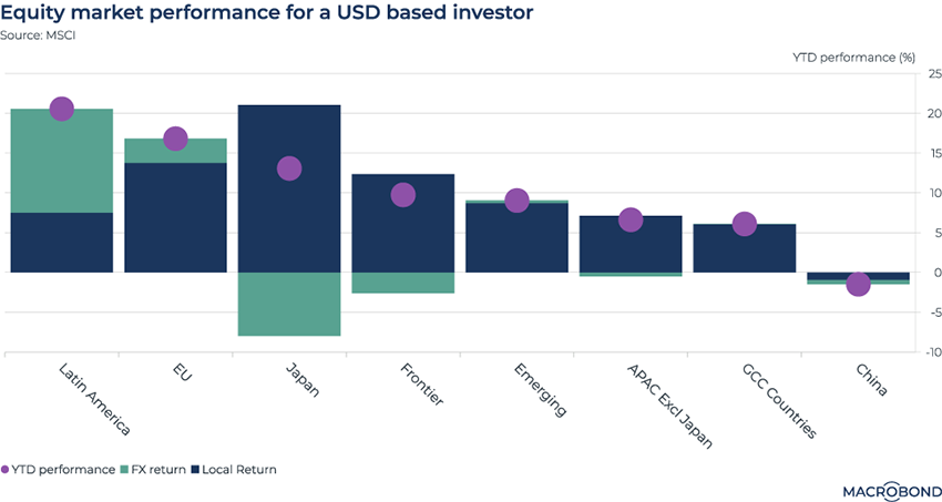
When investing in equities outside your home market, you’re also trying your hand at a bit of currency speculation, at least in the short to medium term. This has been even more the case over the past 12 months. First, the “King Dollar” period saw the greenback crush almost all competition; this was followed by a retreat.
This chart examines the returns for a hypothetical US investor’s non-American stocks this year. Performance is split into stocks’ return in local currency (in blue) and the currency effect (in green). These net out to a total return represented by the purple dots.
Japan has had a hot equity market this year – but the weak JPY is working against you if you’re measuring your performance in USD. By contrast, US-based investors’ European stock returns have been boosted by EUR strength – and this is even more the case for investors with exposure to Latin American equities and currencies.
Visualising volatile commodities and their moves in tandem
.png)
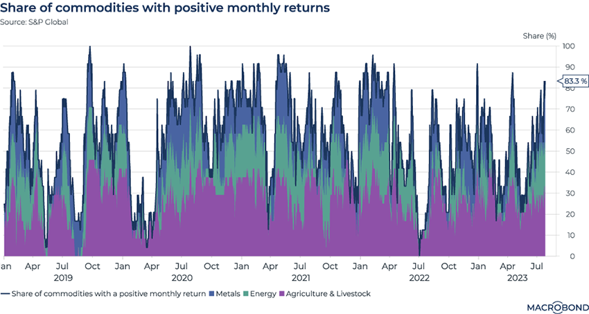
Commodity volatility is a well-known phenomenon. But it can be interesting to visualise how different commodities often trade in unison.
This chart tracks the percentage share of different commodities that were posting a positive monthly return at a given moment over the past four and a half years. Purple represents agricultural commodities, metals are in blue, and energy is in green.
The crash during the outbreak of the pandemic, famous for its negatively priced oil, is clearly visible. Most commodities snapped back after that initial shock.
The unified swoon in mid-2022 is also interesting. The market was unwinding the price shock that followed Russia’s invasion of Ukraine; meanwhile, concerns about rate increases were beginning to weigh on perceptions of US demand. China’s still locked-down economy remained sluggish.
Changing perceptions in the Fed funds futures market
.png)
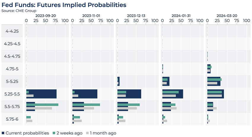
In the wake of the Federal Reserve lifting its key interest rate to a 22-year high this week – and another GDP print that was stronger than expected – this visualisation shows how the elusive “pivot” to rate cuts has been pushed further out, at least as far as futures markets are concerned. (Remember that in May, the market expected a lengthy “pause” through 2023.)
The columns represent five upcoming Fed meetings. The large blue bar indicates the probabilities that are seen today. For the September meeting, futures estimate that there’s a roughly 75 percent chance of the key rate staying in its current range of 5.25 to 5.5 percent; there’s a 25 percent chance of a hike one step up.
The smaller bars represent the market’s perceptions two weeks and a month ago. Interestingly, the market seems to have become more convinced of a Fed “pause” this fall, rather than one or even two more rate hikes.
The market is pricing a very small chance of a pivot in December and somewhat larger probability for cuts in January or March.
Disinflation isn’t a thing in Argentina
.png)
Tip: this chart allows for change region functionality.
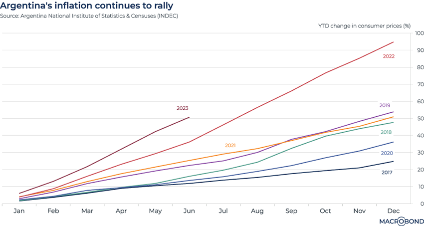
Disinflation is spreading around the world, but there are a few exceptions. One is Argentina, Latin America’s third-biggest economy and a nation with grim experience of historic episodes of hyperinflation.
Earlier in 2023, year-on-year inflation soared past 100 percent for the first time in 30 years. In June, the annualised inflation print reached 115 percent.
This chart visualises the change in consumer prices as a steady progression over the course of various calendar years. Last year was an record outlier in recent history, and this year is even worse.
Bitcoin crash cycles
.png)
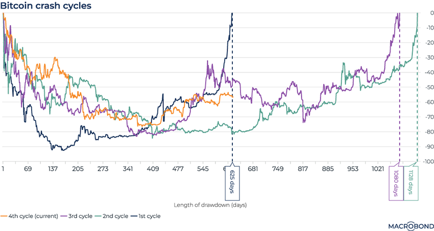
Now that cryptocurrencies have been around for more than a decade, grizzled veterans of the space can say they’ve experienced four different crashes: 2011, 2013, 2017 and 2021.
This chart tracks Bitcoin and compares the lengths, in days, of these four episodes’ drawdowns and recoveries.
The 2011 crash (in blue) was unlike the others: it was the deepest, and also had the quickest recovery to its pre-crash level – 625 days.
The current, post-2021 cycle (in orange) also just hit 625 days. A repeat of the post-2013 and 2017 cycles would see Bitcoin take two more years to climb back to its previous peak.
China’s youth unemployment
.png)
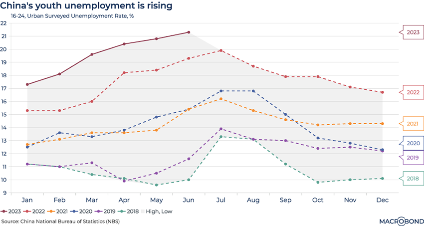
Youth unemployment in China has stayed well above pre-pandemic norms following the dismantling of zero-Covid restrictions, even as overall urban unemployment is improving.
Joblessness among 16-to-24-year-olds reached 21.3 percent in June, nearly double that cohort’s level in June 2019.
The seasonality in the chart is notable, showing the effects of new graduates entering the workforce in the summer.
5 topics
.png)
Macrobond delivers the world’s most extensive macroeconomic & financial data alongside the tools and technologies to quickly analyse, visualise and share insights – from a single integrated platform. Our application is a single source of truth for...
Expertise
.png)
Macrobond delivers the world’s most extensive macroeconomic & financial data alongside the tools and technologies to quickly analyse, visualise and share insights – from a single integrated platform. Our application is a single source of truth for...
.png)