Dwindling oil reserves, India’s economy, and Jackson Hole
.png)
This week’s charts begin with an examination of the US Strategic Petroleum Reserve, which remains at a multi-decade low just as Russia and Saudi Arabia pare production to keep oil prices high. Two high-profile conferences are in focus for financial news flow: we examine how Jackson Hole Fed pronouncements affect markets, and ahead of the G20 in New Delhi, we examine India’s resilient economy. Turning to your investment portfolio, we take another look at the historic performance of momentum strategies versus a traditional 60/40 stock-bond split. In Europe, we show how the German business confidence clock is ticking towards gloom and create a model examining the Swedish currency’s valuation against the euro. Finally, in the US, we show the sectors that are hiring in the second half of 2023 after the high-profile tech layoffs earlier in the year.
The oil market and the US SPR
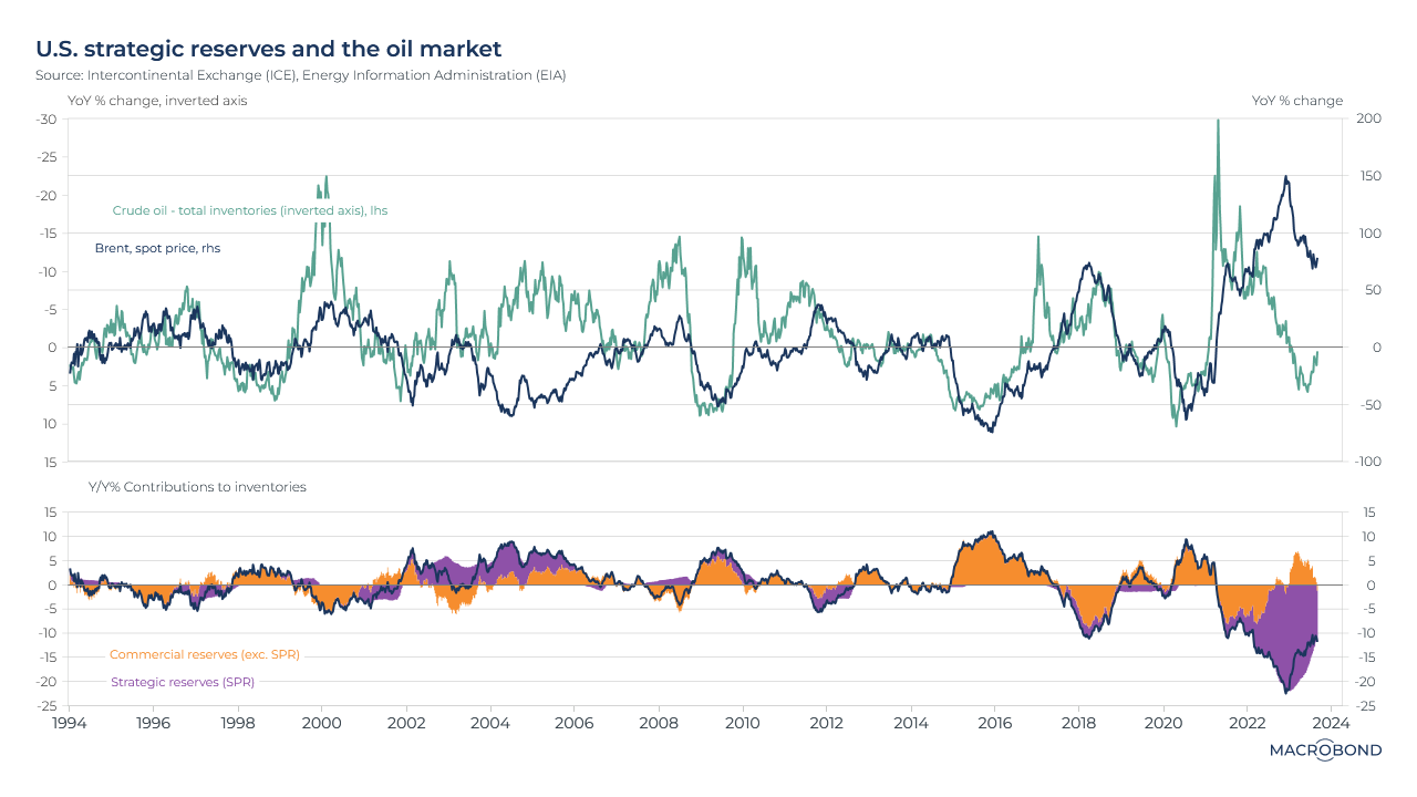
Oil has been in the news as Saudi Arabia and Russia decided to extend production cuts for the rest of the year. There is another noteworthy government player when it comes to this critical commodity: the US Strategic Petroleum Reserve. Famously, President Biden ordered that oil be released from the SPR in 2022 to cushion consumers against the Ukraine war’s impact on gasoline prices.
This visualisation’s top pane tracks the year-on-year change in the price of Brent crude (in blue) against the year-on-year change in total US oil inventories (in green, on an inverted axis).
As the chart shows, historically, these variables are negatively correlated and the lines move in unison: when inventories go down, prices go up, and vice versa. (The post-pandemic demand snap-back is notable in late 2020: inventories plunged and prices rebounded.)
However, the 2022 SPR episode is clearly visible as a gap opened up between the two lines. The second “inventory breakdown” pane shows why this occurred: the SPR (in purple) kept releasing oil while commercial oil companies rebuilt inventory.
While that “commercial” segment has been rebuilding reserves lately, the SPR has not: it remains at its lowest level since 1983, with the Department of Energy waiting for a cheaper refill price.
A closer look at India’s buoyant economy
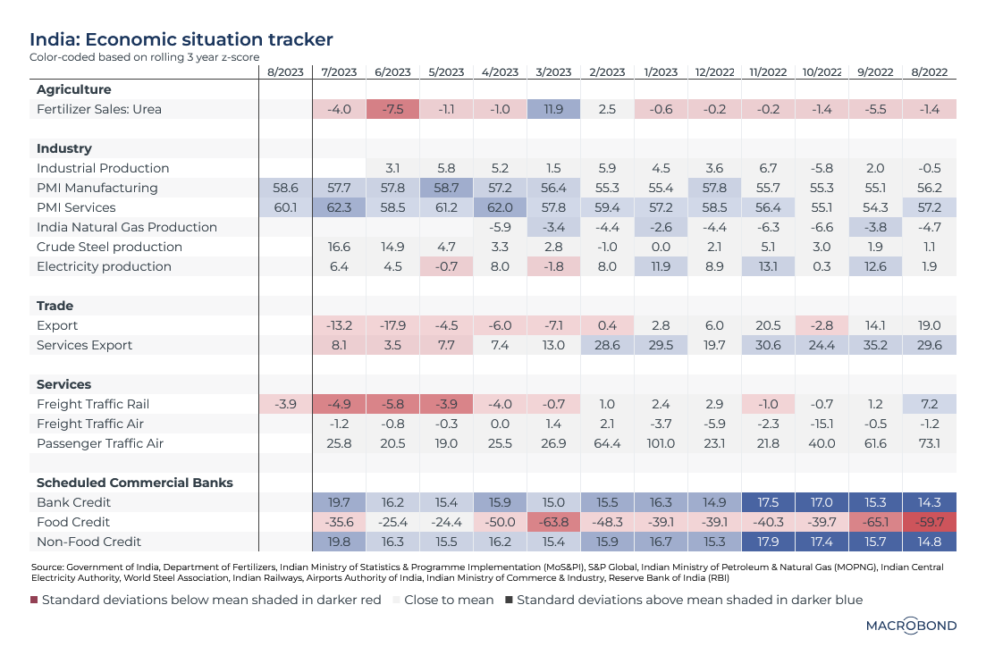
The world’s eyes are on New Delhi, where Indian Prime Minister Narendra Modi is hosting the G-20 summit. He is presiding over a hot stock market (as we wrote about recently) and an economy whose growth has defied regional headwinds, including China’s slowdown and a spike in food prices over the past year. Amid a government infrastructure push, GDP growth in the second quarter was 7.8 percent compared with a year earlier.
This table examines key economic indicators for various aspects of the Indian economy, with darker blue and red squares indicating readings that are notably statistically deviant from the rolling three-year average.
PMI for both services and manufacturing stand out – showing how executives in these sectors are notably optimistic about demand.
On the negative side, slumping rail freight traffic and sales of fertiliser to the key agricultural sector are indicators to watch.
Modeling more market momentum strategies
Note: This chart’s ICE/BAML indices require our premium data sets.
We’re modeling another investment strategy, following the “vigilant asset allocation” you might remember from last month.
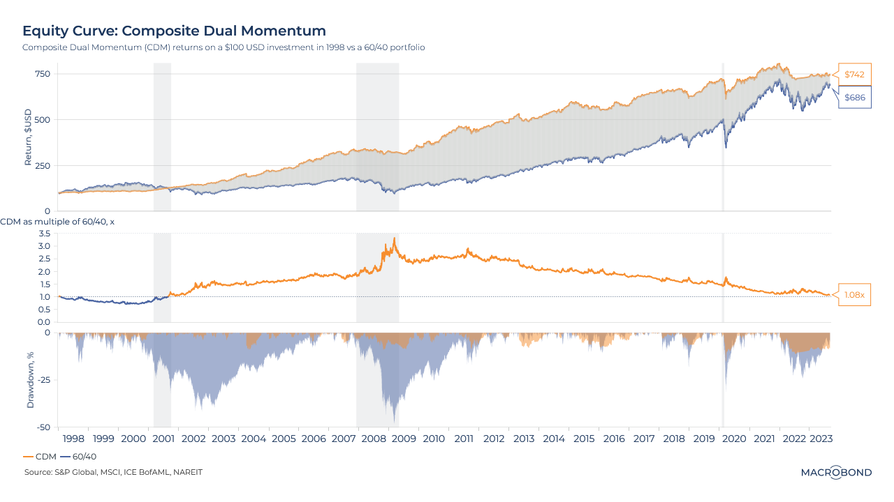
This chart tracks the long-term results of a strategy called Composite Dual Momentum (CDM). It divides a portfolio in four, with each portion targeting a different part of the markets: equities, credit, real estate and “economic stress” (which means the safe-haven assets of gold and long-term US government bonds).
CDM selects the best performing asset within each asset class (relative momentum) but only if their recent returns are positive (absolute momentum). If neither of these criteria is met, it invests in cash.
When comparing the 25-year performance of CDM to the traditional 60-percent-stocks, 40-percent-bonds allocation, the momentum play usually did better, especially during the GFC and the early 2010s. However, the strategy’s performance gradually eroded.
The second pane shows CDM returns as a multiple of the 60/40 since 1998, as well as the drawdown from the peak returns of both strategies.
CDM has much smaller drawdowns, thanks to its high sensitivity to risk, but the “cash default” option has probably held back its performance lately.
*Macrobond users can view how the strategy allocates its weighting across the asset classes since 1998 in a separate time chart included in the link to this chart in our app.
Germany’s lower confidence (and inflation)
Tip: this chart allows for change region functionality.
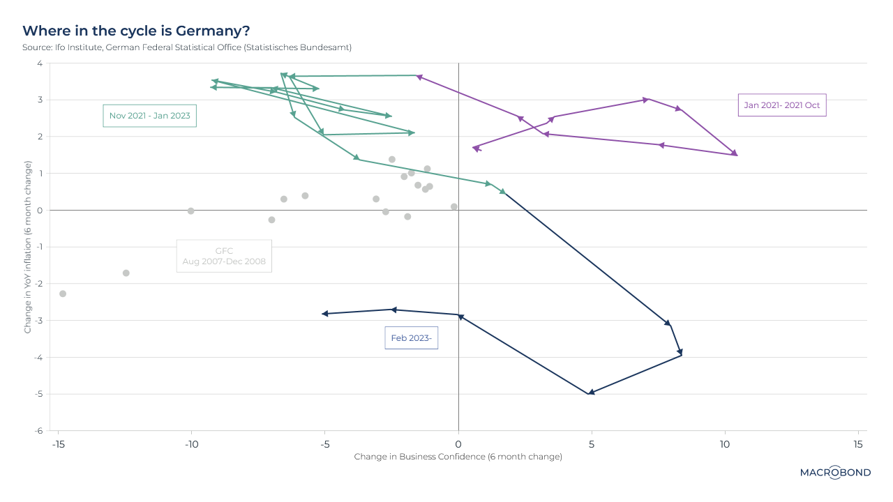
This chart examines the interplay between business confidence and inflation in Germany. Recently, both have come down – showing how central bankers get inflation under control by raising interest rates and thus deflating “animal spirits” in the economy.
This “clock” charts business confidence (the six-month change in the Ifo institute survey) against inflation (also expressed as a six-month-change to the year-on-year rate).
Germany has been undergoing disinflation for most of this year, entering the bottom half of the chart. And as confidence erodes, we have headed to the bottom left quadrant – where we have added some grey dots nearby to represent readings during the global financial crisis.
This is in stark contrast to where we started in the cycle – optimism amid relatively mild inflation in 2021.
The Jackson Hole effect
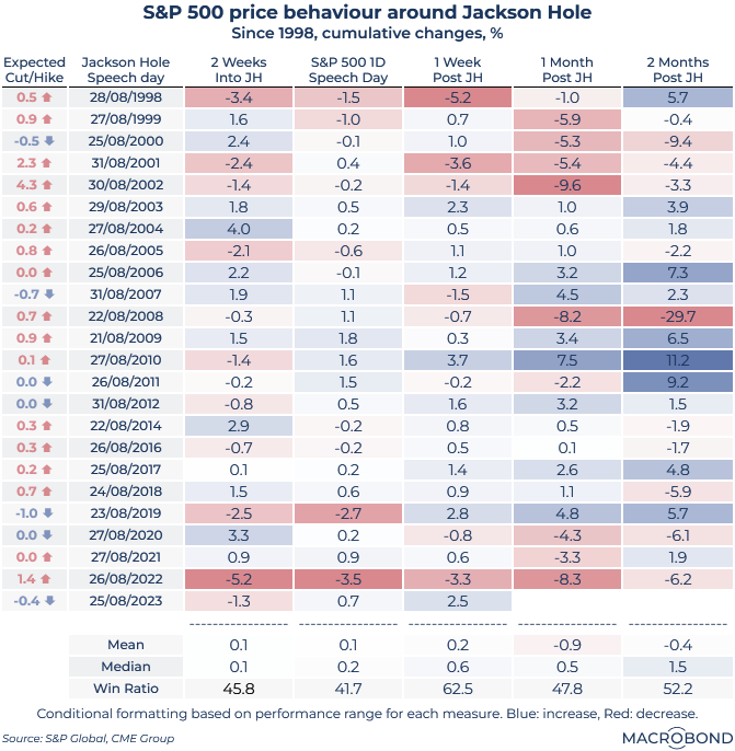
Every August, the Kansas City Fed holds its annual symposium in the Wyoming mountain resort of Jackson Hole. Central bankers discuss economic trends, and their pronouncements regularly move markets.
This table looks at the price performance of the S&P 500 before and after every Federal Reserve chairman speech in Jackson Hole since 1998. (We omitted 2013 and 2015 as Ben Bernanke and Janet Yellen, respectively, did not attend in those years.)
The Bernanke era was famous for hints about quantitative-easing programs delivered at Jackson: note the patch of bright blue in 2009-11 as longer-term market gains followed the Fed chair’s speeches.
“The “win ratio” is the percentage of times that returns were positive in a given time horizon/column. It suggests a broad “Jackson Hole effect” exists – a boost for stocks after the Fed chair’s speech (fading over time without a Bernanke QE hint). Indeed, this year, markets interpreted Jay Powell’s speech as “no alarms, no surprises” and stocks went up.
The left-most column uses Fed funds futures to show expectations of how rates were expected to evolve over the next year. Rates couldn’t go down any further in some of those Bernanke years. But in 2002, markets were pricing in a full 4 percentage points of Fed hiking after a strong recovery from 9/11 and the dotcom crash. (They were a few years early.)
US job cuts are slowing and less tech-heavy; more sectors are hiring again
.png)
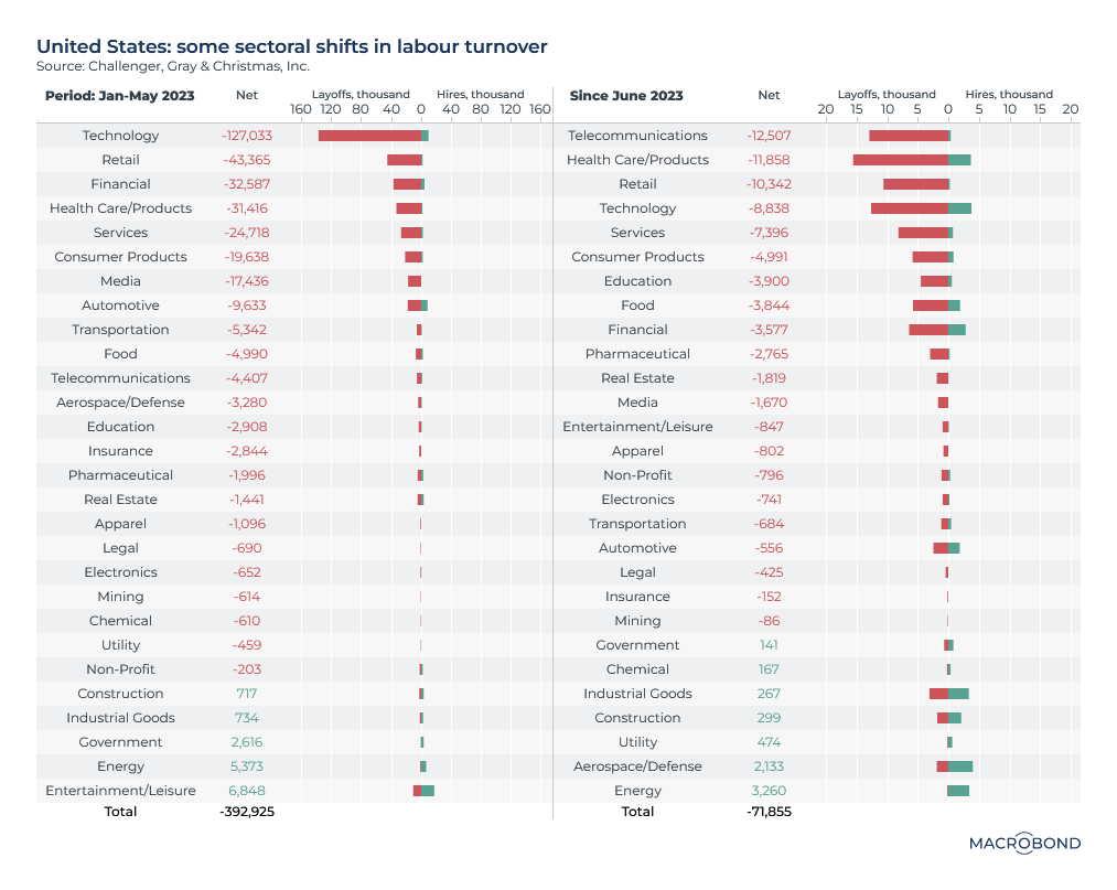
As Jerome Powell attempts to cool a tight US labour market, the overall picture is mixed. Big layoffs in tech were a notable feature of early 2023. And for the first eight months of the year in aggregate, job cuts have more than tripled compared to the same period a year earlier.
However, looking sector-by sector – and comparing the first five months of the year to the three months since then – the employment market is showing signs of resilience.
Layoffs are now more evenly distributed across sectors, and (mostly) happening more slowly. The worst-hit industry since June – telecommunications – saw a net 12,500 job cuts. (Pro-rating that sum to 20,750 for a five-month period would have put that sector in sixth place for layoffs in January-May.)
There’s also more green on the chart: about half the industries shown are doing at least some material hiring, offsetting at least part of their cuts. Energy, in particular, has been consistently adding staff and shedding a negligible number of jobs.
A PPP model says the Swedish krona should be worth even less vs the euro
Tip: this chart allows for change region functionality.
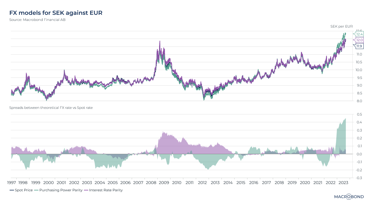
The Swedish krona is weaker than ever against the euro, stoking inflation and presenting a dilemma for the central bank. (We wrote about some of the headwinds hitting the Nordic country earlier this year.) Is the selloff in the currency overdone?
This visualisation revisits an analysis we used earlier this year for the Chinese yuan: Purchasing Power Parity (PPP) and Interest Rate Parity (IRP). We compare the spot SEK/EUR rate to theoretical exchange rates that perfectly reflect these theories*.
PPP suggests identical goods should be traded at the same price across countries – and FX movements should reflect relative inflation, which is higher in Sweden. PPP thus suggests the krona should depreciate even further – to 12.4 per euro. (Speculation that the Riksbank might intervene in the market could be preserving the currency’s value.)
IRP theory suggests SEK/EUR is closer to the right level.
The second panel shows periods of over- and under-valuation by these metrics.
*Macrobond clients can click through to see the models’ methodology, which involves FX rates, CPI and bond yields.
5 topics
.png)
Macrobond delivers the world’s most extensive macroeconomic & financial data alongside the tools and technologies to quickly analyse, visualise and share insights – from a single integrated platform. Our application is a single source of truth for...
Expertise
.png)
Macrobond delivers the world’s most extensive macroeconomic & financial data alongside the tools and technologies to quickly analyse, visualise and share insights – from a single integrated platform. Our application is a single source of truth for...
.png)