Europe’s labour snap-back, gold and the US manufacturing boom
.png)
This week’s charts begin with a dashboard breaking down the much tighter labour markets of the OECD; southern and eastern Europe are leading the way. We then compare the current gold price to historic norms, and examine how US industrial policy is driving a construction boom that is offsetting weakness in homebuilding. On inflation, we create an indicator for the Fed “supercore” concept that zeroes in on services, and show how Switzerland has become the first country to return to the old normal of inflation targets around 2 percent. In China, we visualise economic theories that argue that the yuan’s recent weakness is overdone. Finally, we track how the S&P 500 did after previous Fed tightening cycles ended; the dotcom bust is the only occasion where stocks went down.
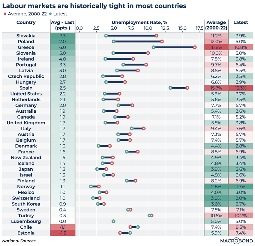
The much tighter labour markets of southern and eastern Europe lead the OECD
.png)
This dashboard visualises the tight state of labour markets across the OECD member nations. The green dots representing present-day unemployment rates are well to the left of the red dots (the 2000-2022 average) for almost every country.
(ECB President Christine Lagarde recently remarked that service-sector companies scarred by the pandemic may be engaging in “labour hoarding,” even as rates rise, fearful of being unable to recruit should growth strengthen.)
The nations are ranked from top to bottom by their divergence from that historic norm.
The cluster of former “peripheral” eurozone members that suffered the most in the early 2010s is notable at the top – as are central and eastern European nations that might be said to have completed their post-Communist transitions: Slovakia leads the table with a remarkable 7.3 percentage point reduction in unemployment.
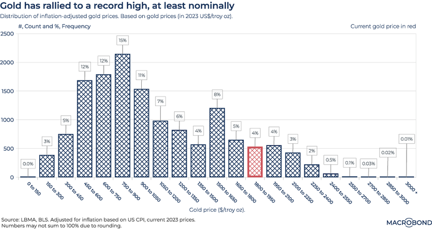
Inflation-adjusted gold prices are high, but they’ve been much higher
.png)
With gold prices hovering near their all-time high in nominal terms, our chart adjusts this classic inflation-hedge investment to reflect inflation.
This histogram’s X axis breaks down daily gold prices since 1968 into buckets USD 150 wide. The current USD 1,800-1,950 range is highlighted in red: as of yesterday, gold was trading at about USD 1,915 per troy ounce (compared with the all-time high – unadjusted for inflation – of USD 2,072 in 2020).
The Y axis tracks the absolute number of occurrences in a given range; the frequency (percentage) is shown above each bar.
For the curious, the inflation-adjusted peak gold price was USD 3,300 in the 1980 spike (which was driven by high inflation, oil shocks and geopolitical upheaval).
Inflation has obviously supported gold once again, but central-bank purchases have too: these institutions reportedly hoovered up 1,079 tonnes of bullion in 2022 – the most since records began. This trend is not unrelated to geopolitical upheaval: central banks in China, India and Russia are concerned about how US sanctions froze reserves held in dollars, euros and pounds.
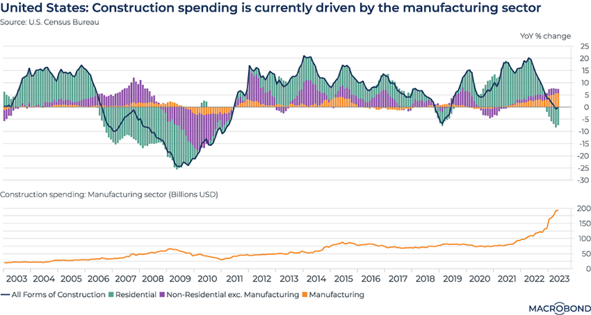
The US manufacturing construction boom offsets residential weakness
.png)
US construction has been resilient through a historic rate-hiking cycle. That’s partly due to a backlog of pandemic-delayed projects. But it’s also a result of President Biden’s ambitious industrial policy programs.
The Inflation Reduction Act and the CHIPS Act aim to boost domestic investment in clean-energy technology and repatriate the production of key supply-chain products, such as semiconductors. (European observers have worried that the continent’s companies will divert investment to the US as a result.)
Our chart visualises two decades of US building activity, breaking down the year-on-year rate of change by contributions from residential construction, manufacturing and everything else.
The overall rate of change today is flat – a stark contrast to the plunge (and abandoned projects) that followed the subprime meltdown and GFC. A pullback in residential has been offset by manufacturing construction reaching a multi-decade high.
As the second panel shows, the absolute level of spending on manufacturing construction has more than doubled in just two years, reaching USD 200 billion.
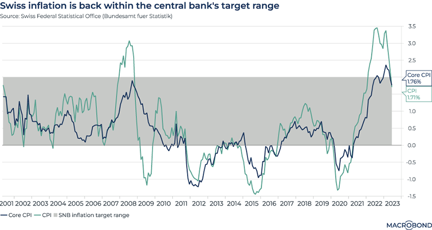
Swiss inflation is back in the pre-pandemic comfort zone
.png)
Tip: this chart allows for change region functionality.
Remember the pre-pandemic days when a 2 percent inflation target was the de facto standard for many central banks? Switzerland recently became the first developed economy to head back to the “old normal,” perhaps giving hope to other inflation-fighting central bankers.
CPI and core CPI, excluding food and energy, are both back inside the Swiss National Bank’s target range, as shown in grey on our chart.
To be sure, the Swiss had one of the least severe inflationary episodes among developed economies, and the SNB remains cautious, saying more rate hikes are likely in the coming months.
In search of the Fed’s “supercore inflation” for wages
.png)
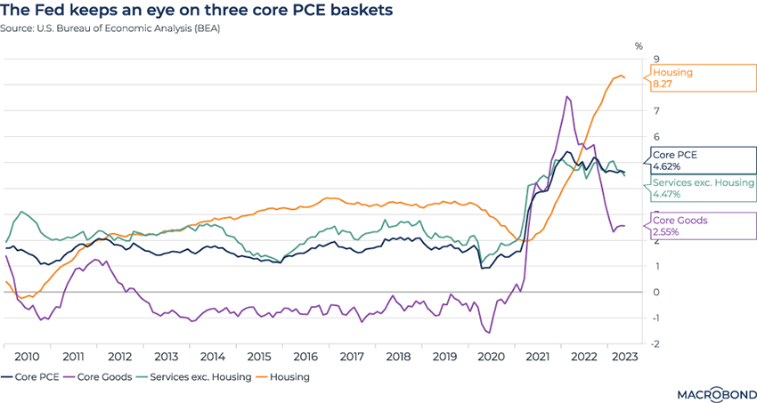
Federal Reserve Chair Jerome Powell introduced a new concept this year with “supercore inflation,” which excludes housing from core personal consumption expenditure (PCE) metrics – aiming to zoom in on prices for services, and by extension, wages.
The “supercore” economic indicator doesn’t actually exist, so we decided to create it.
This chart tracks overall core PCE (which excludes food and energy), core PCE for goods, the housing components of the PCE. We then calculated a services PCE excluding housing and added it to the chart.
The four lines are quite divergent. While goods inflation has faded strongly, the soaring housing component has only recently peaked after accelerating for more than two years.
“Supercore inflation” has stubbornly plateaued for longer, running at about 4.5 percent. No wonder Powell has been hinting that more rate hikes are coming.
China’s weak yuan: undervalued or still overvalued?
.png)
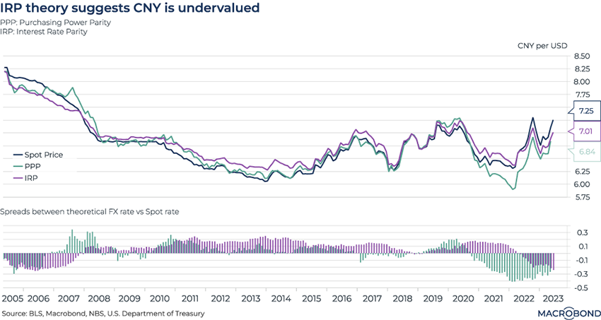
When China reopened, its currency rose – but the gains were short-lived as economic optimism faded. The yuan touched seven-month lows this week as a gauge of services activity fell more than expected. Meanwhile, the PBOC has implied it will move to support the currency if needed.
Given this context, is the yuan overvalued or undervalued? Our chart applies two analyses: Purchasing Power Parity (PPP) and Interest Rate Parity (IRP). It compares the spot CNY-USD rate to a theoretical exchange rate that perfectly reflects these theories. The second panel shows periods of “overvaluation” (2019-21) and undervaluation, which is the case today. (Macrobond clients can click through to see the methodology, which involves FX rates, CPI and bond yields.)
PPP theory suggests identical goods should be traded at the same price across countries – and FX movements should thus reflect relative inflation, which is higher in the US. PPP theory thus suggests the USD should depreciate.
As for IRP, it assumes an international market with free flow of capital (which, of course, isn’t the case for China). An arbitrage opportunity, or “carry trade” generating easy profit from borrowing in low-yield countries to invest in high-yield ones, will arise if exchange rates don’t reflect interest rate parity. IRP theory would call for the yuan to appreciate to about 7 per dollar.
What did equities do after past tightening cycles?
.png)
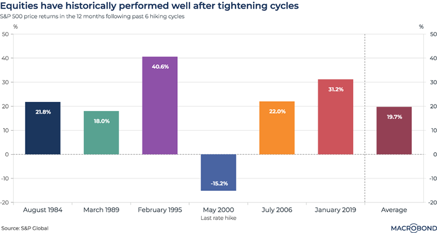
The Fed “pivot” is taking a long time to arrive, with futures trading now anticipating the first rate cut might not occur until mid-2024. In anticipation of that day, what lessons does history have for equity performance?
This chart shows how the S&P 500 performed in the 12 months that followed the end of the last six hiking cycles. We also added the average performance for these six time periods. (The chart uses only price return, ie. capital appreciation, ignoring dividend income.)
The only 12-month period with a negative return was the one that followed the dot-com crash.
5 topics
.png)
Macrobond delivers the world’s most extensive macroeconomic & financial data alongside the tools and technologies to quickly analyse, visualise and share insights – from a single integrated platform. Our application is a single source of truth for...
Expertise
.png)
Macrobond delivers the world’s most extensive macroeconomic & financial data alongside the tools and technologies to quickly analyse, visualise and share insights – from a single integrated platform. Our application is a single source of truth for...
.png)