Global Equities: The Top 10 PE10
Here's an updated scan across countries and regions to find the top (and bottom) PE10, and follows on from a previous version I shared back in August last year. Briefly on methodology, the PE10 is a stock market valuation metric which compares the stock index to the average earnings of the past 10 years.
The reason to look at average earnings is that it smooths out the peaks and troughs that result from business cycles. It's also useful for analyzing countries that typically see greater volatility of earnings e.g. where the index is particularly concentrated. Overall the key point is that it gives a less noisy signal, and from an investing standpoint the biggest challenge is to make the distinction between signal and noise.
The charts below show the top and bottom end of the rankings as well as a look across time at the major global equity blocks. As noted in the 2018 Outlook, the themes of a maturing business cycle, turning of the tides in global monetary policy, and rising valuations across assets and markets means greater selectivity and more emphasis on relative value will likely be rewarded. Certainly it addresses part of the challenge that comes in these later stages of the cycle.
The key takeaways on global equity valuations are:
-There are some notable standouts at the top and bottom ends of the PE10 rankings.
-As broader global equity valuations head higher relative value becomes more important and there remains significant variation or opportunities across the countries and regions.
-At a high level, from a relative valuation standpoint, it still makes sense to be overweight global ex-US equities (particularly EM) vs US equities.
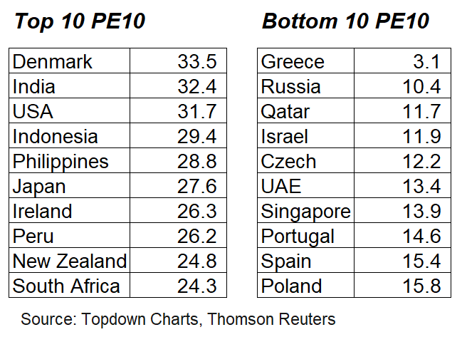
1. The Top and Bottom PE10: First up is a look at the table ranking the top and bottom 10 countries by PE10 valuation. The bottom features a couple of usual suspects (Russia and Greece), although in the case of Greece you might argue that earnings are now structurally lower so the PE10 is less useful for that particular market. At the top end, it's likewise many usual suspects: America and a selection of high growth Asian countries (and Japan). While there are some similarities between those at the top and bottom it's hard to make a broad sweeping statement which generalizes the two groups.
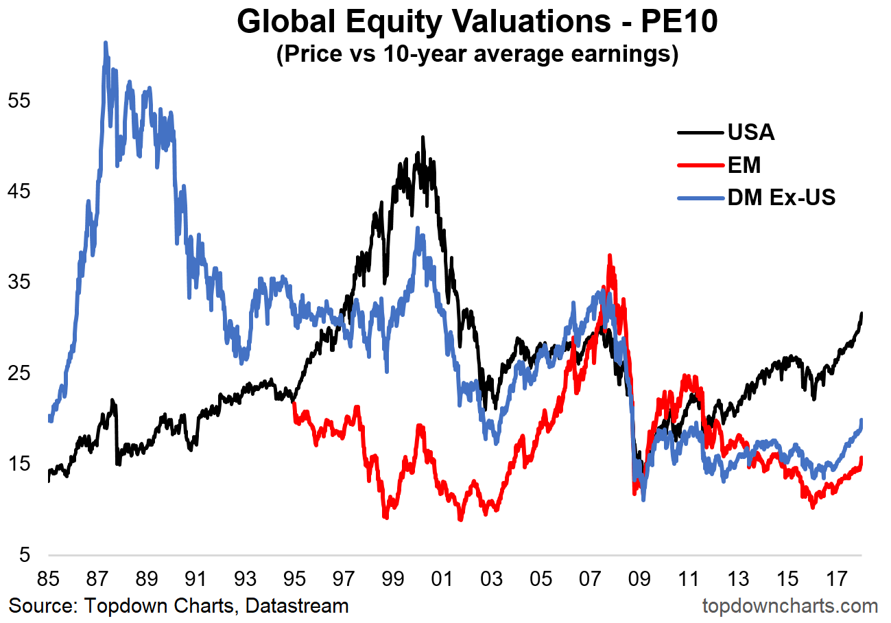
2. PE10 Across the Major Blocks: Adding some historical context, this chart shows the progression of valuations across the major blocks: USA, Developed Markets excluding America, and Emerging Markets. On this metric there remains a compelling relative value argument to be underweight US in favor of the rest of the world, particularly emerging markets, even despite the rapid re-rating recently seen. Of course there are other factors to consider as part of a more in depth analysis (such as earnings, monetary policy, sentiment, etc), but the scope of this article is limited to valuations.
Never miss an update
Enjoy this wire? Hit the ‘like’ button to let us know.
Stay up to date with my current content by
following me below and you’ll be notified every time I post a wire
Callum is Head of Research at Topdown Charts.
Topdown Charts is a chart-driven macro research house covering global Asset Allocation and Economics.

3 topics

Callum is Head of Research at Topdown Charts. Topdown Charts is a chart-driven macro research house covering global Asset Allocation and Economics.
Expertise
Callum is Head of Research at Topdown Charts. Topdown Charts is a chart-driven macro research house covering global Asset Allocation and Economics.
Expertise
Comments
Comments
Sign In or Join Free to comment