Weekly S&P500 ChartStorm - 30 January 2022
The Weekly S&P500 ChartStorm is a selection of 10 charts that I hand-picked from around the web and post on Twitter. The purpose of this blog post is to add some extra color and commentary around the charts.
The charts focus on the S&P500 (US equities) and the various forces and factors that influence the outlook - with the aim of bringing insight and perspective.
Hope you enjoy!
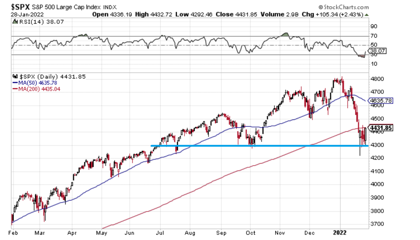
1. Springboard or Diving board? That 4300 level is going to go down as either a big springboard or a big diving board.
For now it looks like a springboard...
As I noted on Twitter, these two things can both be true:
-the bottom is in
-the top is in.
Source: @Callum_Thomas StockCharts
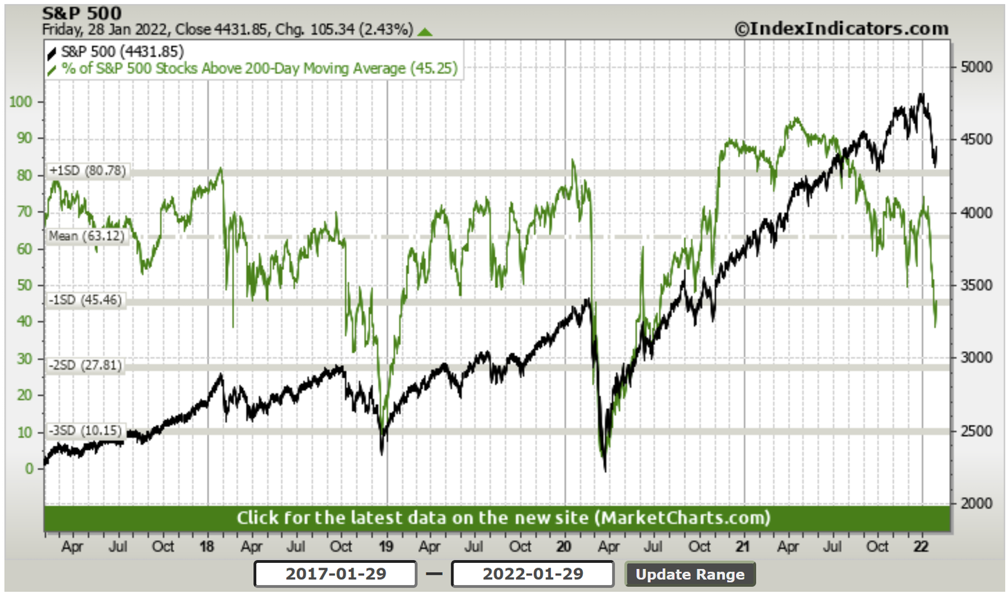
2. Market Breadth: Basically still at about 50/50 on the 200-day moving average breadth indicator: this is not a "sell everything" market, this is a violent rotation.
Source: @Callum_Thomas IndexIndicators
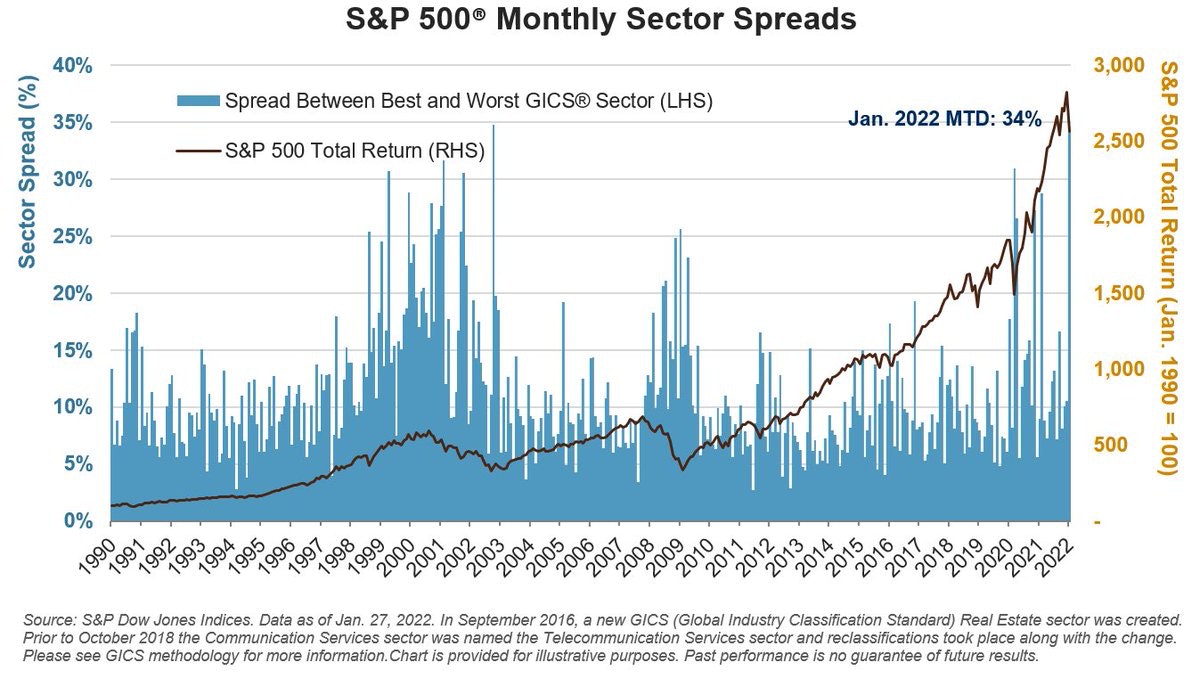
3. Rotation Stations: It was the best of times (Energy +18% in Jan), It was the worst of times (C.Disc -13% in Jan). That’s the widest best-worst spread since October 2002.
Source: @SPDJIndices via @LizAnnSonders
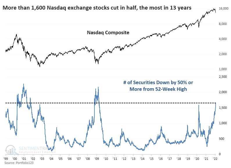
4. The Clear Bear Market: The S&P500 is down -7.6% YTD, and all said so far the correction has been just over -12% from the intraday high to the low...
But elsewhere a raging bear market is well underway: over 1600 stocks in the Nasdaq have *halved*! (i.e. down at least 50% vs their 52-week high).
Source: @sentimentrader
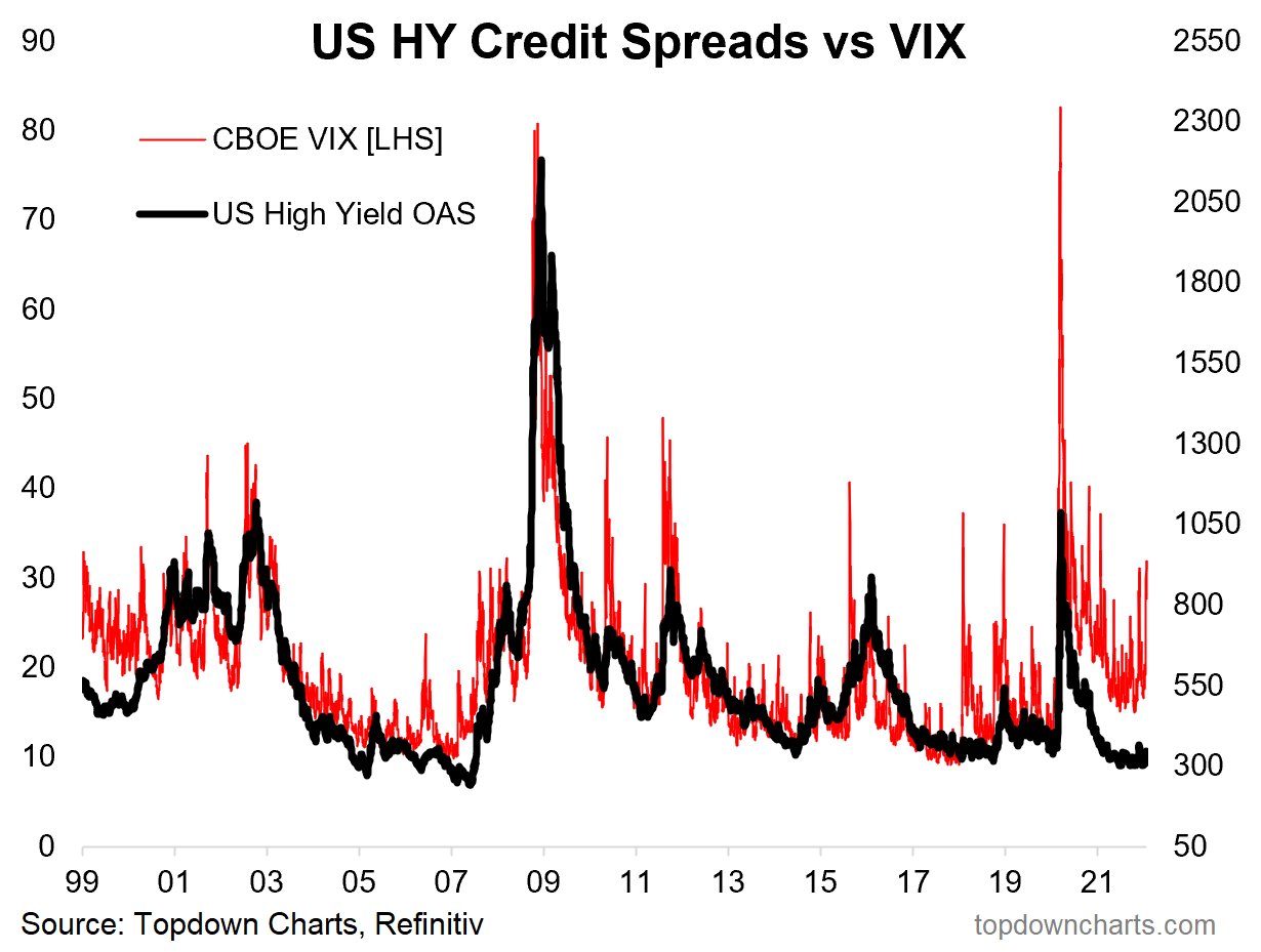
5. VIX Soared, Credit Snored…
Source: @topdowncharts
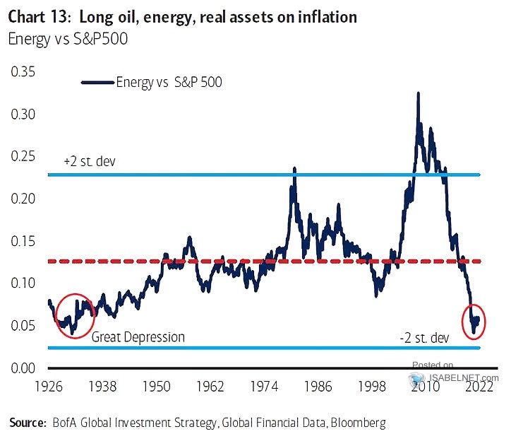
6. Energy Sector: The long-standing and substantial relative bear market in energy stocks appears to be ending. Would it be too simple to expect them to rebound all the way back? (Probably, but effectively I would say this chart represents an element of excess that needs to be at least partially unwound).
Source: @ISABELNET_SA
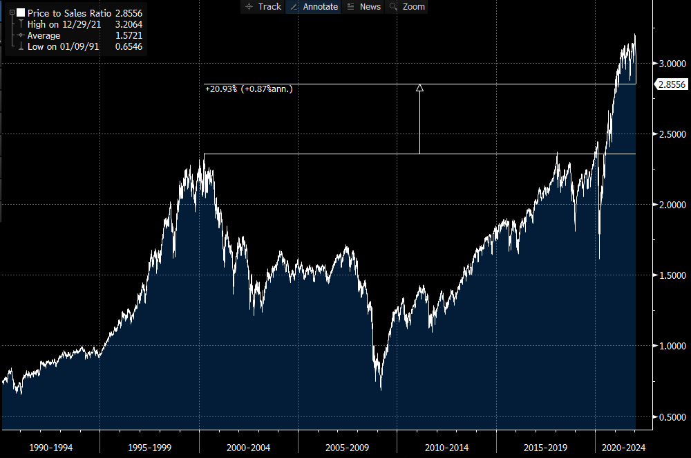
7. Stocks are Cheaper! Good news bargain hunters, the S&P500 price/sales ratio is now *only* 20% above dot com bubble levels!
(Apologies for the sarcasm)
Source: @OJRenick
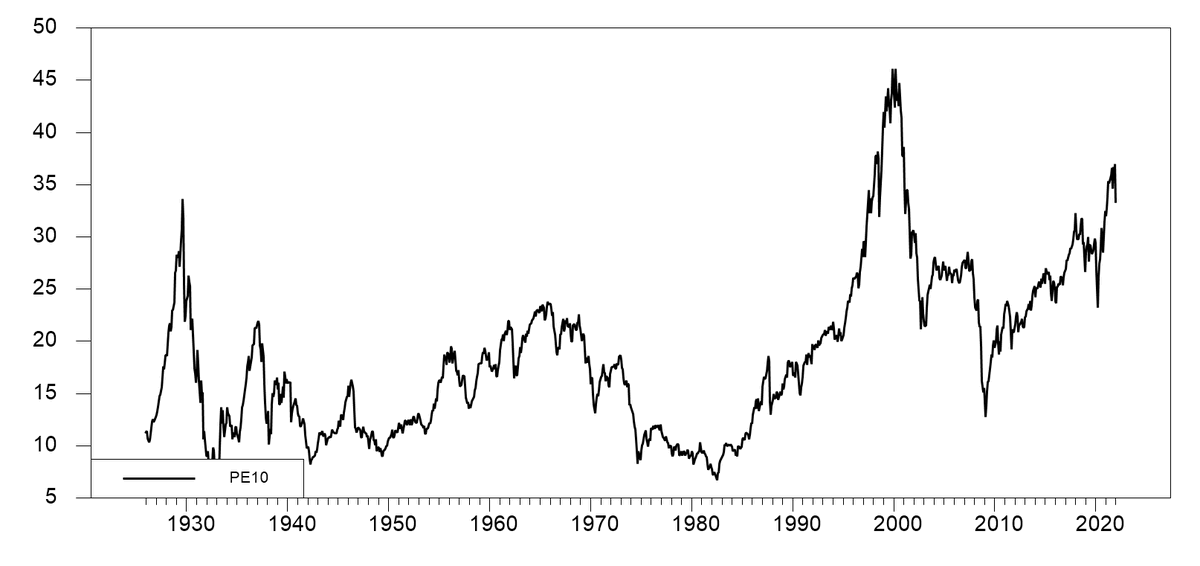
8. "Stocks are cheaper now"
Yes:
-vs the heights of the dot-com bubble
-vs a couple of weeks ago
No:
-vs every other time in all of history (and vs RoW).
Source: @CliffordAsness
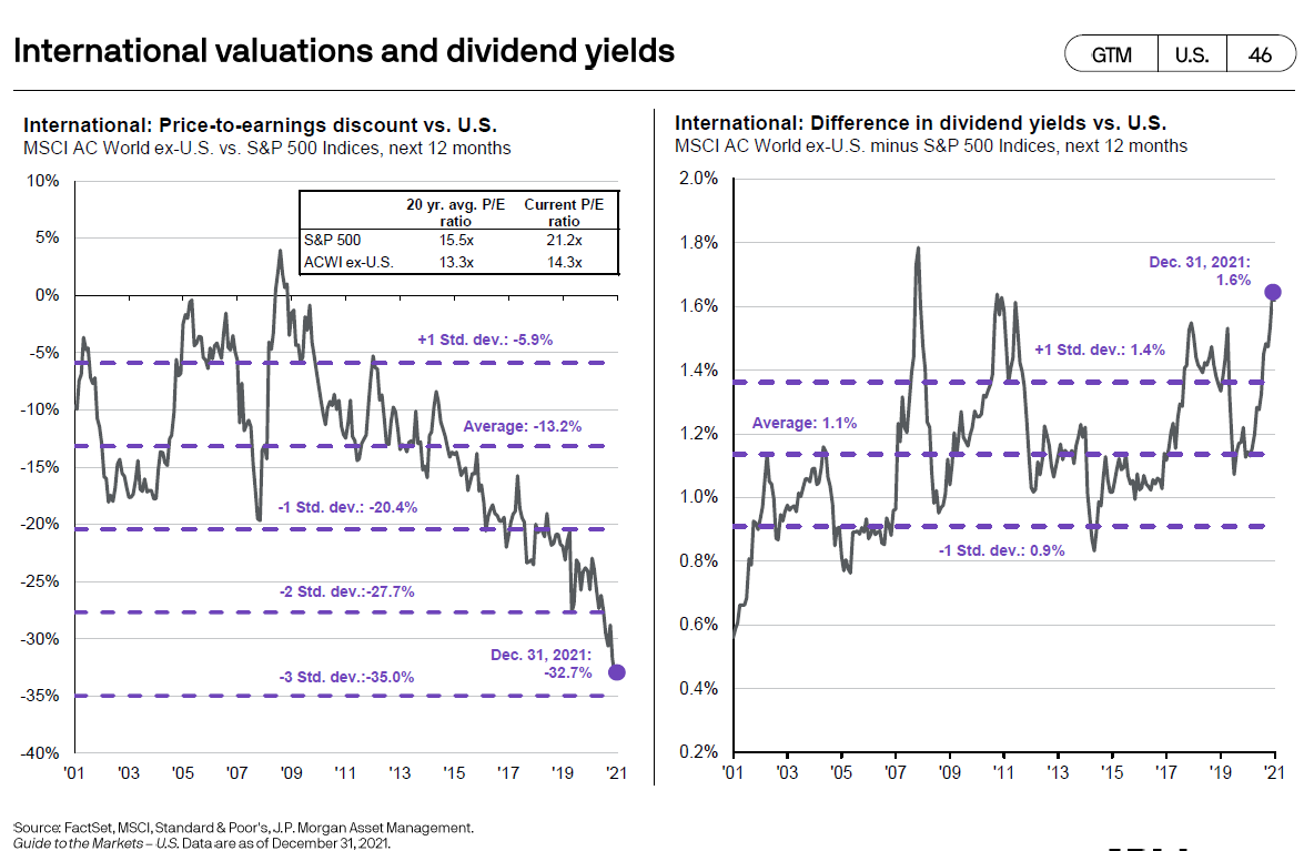
9. Valuations — Global vs USA: On the topic of valuations, I’ve noted before the wide valuation gap between US (extremely expensive) and the rest of the world (reasonable). Of course valuation is only one part of the puzzle, but if you ask me: more and more puzzle pieces are starting to show up too (after being lost under the couch for years).
Source: @trendwhizo
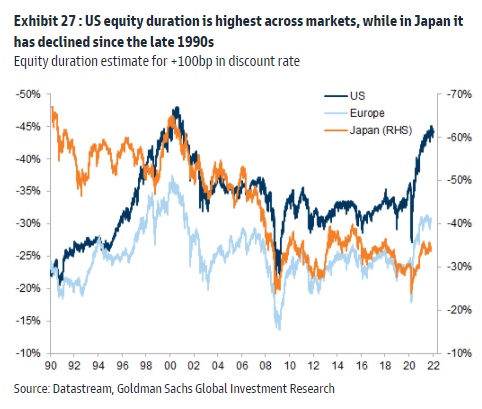
10. Equity Duration: This chart tracks "Equity Duration" aka sensitivity to interest rates. Not only is the US the most expensive market (as noted above), but it is the most at risk should interest rates rise.
*cue the sound of a ticking clock*
Source: @PhilipJagd
Thanks for reading!
Feedback/questions/views welcome in the comment section below.
5 topics

