Charts of the Week - Inverted curves, the SVB effect, and pessimistic Britain
.png)
This week’s charts revisit the evolution of Fed funds futures as the US central bank heads into a potentially pivotal meeting; with yield curves inverted, investors are anticipating both a recession and a potential halt to interest-rate increases. A Fed “pivot” is seen as possible in the wake of the failure of Silicon Valley Bank, which we examine through the prism of small lenders’ loan-to-deposit ratios and potential asset-liability mismatches. We finish with three charts on the UK: growth is projected to stay below trend, workers are striking, and the government recorded a surprise revenue windfall.
Inverted yield curves through history
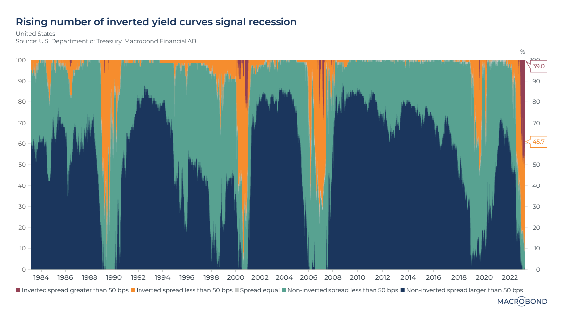
Historically, an inverted yield curve – when long-term interest rates are lower than short-term ones – is a good warning that a recession is coming. Traders are predicting that higher borrowing costs will slow the economy, prompting central banks to cut rates in the future.
This chart tracks a universe of different US bond-yield spreads, showing the percentage that are in normal (blue and green) or inverted (orange and red) territory at a given moment. (The diffusion index is composed of 15 different US government benchmarks, ranging from 1-month bills to the 30-year, long-term bond.)
The spiking inverted curves before the early 1990s, early 2000s, GFC and pandemic recessions could not be more obvious on this chart.
For quite some time, observers have been predicting a recession is inevitable as the Fed tightens policy to tame inflation. The bond market agrees: according to our chart, more than 87 percent of the yield-spread permutations tracked are inverted. About 40 percent have an inverted spread above 50 basis points, the greatest proportion in at least 40 years.
The SVB effect on Fed funds futures
Many people bet on a Federal Reserve “pivot” to dovish policy this year. Few of them probably envisioned a Californian bank failure as the specific catalyst. But the Silicon Valley Bank episode (and Signature Bank, and the subsequent interventions involving First Republic Bank and Credit Suisse) is consistent with the central-banking cliché “tighten until something breaks.”
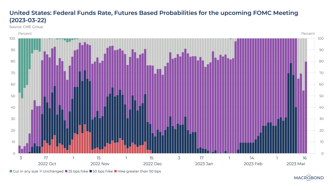
This chart tracks futures markets to gauge evolving perceptions of the outcome of the March 22 Fed meeting. How have attitudes changed since September?
Consider the green bars on the left-hand side. Six months ago, traders bet there was a 40 percent probability that the Fed would be done its tightening cycle by now and would be cutting rates again.
As inflation proved sticky, traders swung the other way and refused to rule out the possibility of a massive rate hike of 75 basis points or more (the red ridge). Then inflation slowed, and the consensus view became a 25-basis-point hike (in purple).
Recent job and inflation reports surprised on the upside, prompting renewed concern that a 50-point hike was quite possible (dark blue). But after SVB, that possibility is off the table; the market expects a 25-basis-point hike – or, possibly, as the grey zone indicates, none at all.
Digging into US bank deposits and assets in the wake of SVB
As analysts and regulators pore over the wreckage of SVB, they are likely to focus on the duration mismatch between its assets and liabilities (i.e. the “volatile” deposits suddenly pulled by the tech sector and venture capital).
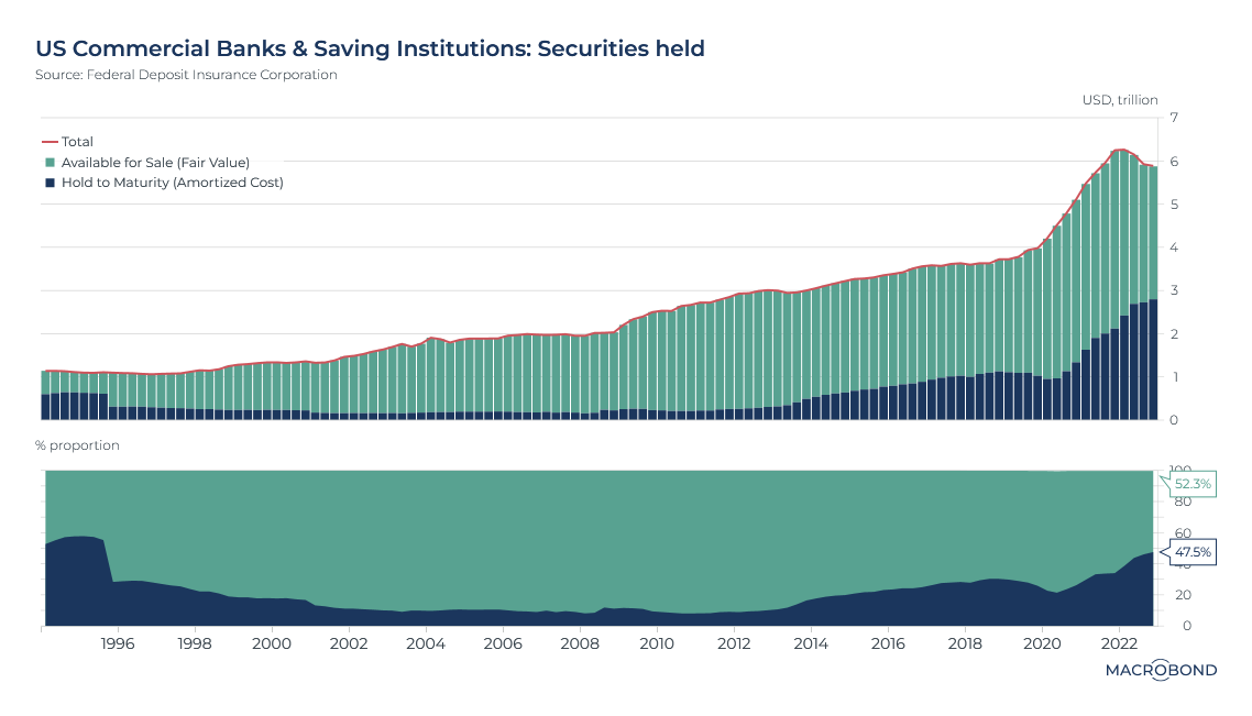
It’s worth examining trends during the pandemic. Deposits surged, while loan demand fell. Banks often placed the difference into securities, as our chart shows – peaking above USD 6 trillion in the first quarter of 2022.
Accounting standards necessitate that banks designate these securities as either “Available for Sale” (AFS) or “Hold to Maturity” (HTM), meaning they will stay on the bank’s books until they expire. We can see a shift in the second pane; the share of HTM surged, and is now evenly split with AFS securities for the first time since the era of 1990s deregulation.
From an accounting perspective, the two are treated differently. HTM securities eat into liquidity: as banks committed to hold them until maturity, they are tricky to sell if cash is needed in the short term.
SVB was known for having a significant portion of its securities’ assets classified as HTM, with most of those bought during the recent period of record low rates.
How big and small US banks swapped roles
The SVB crisis might also lead to an examination of how and why smaller US banks became more aggressive in extending credit. Are they generally more poorly capitalised and overextended compared with larger peers?
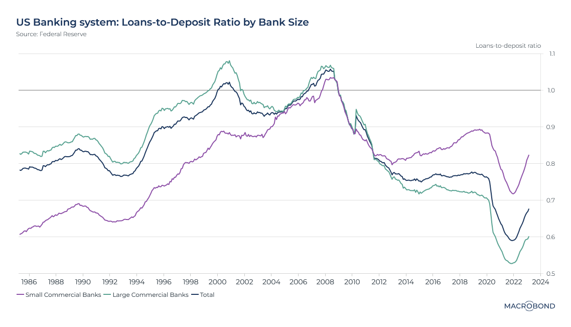
This chart tracks banks’ loan-to-deposit ratios over recent decades. Perhaps unsurprisingly, they peaked just before the global financial crisis in the wake of a long credit boom.
Breaking down the behaviour of larger and smaller banks, as defined by the Federal Reserve, reveals interesting trends. Pre-GFC, small US commercial banks had a lower loan-to-deposit ratio than their larger peers (which the Fed defines as the top 25 domestically chartered commercial banks). From about 2012, that started to reverse.
Recently, ratios for all banks dipped during the pandemic as deposits surged and loan demand weakened. But just before the pandemic, loans represented 90 percent of total deposit liabilities for small banks, compared to just 70 percent (already a record low at that time) for large banks.
Job openings are easing but remain strong
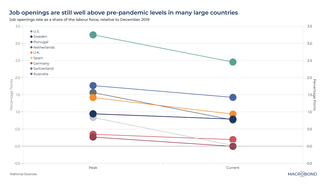
As tighter monetary policy does its work, the employment market is softening a bit. But job openings remain stronger than they were pre-pandemic in most countries.
This chart measures job openings as a share of the labour force in different countries, compared with the December 2019 level (the dotted line). It plots each nation’s 2021-22 peak, when demand soared as economies reopened, as well as today’s level.
Only Portugal and Germany seem to have fallen back to pre-pandemic levels; the US leads nations, with job openings 2.5 percentage points higher than in 2019.
A pessimistic Britain expects to trail the 2010s growth trend
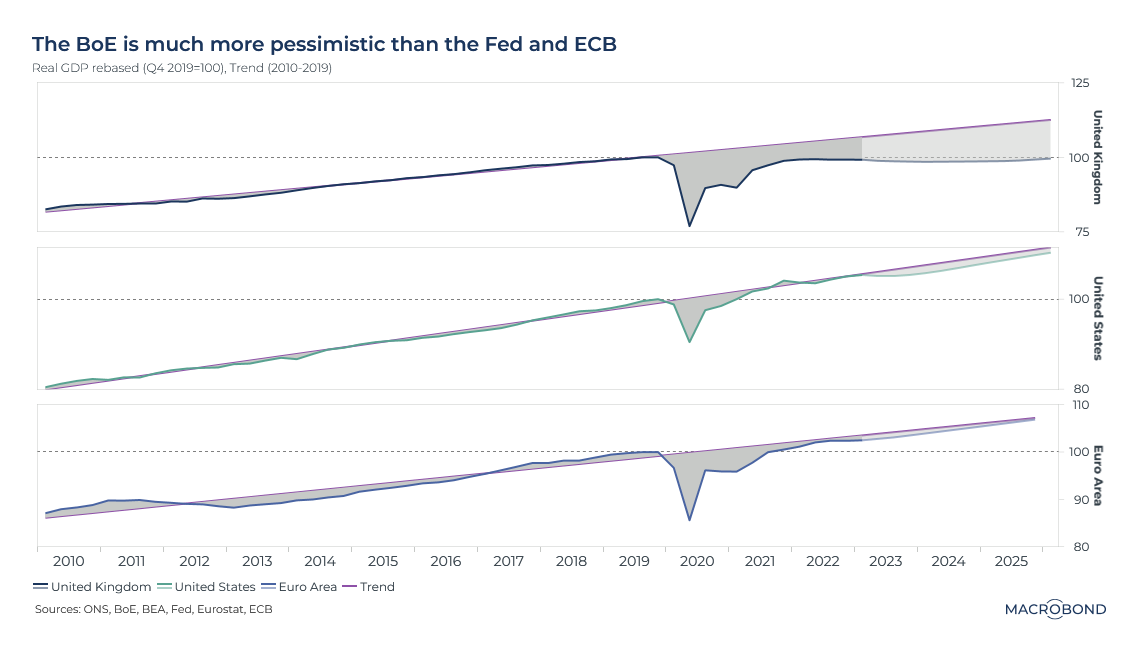
This chart compares US, UK and eurozone central bank growth expectations against the “trend line” between 2010 and 2019. Britain’s central bank stands out with its pessimistic outlook.
The UK economy is no bigger than it was on the eve of the COVID-19 pandemic, and as this chart shows, the Bank of England does not expect to recover that ground until 2026 at the earliest.
It’s a stark comparison with the pre-pandemic, pre-Brexit period. Even after the financial crisis slowed growth, UK GDP growth per capita tended post some of the strongest performances in the G7 during the “austerity” era. Over that time frame, the eurozone’s below-trend growth is visible on our chart, a result of the region’s debt crisis.
UK strikes evoke the Thatcher era
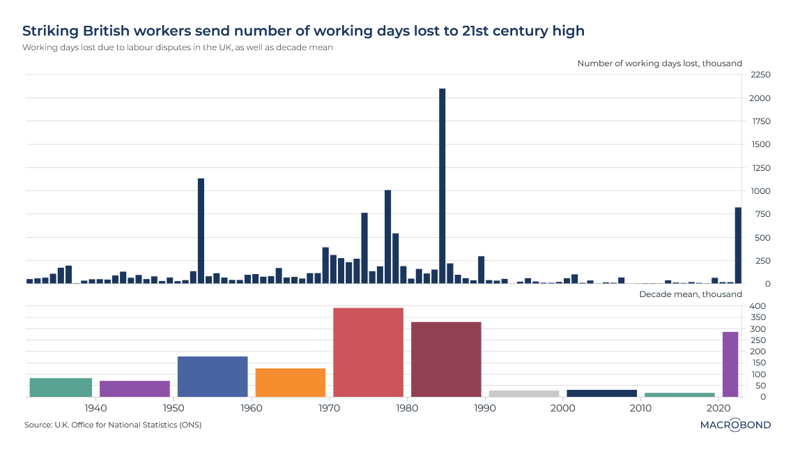
Londoners are getting used to strikes disrupting the city’s transport network. Across Britain, such labour disputes are having the biggest impact since the 1980s.
As our chart shows, the last time the number of working days lost from strikes was as high was during the premiership of Margaret Thatcher – an era famous for its labour unrest. The last 12 months have seen industrial action in the transport, storage, information and communications industries.
It's worth noting that this figure not only includes the striking workers, but people who were unable to get to their workplace.
As the second pane of our chart demonstrates, showing the mean yearly value for each decade, missed working days due to strikes had been comparatively rare since 1990.
The British budget surprise
There was one notable bright spot for the British economy recently – at least if you were the finance minister. (The nation’s taxpayers might disagree.)
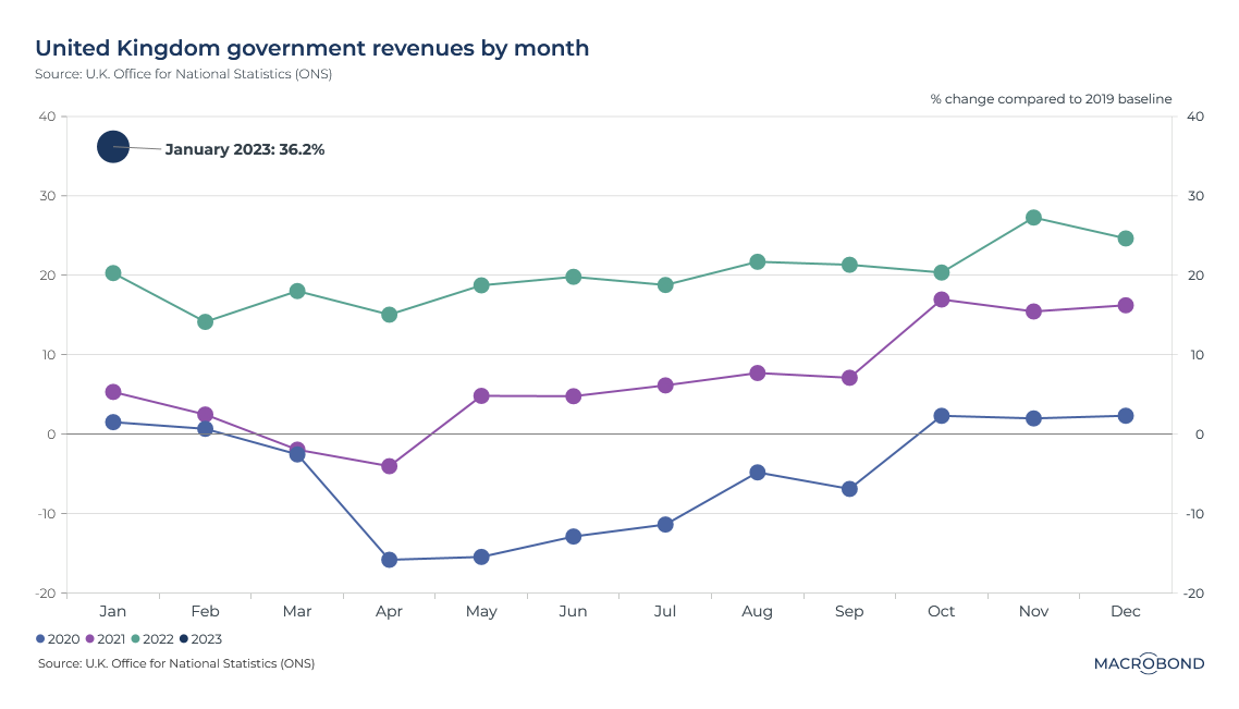
This chart tracks month-by month government revenue over the past three years, expressed as a percentage change versus the same month in 2019.
This past January saw revenue jump 36 percent versus 2019 levels. It’s the month when taxes are due, and self-assessed income tax receipts were the highest since monthly records began in 1999.
This windfall, which meant public borrowing was less than expected, created room for Chancellor of the Exchequer Jeremy Hunt to expand public spending and offer tax breaks.
4 topics
.png)
Macrobond delivers the world’s most extensive macroeconomic & financial data alongside the tools and technologies to quickly analyse, visualise and share insights – from a single integrated platform. Our application is a single source of truth for...
Expertise
.png)
Macrobond delivers the world’s most extensive macroeconomic & financial data alongside the tools and technologies to quickly analyse, visualise and share insights – from a single integrated platform. Our application is a single source of truth for...
.png)