Important value signals for global equities
Learning Goals
Understand the difference between absolute vs relative value
Apply understanding of value signals to global equities and explore new concepts
Grasp nuance, challenges, merits of value signal applications for global equities (particularly as it pertains to countries/regions)
Concepts
In this article we build on the concepts from the previous post introducing valuations (how to use valuation signals in navigating risk and return through the cycle) — looking specifically at global equities and applying what we learned in the previous post, but also explore several new concepts and issues when it comes to using valuations to navigate risk and return within global equities and across the cycle.
First, as a refresher, the same concepts generally apply when it comes to global equities. Simply put, we want to buy low (when stocks are cheap), and sell high (when stocks are expensive).
But as noted, while valuation signals have their strongest information about risk and opportunities at extremes, through the range it’s almost more of a momentum signal – and you need to grasp how the signal from valuations will change as the cycle progresses. The chart below shows how this plays out at the conceptual level.
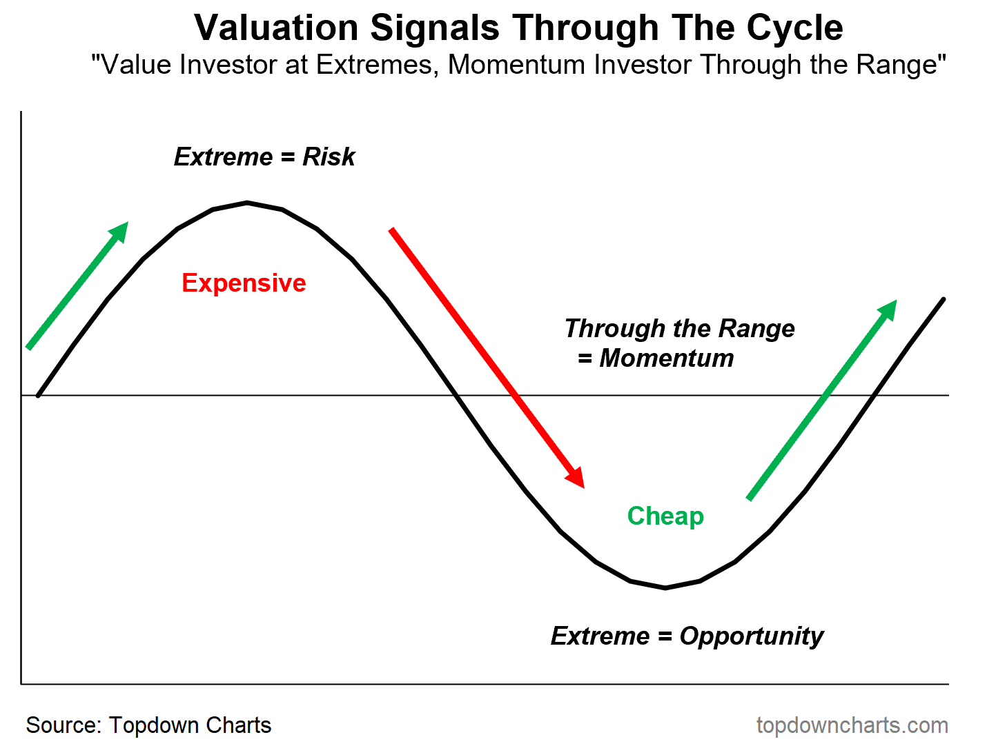
It can make as much sense to avoid something that is cheap – but has strong downward momentum (typically reinforced by deteriorating macro/fundamentals), as it might to stay invested in something that is expensive – but has strong upward momentum (again, typically reinforced by macro/fundamentals; and often referred to as growth when it’s on the way up).
It’s important to review this conceptual cycle map when it comes to valuation signals in absolute terms, but the same kind of concepts are also relevant when it comes to *relative valuations*.
So far in talking valuations we mean it in an absolute sense – is the asset/market cheap or expensive outright (often in relation to the historical tendency). But another important lens in valuations is that of relative value – how one asset is looking relative to another.
This is particularly relevant for global equities because one of the key considerations aside from the high-level asset allocation decision (e.g. allocating to global equities vs cash or bonds), is how you allocate to global equities on a country and/or regional or group level.
To compare and contrast the two ways of looking at valuations, consider the quadrant below.
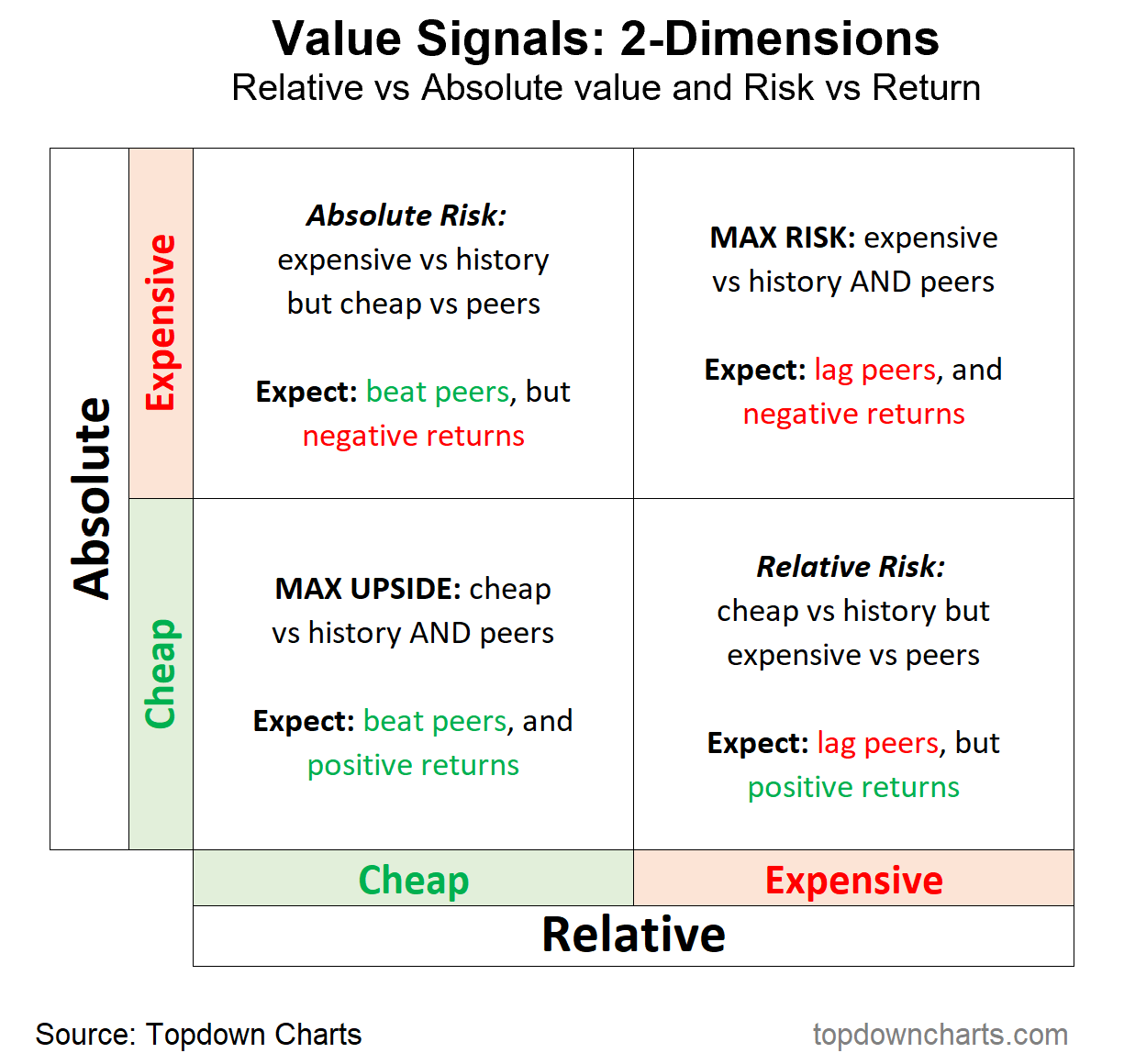
Adding in a second dimension to the way we think about valuations can support investment decisions, help avoid risk, while also bringing in important information on opportunity-cost (or benchmark-aware insights).
For example, consider the lower panel of the table: often times when you get a global market correction just about every country/region lights up as cheap in absolute terms as investor panic drives down prices further than the deterioration in fundamentals justifies. Again, the over-reaction creates a value opportunity. But here’s the thing, when looking at the global equities universe – yes maybe every market rises from that cheap valuation starting point, but not all markets are created equal: some will rise further and faster than others.
We can find clues to that in relative value – those markets that get beaten down further than others: creating a large valuation gap vs peers ultimately creates the opportunity for greater upside vs peers over the longer-term.
It’s really the same concept as absolute valuations, but basically for a new synthetic asset whose price is the relative performance of the two markets being compared, and whose valuation indicator is based on the relative valuation level of the two markets (e.g. is market x trading at a premium or discount vs market y on a PE ratio basis?).
Data and Application
These two approaches are demonstrated with data below, using Global excluding-US (ex-US) Equities as the absolute value example, and global ex-US vs US equities as the relative value example.
The first most apparent thing is the extremes in the indicators lining up with peaks and troughs in the price series, i.e. the moment of max risk vs opportunity. The second standout is the apparent cycles at play, which demonstrates in the real world how the conceptual cycle map works in practice.
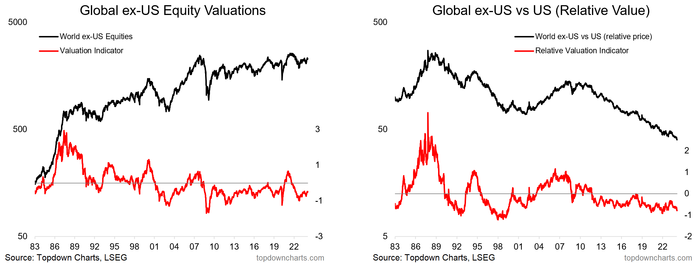
Albeit, also standing out are some of the exceptions and complications. And it is important to note how the conceptual model is a lot messier when applied in the real world. This does speak in part to the limitations of value signals – especially if you end up over-relying on valuations (or any other one signal). But even if there are exceptions and even if the real world doesn’t quite fit precisely with the conceptual framework, it is still vital to have core guiding principles; and to have an underlying intuition around the way things should work.
Just as you are never going to get it right 100% of the time when it comes to making decisions about an unknowable and uncertain future, valuation indicators are not going to work precisely to plan 100% of the time. But getting it right “most of the time” is enough both in terms of investment decision making (especially when risk is controlled, and upside allowed to run), and indicator reliability.
And actually over the longer-term valuation signals do provide useful information on forward returns. The scatter plots below show the level of the PE10 ratio and subsequent 10-year price changes (annualized), for as many countries as the data is available and for the longest period of data availability across the emerging market and developed market universes.
In both cases, the slope of the line and distribution of dots is about as you would expect – generally higher subsequent returns at the lower valuation levels, and generally lower subsequent returns at the higher valuation levels.

Interestingly, the results are more compelling when it comes to relative valuations and relative returns – which are shown below, using the same approach (but this time looking at individual country PE10 discount/premium vs global, and subsequent relative returns [spread] vs global).

So again, while there are exceptions to the rules (and we should seek to understand why those exceptions come about, and protect against the pitfalls of those by bringing in more pieces of the puzzle e.g. monetary policy changes, cycles in fundamentals, and structural shifts) – we should still focus on the rule, the concept, and therefore derive useful signals from the data.
Practitioner Perspectives
In this section I turn to my mostly institutional investor following on social media to add some practitioner perspectives on the matter and as a prompt to consider some of the other practical issues in application.
Use of Relative Value
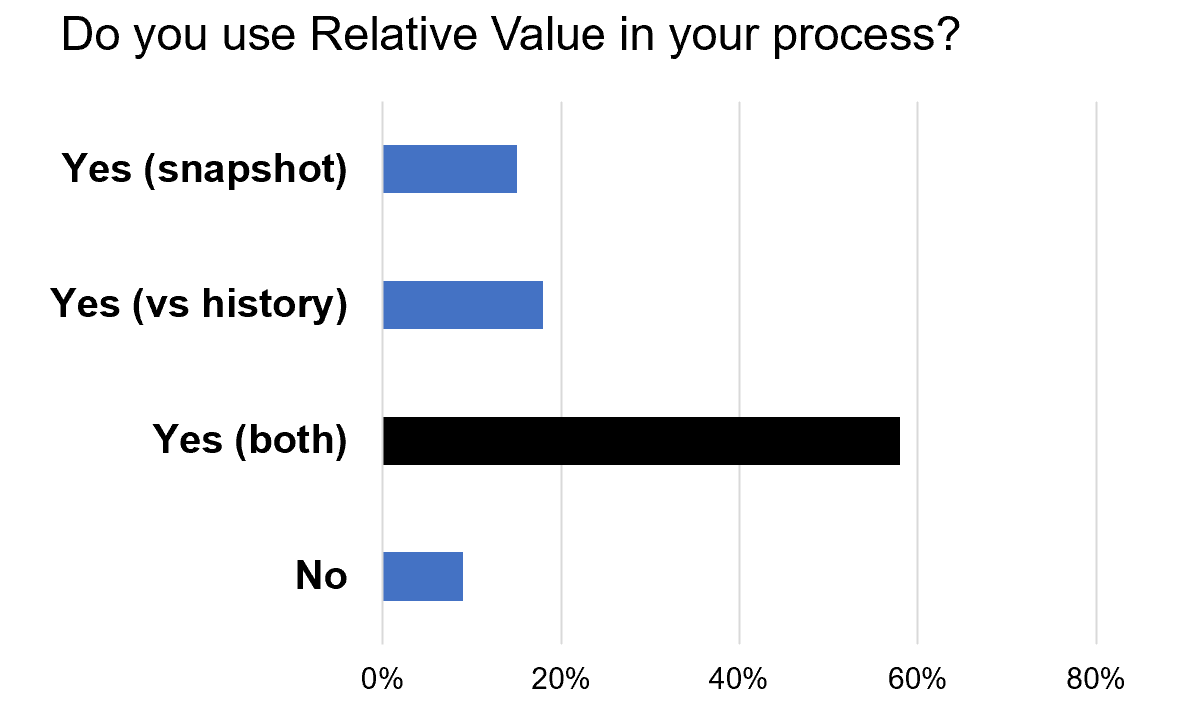
In this survey the question was do people use relative value in their investment process – and the answer is basically 90% yes (which should tell you something about its merits!). Most people look at relative value both from a snapshot in time and relative to history basis. Let me explain the difference with an example.
Source: Callum Thomas (LinkedIn), Topdown Charts
The table below shows the PE10 ratio for US, Developed ex-US, and Emerging Markets. In the bold is the latest observation (12-Feb-2024) – from that data we get information about the ranking of the 3 markets: EM is the cheapest, US is the most expensive. The relative value discount is shown in the lower rows (e.g. EM vs USA – EM trading at a 57% discount vs US). Those are snapshots. The second column in light italics shows the long-term average (maximum available data). With the historical context we can see that the EM vs US discount of 57% is greater than the typical discount of 38% (so it is a larger discount than usual: which is important to note as it makes the cheap relative value signal more meaningful).
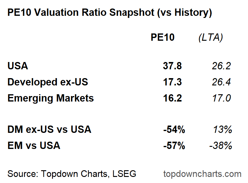
So this is what we mean by a one-off snapshot right now, as opposed to looking at how the current relative value signal compares vs history (and we looked at that visually in the global ex-US vs US chart earlier).
Global vs US Valuation Gap
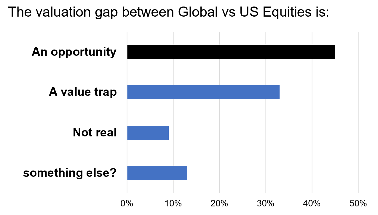
As we saw earlier (and in the table above), global ex-US equities are trading at a deep discount vs US equities. This is something I have dug into in detail in my own work, so I wanted to see what the perspectives were on it – do people see it as the opportunity that it seems to be, or is there skepticism..
Interestingly, most people saw it indeed as an opportunity – this makes sense given what we’ve talked about and what the data shows.
Source: Callum Thomas (LinkedIn), Topdown Charts
BUT: quite a number of people saw it as an example of a value trap – which is a situation where valuation levels e.g. go to a cheap level, and stay cheap – “cheap for a reason”. The logic behind this would be something such as ‘because US equities (big tech) has superior growth prospects, they should trade at a permanently higher valuation vs the rest of the world’. And the truth is, value traps do happen. Sometimes you get structural shifts (see the reflections section below for examples).
But equally, a material amount of folks selected “not real” or something else, and there were plenty of comments… e.g. one fact to consider is the changing sector and country weightings within global equities. Over time, market cap weighted indexes will drift out of the worst performers and into the winners. In practice this has seen the US index skewing heavily into big tech, and global skewing comparatively more into old cyclicals.
These sector differences do have an impact on the true/adjusted relative value picture, and it is worth making adjustments (I have ran the numbers, and for what it’s worth, there still is a value discount, albeit slightly less-so when you adjust for sector differences). But at the same time, most investors are actually allocating based on indexes, and it is the index that you are buying/selling – not the sector-adjusted version. Still, two important nuances to consider.
Relative Value Efficacy
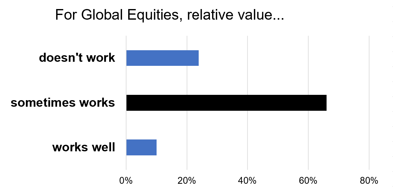
In this one I wanted to get a sense of the perception around relative value – we got some insight into this matter in the previous survey, but this one asks it more directly. The consensus is that it sometimes works (probably a fair assessment, certainly given the fact it works better for longer-term timeframes e.g. the scatter plot earlier showing a clear link between relative value premium/discount and subsequent 10 year returns, and also given the potential for structural shifts, and impact of composition changes).
Interestingly, just over 1/5 said it doesn’t work. I would say if you based your opinion on the track record of relative value, and especially in the case of global vs US, you might easily come to that view. The global vs US valuation discount has persisted for about a decade now (to a greater or lesser degree), and yet there has not been any major turnaround in the US vs global relative performance line. So if we are focused on recent history, and shorter-term timeframes, you might indeed say it doesn’t work. Meanwhile I would place myself somewhere between saying it works well (based on the data), and sometimes works (given the nuance and exceptions).
Source: Callum Thomas (LinkedIn), Topdown Charts
So even though there are exceptions to the rules, and a healthy range of opinions on the current global relative value landscape, clearly practitioners find merit in using relative value signals.
Reflections
By now I think it’s quite clear that there are potentially highly valuable signals to glean from both absolute and relative valuations in the global equities context. They can help inform us on the risk vs opportunity outlook both in absolute terms (will the market go up or down), and in relative terms (will a certain market out/under-perform vs peers).
The conceptual framework of buy low (cheap), sell high (expensive), and momentum through the range, also applies well – as we saw in the data and applications section. So I would say valuation signals are an important source of information for investors in global equities, especially for asset allocators, but also for those involved in global equity stock-picking (being aware of where the maximum risk vs opportunity lies across the country/regional landscape).
But, as with many things, application in the real world is often nuanced, complicated, and features many exceptions. This is not a reason to ignore or discard value signals, and indeed, the set of charts below shows examples of several countries who saw a clear tendency for mean reversion over time, and a relatively consistent range (and stable upper/lower bound).
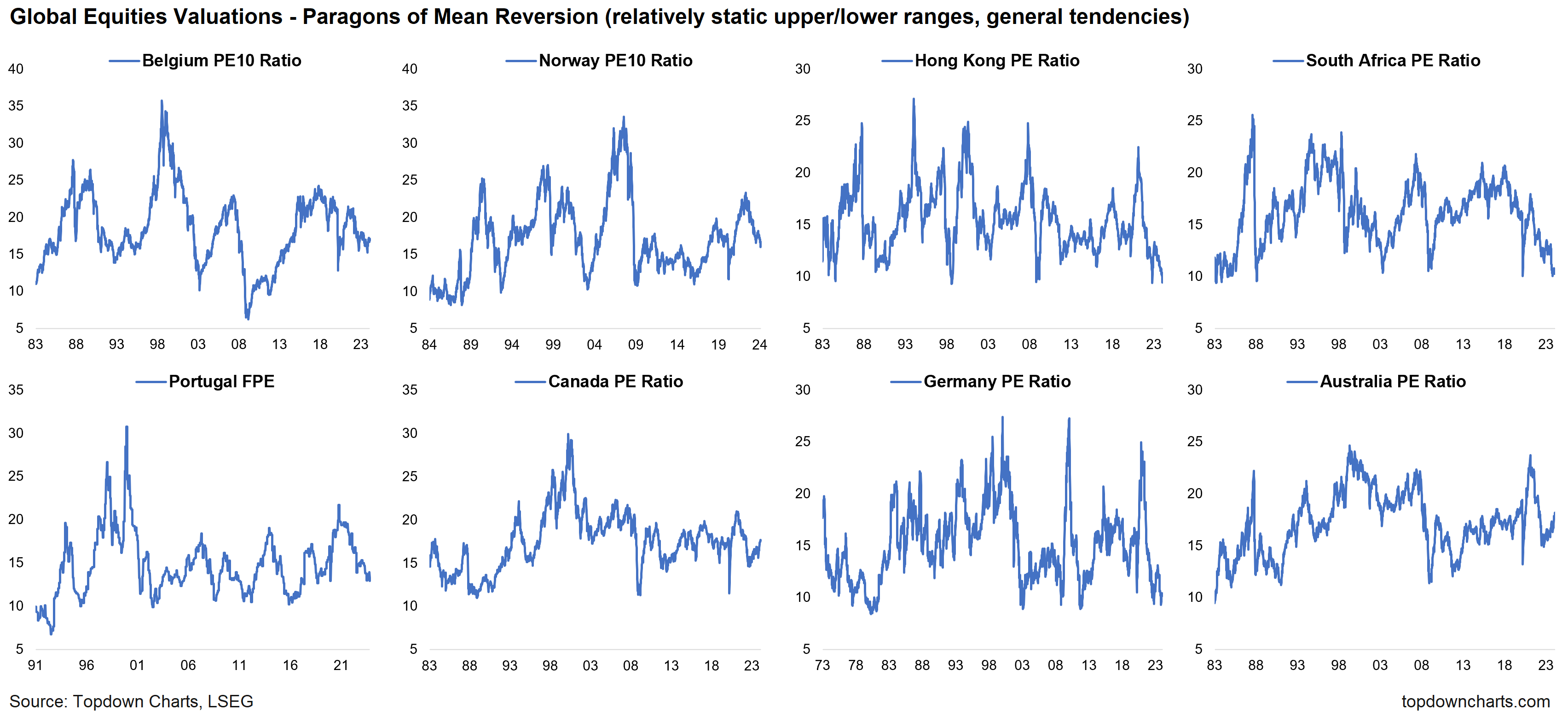
These paragons of valuation mean reversion (which is a key concept for value signal design – the indicator should ideally travel in a typical range, and should say cheap at bottoms, expensive at tops) show again why it’s worth paying attention to as an important source of information.
However, as alluded to, there are exceptions and nuance – the examples below show structural breaks and shifts in the typical range. In some instances e.g. Japan, you went from a lower range, to a higher range, and then back to a lower range. These shifts can be caused by changes in market composition, macro regimes (different growth/inflation/interest rate levels), structural changes in the economy and political backdrop (e.g. emergence of new industries/tech, worsening or improving governance), and can especially be an issue in smaller markets where even a single company or sector can significantly shift things.
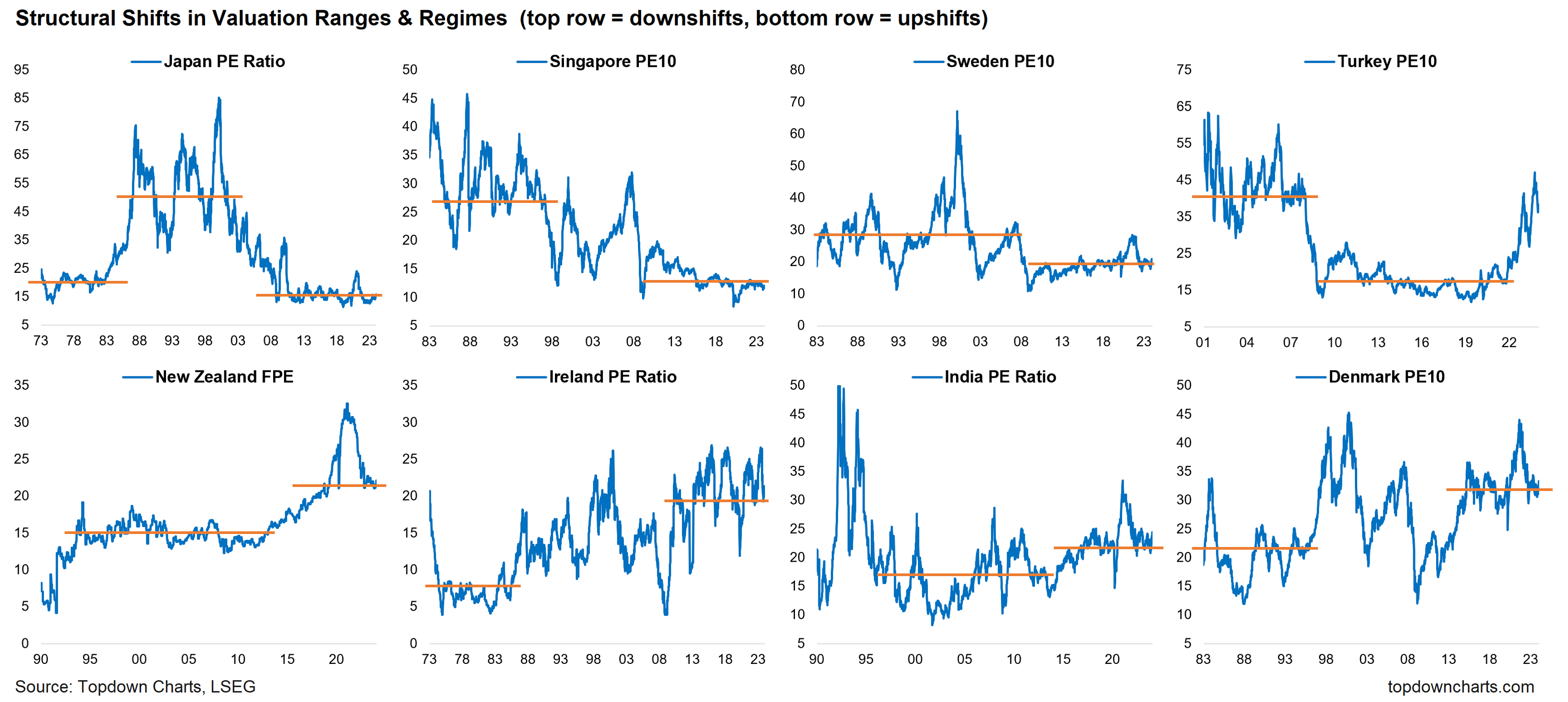
Again, we don’t ignore/discard value signals because of this, but rather we pay attention to what can cause such exceptions, shifts, and changes in signal purity over time. In this way, we can still obtain significant advantages in navigating risk vs return, while being well-informed on the limitations and prospective pitfalls of overreliance on any one signal.
And finally, even when there are shifts like those above, the extremes (particularly where the indicator hits an extreme, and then turns the corner) continue to offer important insights. Furthermore, I will discuss ways to correct for some of these issues in a future note on indicator design.
In the meantime, an important set of concepts and tools to add to your analytical set.
Key Points
Valuation signals are useful for global equity investors and asset allocators in gauging forward-looking risk and opportunity both in an absolute and relative sense, and across the cycle.
The concept of buy low (cheap) and sell high (expensive) works for absolute returns (market goes up/down) and relative returns (one market under/out-performs vs another market).
Overlaying relative vs absolute value signals can provide a fuller picture and add further insight to inform investment decisions.
There are exceptions and nuance to the conceptual rules, such as structural shifts in the typical range, timing, and changing market composition.
It is important to understand the limitations and avoid overreliance on a single signal, but still draw on the valuable insights that value signals can offer.
—
Best regards
Callum Thomas
Head of Research and Founder of Topdown Charts
5 topics

