Weekly S&P500 ChartStorm - 29 May 2022
The Weekly S&P500 ChartStorm is a selection of 10 charts that I handpicked from around the web and post on Twitter. The purpose of this post is to add extra colour and commentary around the charts.
The charts focus on the S&P500 (US equities); and the various forces and factors that influence the outlook - with the aim of bringing insight and perspective...
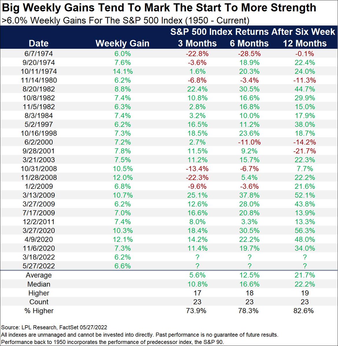
1. Scintillating stock market statistics: The market was up 6% last week. Historically, on average, subsequent returns were positive most of the time, and often materially so.
(albeit note the outliers/exceptions: 2008 financial crisis, 1974 inflation shock, early-2000’s dot-com bubble bursting, and 1980 when Fed Chair Volcker hiked the economy into recession to get inflation under control…)
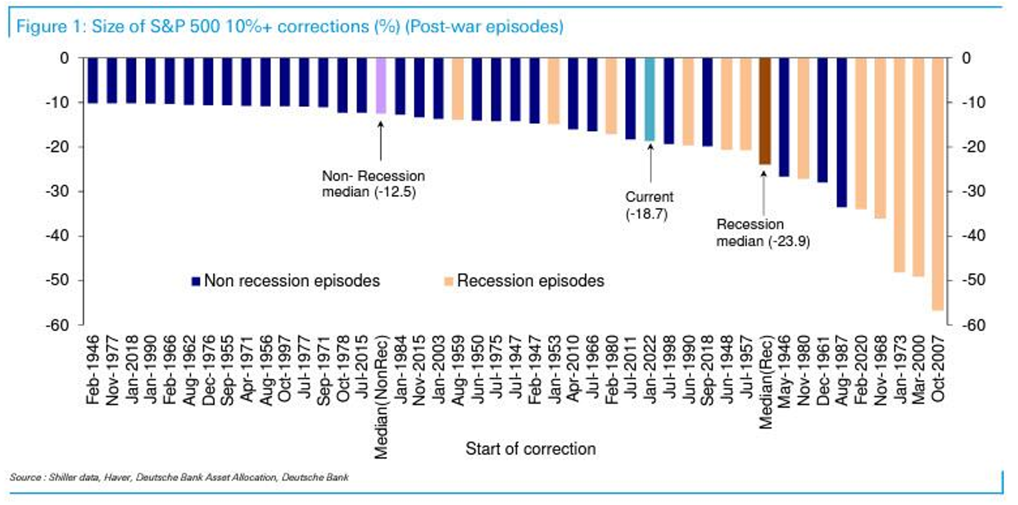
2. Recession session: In terms of recessionary versus non-recessionary stock market corrections, it sure does look like we are skewing toward the recessionary end of the scale in this chart. But the key point is that the answer as to whether this is going to be a more drawn out and deeper bear market will depend on recession: yes or no.
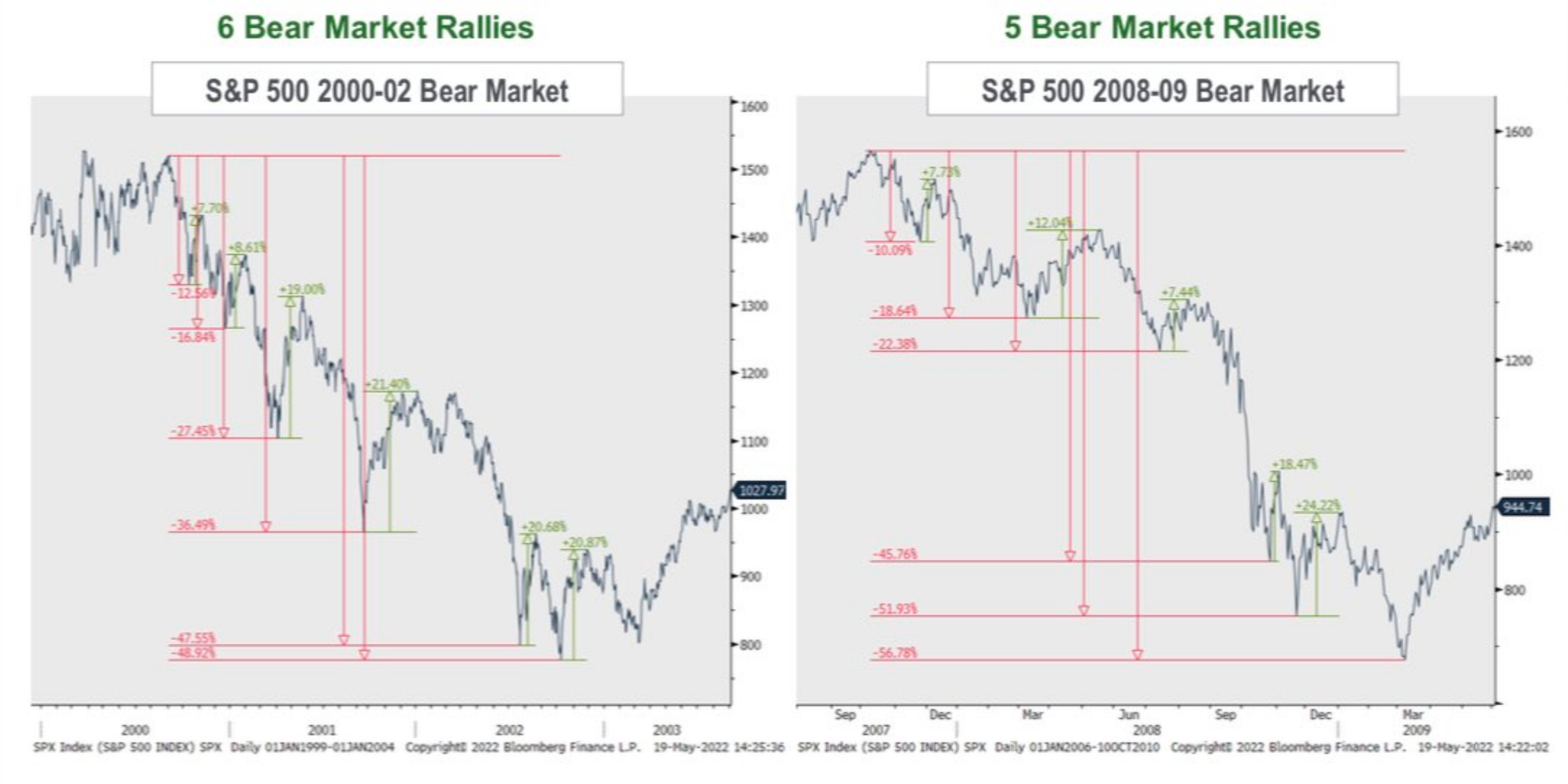
3. Bear market rallies: Beware of the bear market rally
As a reminder, if this is actually a bear market that we are in right now, it will likely feature numerous and very seductive and very confusing bear market rallies.
Good for trading/positioning, but can also be a trap.
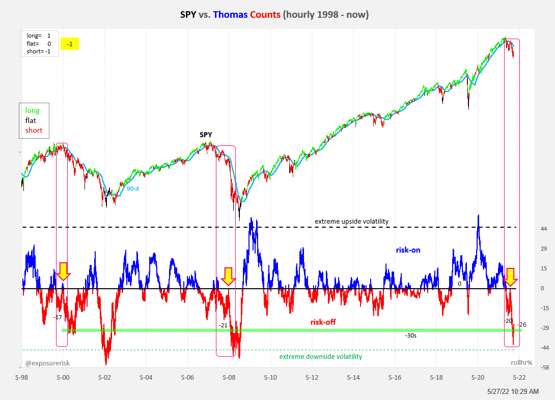
4. Upside-downside ups and downs: Here's the rolling counts of extreme upside vs downside volatility (per cent changes above/below a certain threshold: the original was daily and 1% +/- threshold). I mentioned this indicator a while back, and @exposurerisk has run with this alternative indicator, dubbing it the Thomas Counts.
But anyway, the key point is it puts on clear display the shifts in market regime from upside frenzy to downside fear. It's charts like this (and the macro backdrop) that make me think we're still early in the bear phase, and that this does represent a market regime change rather than a reversion to “buy the dip“.
5. Valuation eights: Some folk are already saying "Hi, Value" …while others are still saying "High Value!" Meanwhile, I look at this chart and say it still looks a ways to go before all the excesses are worked through.

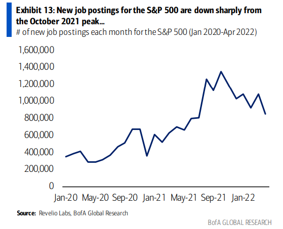
6. S&P 500 job listings: Glance at this chart, looks like the labour boom has peaked…
"total new job postings for the S&P 500 companies further fell in April to 853K, the lowest level since July 2021"
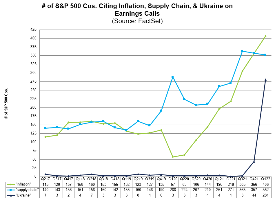
7. Peak Problems — supply chain edition: Seems like companies are starting to complain less about supply chain issues... peak supply chain problems?
Said it before: one way to fix supply chain problems is to fix (stimulus-driven) excess demand: after all, taken to the extreme: no demand = no backlogs. And that's what will get the green line down.
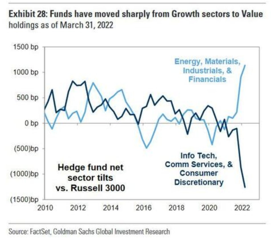
8. Great rotation: only comment I have on this one (it speaks for itself) is to remind you that this chart is benchmark-relative… and the benchmark is still heavily skewed to those techy sectors (dark blue line).
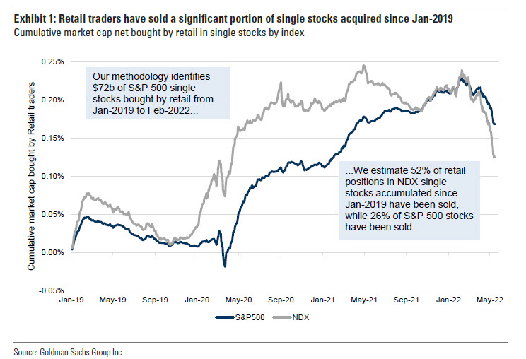
9. Retail over and out: This may be a grim paraphrasing of the term from last week “VTI and Chill“ to "Liquidate and Chill".
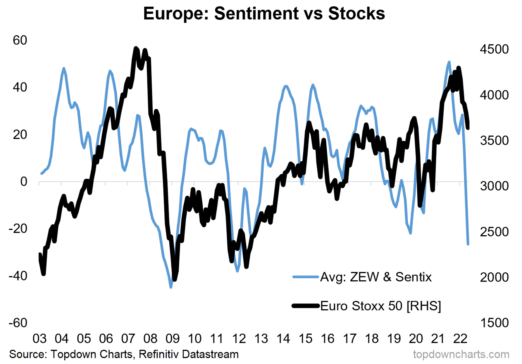
10. European equities: 2008 or 2011?
(the last time sentiment moved like this was in 2008 when it foreshadowed a much deeper fall to come, but also in 2011 where it fell in reflection of real macro challenges but the stockmarket ranged and stagnated for a bit rather than crashing further …remember, bull markets and bear markets are not the only answer: crab markets are also a thing (where markets just range and go sideways))
Thanks for reading!
Callum Thomas, founder and head of research at Topdown Charts.
Any feedback, questions and views are welcome in the comment section below.
Never miss an insight
If you're not an existing Livewire subscriber you can sign up to get free access to investment ideas and strategies from Australia's leading investors.
And you can follow my profile to stay up to date with other wires as they're published – don't forget to give them a “like”.
5 topics

