Weekly S&P500 ChartStorm - 3 October 2021
The Weekly S&P500 ChartStorm is a selection of 10 charts which I hand pick from around the web (+some of my own charts), and then post on Twitter.
The charts focus on the S&P500 (US equities); and the various forces and factors that influence the outlook - with the aim of bringing insight and perspective.
Hope you enjoy!
1. Happy New Month! It’s usually a fun/throwaway line to say “happy new month” and wheel out the monthly chart, but I guess this time we are probably genuinely hoping it will indeed be a happier new month! September saw the S&P500 down near the bottom of the performance tables as a long worry list triggered off what was arguably a well overdue selloff.
Source: @topdowncharts
2. Seasonal Trends: This chart has been a running feature, and it spurred me to ask in the tweets this week “could it really be that simple?“ Seems awfully convenient that the market finally took a bit of tumble during what is typically a seasonally weak part of the year. Of course, the attention now shifts to the next part of that chart… is a powerful year-end rally on the cards? I’ll say this: seasonality is a very interesting factor, but I always say it should be the last thing you look at, and it’s simply an average of what happened in the past - there are many exceptions to the rule, and Murphy would tell us that when we go to rely on it, it will probably break!
Source: @topdowncharts
3. S&P500 Monthly Seasonality Statistics: This table provides an exquisite follow-up to the previous chart. One thing that stands out is that the last 3 months of the year tend to be good… on average. Notice though how the average hides something deeply disturbing in October: this month has historically been both the best and the worst - the most volatile range of outcomes. December is a bit more clear cut, but anything could happen in October!
Source: @topdowncharts
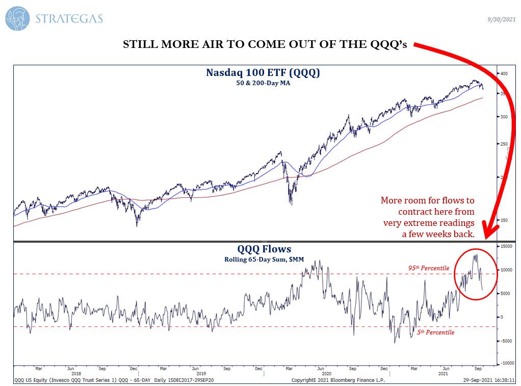
4. What The Flows Shows: One trigger of the selloff has been the damage done to growth stocks by the pop up in bond yields… that arguably comes at the worst possible time for the Nasdaq where massive inflows showed extremes in sentiment. I would be haste to point out that a euphoric reading like what we saw in recent weeks on this chart means an entirely different thing at the later stages of a trend (i.e. contrarian bearish), vs the beginning stages (i.e. the surge in flows in 2020 was bullish - a sign of strong momentum following a turning point). Could well be another turning point for tech stocks.
Source: @verrone_chris
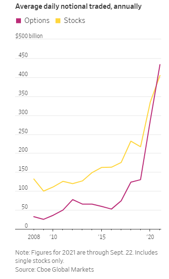
5. Options vs Stocks: This chart documents the rise of retail and the state of speculation. The pandemic proved a perfect storm to spur on speculation on a scale never before seen. Individual investors locked at home with not much to do, with stimulus cash in the bank, with greater ease of access to the markets and information than ever before, and at a lower and lower cost. What could go wrong?
Source: @SarahPonczek @GunjanJS @WSJmarkets
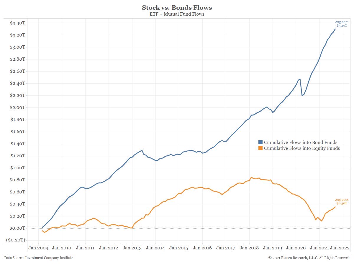
6. What Great Rotation: Every now and then an idea surfaces about a great rotation out of stocks and into bonds - afterall, bonds will likely deliver negative real returns, and meanwhile stocks have got earnings growth, dividends, and a track record of beating inflation. Maybe taper (penciled for November) will be the trigger of a rotation? (great or otherwise)
Source: @LizAnnSonders @biancoresearch
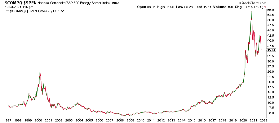
7. Tech vs Energy: This is a very important chart. Aside from the interesting technicals (head and shoulders top in tech vs energy stocks?), basically this chart documents the path of markets through the pandemic. Tech won, energy lost. But with the pathway out of the pandemic slowly becoming more clear, what do you think will happen next? It’s going to be hard for tech to replicate the dividend handed to it by the pandemic, meanwhile energy demand will resurge. I’ll let you join the dots there!
Source: @HFI_Research
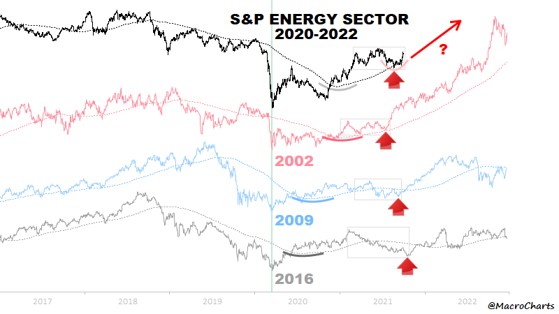
8. History Rhymes for Energy Stocks? Seems the tides are turning for the long-ailing energy sector, and a handful of historical analogs provide some cause for optimism. Maybe this move is just getting started…
Source: @MacroCharts
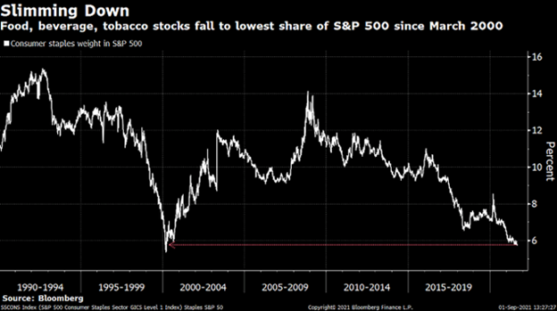
9. Consumer Staples: Boring old low-energy consumer staples have fallen to the lowest weighting of the S&P500 since March 2000. It’s worth noting that tech has done a lot of the heavy lifting here (with tech and tech related at a record high weighting of the S&P500). The knee-jerk reaction is to fixate on that 2000 period (dot-com bubble 2.0?) - it sure is different this time in many respects, but there sure are a lot of similarities… history rhymes?
Source: @ETFProfessor
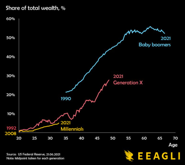
10. Generational Wealth: This is quite an interesting way of mapping out the passing of the generational wealth-torch. Of course there is a lot we could say on this one e.g. with regards to the riding of the waves of structural bull markets in equities, bonds, and real estate. Will the next generation be so lucky?
Source: @MacroAlf
Thanks for reading!
Feedback/questions/views welcome in the comment section below:
Stay tuned for next week's edition!
5 topics

