Real yields, Taiwanese trade and Bitcoin’s rally
.png)
This week’s charts begin with a historic look at US bond returns, comparing the disastrous post-inflation yields of recent years to previous decades. We also set the scene for a wave of upcoming central bank decisions: we check the futures market for clues about when the Federal Reserve might be done raising rates, and examine how a tight job market might influence the Bank of Japan. Speaking of employment, we show how US jobless claims skipped “seasonality” this fall, avoiding the usual upturn. We also examine the post-pandemic US savings cushion, breaking it down between rich and poor. Turning to emerging markets, we create a visualisation of inflation for 14 countries. And we conclude with Bitcoin’s recent rally as crypto enthusiasts get excited about an ETF.
Different eras for US real yields
.png)
This chart can be applied to different countries using Macrobond’s change region functionality.
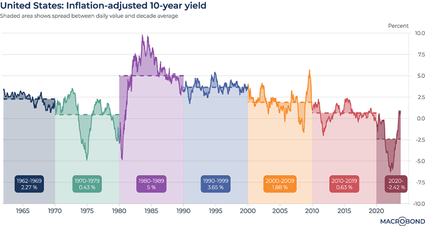
As price increases slow and central banks raise interest rates, it’s interesting to see how US 10-year yields have fluctuated when adjusted for inflation.
This chart breaks down the evolution of real US 10-year yields by creating an average for each decade. The real yield peaked in the early 1980s, when Federal Reserve Chairman Paul Volcker was famously engaged in sharp rate hikes to bring down inflation that was even higher than it was 2022-23.
As we can see in the 1970s, bonds were a bad bet; inflation largely wiped out your yields. By contrast, investors who bet that Volcker would succeed in his quest were rewarded handsomely. The average post-inflation return was 5 percent in the 1980s – making it the best decade.
1970s-style returns returned in the 2010s – this time due to disinflation and ultra-low rates. And we’re still in negative returns so far in the 2020s after a historic, inflation-driven bear market.
Factoring in Fed hikes (or cuts) after next week’s likely pause
.png)
Fed policy makers convene next week, and the market consensus calls for them to stand pat on interest rates.
This table peers into 2024 by using the implied probabilities for rate levels predicted in the Fed funds futures market.
Will Jay Powell announce one more hike before the end of the year? The market is pricing in a 29 percent chance of this outcome.
As this chart shows, the chance of two more rate hikes over the next year (which would bring the key policy rate to a 5.75- 6 percent range) is viewed as unlikely, though not impossible.
There’s a 50 percent chance that we’ll still be on “pause” mode in May; by the end of 2024, a 90-percent-plus chance of a pivot to rate cuts has been priced in.
Taiwan’s semiconductors boost the trade surplus to a historic high
.png)
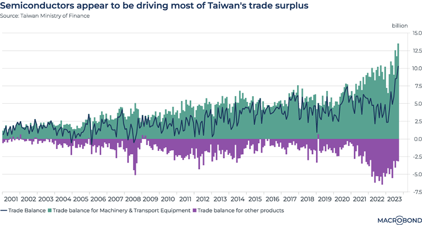
Amid perennial geopolitical tensions and a wobbling global economy, Taiwan can always count on demand for its high-end semiconductors.
Taiwan Semiconductor Manufacturing (TSMC), whose customers include Apple and Nvidia, recently reported better-than-expected third-quarter figures. While the company had been navigating one of the chip industry’s cyclical downturns, analysts said TSMC is poised for another leg of growth amid demand for AI chips.
This chart aims to show the outsized effect of the semiconductor industry on Taiwan’s trade balance – which recently touched a historic surplus. The chip industry is included in the “machinery & transport equipment” segment. All other sectors (in purple) are experiencing a trade deficit.
Japan’s labour market over the decades
.png)
As Japan maintains the world’s last negative interest-rate policy and the yen sinks, the central bank is watching for sustained wage growth before it moves into positive territory.
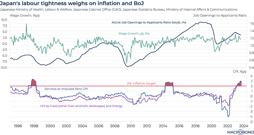
This visualisation shows the sea change in the Japanese job market over the decades. In the first pane, we track the ratio of job openings to applicants (the blue line, measured on the right-hand axis) to year-on-year wage growth, as measured on the right-hand axis.
After the famous “lost decades” for Japan, the trend line for the former changed radically in the 2010s. Starting in about 2014, the number of available jobs exceeded the number of applicants. Despite that, year-on-year wage growth has stayed relatively muted (so far), and the market has not returned to pre-pandemic tightness levels.
However, wage-driven services inflation (as well as underlying inflation, which excludes food and energy) is now above the 2 percent target for the first time since 2014, as the second pane shows.
As the BoJ announces its latest policy update on Oct. 31, stay alert for more labour market data released on the same day.
Read Harry Ishihara’s latest blog on Japan’s monetary policy and obsession with wage growth here.
Rich and poor Americans’ post-pandemic savings cushions
.png)
Between government income support, windfall returns from tech stocks and lockdowns’ blow to consumerism, the pandemic made a big difference for Americans’ savings – whether they were rich or poor.
This chart is a follow-up to our chart from earlier this month, which showed how the US “savings cushion” was revised to be plusher than originally assumed.
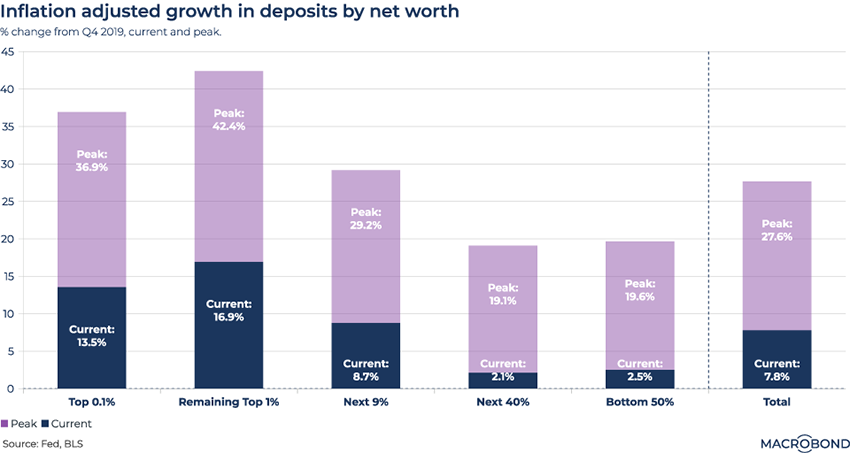
We segmented Americans into five “net worth buckets” and compared their deposits in checking and savings accounts to the last quarter before the pandemic (Q4 2019), adjusted for inflation.
The purple bars represent the peak gains in peoples’ bank accounts. The dark blue reflects how those gains have shrunk, due to inflation, spending and debt paydowns. For the bottom 90 percent of the wealth distribution, the extra savings are almost gone.
Perhaps surprisingly, the merely affluent did relatively better than the ultra-wealthy; the top 1 percent of households by wealth, excluding the richest 0.1 percent, saw their savings jump more than 42 percent. They have also retained the most savings of any group, with almost 17 percent more inflation-adjusted dollars in the bank than four years ago.
Seasonality isn’t kicking in this year for the strong US job market
.png)
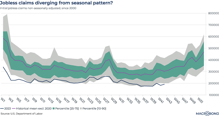
Even after a historic rate-hiking cycle, the US labour market has tended to defy gravity. This chart shines another light on this resilience.
This visualisation tracks seasonality in US employment. Jobless claims are usually highest during the winter, as companies tend to announce more layoffs later in the year; meanwhile, students tend to enter the workforce mid-year. This results in a W-shaped chart.
As a result, labour figures are often “seasonally adjusted” to strip out the effect of predictable trends.
This chart, however, is very much non-seasonally-adjusted. We’re experiencing an anomaly: jobless claims are not doing what they usually do in the autumn, and are evolving on a trajectory lower than the 10-90 percentile band.
Cooling (and re-heating) inflation in emerging markets
.png)
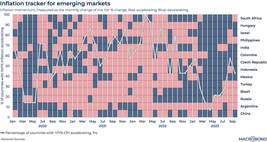
This Tetris-style chart considers inflation momentum across 14 emerging markets, starting in January 2020. (Like last week’s “accelerometer,” this visualisation aims to track the speed of inflation for multiple economies at once.)
This time, we’re defining inflation momentum as the monthly change in the year-on-year headline CPI rate. Red cells indicate month-on-month acceleration; blue cells, a deceleration.
The white line cutting across the cells tracks the percentage of these 14 countries that are experiencing accelerating inflation on any given month.
After an increasing wave of blue throughout 2022 and much of 2023, the red cells are mounting a comeback. Brazil, Turkey and the Philippines are among nations that have flipped back to accelerating inflation.
Bitcoin rallies on ETF enthusiasm
.png)
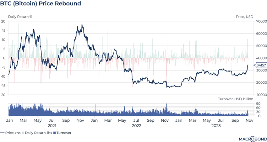
Stocks have been under pressure lately, but Bitcoin might be back.
The cryptocurrency has roughly doubled in price over the past year and almost reached USD 35,000 this week, an 18-month high, as our chart shows.
The recent enthusiasm is likely related to BlackRock’s proposed iShares Bitcoin ETF. It was listed on the Depository Trust and Clearing Corporation (DTCC) last Monday in what was considered a mini-win for crypto investors.
The concept of a crypto ETF is still under review by the SEC, however. Indeed, Bitcoin wobbled when BlackRock’s ETF vanished from the DTCC website a day later, but it later reappeared.
The second panel reflects trading volume as measured by value. This remains subdued compared to Bitcoin’s 2021 heyday.
5 topics
.png)
Macrobond delivers the world’s most extensive macroeconomic & financial data alongside the tools and technologies to quickly analyse, visualise and share insights – from a single integrated platform. Our application is a single source of truth for...
Expertise
.png)
Macrobond delivers the world’s most extensive macroeconomic & financial data alongside the tools and technologies to quickly analyse, visualise and share insights – from a single integrated platform. Our application is a single source of truth for...
.png)