The ASX 200 just hit a new record high and nobody noticed
While the ASX 200 remains below its Feb peak, there's another story hiding in plain sight – and it’s one the financial media totally missed!
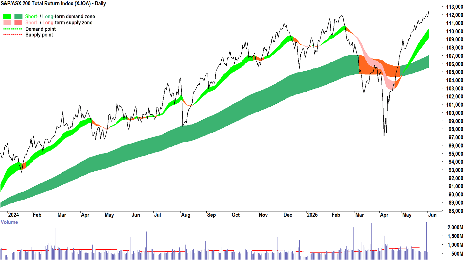
On Tuesday, 3 June 2025, the S&P/ASX 200 Index (XJO) closed at 8479.5, still shy of its 14 February 2025 high of 8616. But here's the twist: Despite a rollercoaster few months that saw the benchmark index of Aussie shares nosedive to 7169 by 7 April – a stomach-churning 16.8% correction – an arguably more accurate measure of its performance quietly notched up a new all-time high.
Not that you'd know it from reading the headlines in the financial press! Just us...we’re the only after-market wrap that picked up on this rather impressive feat by the Aussie stock market – made even more impressive given how dire things looked after President Trump announced his Liberation Day “reciprocal” tariffs back in April.
So why did every other market wrap miss this major milestone? 🤔
Because most market wrap writers only know about / quote the XJO and not the far more descriptive XJOA. Ooh…what’s that I hear you say!? The S&P/ASX 200 Total Return Index (XJOA) is a far more accurate depiction of the performance of Australia’s 200 biggest stocks, because it adds back all the dividends they’ve paid along the way.
So, on a “total return” basis, Aussie stocks as measured by the XJOA closed at a fresh record high on Tuesday. Why is this important, and what even is a total return index, anyway? Let’s break it down.
Capital + Dividends = Total Return ✅
On Tuesday, 3 June, the S&P/ASX 200 Total Return Index (XJOA) closed at 112,434, up from its previous record close of 111,936 set on 14 February. On Friday, it had already broken through that level, but no headlines appeared. No flashing tickers. No big interviews. Just crickets chirping 🦗!
This is because most media outlets, and to be fair, most investors, only focus on "price return" charts, i.e., the movement in stock price / index price alone. So, if Stock A starts the year at $10 and ends it at $11, the price chart will say it returned 10%. But if Stock A also paid 50 cents in dividends over the year, and you reinvested those dividends into more shares, your actual return is higher – 15%, not 10%. That 5% difference is the dividend effect. And as I’ll show you, over time, it can be massive.

A "total return" index takes the dividends paid by stocks and assumes they’re reinvested. It paints a fuller picture of how long term investors who reinvest their dividends really perform. The XJOA is the most widely used benchmark for this concept in Australia. It tracks the same 200 companies as the XJO, but it adds back the value of all the dividends they’ve paid. It’s how fund managers and super funds typically measure their performance.
That last bit is super important for you, too. Because if you’re like most investors, your super fund just keeps chugging away, collecting dividends and reinvesting them back into the market to grow your balance over time. The XJOA is therefore a far better representation of how your super balance is tracking compared to the regular XJO.
Compare the pair: Price Chart vs Total Return Chart
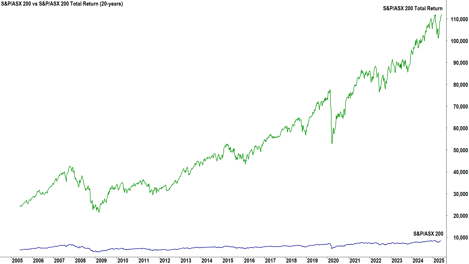
To bring some of these concepts into focus, let’s check the difference between the XJO and the XJOA over the last 20 years. I’ve plotted both indices on a chart with the same scale only to show that this is a pretty useless comparison! The prices of both indices don’t talk to each other at all – they’re completely different values because by our starting point of 2005, the XJOA had accumulated a whole heap of dividends already, and therefore its trading at a substantially higher price than the XJO.

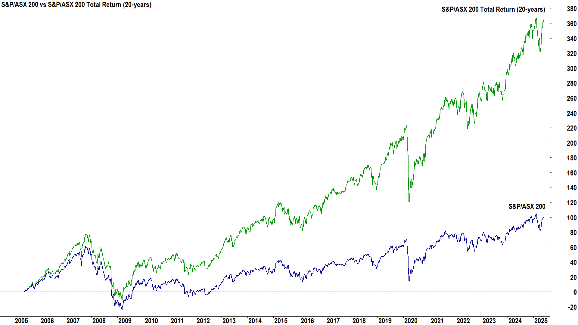
Okay, the chart below makes way more sense! It shows the percentage change of both indices since 1 June 2005. Now we’re comparing apples and apples. As you can see, there’s no contest – the XJOA is lightyears ahead of the XJO in terms of performance – i.e., reinvesting dividends increased the return of the XJOA by over 260% over the last 20 years.

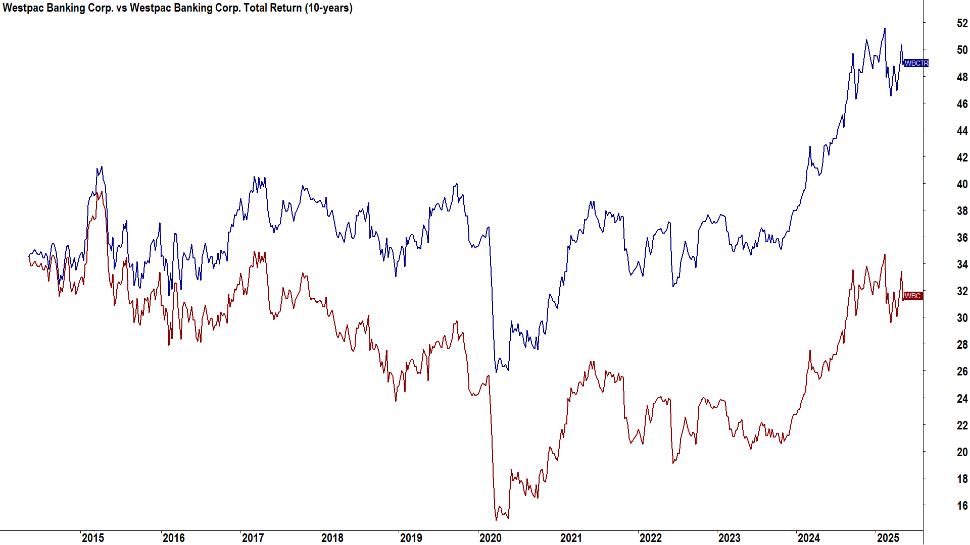
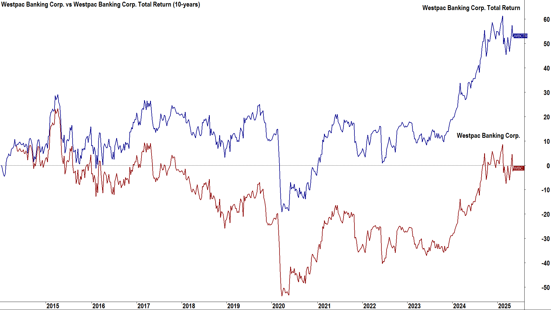
Just to show that the price return / total return comparison can be done on individual stocks, let’s look at Westpac Banking Corporation (ASX: WBC) since 2014 as an example. Below I have prepared a same price scale chart for WBC and its total return variant, which I’ll call WBCTR. Note, that I had to build the WBCTR chart myself, because sadly, no cheaply / easily available charting package performs this task*.
%20vs%20WBC%20Total%20Return%20Price%20scale.png)
I’ve deliberately chosen WBC because on a price only basis, with its stock trading around $35 in 2014 and around $33 today – on the face of it – it appears WBC has lost value over the past 10 years or so. However, when we consider the WBCTR chart, we can see that if we reinvested all of WBC’s dividends back into more WBC stock over the period, its stock price would be closer to $50.
The percentage scale comparison is shown below for your reference. Again, note that a nil return on WBC since 2014 on a price only basis transforms into a +50% return on a total return basis. I’m not advocating investing in stocks that don’t also deliver a healthy capital return over a 10 year period, simply that a total return chart shows how long-term investors may have received a substantial return from dividends alone, even if a stock’s price has been stagnant.
%20vs%20WBC%20Total%20Return%20Percentage%20change%20scale.png)
Conclusions
Firstly, we should always consider a stock or index’s return as a combination of dividends and capital gains/losses. This provides us with a fairer comparison tool to compare stocks that tend to favour higher dividend payouts against those that reinvest dividends to compound their stock price growth.
That brings us back to the ASX 200. When mainstream financial media says the market is "at a new record high" or "at a new bear market low", keep in mind that they’re most likely talking about the standard XJO price index. But price alone is only part of the story. Dividends make up a huge portion of returns – especially in Australia, where dividend yields are some of the highest in the world thanks to a strong dividend culture and franking credits.
As of Tuesday, 3 June 2025, the ASX 200 has never been stronger on a total return basis. That’s worth celebrating – or at least acknowledging – and it’s a curious oversight from the financial media that not one major outlet (apart from us!) reported on it. So, keep in mind when you see headlines claiming that the market has just hit a record, remember: Unless they’re quoting total return figures, it might be more noise than news.
*TradingView has a dividend adjustment option “ADJ” bottom left of your chart screen – but I don’t find it works very well! It doesn't add back dividends to show the cumulative price over a period. It does, however, seem to work better with the scale in “Percentage” mode. Now toggling ADJ on and off, shows the percentage difference between the price only and dividend adjusted returns over the chart’s lookback period.
This article first appeared on Market Index on Wednesday 4 June 2025.
Never miss an update
Enjoy this wire? Hit the ‘like’ button to let us know.
Stay up to date with my current content by
following me below and you’ll be notified every time I post a wire
Carl has over 30-years investing experience and has helped investors navigate several bull and bear markets over this time. He is a well respected markets commentator who specialises in how the global macro impacts Australian and US equities. Carl has a passion for technical analysis and has taught his unique brand of price-action trend following to thousands of Aussie investors.
........
Investing is risky. Inevitably you will endure losses. If you can't cope with losing, don't invest.

%20vs%20WBC%20Total%20Return%20Price%20scale.png)
%20vs%20WBC%20Total%20Return%20Percentage%20change%20scale.png)
5 topics
11 stocks mentioned

Carl has over 30-years investing experience and has helped investors navigate several bull and bear markets over this time. He is a well respected markets commentator who specialises in how the global macro impacts Australian and US equities. Carl...
Carl has over 30-years investing experience and has helped investors navigate several bull and bear markets over this time. He is a well respected markets commentator who specialises in how the global macro impacts Australian and US equities. Carl...
Comments
Comments
Sign In or Join Free to comment