Weekly S&P 500 #ChartStorm - 15 Jan 2017
Here's 10 charts on the S&P500 covering the short term outlook, medium term earnings outlook, US election, and political risk. Overall a similar conclusion from last week holds i.e. that short-term there remains some risks, but medium term the outlook is positive on the back of improving earnings. Aside from that there remains considerable uncertainty on the policy front (and importantly, this uncertainty includes the possibility of material positive uplift e.g. tax policy, as well as potential disappointment). So enjoy the charts, and good luck for inauguration week (and the weeks thereafter!), and keep an eye on those divergences...
Those that follow my personal account on Twitter (VIEW LINK) will be familiar with my weekly S&P 500 #ChartStorm in which I pick out 10 charts on the S&P 500 to tweet. Typically I'll pick a couple of themes and hammer them home with the charts, but sometimes it's just a selection of charts that will add to your perspective and help inform your own view - whether its bearish, bullish, or something else!
The purpose of this note is to add some extra context beyond the 140 characters of Twitter. It's worth noting that the aim of the #ChartStorm isn't necessarily to arrive at a certain view but to highlight charts and themes worth paying attention to.
So here's the another S&P 500 #ChartStorm write-up!
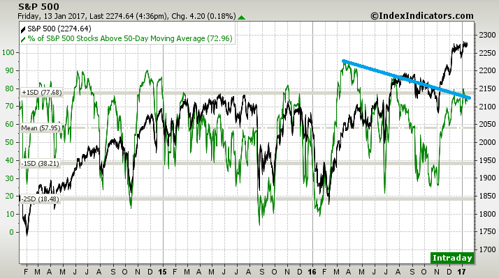
1. 50 day moving average breadth: Similar to last week (which showed 200 day moving average breadth) this week we see the same bearish divergence in 50dma breadth (price making higher highs vs breadth making lower highs). What's also interesting is the down trend line in the chart was briefly broken to the upside, but then has so far failed to decisively break. The logical conclusion if it doesn't compellingly break the down trend line will be a correction of some magnitude. Again, it's one of those things where if it does break more decisively to the upside it will be the harbinger of the next move up.
Bottom line: We continue to see bearish divergence for the S&P500 vs market breadth measures.
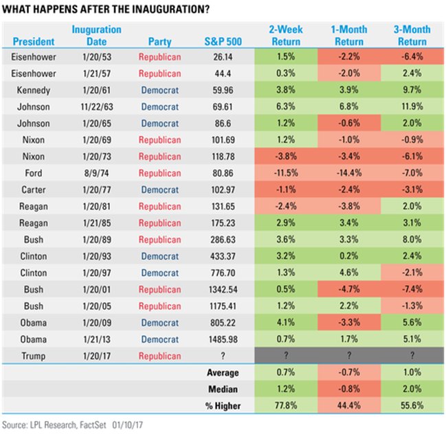
2. It's inauguration week! This week PEOTUS Donald Trump will be inaugurated as the 45th President of the United States of America, specifically on Friday the 20th. The table below from LPL Research (VIEW LINK) shows the performance of the market 2 weeks, 1 month, and 3 months after the inauguration. It's hard to say there's any real reliable pattern there, but on average the first 2 weeks are good, and 3 month is generally positive but with a mixed track record. Something to keep in mind as "President Trump" takes office. Of course much will depend on how he goes with his first 100 days plan.
Bottom line: Market returns are usually positive in the first 2 weeks and on average positive for the 3 months after inauguration.
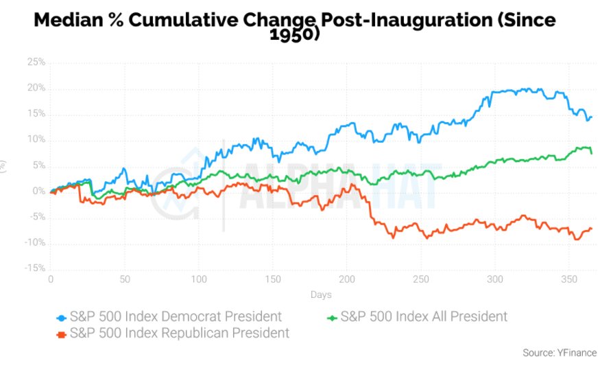
3. Post-inauguration returns - another view: Following on from the previous chart, this graph (VIEW LINK) shows the median cumulative performance of the S&P 500 in the year following inauguration. It also splits out performance during Republican vs Democrat presidents. The overall tendency is that the market goes up (unsurprising given that over the long run that's what the US stock market has typically done). Notably there is quite a difference between Republican vs Democrat (a whole host of reasons including luck/timing influence this). So the open question is, will this time be different?
Bottom line: The median performance post-inauguration are typically positive, but not so much for Republican.
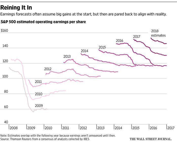
4. Earnings in focus: The next few charts look at earnings. The first one (VIEW LINK) highlights the tendency of analysts to be too optimistic, with earnings forecasts inevitably drifting down as the year wears on. It seems in aggregate analysts are typically too optimistic (except sometimes they're too pessimistic e.g. 2011). So will we see 2018 go down a familiar path or is it time for an exception? The next few charts provide some forward guidance on the issue...
Bottom line: The historical tendency is for analysts to be too optimistic on earnings forecasts.
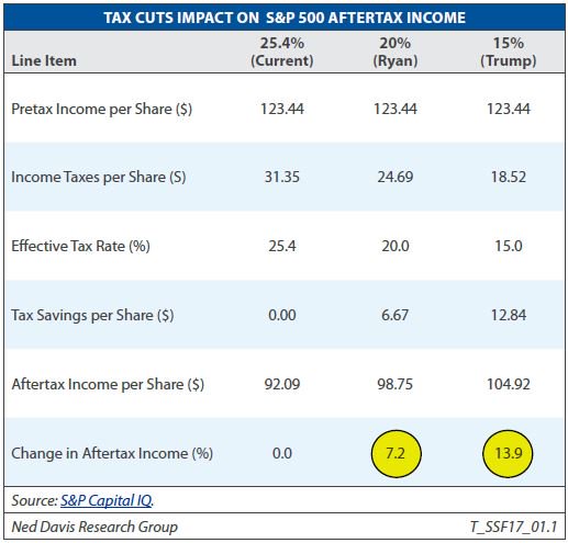
5. Tax policies: The below (VIEW LINK) table looks at the various potential new tax policies under a Trump presidency and projects as much as a 7-14% uplift in after tax earnings - which would be a material change. This is one of the key sources of potential upside that has helped the market rally following the election result, and there is a risk of disappointment. But even a mild delivery e.g. 7% will provide material upside to earnings.
Bottom line: Proposed tax changes will likely boost S&P 500 after tax earnings.
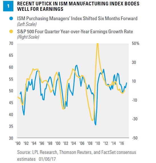
6. PMI vs EPS: The below chart from LPL Research (VIEW LINK) shows the ISM Purchasing Manager's Index vs the year over year growth rate of S&P500 earnings. The key point is the ISM PMI had already turned up from the low in December 2015 and the resultant improvement in the economy has started to flow through to improving earnings. So tax cut or no tax cut the fact is earnings are already on the mend.
Bottom line: The rebound in the PMI has coincided with and lead the rebound in earnings.
7. Weekly leading indicator: The ECRI weekly leading indicator for the US economy has made a remarkably turnaround and in the past this has often signaled a recovery and acceleration in earnings growth. This time is no different, and the earnings outlook for the S&P500 looks solid at this point (note in the past we've shown it against forward earnings - vs trailing earnings this time, which shows an even stronger link). That's not to say there aren't risks, for example a renewed surge in the US dollar (VIEW LINK) could easily act as a headwind to earnings, as it did in 2015.
Bottom line: The earnings outlook for the S&P500 is improving.
[SPXCS150117-7.PNG]
8. Policy uncertainty vs the VIX: There are a number of variations of this chart doing the rounds (I first put this chart together quite a while ago). The thinking goes, because policy uncertainty is high the CBOE VIX should also be high. There is a loose coincident correlation between the two, which breaks down to the upside and downside at various points in history. That the policy uncertainty index remains high (vs VIX low) at the moment in my opinion reflects a couple of things, 1. A sense of political risk exhaustion (people no longer care as much); 2. A case of uncertainty - yes, but on balance a positive outlook e.g. potential tax cuts and improving macro; and 3. A potential peak in political risk (VIEW LINK) . I'll let the reader decide which one. But while I would tend to explain it away, you can't completely dismiss it.
Bottom line: The relationship between the VIX and the US economic policy uncertainty index has broken down.
[SPXCS150117-8.PNG]
9. Policy uncertainty and the equity risk premium: Another take on charting political risk is to show the economic policy uncertainty index versus the equity risk premium. Perhaps unsurprisingly the higher the level of economic policy uncertainty the higher the required equity risk premium. This reflects the market conditions that prevail under greater uncertainty and the premium required for investors to take on the risk. It thereby also shows how costly it is (VIEW LINK) to corporations (higher risk premium means greater cost of equity financing) in environments of greater uncertainty, despite monetary policy accommodation. Anyway, one potentially telling point is the US equity risk premium as measured by ASR has started to come down.
Bottom line: Higher policy uncertainty generally sees a higher required equity risk premium, lately there is a slight disconnect between the two series.
[SPXCS150117-9.PNG]
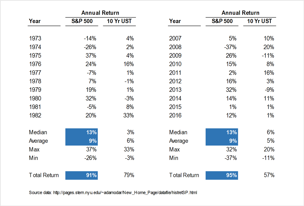
10. Bear market, bull market, potato, tomato: The below table (VIEW LINK) compares and contrasts the 1973-1982 "bear market" with the 2007-2016 "bull market". On the face of it they look pretty similar (similar median return, total return, similarly large max/min returns) albeit the 70's saw more annual drawdowns (4) vs only 1 in the latter, not to mention the surging inflation vs virtually non-existent inflation in the past decade. But anyway, at least on a headline basis it goes to show how the paths to the same end can be very different.
Bottom line: Interestingly enough, the bear market of the 70's actually looked similar to the bull market of the 2010's.
So where does all this leave us?
This week there's probably 3 categories of interest:
1. Outlook
On the outlook, there is of course the earnings charts (more on that on the 3rd point) which point to a positive outlook for earnings over the medium term which should be supportive for equities, or at least provide an environment where selloffs and corrections can be bought. On that note, the first chart continues to sound a warning tone with bearish breadth divergences, likewise the divergence between the VIX and policy uncertainty.
2. Inauguration
The two charts in this week's edition on returns for the S&P500 following the US presidential inauguration point to positive short term returns, and overall positive returns across the year, albeit the 1 year chart does show Republican presidencies usually see poor returns post-inauguration... will this time be different?
3. Earnings
The selection of charts on earnings show potential material upside from new corporate tax policies, and also show pretty strong evidence for an improving outlook (and already a rebound in YoY earnings growth). This is supported by, among other things, an improving US economy. Again, this is why I would say the medium term outlook is positive as improved earnings growth should be supportive for the market.
Summary
Overall I would say the same sort of conclusion from last week holds i.e. that short-term there remains some risks, but medium term the outlook is positive on the back of improving earnings. Aside from that there remains considerable uncertainty on the policy front (and importantly, this uncertainty includes the possibility of material positive uplift e.g. tax policy, as well as potential disappointment). So good luck for inauguration week (and the weeks thereafter!), and keep an eye on those divergences.
See also: Weekly S&P500 #ChartStorm - 8 Jan 2016 (VIEW LINK)
Never miss an update
Enjoy this wire? Hit the ‘like’ button to let us know.
Stay up to date with my current content by
following me below and you’ll be notified every time I post a wire
Callum is Head of Research at Topdown Charts.
Topdown Charts is a chart-driven macro research house covering global Asset Allocation and Economics.

9 topics

Callum is Head of Research at Topdown Charts. Topdown Charts is a chart-driven macro research house covering global Asset Allocation and Economics.
Expertise
Callum is Head of Research at Topdown Charts. Topdown Charts is a chart-driven macro research house covering global Asset Allocation and Economics.
Expertise
Comments
Comments
Sign In or Join Free to comment