Weekly S&P500 ChartStorm - 24 July 2022
The charts focus on the S&P500 (US equities); and the various forces and factors that influence the outlook - with the aim of bringing insight and perspective...
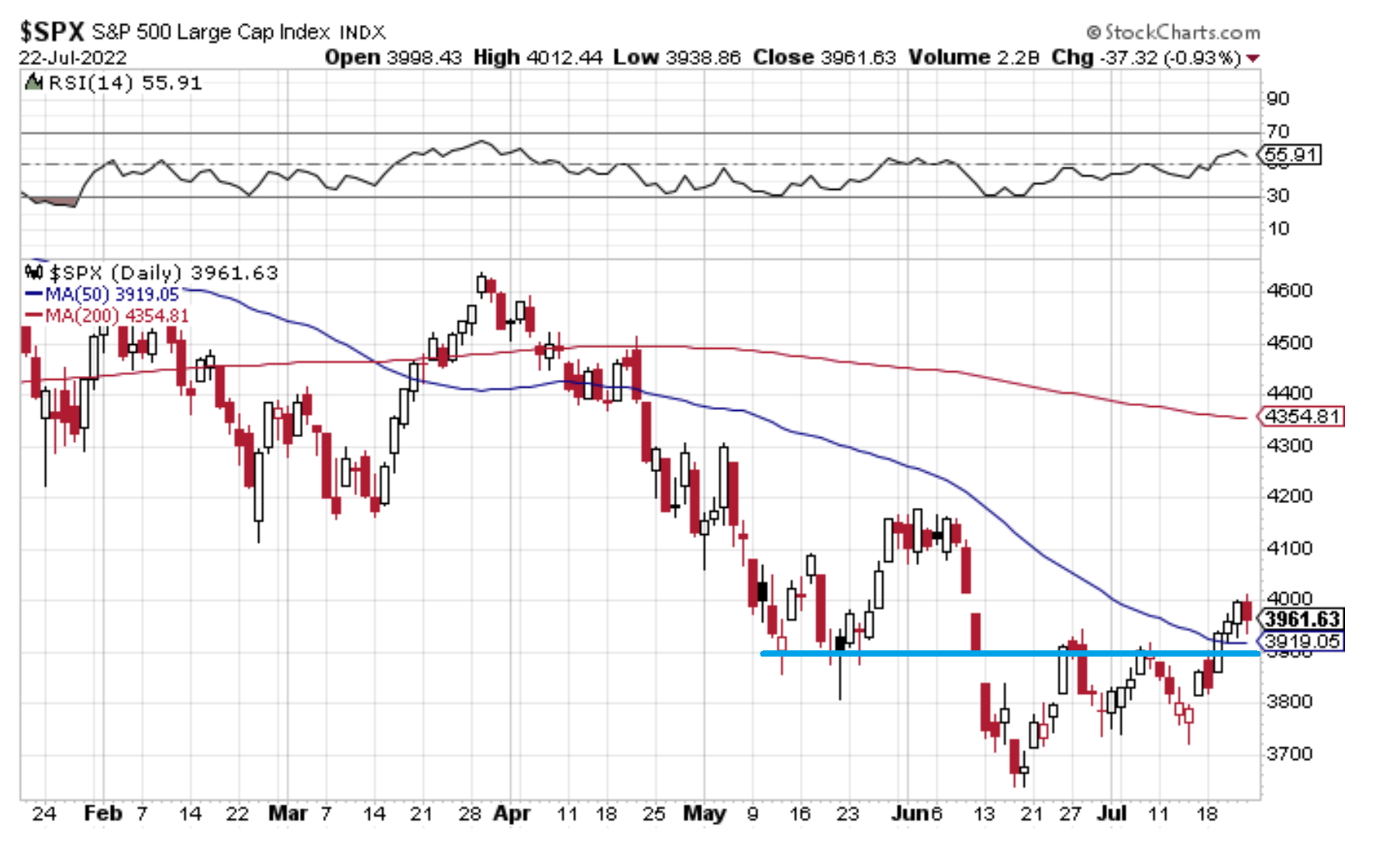
1. Support & resistance: The S&P 500 has managed to breakout vs initial short-term overhead resistance around 3900 AND its 50-day moving average, but has subsequently found another ceiling at 4000 (and arguably now features an overbought RSI).
The key thing for the bulls is that the 3900 level holds -- a successful test of what is now short-term support would be bullish, while a break lower would likely be the first step in another wave lower. Open-minded, and listening to what price is saying…
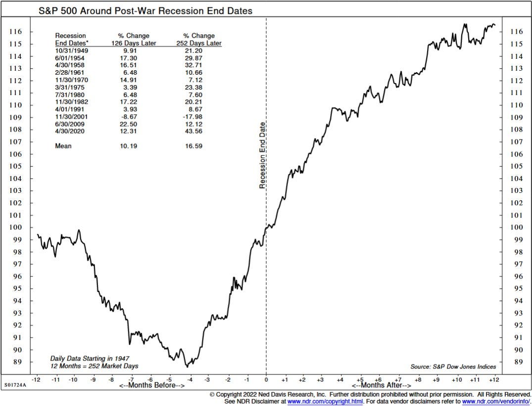
2. Recession trading: Interesting to note that "on average, the S&P 500 tends to bottom about 4 months before the official recession end date".
(albeit, I don't know if we even have an official recession start date yet! and there are still big open questions about the degree + magnitude of a prospective forthcoming global recession)
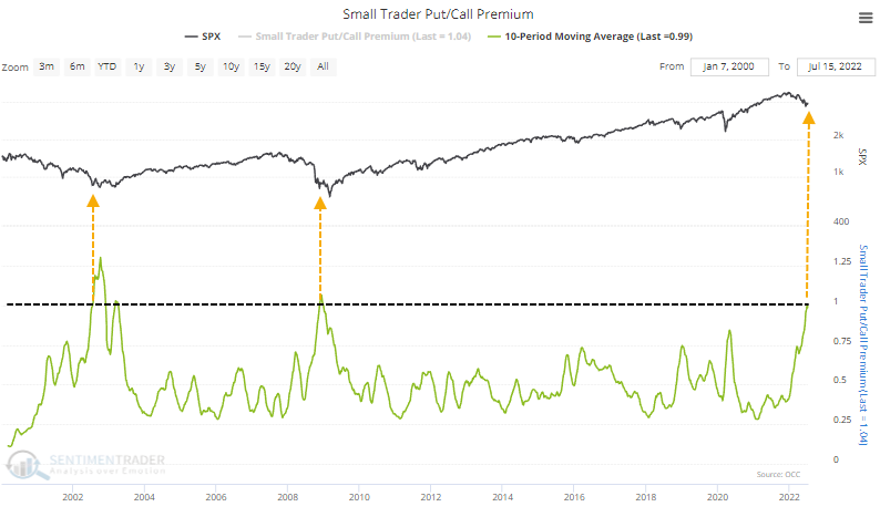
3. Small put/call: Apparently small traders are now "spending more on leveraged, expiring bets that stocks will fall than they spend on bets that stocks will rise"
As a twist on Buffett’s old saying… Bears be fearful when others are greedily betting on fear? (of course, the other interpretation is that rather than this being traders outright betting on a fall in the market, they are simply trying to hedge… but then we know a lot of folks got into options trading the past 2 years, with pure get-rich-quick speculative intent)
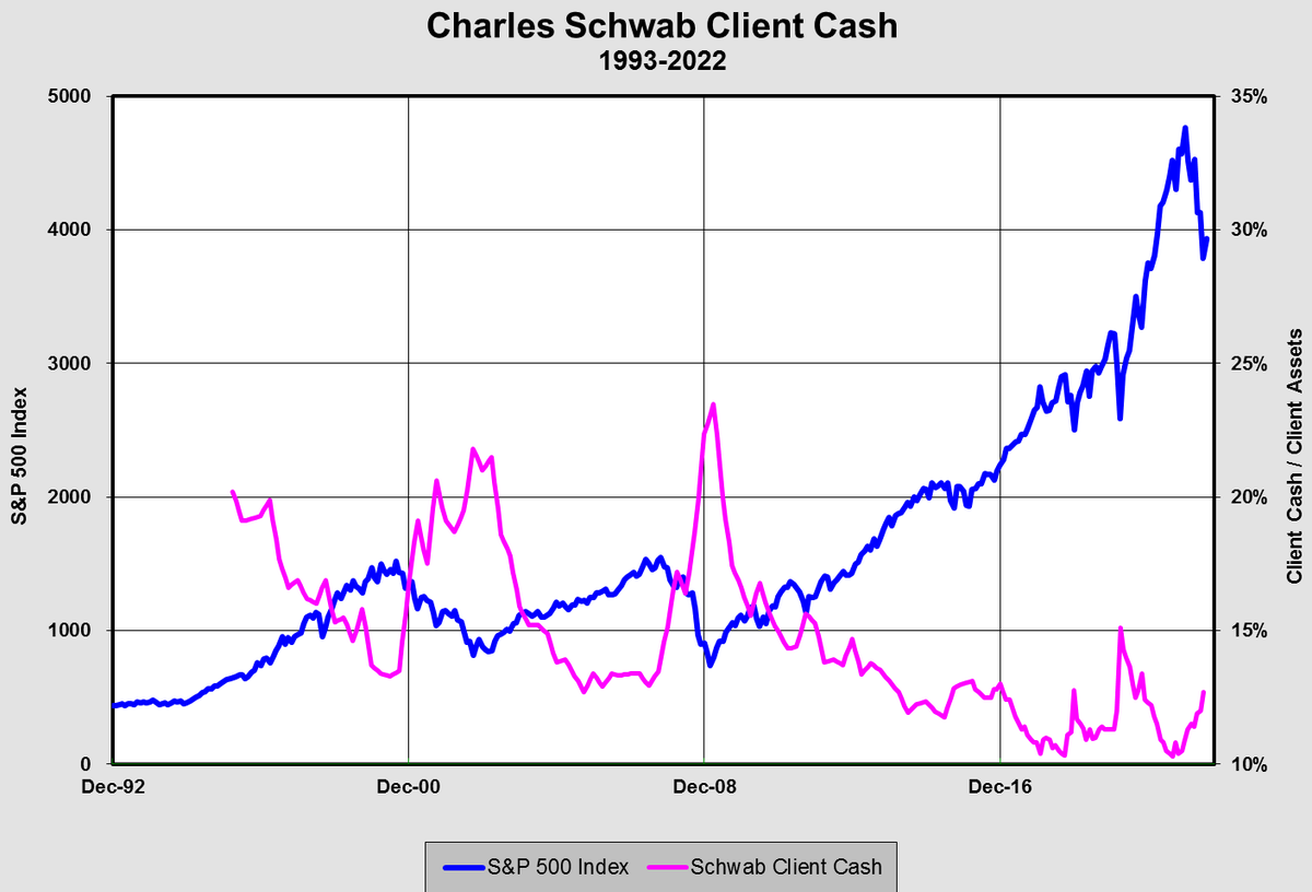
4. Cash allocations: Cash up but not out...
Cash allocations (as measured by Charles Schwab — but from my data, confirmed by AAII survey and ICI actual data) have lifted to multi-month highs, but are still miles off some of the major contrarian bullish levels seen in recent decades.
5. Googling bears: There’s an interesting dynamic — never before in history has information and sophisticated market analysis/data been so widely available... as such, people are more informed and speed of understanding is generally higher, but still it raises the question: if "everyone expects a bear market", will it still happen?
(I guess part of that is to ask: who is this “everyone“, but also what is driving the market — is it simply just flows and sentiment (which matter in the short-term), or do fundamentals matter eventually)
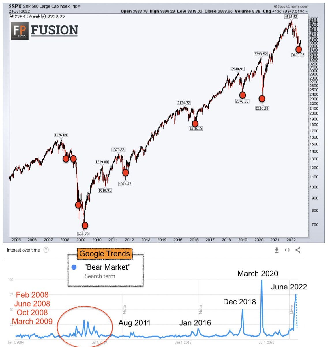
Source: @FusionptCapital
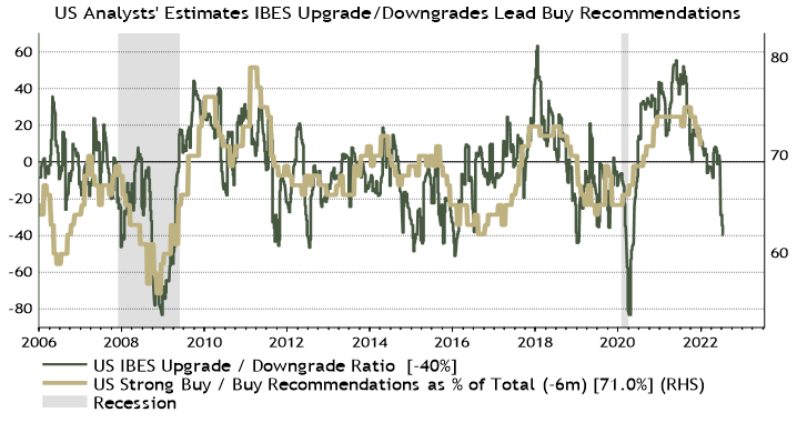
6. Downgradient: Back on the fundamentals, here comes the earnings downgrades as analysts catch up (down?) to the deteriorating economic outlook.
Along with falling earnings estimates, history says we likely see a collapse in "Strong Buy and Buy" recommendations…
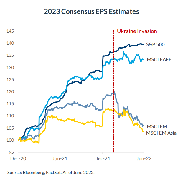
7. Earnings outlook: Emerging Markets are usually a few steps ahead of developed markets given the heavy weightings in EM equities to traditional cyclical sectors (and hence sensitivity to the ebb and flow of the global economy).
As such, Developed Markets, and more specifically S&P 500 earnings estimates are likely the next shoe to drop in all this.
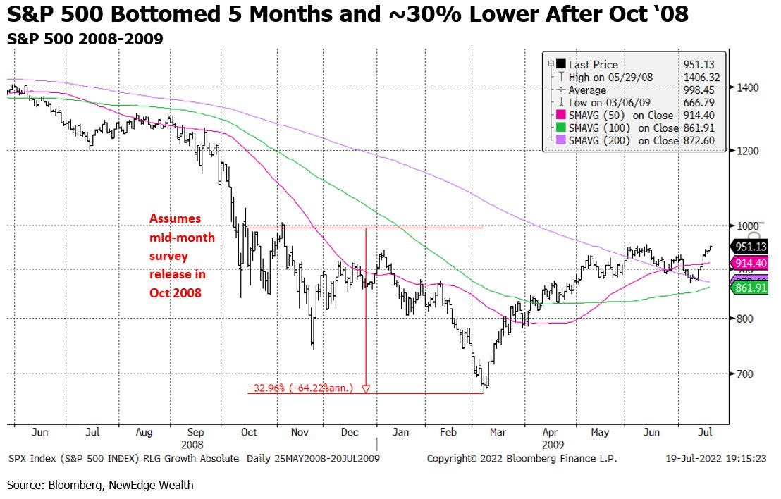
8. Contrarians beware: The latest BofA Fund Manager survey showed the lowest allocation to stocks since Oct 2008 -- which contrarians would think would be a good thing... right?
But as Cameron Dawson of NewEdge highlights, back then the S&P didn't bottom until 5 months later and ~30% lower. Goes to show that Sentiment/Positioning carries not just contrarian information (at extremes — and sometimes with an early signal), but also momentum information.
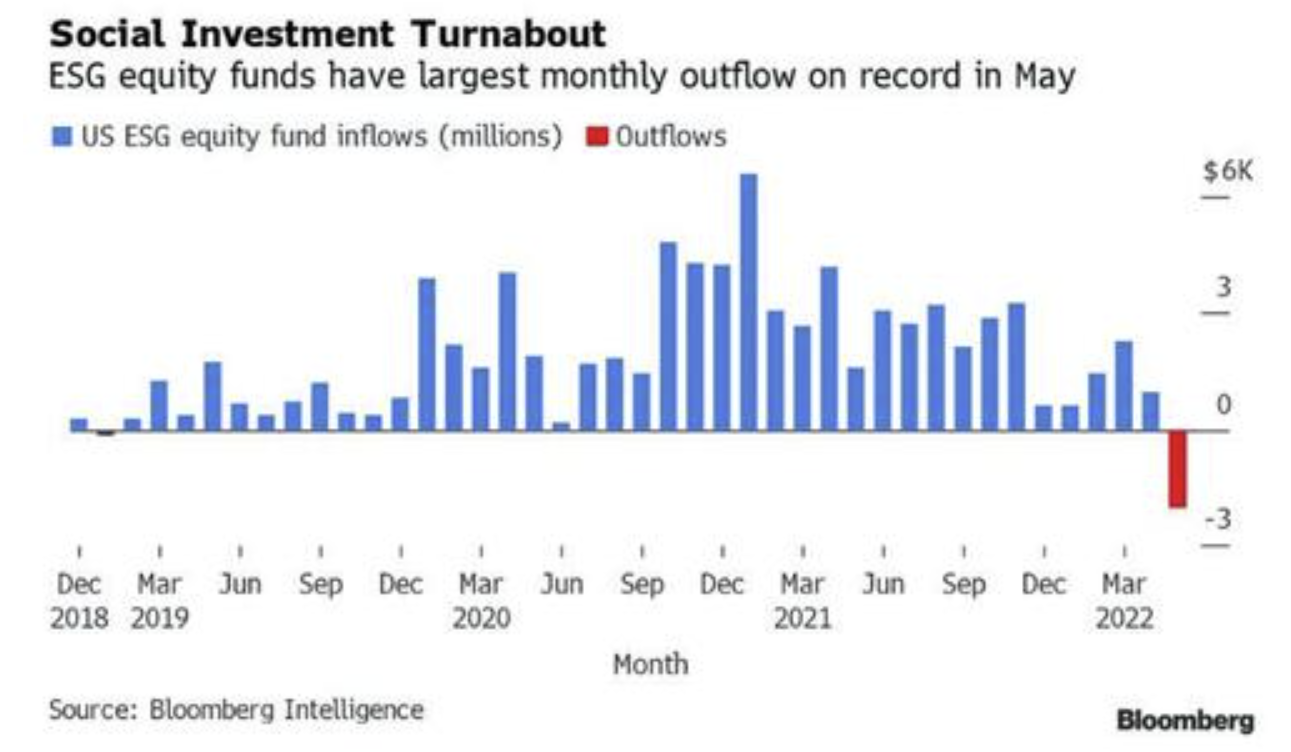
9. Escaping ESG: ESG investing faces its biggest test in the form of poor performance and wavering conviction in the face of an energy security crisis (no one ever said the energy transition was going to be easy!) not to mention big issues around greenwashing and often a material mismatch between marketing vs investor intentions (e.g. there is a big difference between just excluding a few stocks vs actually making an impact). And this chart shows what perhaps might be the start of an “ESG winter” in terms of flows.
Source: @LanceRoberts via @zerohedge
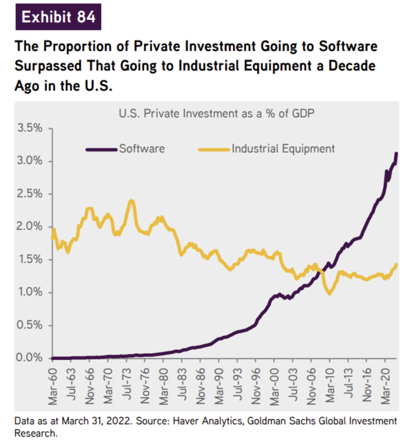
10. Investment into bits vs bits and pieces... Interesting chart, interesting trends, and very much reflective of some of the price trends you see in the stock market in terms of sectors, countries, and relative performance.
Thanks for reading!
Callum Thomas, founder and head of research at Topdown Charts.
Any feedback, questions, and views are welcome in the comment section below.
5 topics

