2018 summed up in 5 charts
If 2018 were a boxing match, you would be Mundine and Mr. Market would be Horn. It only took you 96 seconds to be battered and bruised to the floor. What went wrong? What did you miss? Like Horn, markets have been unforgiving. Globally, we have seen one of the largest spikes in volatility, with a 10% peak-to-trough sell-off for the S&P 500, Emerging Markets have fallen by 30% and locally, we have seen house prices fall at the fastest pace since the GFC. So what happened? We got in touch with four leading experts to tell the story of 2018 in one chart, and how it may unfold in 2019.
Responses are from Gopi Karunakaran, Portfolio Manager at Ardea Investment Management, Callum Thomas, Head of Research at Top Down Charts, Jonathan Rochford, Portfolio Manager at Narrow Road Capital and Brett Gillespie, Head of Global Macro at Ellerston Capital.
Interest rates matter … a lot
Gopi Karunakaran, Portfolio Manager, Ardea Investment Management
Why is it important?
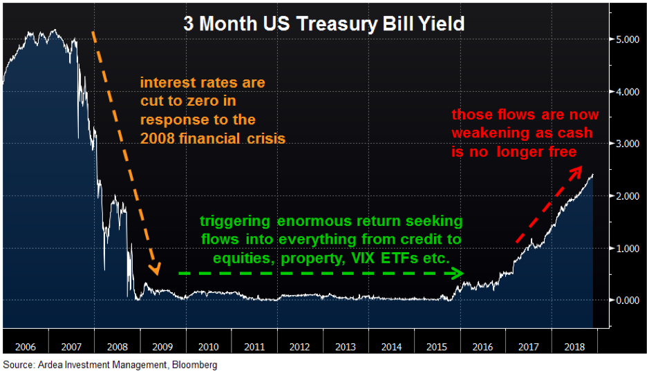
Even if you have no exposure to fixed income, interest rates still matter … a lot.
Having minimal credit or interest rate risk (politics aside), the interest rate on very short dated US government bonds, referred to as Treasury Bills (or T Bills), can be used as a proxy for a risk free rate of return.
In response to the 2008 financial crisis, central banks around the world cut interest rates and embarked on an unprecedented program of monetary stimulus. As a result, risk free rates around the world fell to zero. This had two related effects:
1. Asset prices pushed higher
Risk free rates form the foundation from which all discount rates are calculated. These discount rates are then used to value cash flows generated by assets ranging from bonds to stocks to real estate. As discount rates fell, the valuation of cash flows rose and therefore asset prices were pushed higher.
2. The reach for yield
Secondly, as the rate of return investors could get from lower risk assets fell in line with risk free rates, a great rotation of capital began that has lasted for the past ten years. A wall of money progressively moved up the risk spectrum, into riskier and riskier assets, in order to generate higher returns … the so called ‘reach for yield’.
In fixed income this manifested as capital rotating out of cash deposits and government bonds into progressively riskier credit securities. More broadly, capital poured into everything from equities to emerging markets, property, VIX ETFs etc. … basically anything that offered a return above zero.
This was a paradigm in which the desperate search for returns trumped considerations of how much risk was being taken to earn those returns. As risk free rates are now rising, the paradigm has changed. Cash is no longer free and those return seeking flows have correspondingly weakened. In July this year, the yield on 3 month US T Bills broke above 2%, and have since gone even higher. As the chart shows, this is a big change from the free money world investors had become accustomed to in the post financial crisis era, with more than half of that move higher happening in just the past 10 months. It’s not a coincidence that equities and pretty much all other asset classes have struggled over this period.
What does it tell us?
- Firstly, the discount rate applied to all financial asset valuations is now rising and therefore, all else equal, asset prices should become more vulnerable.
- Secondly, you can now earn 2.4% from risk free 3 month T Bills at a time when riskier assets are offering much smaller return pick-ups than they used to. This naturally means the compulsion to keep stretching risk budgets in the search for higher returns is no longer as strong and the risk vs. reward proposition of continuing to reach for yield is now much less appealing.
This doesn’t mean all capital flows suddenly reverse into lower risk assets. Rather, it’s subtle at first, like water leaving a bath tub when the plug is removed. Initially you hardly notice but then it becomes increasingly obvious the water is running out. We’re already seeing some evidence of this, for example in accelerating outflows from even ‘safe’ investment grade credit assets. This dynamic has negative implications for asset price valuations and volatility across all financial markets. So far 2018 has only given us a small taste of this … we expect much more going forward.
The stars finally align for Emerging Markets
Callum Thomas, Head of Research – Global Economics & Asset Allocation, Top Down Charts
Why is it important?
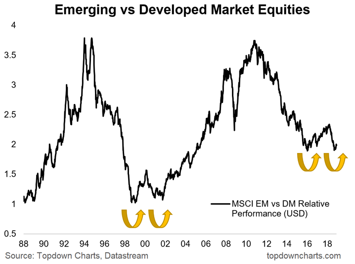
The chart I’ve picked out (from the many many possible choices I had!) shows the relative performance of emerging vs developed market equities, and aside from the valuation case I mention below, there’s also an interesting possible repeat of history getting underway.
Technical analysts call this pattern a double bottom, it’s where a market makes a low, rebounds, and then drops back to the same low. The reason you often see this kind of price action around a major market turning point is because often times when you have a long running and substantial trend in price it reflects a genuine shift in the fundamental picture i.e. in this case bearish over the past 8 years. And these big trends in the underlying fundamentals can take time to run their course e.g. economic rebalancing, monetary policy cycles, business cycles, etc. It’s also important from an investor psychology standpoint as they start to perceive a floor under prices and make their way back into the market.
To me, this is probably one of the most interesting charts to keep on the radar from a global asset allocation perspective as we move closer into the new year, and perhaps more importantly, as we edge closer to a new decade – which is where charts like this start to get really interesting!
What does it tell us?
Emerging markets have had a good old-fashioned beat up this year. EM equities and EM currencies both took a thorough beating as the rebound in the US dollar turned what was previously buoyant optimism on these asset classes to outright pessimism and panic.
For those like me with a contrarian bent, it’s where things get really interesting investment-wise. In October a number of my favourite valuation indicators started to light up in a compelling way for emerging markets. This list included:
1. Equity risk premium
2. CAPE (cyclically adjusted PE ratio)
3. Forward PE
4. Median valuation across sector and country
5. Relative valuations vs developed markets.
My view is when it comes to investing over a medium-long-term timeframe, you really put the odds in your favour when you buy stuff cheap. It may mean taking on more volatility or the prospect of finding an opportunity to buy at even cheaper prices after you start building a position, but ultimately, it’s about trying to put the odds in your favour as investing is a challenging endeavour. And when it comes to EM vs DM equities, we see the odds are increasingly in favour of EM.
A substantial tailwind has become a significant headwind
Jonathan Rochford, Portfolio Manager, Narrow Road Capital
Why is it important?
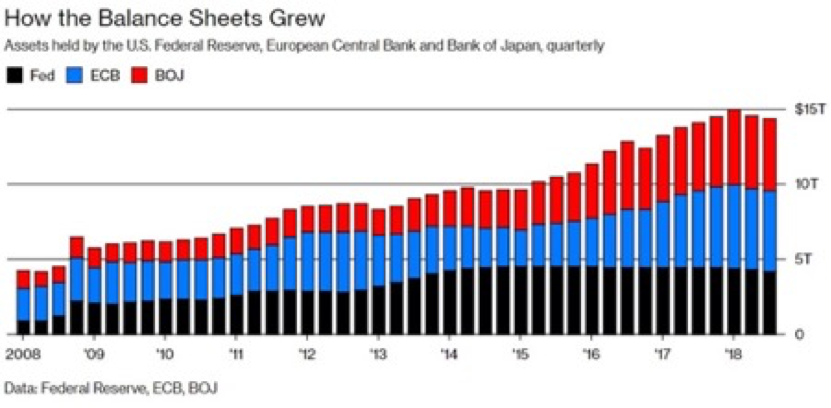
Investors wondering why equities and emerging markets are having a tough year this year should take note of the above chart from Bloomberg. It shows that for almost a decade central banks in the US, Europe and Japan have printed money and bought government debt, corporate debt and in some cases even equities. The money printing has served as a constant and artificial bid for assets of all types. Central bank buying of government debt has seen other investors crowded out of government debt and resorting to riskier assets like high yield debt, emerging market debt, equities, property, and infrastructure.
What does it tell us?
Now that the US is unwinding its money printing and Japan has substantially slowed the rate of its quantitative easing activities, the three major central banks are now net sellers. What was a substantial tailwind for risk assets has become a headwind. When combined with increasing interest rates in the US, which makes cash and short-term debt a more viable alternative, it’s no surprise that risk assets haven’t continued the strong gains from previous years.
Investors are now faced with a challenging outlook when considering how to meet their return targets. One area of opportunity is Australian alternative credit, which has continued to post gains during the ASX sell-off of the last three months. Returns of 6-8% on short dated, low risk debt are comfortably achievable. AAA rated debt paying 3.50-4.00% is another standout opportunity.
What will drive the tightening?
Brett Gillespie, Head of Global Macro, Ellerston Capital
Why is it important?
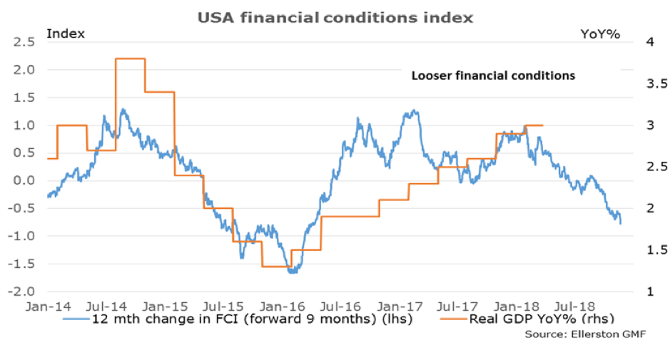
Financial conditions tell us how US GDP growth is likely to evolve over the coming year. It captures not just the impact of Fed hikes and movement in US treasuries, but the cost of borrowing for corporates, the impact of the exchange rates and the impact of the equity market. A tightening of financial conditions is driven by any or all of Fed hikes, higher bond yields, higher corporate borrowing rates, higher exchange rate or a weaker equity market. The trick is to work out the right weight of these components so as to provide a reliable forecast. Our model has been working well.
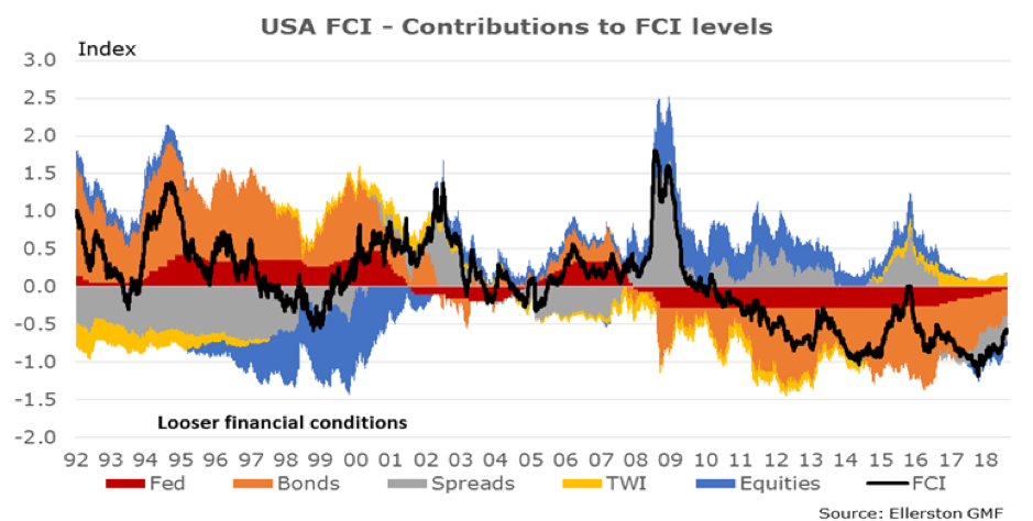
What does it tell us?
Our model suggests US growth will slow below 2% next year. However, we are expecting 2.5% growth. Why? Fiscal stimulus. The model does not directly capture fiscal policy and given how large the US tax cuts are this year and into next year we need to add about 0.8% to the growth outlook for 2019. It is also very instructive to see where the tightening is coming from. Recently, it has come from higher corporate lending rates (spreads) and weaker equity markets. That has created the last leg of tightening (over the last 3 months). Why is that important? Because it can reverse quickly if equity markets rally (as opposed to the tightening been totally driven by Fed rate hikes). But as we stand today, the Fed has less work to do in 2019.
Our view is some more tightening in financial conditions will be required as we look into 2020 to slow the US economy to trend (around 1.8%). The more difficult question is what will drive that tightening? The Fed, or a further fall in equity markets and wider corporate spreads? We think corporate spread widening could become the key driver, which would mean weaker equity markets but also less rate hikes from the Fed. But if corporate spreads stabilise or improve, the Fed will need to do more of the lifting.
Never miss an update
Enjoy this wire? Hit the ‘like’ button to let us know.
Stay up to date with my current content by
following me below and you’ll be notified every time I post a wire
Livewire Exclusive brings you exclusive content from a wide range of leading fund managers and investment professionals.
2 topics
5 contributors mentioned
Livewire Markets
Livewire Exclusive brings you exclusive content from a wide range of leading fund managers and investment professionals.
Expertise
Livewire Markets
Livewire Exclusive brings you exclusive content from a wide range of leading fund managers and investment professionals.
Expertise
Comments
Comments
Sign In or Join Free to comment