A major headwind to global recovery

Chris Rands
Yarra Capital Management
The narrative we see at the moment is for a US-led, global recovery. However, the U.S. economy is at 2% inflation and 2% growth. Both times we had these conditions in recent years, growth fell away very quickly. Here we look at a major headwind that could see this pattern repeat: demographics.
Some major players missed the memo about the recovery
If you use forward indicators at the moment, like the oil price or ISM surveys, what you'll see is that this outlook of above 2% growth in inflation should continue for the rest of this year.
This is really going to set the Fed up to continue hiking rates and drag rates higher as they move that front end. The narrative that flows off the back of this is that global markets should be rising as well because the US is going to lift all boats.
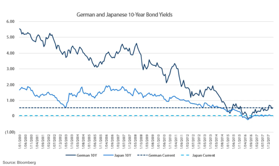
The problem with that, however, is that a couple of markets seem to have missed the memo.
The chart below shows Japanese and German interest rates going back to the year 2000. They're both below 1%. They've risen slightly over the past few months, but they're still basically at all-time lows. When I look at these, I think there's a bigger question sitting underneath this. Something has changed.
Something has changed
Has something changed that means the US-led recovery is no longer going to hold true? I'm going to say yes. To explain why, I'm going to use this chart.
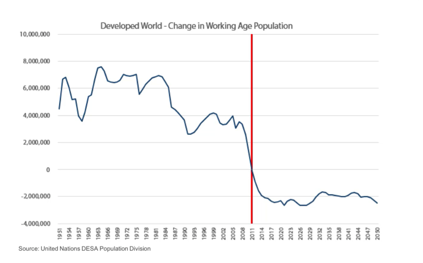
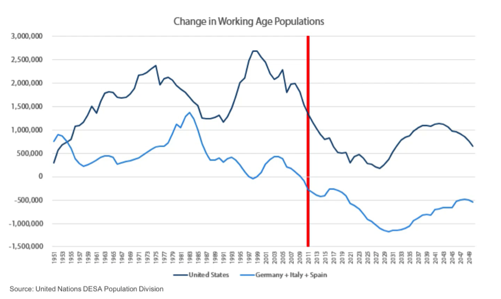
This is the annual change in the working age population for the developed world since 1950. That metric shows the number of people that we have in an economy aged 15 to 64. From this chart, you'll see from 1950 through to 2008 the developed world was adding somewhere between 2 and 6 million new people of working age every year.
From 2011 onwards we're actually seeing 2 million people per annum coming out of the working-age population, right across the developed world.
Now to really understand why this matters you just need to think of what a working-age population is. This is showing how many people are going to be entering the developed economy ready to work. So when this metric is expanding, we get more and more people available for work and that can push GDP higher. When it begins to fall like we're seeing now, governments need to figure out how they're going to keep people in employment, or they're going to see their labour bases decline.
Smaller workforce, smaller GDP
When we say the developed world changed in 2011, we need to then think about what type of effects could come from this. Now to do this I'm going to focus on Japan. The importance of Japan is that their working-age population started declining in 1995. So they have a 16-year headstart on the rest of the world. Rather than looking at them as an outlier over the past 20 years, we can potentially look at their experience and say, "What lessons can we learn from this?"
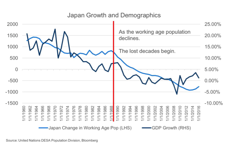
The chart I have here is the growth in Japan against the working age population. The red line shows where the working population peaked in 1989 before declining through the 90s. Once it began to decline in the 90s Japanese GDP went into a lost decade. Now you might think, "Well what's really causing this?" If you just think of GDP as what underlies it, it's really how much output everybody in the economy achieves. So there are two things that we need to worry about for the long term. How many people are working and how much are they able to produce when they turn up to work?
The working age population really affects that first part of your equation. How many people do we have working? As this metric begins to decline you see labour forces begin to decline as well because you can't get as many people to do the work. Now if you were to go and look at Japan during this period, employment actually peaked in the 1990s. It's been going sideways since then. So the fact that they've grown at all is a testament to their increasing productivity. Now that's very positive, but if you don't have new workers coming into your economy it's very hard to drive incremental increases of your GDP above where the productivity is growing at.
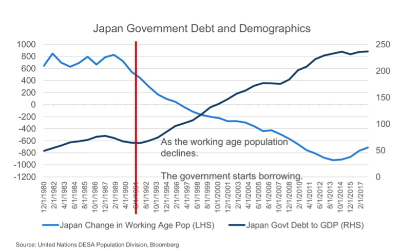
The second problem this causes for economies is in government debt. So similar to growth, here I show government debt to GDP against the working age population. The light blue line again shows the 1989 decline and then straight away we see government debt explode. So this is actually a relatively simple explanation for what happens.
On the expenditure side, as our working-age population declines we have more and more people into retirement who are 65 plus. These people need healthcare spending, pensions, and the likes, which your younger age groups don't need. So during this time the government is going to see rising expenditures.
On the flip side of that though is their revenues. As the working age population begins to decline it's harder to get people into employment, and those people are who pay your taxes. So if you're not able to increase your tax base then you're going to have some fiscal struggles. Now again this is exactly what we saw in Japan. In the 1990s, tax revenues peaked. They've been going sideways since. But over the same period their expenditures have almost doubled, and the outlook looking forward is for that to continue, because they have an ageing population. This is why you really see debt go from 50% in the 90s to 250% now, because the only way for them to fund that difference without raising taxes or cutting expenditure is to borrow money.
So when we look at these two effects, they're both relatively simple. We can probably expect lower GDP and we can also expect higher debt levels. Both of those can affect interest rates. On the GDP side, if we have a lower trend GDP right now than 10 years ago, the central banks are going to look at what they can do to get back to what was 10 years ago even if the fundamentals have changed. That encourages them to keep cutting. The other thing is if government debt gets too high the only thing that you can do to continue paying it is to keep the interest rate low. So both of these factors are encouraging rates to be low in the developed world at the moment.
Europe is facing the same problem
Now with that information we can come back to this US-led narrative. Are they able to pull the rest of the world with them? To look at that we really need to split out what's happening in the developed world. So here I take the US working age population and also the combination of Germany, Italy and Spain. So on the top you can see the US, while it declined in 2011 it always remains positive. And in fact sometime in the late 2020s it should start improving again.
The problem is in Europe. In 2011 Europe went negative. And that process is going to accelerate through the 2020s. So this outlook is actually getting worse from here for them, and you begin to see the problems that they're faced with. As their working age population begins to decline, their growth rates are probably going to fall and that's going to need low rates to sustain them.
We can take this one step further and look at the developed world over the past five years.
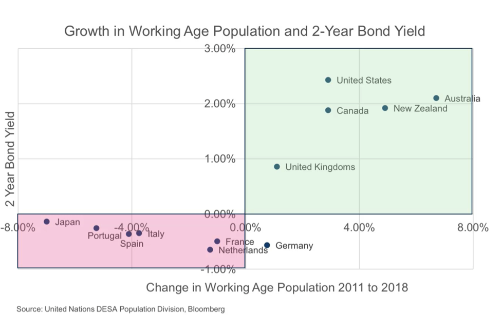
This chart shows the current two-year bond yield on the vertical axis. The higher you look, the higher the short-term interest rates. On the horizontal axis is the change in the working age population since 2011. The countries on the right are the countries that have a growing working-age population. The countries on the left are those that have a negative working age population.
There are really two things that you need to look at to identify the winners and the losers of this process. The countries on the right have been able to achieve higher growth, higher inflation and with that higher rates. The countries on the left unfortunately, they've been seeing low inflation, barely any growth and negative rates now. I don't think that it's a coincidence that Portugal, Italy and Spain, that three of the four pigs show up in this worst scenario, because they're really struggling to grow and part of that is they don't have expanding workforces anymore.
Growing populations, growing economies
The other thing to point out from this is the countries that are seen as safe havens. The United States, Canada and Australia, they're all on the right. They've got lower debt levels than the other countries. And I really want to point out Australia here. Australia is as far right there out of the top 10 developed countries. So we've had the best working-age population growth. With that, we've also had the highest rate of inflation, the highest rate of growth, and for most of the time a higher level of rates. If you were to recreate this distribution over the next five years, what you would see is that Australia remains in that position. It's going to have positive working-age population growth for the next five years, and while it's not as strong as what it was in the early 2000s it still remains positive. So we should see continued growth and positive rates at least in Australia.
Now some of you are probably thinking, "Well if Australia has positive population dynamics and Europe's stuffed, why would I really care about Europe?" And that might be true from a fundamental perspective, but the problem is that those European problems are leaking out into the rest of the world. So to show this I have two charts here.
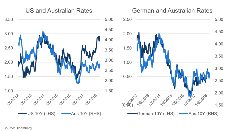
On the left is Australian 10-year rate (in the light blue), against the US government rate (in dark blue). So you can see over the past two years US government rates have risen from about a low of 2% up to closer to 3%. At the same period, Australian rates have barely moved. So what we're seeing at the moment is not that the US is dragging us higher. In fact, something else is happening. And that's where we come to the chart on the right.
On the right is the German 10-year bond against Australia's 10-year bond, and the correlation here is almost one to one. So what you're seeing here is not that the US is pulling us higher, it's that Europe is dragging us lower in yields.
If you step back and think about what's happening here it seems somewhat intuitive. As Europe cuts their interest rates to negative, then those investors want to look somewhere else for a better yield. Australia has a triple AAA rating and higher cash rates so they say, "Fantastic. I'll take that." Now you can think of this spread kind of like an elastic band. As the European spread drops low, they're looking to buy our rates and pull us with it. If our rates move too far away from that and that spread increases, then those buyers are going to come in and pull it back towards the German rates.
So my view on this is if you're going to forecast drastically higher rates across the rest of the world outside of the US, firstly you need to know about what the US is doing, but secondly, you need to know what the problem is in Europe. And if you take a demographic perspective of the long term, and you look at the Japanese experience over the past 20 years the conclusion might be "Well, their economy is a little bit shakier than we expect and rates could remain lower for longer and really hold the rest of the world down in terms of yields."
Three key takeaways
The first is that demographics matter, and that not all countries are the same. In the working population versus bond rates chart above, the countries on the left with the negative working age population growth, those countries are the ones that look a little bit shakier and may not be able to achieve the high growth that the market is seeing them rebounding to.
The second takeaway is really that the extreme actions that are coming out of central banks in Europe and Japan are affecting the rest of the world. The problem to me at the moment is not that the US looks good; the US looks probably the best it has in eight years. The problem is coming out of Europe and so we also need to understand when they're going to get better if we're going to forecast higher rates.
The final thing is the positive out of this. Australia has some of the best population dynamics out of the entire developed world over the next five years. So while there are problems across the rest of the world, for Australia at least we should be able to continue to see positive growth in inflation, and with that, positive yields.
Further insights
For further analysis and insights from the team at NIkko Asset Management, please visit our website
Never miss an update
Enjoy this wire? Hit the ‘like’ button to let us know.
Stay up to date with my current content by
following me below and you’ll be notified every time I post a wire
Chris is responsible for portfolio management, including portfolio construction and trading for various Australian fixed income portfolios including the Nikko AM Australian Bond Fund at Yarra Capital Management (Nikko AM was acquired by Yarra Capital Management in April 2021). Chris has over 9 years of experience in the fixed income market. He is also co-host of the popular Australian podcast series The Rate Debate.

4 topics
Chris Rands
Co-Portfolio Manager, Fixed Income
Yarra Capital Management
Chris is responsible for portfolio management, including portfolio construction and trading for various Australian fixed income portfolios including the Nikko AM Australian Bond Fund at Yarra Capital Management (Nikko AM was acquired by Yarra...
Expertise
Comments
Comments
Sign In or Join Free to comment
most popular
Investment Theme
If 24 LICs ran the Melbourne Cup, which ones would we back?
Affluence Funds Management