Weekly S&P500 ChartStorm - 12 June 2022
The Weekly S&P500 ChartStorm is a selection of 10 charts that I handpicked from around the web and post on Twitter. The purpose of this post is to add extra colour and commentary around the charts.
The charts focus on the S&P500 (US equities); and the various forces and factors that influence the outlook - with the aim of bringing insight and perspective...
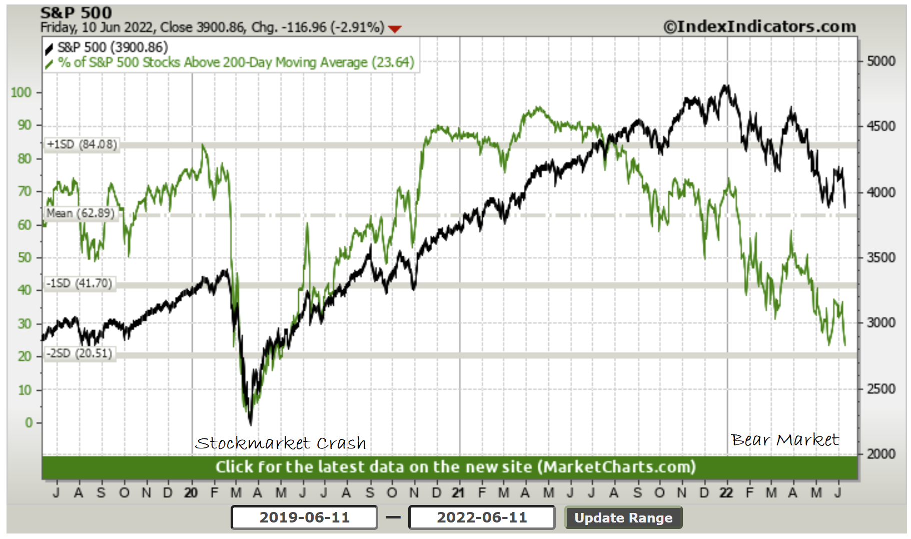
1. Bear Market vs Market Crash: This is probably the best image to use in a textbook to compare and contrast a bear market vs a market crash.
And p.s. forget about that “20% = bear/bull“ b.s., bear markets are a process, not a percent change. Current market action reflects removal of stimulus, correction of previous expensive valuations, and overall: a transition in the underlying business/financial cycle.
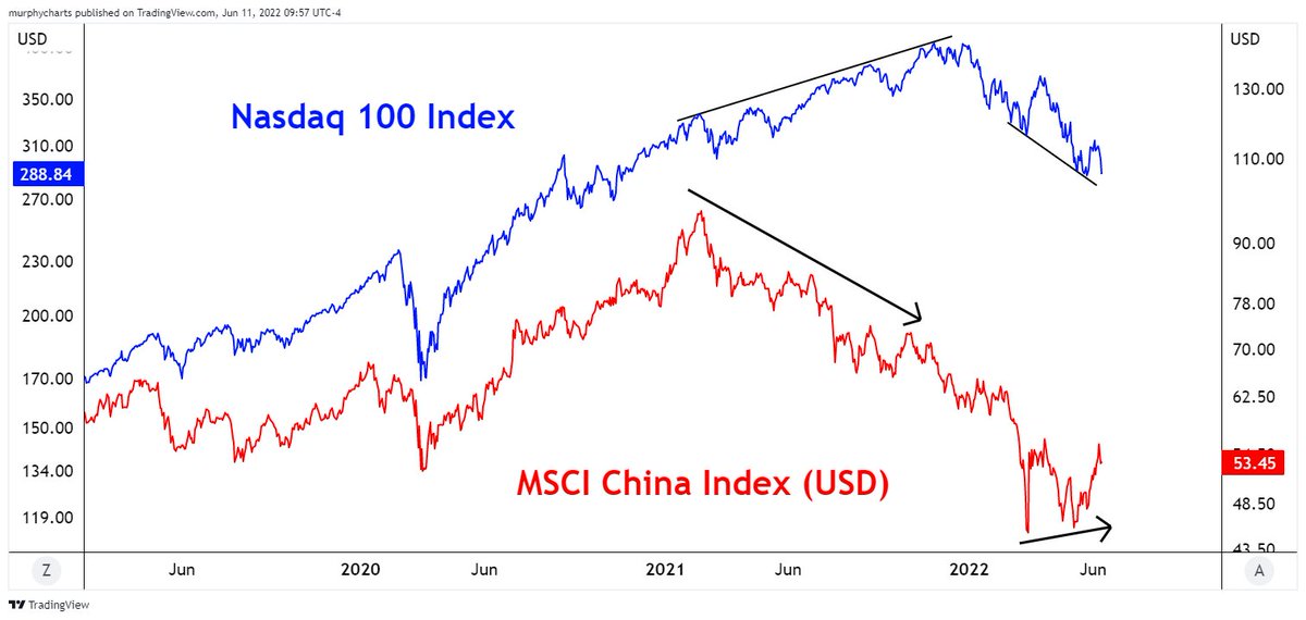
2. FIFO: Keep an eye on China... Chinese tech sector basically provided the playbook for Nasdaq: first to fall and likely first to bottom. From a macro standpoint, China is also many months ahead — they never really stimulated that much, and actually ran fairly tight monetary/fiscal settings last year. And as such we’d seen significant slowing there even before the lockdowns. But also looking further out, they are most likely to be first to pivot to stimulus down the track too. So keep an eye on China macro and markets!
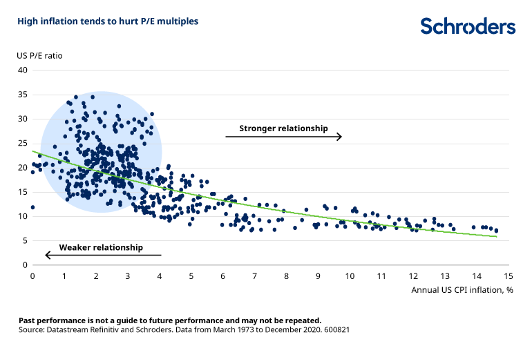
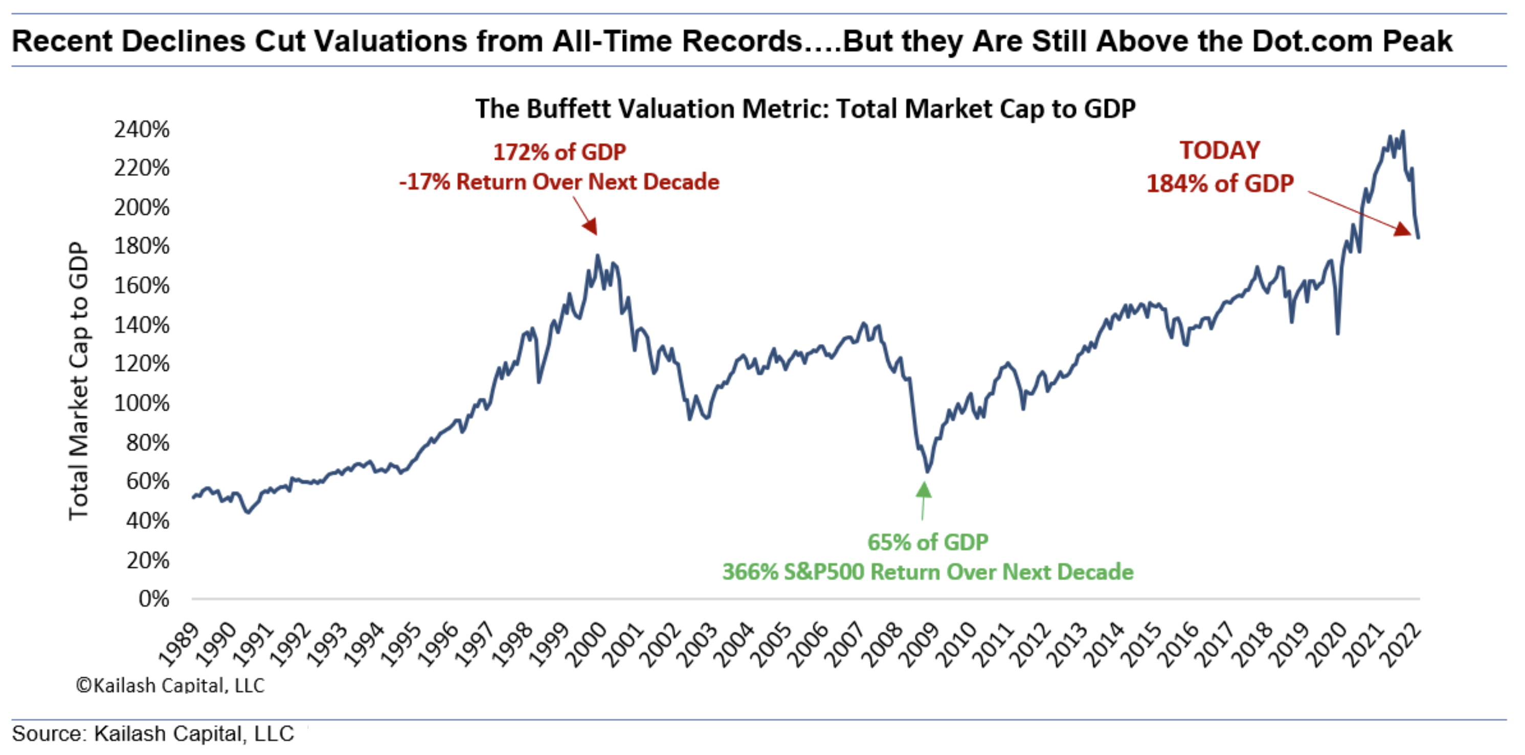
3. CPI and PE Ratios: Everyone's (current) favorite economic data report was out this week and it showed annual CPI inflation running at an 8.6% clip.
On this chart that would imply a P/E ~11x (Current P/E is ~20x 😅😓🥵).
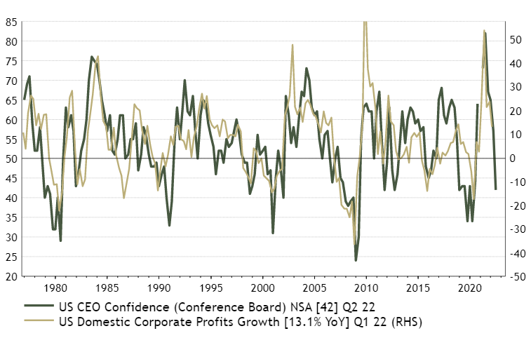
4. Profit Pitfalls: Some might look at the previous chart and proffer a statement such as: "OK, so what if P/E ratios go lower, at least earnings are growing, right?"
Thing is, the outlook for profits looks precarious if CEO confidence is anything to go by… (n.b. profits are the “E“ in the P/E ratio: if P/E goes down it can mean that either E went up and P stayed the same or that P went down and E stayed the same, but if E goes down and P/E goes down, then that is the worst cast scenario for the P)
5. Consumer Sentiment vs Stockmarket Positioning: Consumers are extremely pessimistic, but yet they hold steady in their stockmarket holdings. This is either a broken correlation or a correlation that will break a lot of things... !
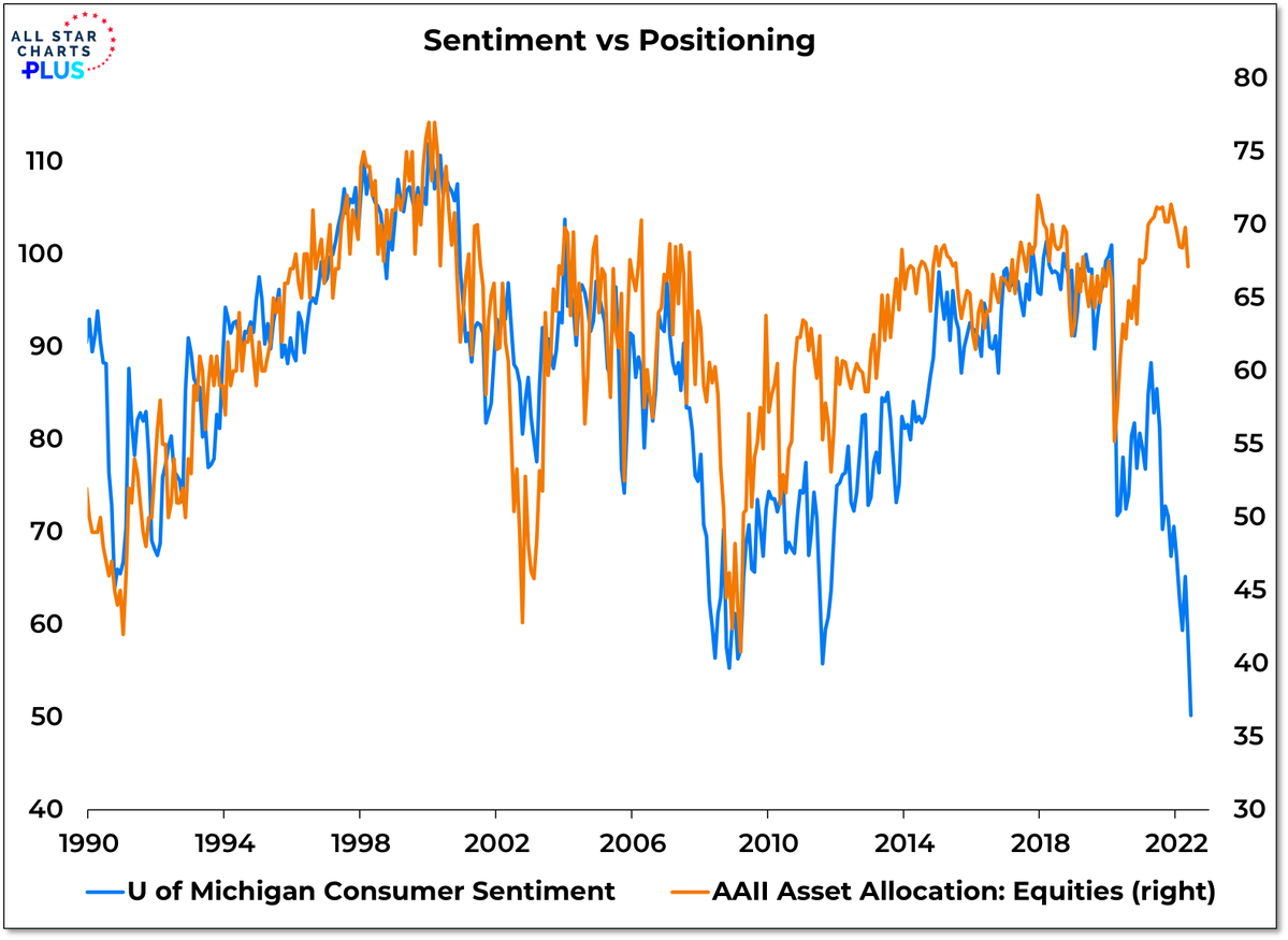
6. Household Equity Allocations: In case you doubt the data in the previous chart (which in fact is simply a survey of members of the AAII), here is the aggregate view across all US households: equity allocations are bigger than ever before.

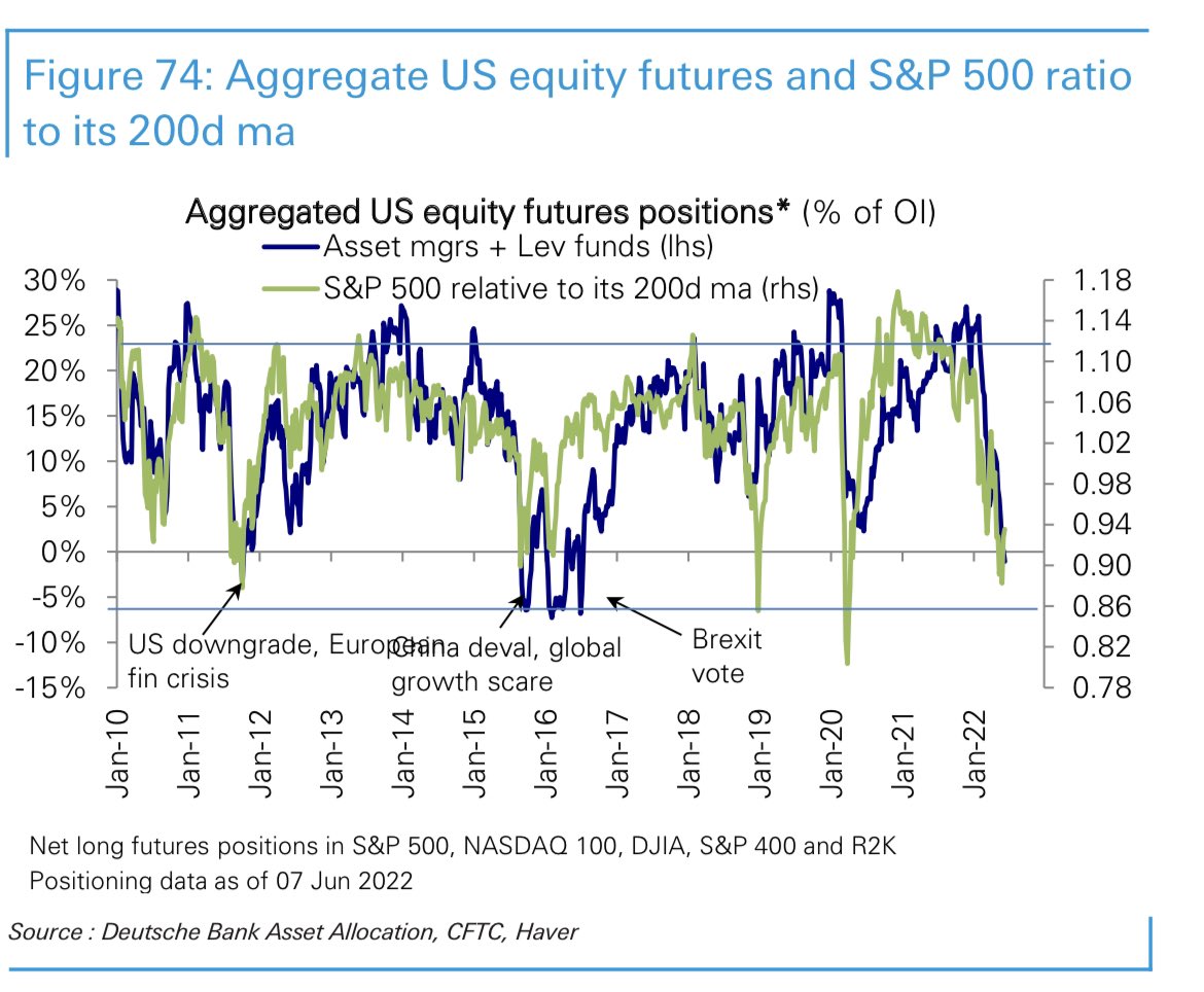
7. Futures Positioning: Meanwhile the pros are increasingly all-out: “Equity futures positioning (asset managers and leveraged funds) has now turned net short for the first time since the Brexit shock in **2016**”
(albeit, being futures positioning, there could be some hedging or L/S trades getting mixed into this)
8. Energy vs Technology: Everyone was so busying investing in tech and chasing dreams of the future, we forgot to invest in energy, and now: results.
To be fair, I would not expect that these two lines will cross again any time soon as such, but definitely expect some further rotation.
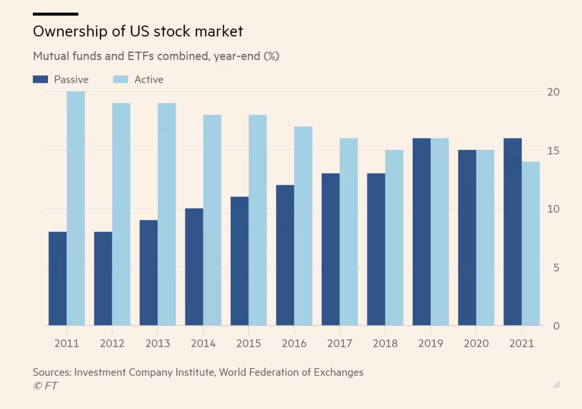
9. Passive vs Active: Corollary to the previous chart, the push to passive means that many investors were mindlessly drifted into massive tech exposures and out of energy (and materials for that matter) by virtue of delegating their investment strategy to simply “buy the biggest stocks“ (at least for passive funds that follow market-cap based indexes).
(albeit, to be fair a lot of active funds were probably boots into tech/momentum too!)
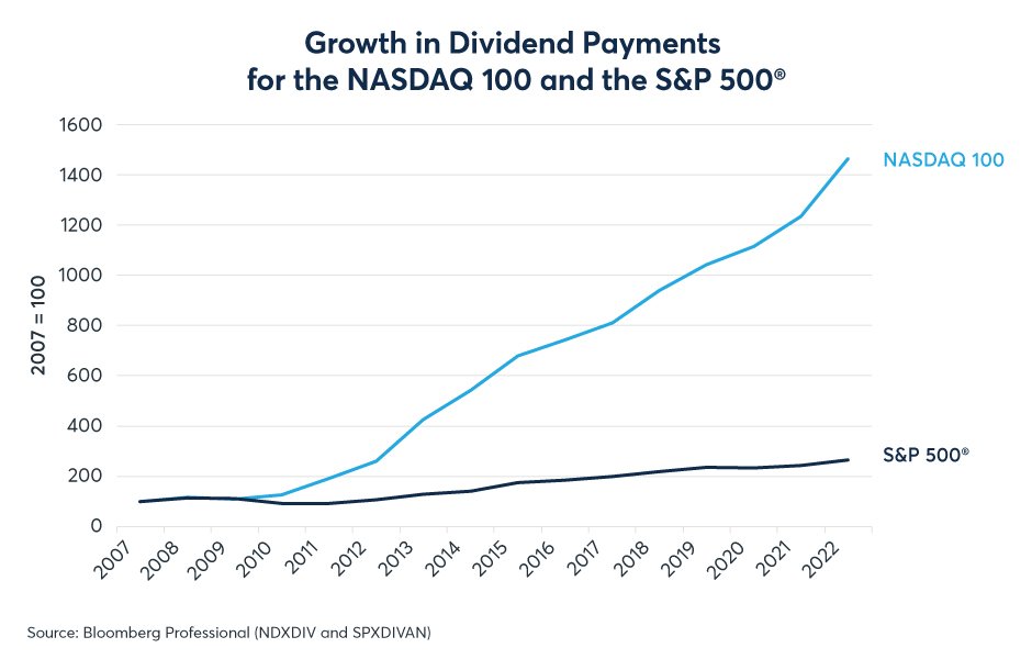
10. Dividend Growth: Most income oriented investors probably focus on dividend yield, but this chart goes to show that growth of dividends also matters…
Thanks for reading!
Callum Thomas, founder and head of research at Topdown Charts.
Any feedback, questions and views are welcome in the comment section below.
4 topics

